The network for creativity
Join 1.25M professional creatives like you
Connect with clients, get discovered, and run your business 100% commission-free
Creatives on Contra have earned over $150M and we are just getting started
Back to feedPost

Just wrapped a brand identity animated bento for Jutech Horizon Developments Ltd, using Jitter.video
Here's what the bento board covers:
🔷 Logo — a bold construction helmet icon paired with strong uppercase typography that commands authority
🎨 Color Palette — Navy Blue (#001F3F), Gray (#BABCBD), and Gold (#FFD700). Power, precision, and premium energy in three swatches.
🚛 Brand in the wild — logo applied on their concrete mixer truck, showing how the identity lives beyond the screen
✍️ Typography — Host Grotesk across all 6 weights (Light → Extrabold), keeping the brand voice clean, modern, and versatile
📐 Brand tagline — "Developing Horizons. Delivering Excellence." paired with a photo of an architect reviewing blueprints — context that ties the identity back to the industry.
This one was about building trust through design. Every element was intentional. 💛
The network for creativity
Join 1.25M professional creatives like you
Connect with clients, get discovered, and run your business 100% commission-free
Creatives on Contra have earned over $150M and we are just getting started



Related posts

working on a case study for my latest project - brand identity for Coral Pay.
need your help choosing the best cover video for it:
35 voted
23%
118 voted
77%
153 votes
Closed

Lilac looks amazing with the 3D shining.

How do you make a construction brand feel consistent from a business card to a building site?
Brixon’s identity brings angular lettering, an assembled geometric symbol, and a lime, black, and white palette together.
I carried those elements into stationery, brand guidelines, team identification, social graphics, and site signage, then brought the system into motion with Adobe After Effects.
The connecting decision: keep the geometry and layout structure consistent while the logo details, messages, and application previews change within the animated panels.
My contribution covered brand design, graphic design, and motion design.
What draws your attention first: the wordmark, the lime palette, or the rotating symbol?
See the full Brixon case study. If you’re shaping a construction or development brand, I’m available for brand identity and motion projects.

Incomparable work!

YUZU Flavor Face-Off — Which One Wins?
39 voted
48%
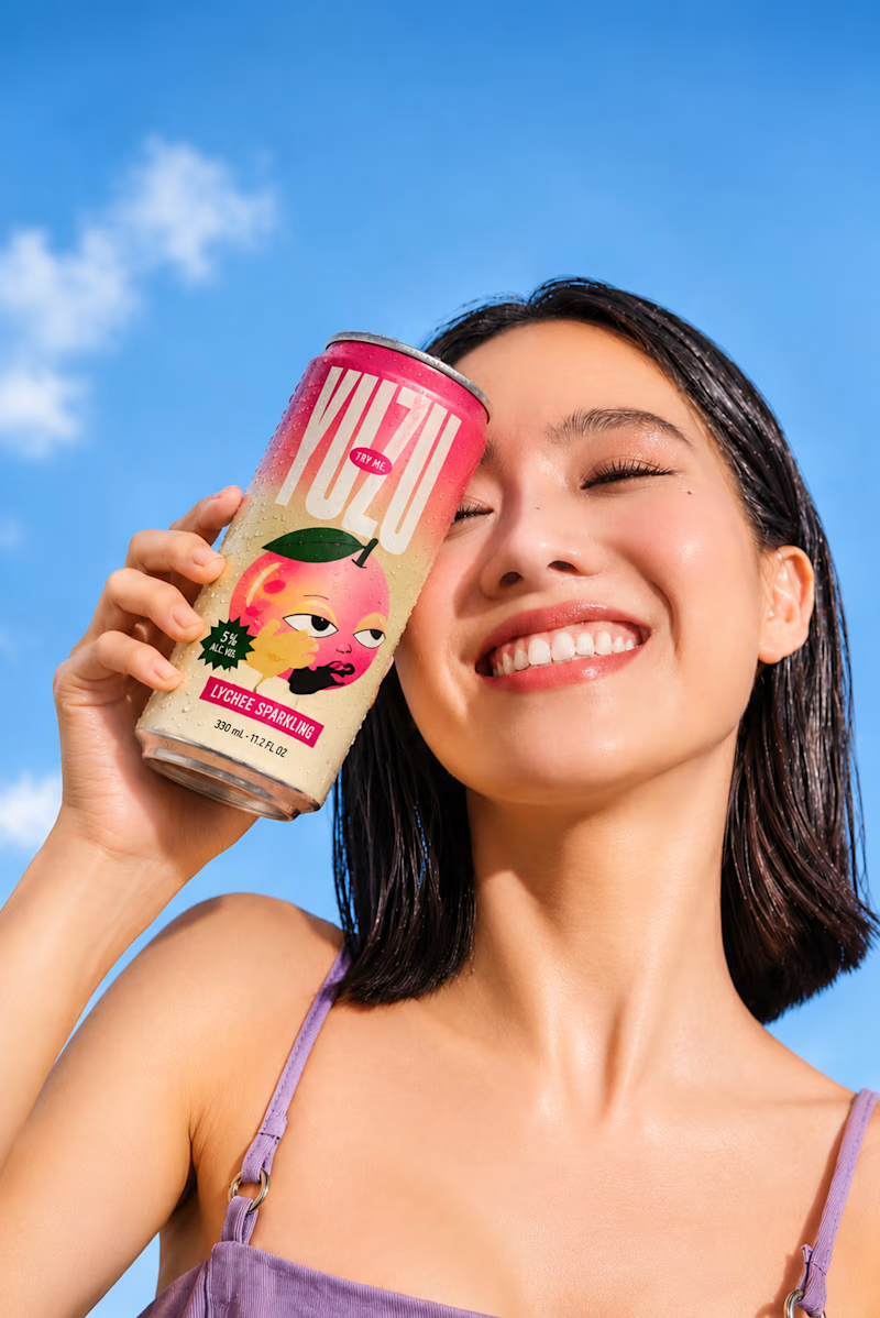
43 voted
52%
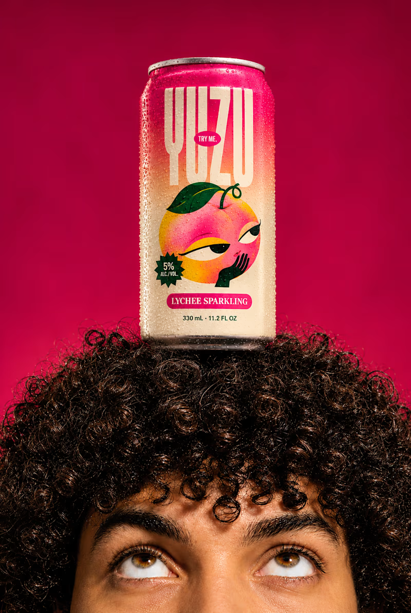
82 votes
Closed

Fresh & Bold gets my vote. That deep red makes the can impossible to miss, and the design lets the product do the talking instead of the lifestyle shot around it. Sweet & Playful is lovely photography, but on a shelf I think the red one is the one you'd actually pick up first.