The network for creativity
Join 1.25M professional creatives like you
Connect with clients, get discovered, and run your business 100% commission-free
Creatives on Contra have earned over $150M and we are just getting started
Back to feedPost
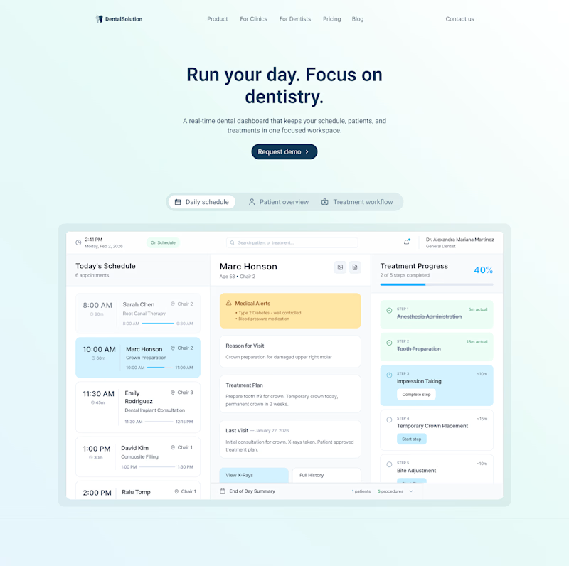
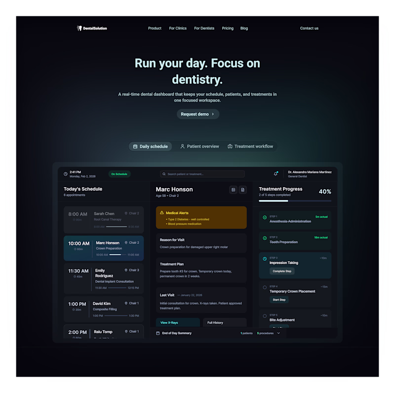
Taste Test
Dentist dashboard: light or dark? ↓
Option 1: Calm and open
Option 2: Focused and immersive
Which would you choose?
3 voted
60%
2 voted
40%
5 votes
Closed
It might sound silly, but since the niche is dentists, I associate white teeth with the light theme
It doesn’t sound silly at all! That’s just how the brain works by making associations. Yeap, light mode can definitely evoke a sense of hygiene and cleanliness.
I’d choose Option 2. It feels more focused and immersive, which makes a lot of sense for a dashboard you’ll be using throughout the day.
That’s a great point. Option 2 really helps with eye fatigue especially since dentists work under such bright lights and spend so much time focused on tiny details through their loupes. It makes the transition to the screen much smoother.
Don't know about me but dentists definitely would love white since their obsession with white-ness eh ?
The network for creativity
Join 1.25M professional creatives like you
Connect with clients, get discovered, and run your business 100% commission-free
Creatives on Contra have earned over $150M and we are just getting started
Related posts
Light or dark. Which theme works better here?
8 voted
21%
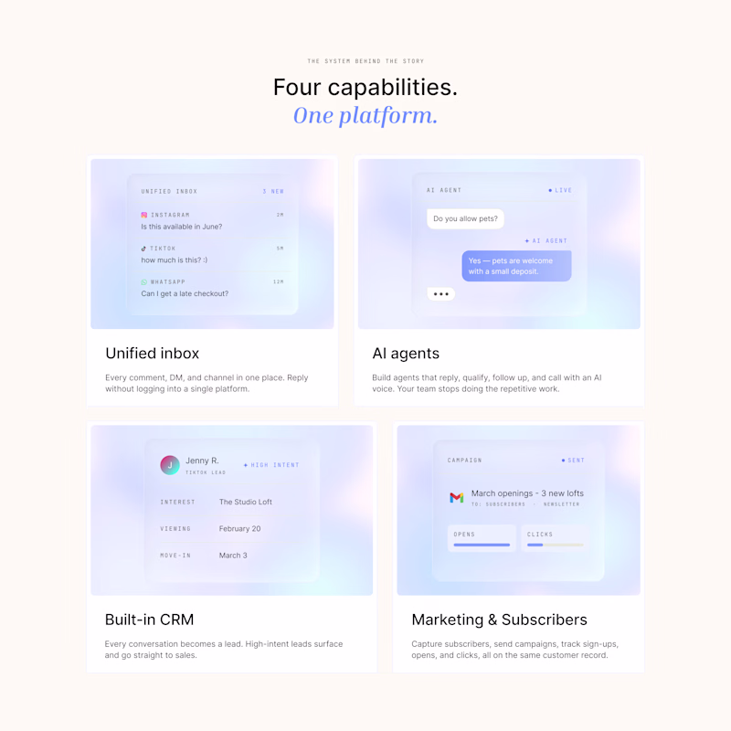
31 voted
79%
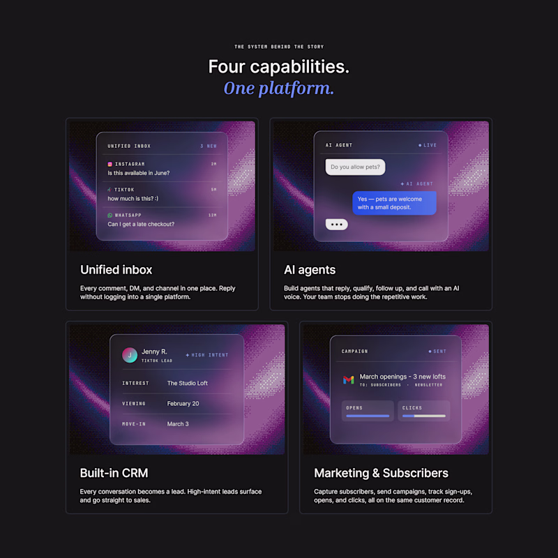
39 votes
Closed
The colours of dark mode is something that will keep me working on the site…..
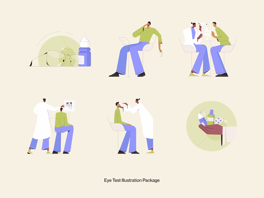
Good medical illustration doesn't dramatize. It clarifies.
This Eye Test Illustration Package was built for healthcare platforms, optometry clinics, and health tech products that need warm, approachable visuals to communicate clinical moments without making them feel cold or intimidating.
Six scenes. Glasses and eye drops. A patient on a video call. Doctor-patient consultation. Vision chart test. Eye examination. Medication handoff. Every illustration covers a real touchpoint in the eye care journey, drawn in a style that feels human, not clinical.
Soft sage green, warm periwinkle blue, and a cream canvas that lets every character breathe. The color palette alone does half the work; it says "healthcare" without saying "hospital."
This is illustration work designed to live inside a product, not just decorate it.
Does this feel like a visual style your healthcare product needs? 👇
Tools: Illustrator · Figma
#IllustrationDesign #MedicalIllustration #FlatIllustration #HealthcareDesign #ContraFreelance #UIIllustration #DigitalIllustration #IconDesign
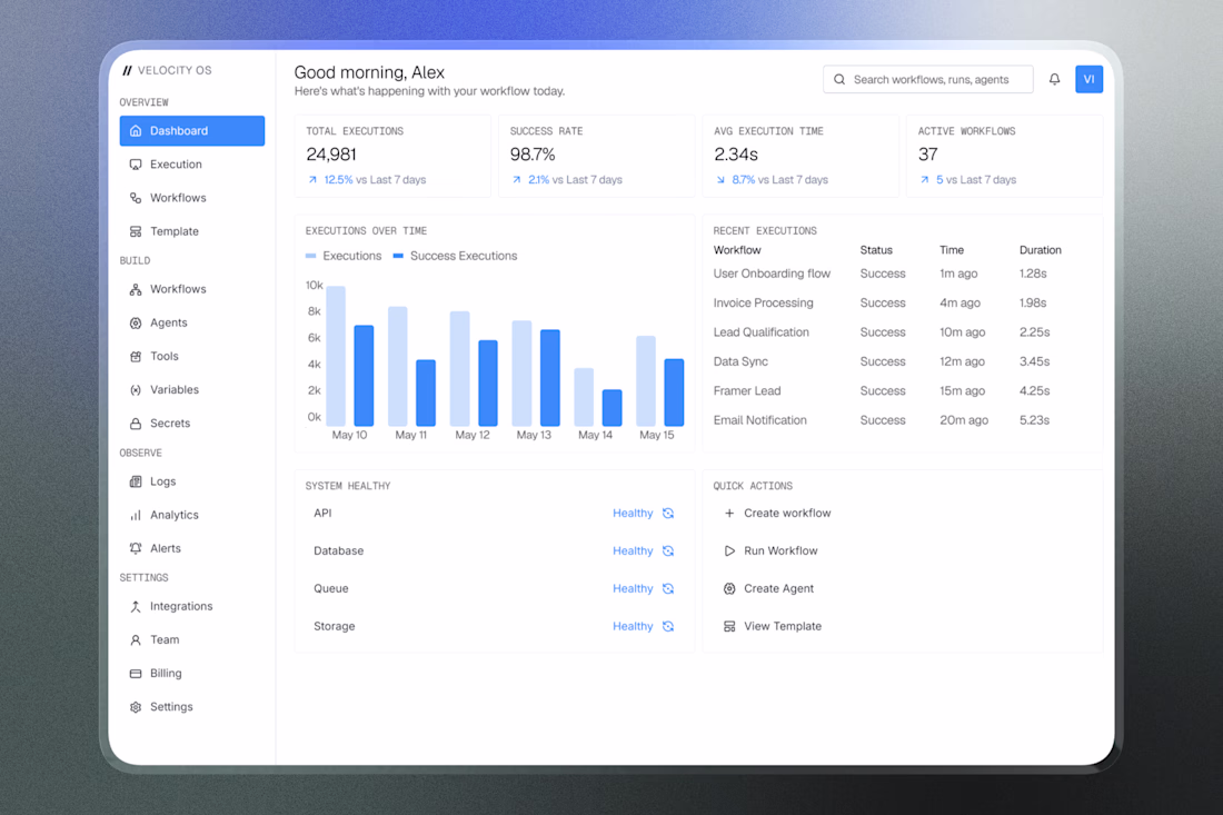
Every metric has a purpose. Designed this dashboard for VelocityAI to make workflow monitoring simple and fast⚡
Here's a preview :)
Trending
Claude
Claude has entered the design space. How are you using Claude Design?
Contra University
Learn from expert creatives how to earn more using next-gen AI tools.
creativeaiflow
Creative AI workflows are evolving. What tools do you use, and what are their strengths and weaknesses?
freelancerlife
Freelancer life is wins, pivots, and everything in between. What’s yours right now?