The network for creativity
Join 1.25M professional creatives like you
Connect with clients, get discovered, and run your business 100% commission-free
Creatives on Contra have earned over $150M and we are just getting started
Back to feedPost
Taste Test


Collage. The overlapping photos behind that headline feel more fun right away.

Looks amazing, very inspiring work!

Framed for me

The collage one for sure. It feels playful and a little chaotic in a good way, the framed version is nice but feels more like a typical studio

Framed! While the Collage version definitely brings a great, playful energy, the Framed layout wins for me because it looks incredibly polished and premium. It gives the agency a highly structured, top-tier studio feel while still looking fresh.

Framed is professionally designed🔥🔥

While I love the animation on Collage, I think Framed is clean

Voted Framed, and here is the contrarian reasoning: your question asks which looks fun to work with, but Collage wins that on the first glance and loses it on the second. Agency as funny as hell sits on a pile of overlapping photos that make the headline hard to read. A pinch of...

i think both do the job, but the collage's title won me over!


Amazing work🔥👏👏

Loved the option-1!

I like the framed concept more, which one you prefer more?

Frame looks better I think


Frame looks better


wowwwww😍
The network for creativity
Join 1.25M professional creatives like you
Connect with clients, get discovered, and run your business 100% commission-free
Creatives on Contra have earned over $150M and we are just getting started



Related posts


Which brand showreel preview design would you choose - Silver & Ropes or Purple Stones? ⚡
Lynksen is cooking something fire...
and we need your expert eyes on this one 🔥😎
Vote and tell why! 👇

12 voted
24%
37 voted
76%
49 votes
Closed
Going with Purple Stones. It feels more distinctive and memorable for a showreel, Silver & Ropes is clean but a bit safer.

Testing two color directions for Pilotly, an AI agent platform for product teams.
Which direction would you pick for an AI automation product?
3 voted
100%
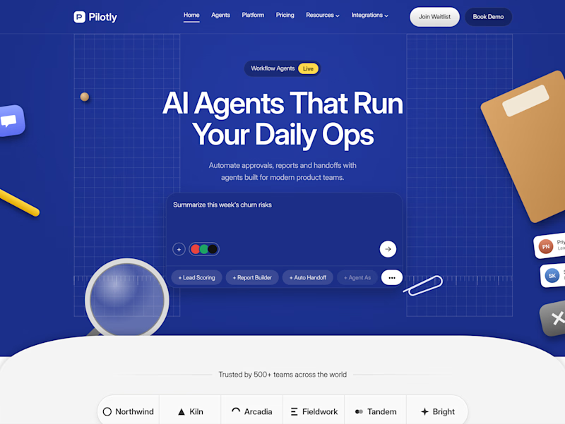
0 voted
0%
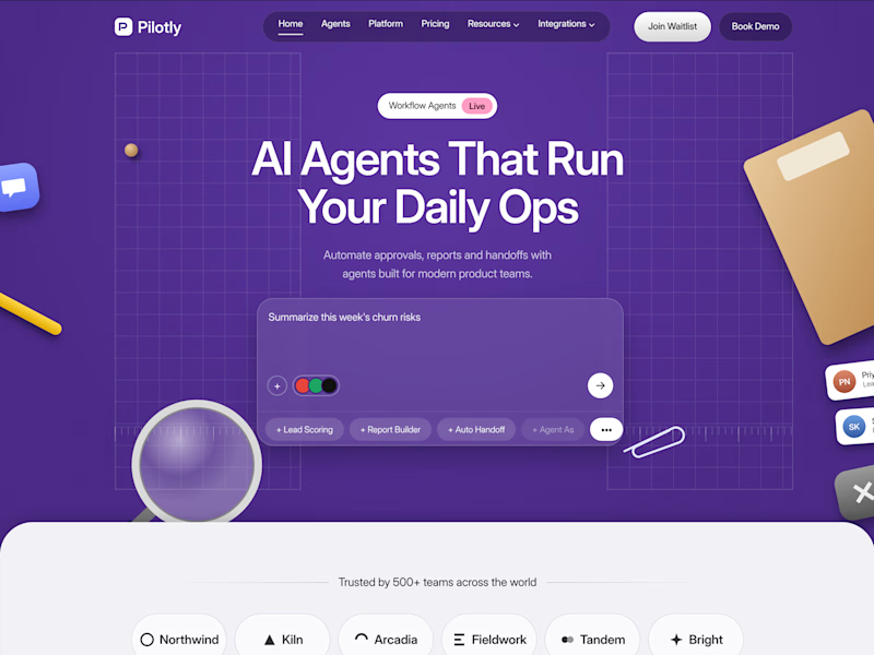
3 votes
Closed

I'd pick Violet Desk. Blue is what every SaaS uses, violet stands out and still says AI, and the orange sticky notes pop more against it. Does the hero chip row under the headline work on mobile?

Which hero would you choose — 1 or 2?
Two directions for Amber House, my real estate website template. The first pairs a closer architectural crop with an asymmetric layout. The second gives the building more breathing room, with a wide view and a centered headline.
Same template, two different first impressions. Which feels stronger to you, and why?
24 voted
59%
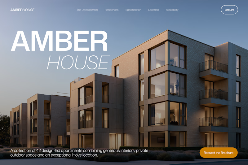
17 voted
41%
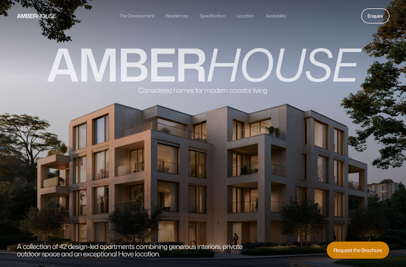
41 votes
Closed

I will go with Bold & Asymmetric!