The network for creativity
Join 1.25M professional creatives like you
Connect with clients, get discovered, and run your business 100% commission-free
Creatives on Contra have earned over $150M and we are just getting started
Back to feedPost

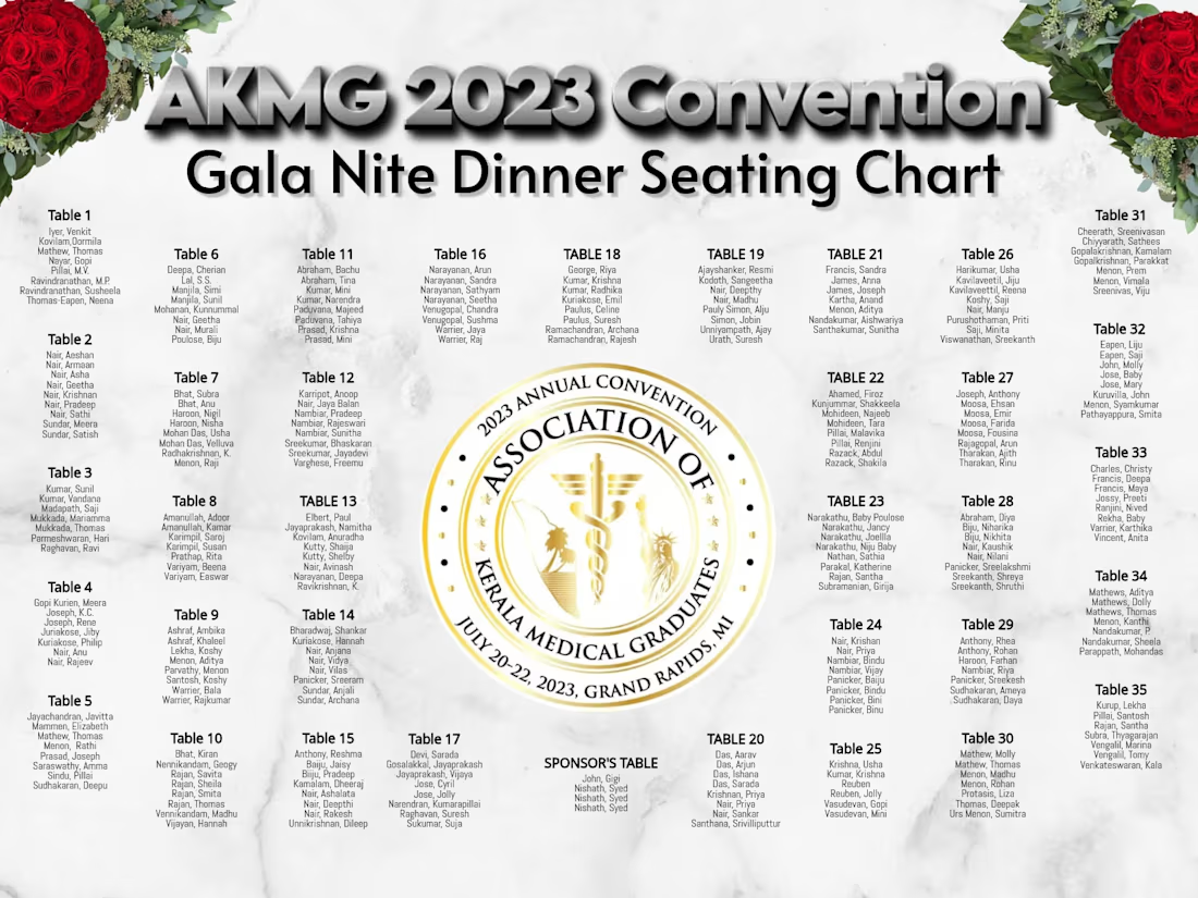
Large-Format Event Print Design


The network for creativity
Join 1.25M professional creatives like you
Connect with clients, get discovered, and run your business 100% commission-free
Creatives on Contra have earned over $150M and we are just getting started





Related posts

Sky is the limit? I just tried Opus 5.5 for the first time, and honestly… it’s insane. I designed the whole UI in Figma, animated it with a single prompt, created the presentation, and then asked Opus to add the mockup movement together with the UI animation.
Teams are going to become faster and more productive, but I think something even more interesting is happening: our ideas can go much further now. The gap between having an idea and actually bringing it to life is getting smaller and smaller.
I think one of the most important skills for designers now is taste, knowing what looks good, what feels right, what to keep, and what to remove. And who knows… maybe next month we’ll need to develop another skill.


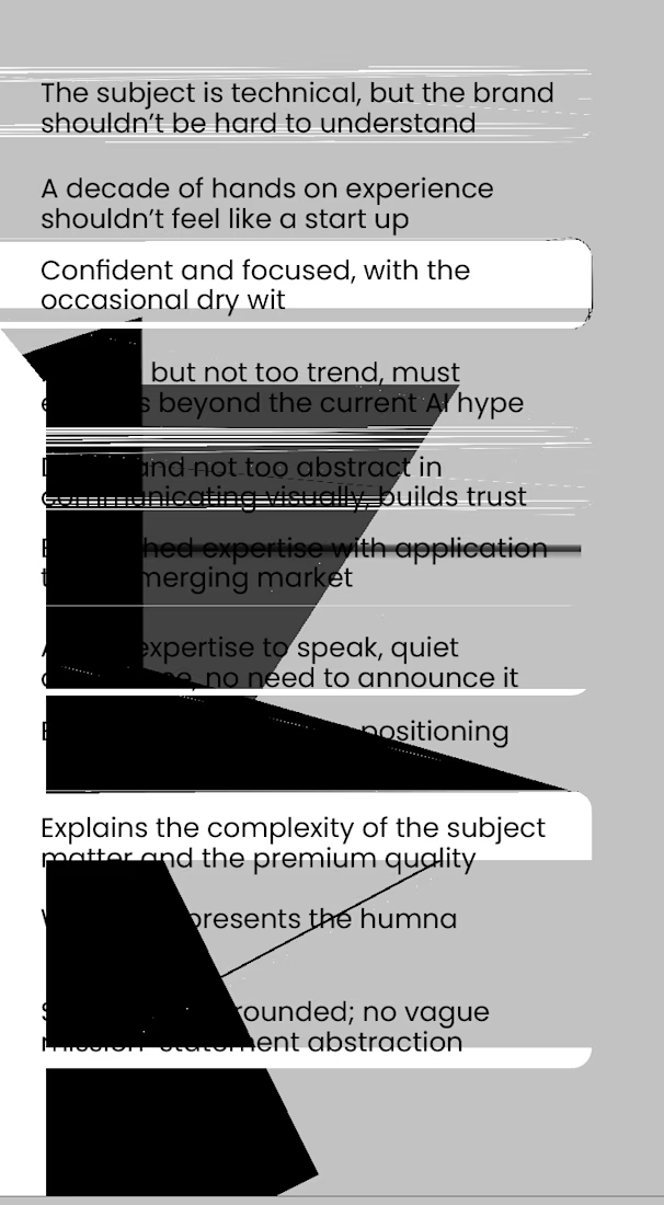
Indesign works very much like I do.
It has an alter ego as a glitch artist.
Here are a few of its latest finest works.


Logo Design & Brand Identity created for Auraflint Atelier — a scent & fragrance brand.
©2025
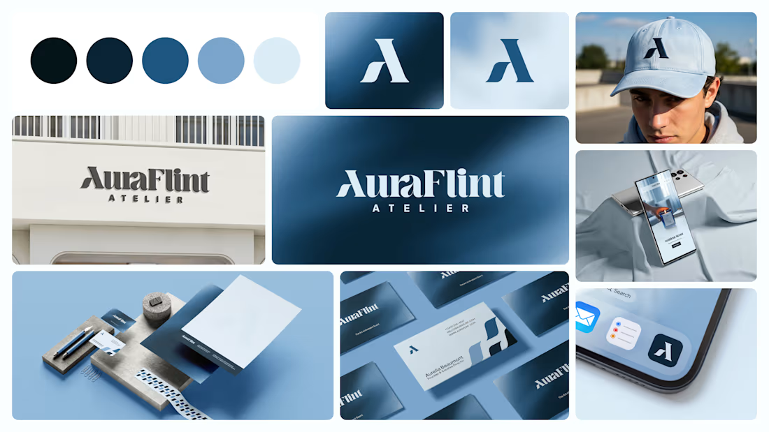

I liked colour palette.