The network for creativity
Join 1.25M professional creatives like you
Connect with clients, get discovered, and run your business 100% commission-free
Creatives on Contra have earned over $150M and we are just getting started
Back to feedPost

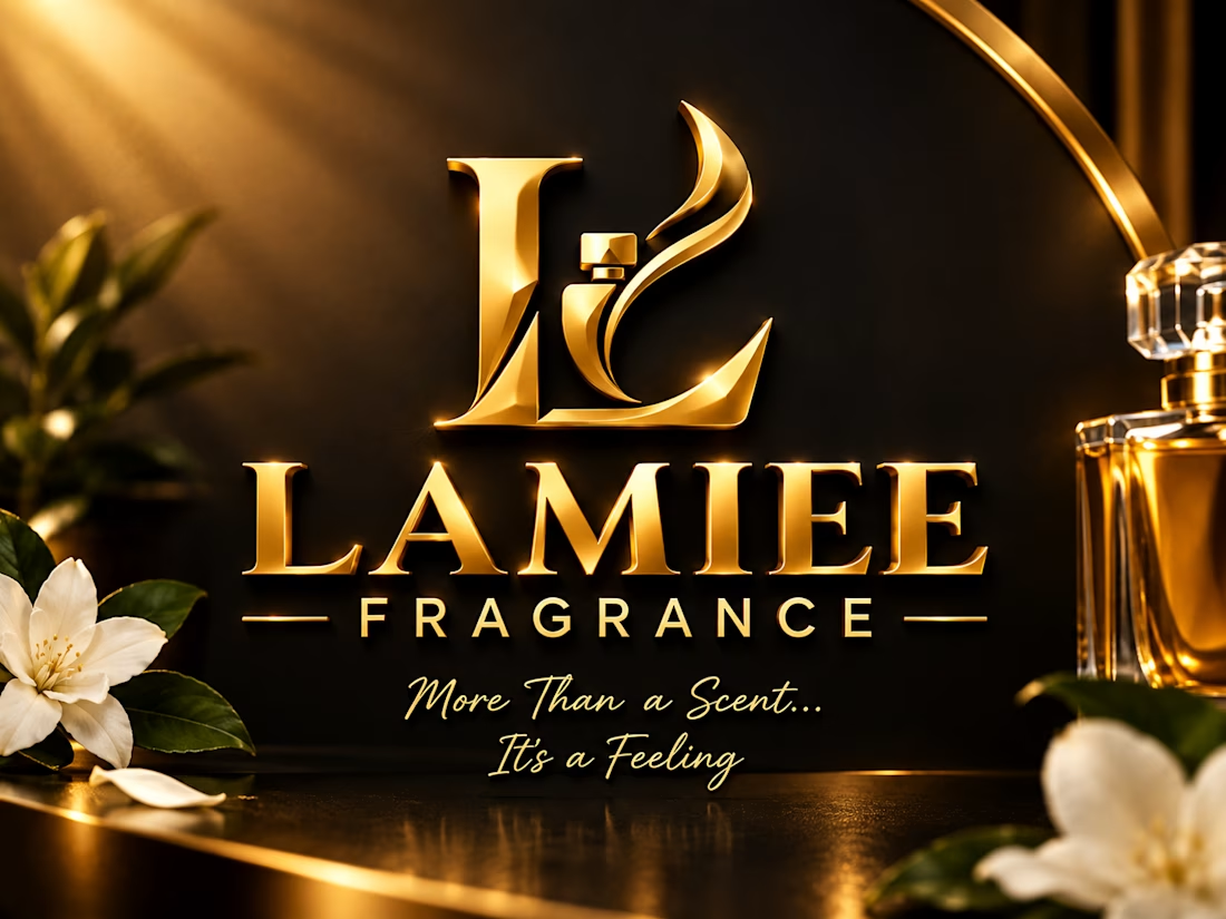
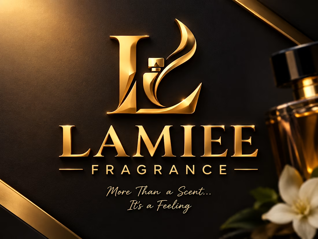
These two designs were made for my client,both are similar but have a little difference.
It's the difference in-between the design that brings out the beauty of it
LAMIEE FRAGRANCE — where elegance meets visual identity.
A clean, premium promotional design created to showcase the brand’s sophistication and make a lasting impression.
Need a design that makes your brand stand out? Let’s bring your vision to life. DM me today!
#GraphicDesign #Branding #LAMIEEFRAGRANCE #VisualDesign #Portfolio


The network for creativity
Join 1.25M professional creatives like you
Connect with clients, get discovered, and run your business 100% commission-free
Creatives on Contra have earned over $150M and we are just getting started





Related posts

Designing Brand identity ✨
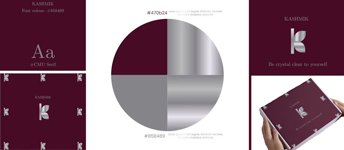
SILVER + DARK PINK = Luxury.
KASHMIK- 'Be crystal clear to yourself' , is a journal brand which is made to give you a feel of luxury and openness to yourself. The colour chosen is show how bold you are, how unique you are.

That's really great for luxury brands great job 🎉🎉


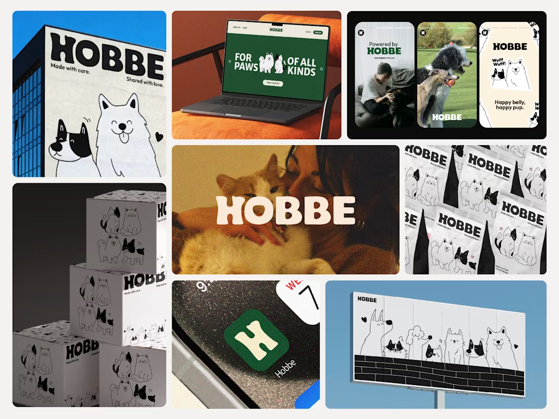

Like the branding and illustrations


Only one will win, and you get to decide which.
Two AI-generated images. Same creative intent. Different visual outcomes.
The images were generated with AI, but the art direction, visual decisions, composition, styling, and overall creative direction came from me as the human behind the work.
Now comes the real taste test.
Which one has the stronger visual language? Which one feels more intentional, more refined, and more memorable?
11 voted
69%
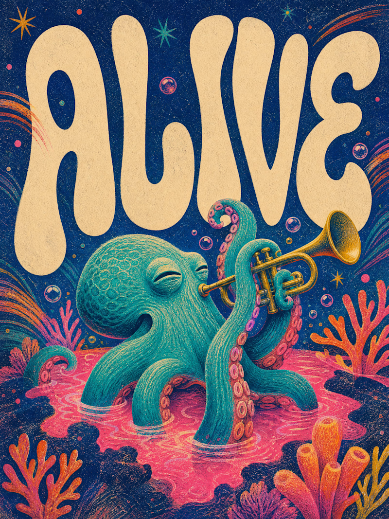
5 voted
31%
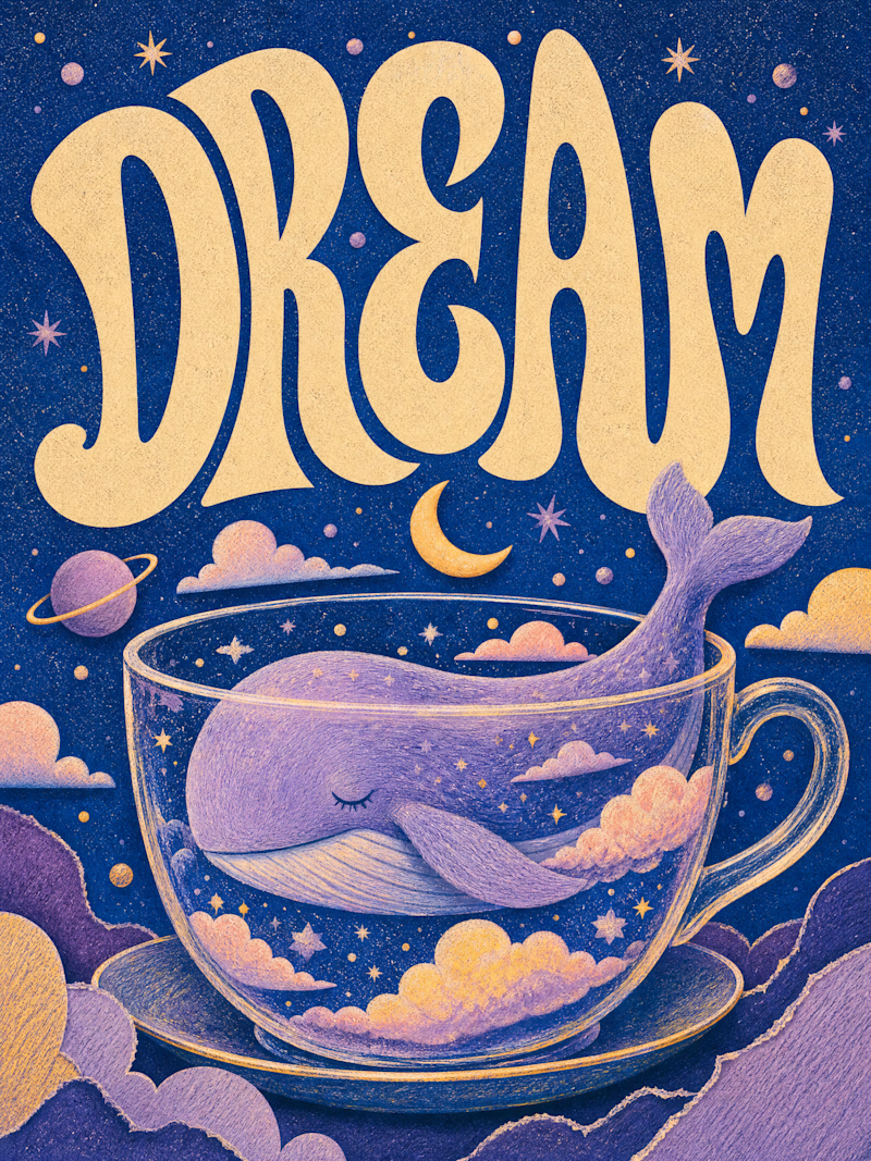
16 votes
Closed

Outstanding work