The network for creativity
Join 1.25M professional creatives like you
Connect with clients, get discovered, and run your business 100% commission-free
Creatives on Contra have earned over $150M and we are just getting started
Back to feedPost

The challenge: Pinterest publishes annual color trend predictions (Palette). Historically, this content lived as a blog post — a one-and-done format that didn't hold up well over the following months.
The strategy shift: I led the move from a blog-style post to a long-form, evergreen landing page — a content structure and IA decision, not just a copy refresh. The new page ran 75% longer than the prior year's post.
The results (30-day comparison vs. the prior year's blog post, same calendar window):
+300% increase in visitors scrolling 100% of the page
Page abandonment (visitors who scrolled 0%) dropped from 79% to 28%
+164% increase in "Create Ad" clicks
+50% increase in brand visits
The takeaway: Despite being significantly longer, the new format kept people engaged rather than losing them


The network for creativity
Join 1.25M professional creatives like you
Connect with clients, get discovered, and run your business 100% commission-free
Creatives on Contra have earned over $150M and we are just getting started







Related posts

Title:
VAULT — Personal Finance & Wallet iOS UI
VAULT is a modern personal finance & wallet app designed for iOS, focused on making everyday money management simple, clear, and intuitive.
The complete UI includes:
• Overview / Home
• Transactions
• Transaction Details
• Budgets
• Analytics
• Profile & Settings
Designed in Figma with an iOS-first approach, clean layouts, clear financial data visualization, and a consistent mobile experience.
📱 iOS UI Design
🎨 Figma
💰 Personal Finance App

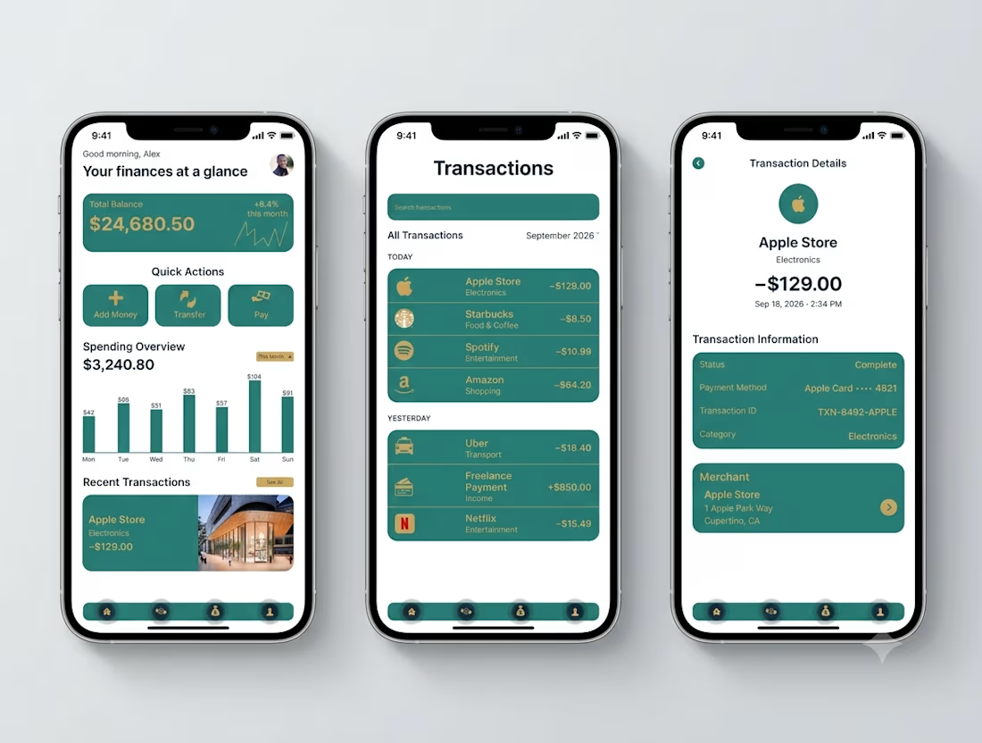

Transaction Details splits the payment record from the merchant card - status, card, transaction ID in one block, the store address in another. That separation is what makes a dispute resolvable.

Day 12/30 of my hero section challenge.
Another day of prioritising the visuals and imagining a company that doesn't exist. I promise the next one is a tech brief with barely any imagery at all, I've leaned hard on beautiful photography for twelve days straight.
Concept: a mycelium materials company producing leather, packaging and foam grown from fungal networks. The design deliberately inverts the category's defaults; biotech branding tends toward dark, clinical and electric blue, so this one goes warm and botanical, with a subtle looping video of spores drifting and mushrooms emerging. The copy pulls hard the other way: plain, technical, B2B-direct, anchored by two concrete numbers instead of sustainability adjectives.
Twelve briefs across travel, food retail, personal branding, events, landscape architecture, pet services, hospitality, coffee, lighting, wellness, restaurants and now biomaterials.
12 down, 18 to go.
Built on the Viper template by Westhill Studio, adapted and customised by me.
Imagery and video generated with AI.


brilliant


Question: Which creative angle would you test first?
A) 20% OFF + Free Shipping
B) Curiosity + Taste Appeal
2 voted
40%
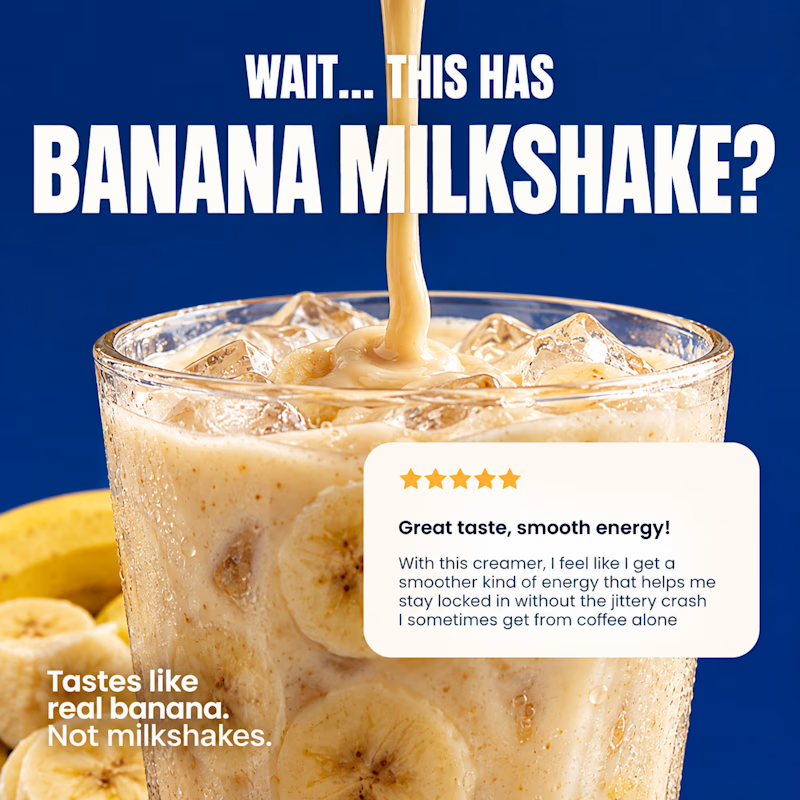
3 voted
60%
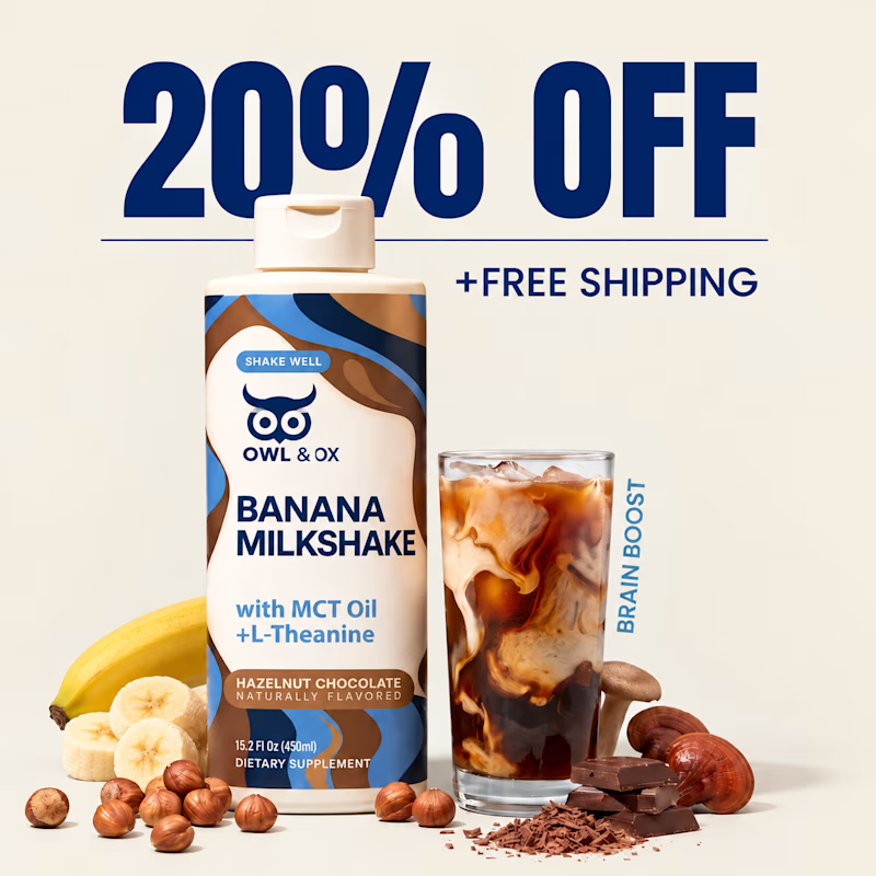
5 votes
Closed

i think both are better