The network for creativity
Join 1.25M professional creatives like you
Connect with clients, get discovered, and run your business 100% commission-free
Creatives on Contra have earned over $150M and we are just getting started
Back to feedPost

Whenever I feel stuck I end up tinkering with my website. This week's victim: my newly redesigned contact page featuring a framer university component I adapted for behuman and loved so much I needed it on my own site.
I've always used browser based email apps and hate accidentally clicking on an email to find its opened a system default mail app I never use and don't even have set up. I think this is such a genius improvement on an established (dare I say outdated?) UX pattern.
Which camp do you fall into? Copy the email address and paste it where you want or click to open the system default?

I've intentionally kept this page minimal in terms of color usage.
The network for creativity
Join 1.25M professional creatives like you
Connect with clients, get discovered, and run your business 100% commission-free
Creatives on Contra have earned over $150M and we are just getting started




Related posts


Pillo’s pricing page uses two light cards on a dark background. The orange accent continues from the rest of the site.
Framer template: https://startfrom.co/templates/pillo
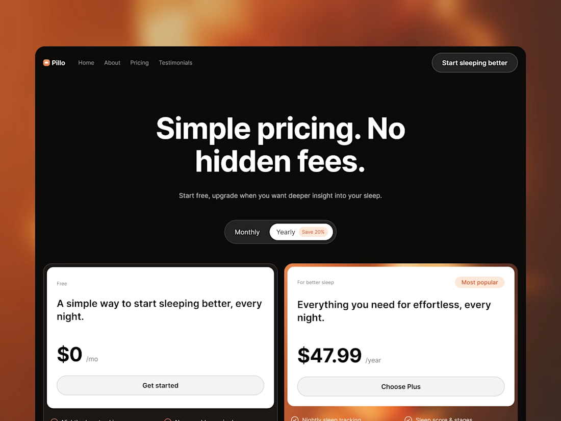
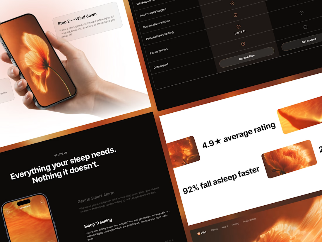

Really like this pricing direction. The two light cards against the dark background create a clear visual hierarchy, while the orange accent keeps the page connected to the rest of the brand. The simplicity makes the plans feel easy to compare.

Fashion Email Sales Copy — Promotional Campaign
Short description:
Persuasive email copy designed to turn attention into action, from subject line to CTA.
What I did:
Email sales copywriting
Subject-line development
Customer-focused messaging
Promotional storytelling
Call-to-action copy
Conversion-focused writing
Project type: Personal/Concept Project
Because this is a portfolio sample rather than paid client work, I recommend clearly presenting it as a concept project rather than implying that it was created for a real brand.


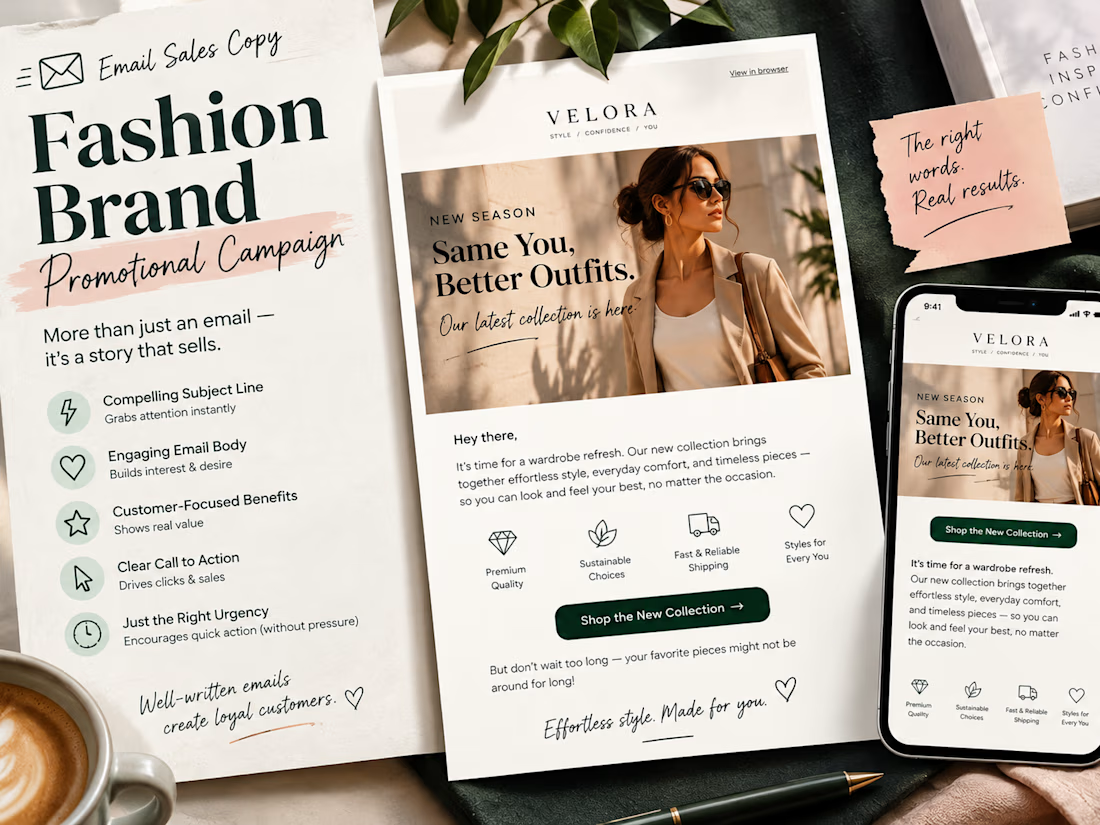

wow it looks quite appealing

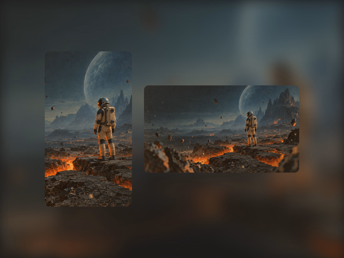
Exploring the visual identity for my first Framer template. I really like this combination of cool and warm colors, so I might follow this direction :)