The network for creativity
Join 1.25M professional creatives like you
Connect with clients, get discovered, and run your business 100% commission-free
Creatives on Contra have earned over $150M and we are just getting started
Back to feedPost


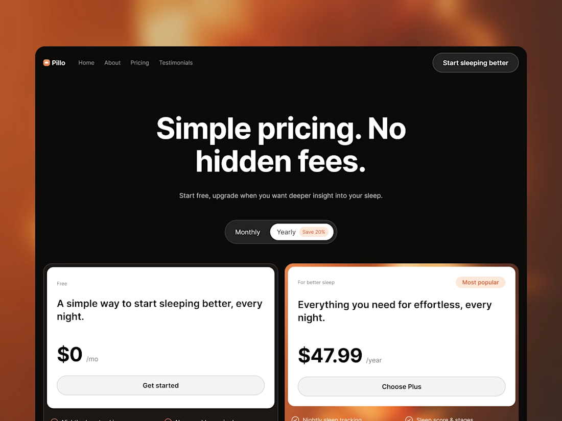
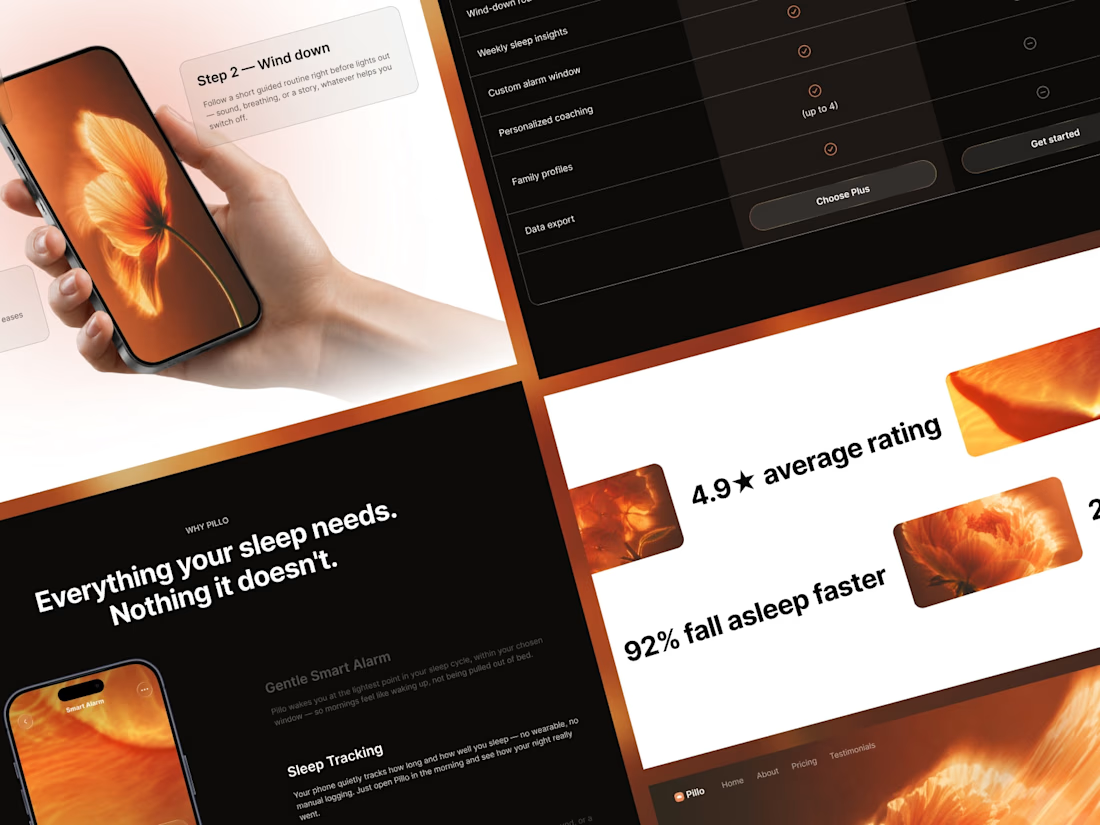
Pillo’s pricing page uses two light cards on a dark background. The orange accent continues from the rest of the site.
Framer template: https://startfrom.co/templates/pillo

🔥

Great use of typography!

Really like this pricing direction. The two light cards against the dark background create a clear visual hierarchy, while the orange accent keeps the page connected to the rest of the brand. The simplicity makes the plans feel easy to compare.
The network for creativity
Join 1.25M professional creatives like you
Connect with clients, get discovered, and run your business 100% commission-free
Creatives on Contra have earned over $150M and we are just getting started



Related posts

Left or Right ?
Two interaction concepts for my next @framer template team card memebrs.
Which one would you go with?


Now live in Framer 🚀 Designed & built in Framer.
If you're looking for a Framer designer/developer for a similar website or want to explore more of my work, feel free to connect with me or send me a message. 🤝





Nice layout & interactions, and great image use in the hero! 🙌

I got a lot of compliments on the Cursor code component I used in my updated Maestroclass template. So I just published it in the marketplace for FREE. Remix here for your next project : https://framer.link/gGHGkAr

Did the image have parallax on scroll... it'll be great 👌