The network for creativity
Join 1.25M professional creatives like you
Connect with clients, get discovered, and run your business 100% commission-free
Creatives on Contra have earned over $150M and we are just getting started
Back to feedPost

Whenever I feel stuck I end up tinkering with my website. This week's victim: my newly redesigned contact page featuring a framer university component I adapted for behuman and loved so much I needed it on my own site.
I've always used browser based email apps and hate accidentally clicking on an email to find its opened a system default mail app I never use and don't even have set up. I think this is such a genius improvement on an established (dare I say outdated?) UX pattern.
Which camp do you fall into? Copy the email address and paste it where you want or click to open the system default?

I've intentionally kept this page minimal in terms of color usage.
The network for creativity
Join 1.25M professional creatives like you
Connect with clients, get discovered, and run your business 100% commission-free
Creatives on Contra have earned over $150M and we are just getting started
Trending

Claude
Claude has entered the design space. How are you using Claude Design?

Contra University
Learn from expert creatives how to earn more using next-gen AI tools.
creativeaiflow
Creative AI workflows are evolving. What tools do you use, and what are their strengths and weaknesses?
freelancerlife
Freelancer life is wins, pivots, and everything in between. What’s yours right now?












Related posts


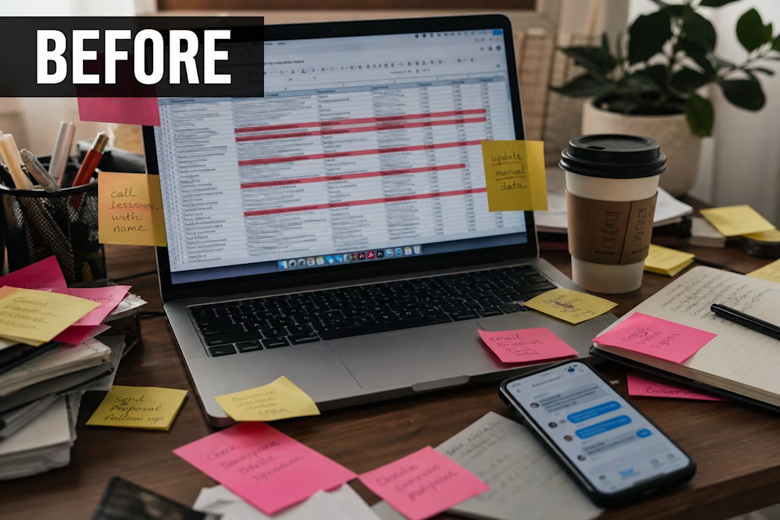
I used to start my mornings in a spreadsheet.
Copy a name.
Paste into the CRM.
Send a Slack message.
Update another sheet.
Repeat.
By 11am I was tired and the real work had not even started.
One week I sat down and said enough.
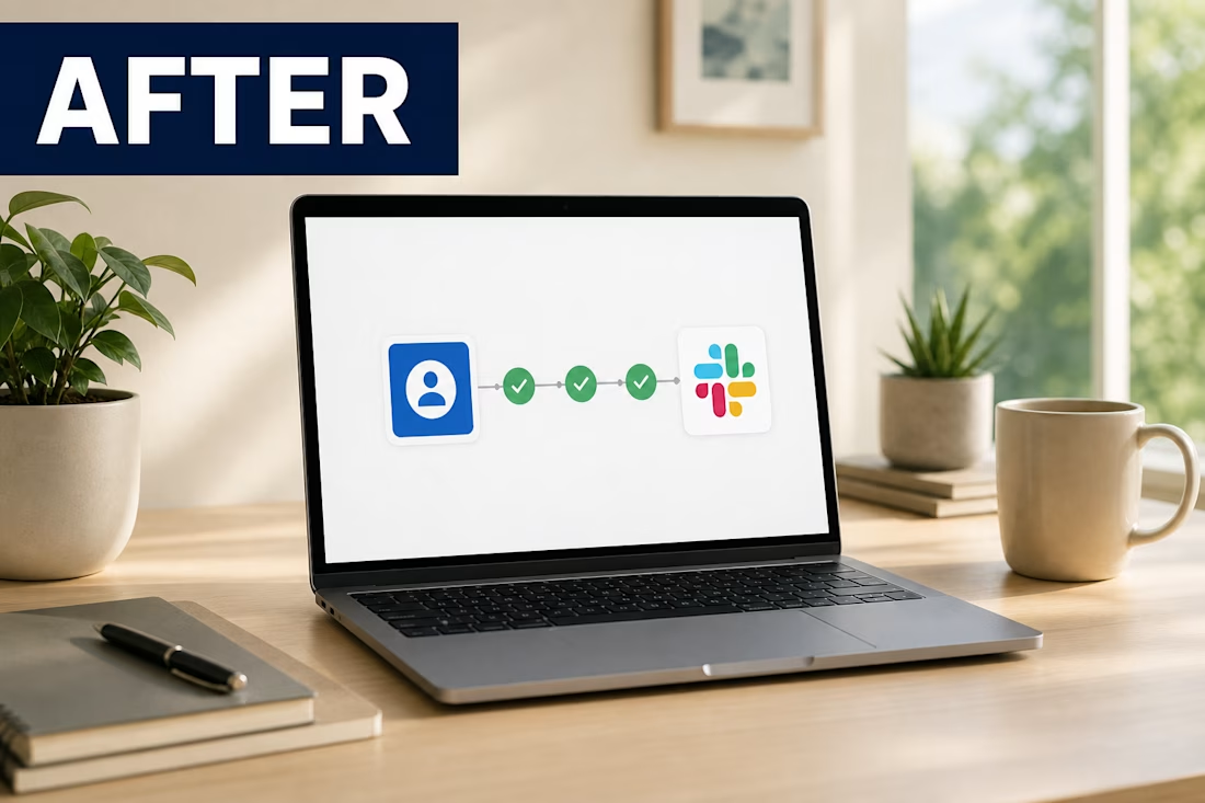
I built a simple flow.
New lead comes in.
CRM updates itself.
My team gets the ping.
I get my morning back.
The funny part?
Clients think I am “always on top of things.”
Nah.
I just stopped doing robot work like a robot.
If you are still moving the same data between 4 apps by hand, you are not lazy.
You are just overdue for a system.
I help businesses set this up with Zapier, n8n, Make, and CRM tools.
Comment “FLOW” if you want me to show you what your version could look like.


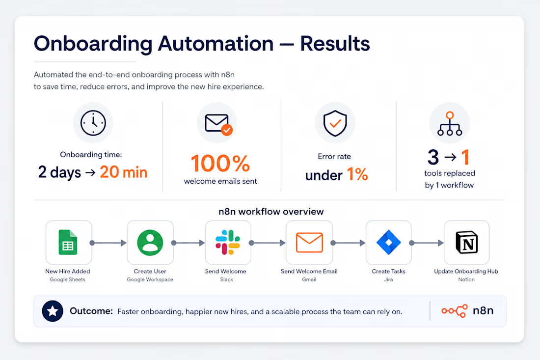
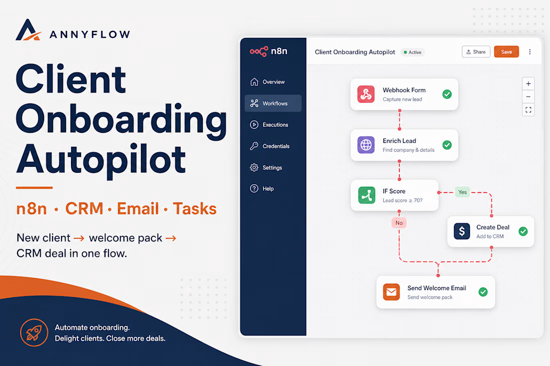
Designed a full client onboarding workflow in n8n so no new client falls through the cracks.
When a client submits the intake form, the system:
• Validates and enriches their details
• Creates the CRM contact + deal
• Sends a branded welcome email
• Assigns onboarding tasks to the team
• Routes VIP clients to a priority path
Stack: n8n · CRM · Email · Task manager
Impact:
• Onboarding cut from ~2 days to ~20 minutes
• 100% welcome emails sent automatically
• Under 1% error rate
• Replaced 3 manual tools with one workflow
Perfect for agencies and service businesses that want a smooth, repeatable client kickoff.



I’ve been working on this for a while now, refining the calendar section on the booking page to ensure it’s intuitive and easy to use. #UIUX #ProductDesign #BuildingInPublic
