The network for creativity
Join 1.25M professional creatives like you
Connect with clients, get discovered, and run your business 100% commission-free
Creatives on Contra have earned over $150M and we are just getting started
Back to feedPost

Overview
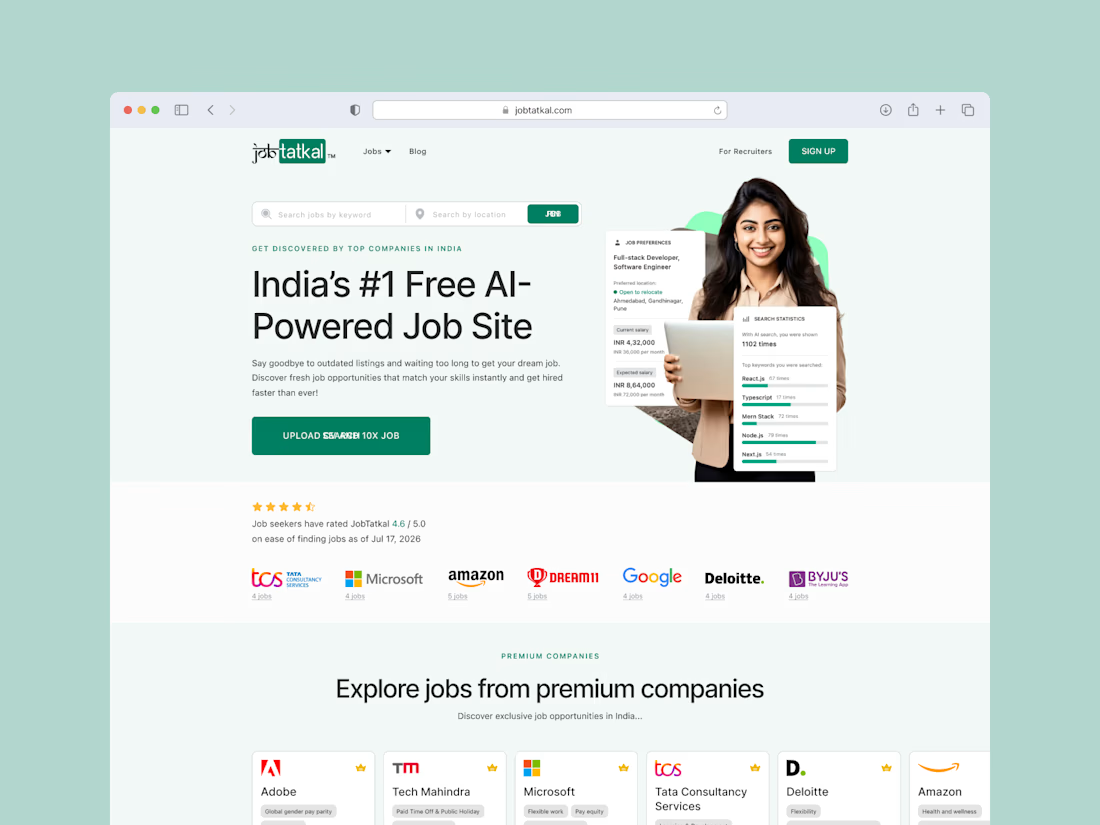
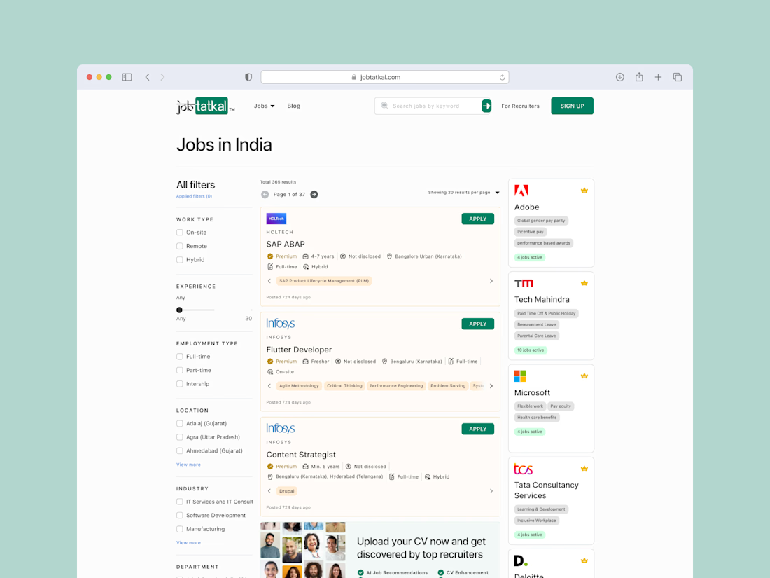
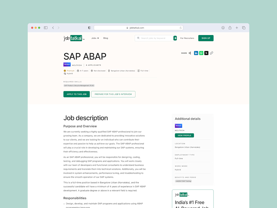
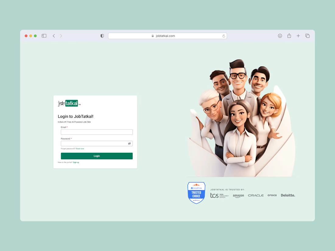
Job Tatkal is an AI-powered job portal that connects job seekers with relevant opportunities through intelligent job matching, resume analysis, and a streamlined application experience. The platform helps candidates discover jobs faster while enabling recruiters to manage hiring more efficiently.
Project Brief
I worked as the Product Designer for Job Tatkal, designing a modern and user-friendly experience for both job seekers and recruiters. My focus was on simplifying the job search journey, improving the application process, and creating intuitive workflows that reduced friction across the hiring experience.
Role
Product Designer
Responsibilities
Product Discovery, User Journey Mapping, Information Architecture, User, Flow Design, Wireframing, UI/UX Design, Interactive Prototyping, Design System, Developer Handoff, Design QA
Tools
Figma, FigJam, Miro


The network for creativity
Join 1.25M professional creatives like you
Connect with clients, get discovered, and run your business 100% commission-free
Creatives on Contra have earned over $150M and we are just getting started





Related posts

Which hero direction feels right for this founder-focused brand?
While working on the homepage for Sean Parsons, a brand focused on empowering non-technical founders to launch tech startups, I explored two different visual directions for the hero section. Same message, same structure, just a different mood and color system.
Option 1 - Warm Olive. Dark, grounded, and editorial, giving a warm, established, expert feel.
Option 2 - Light Purple. Clean, modern, and vibrant, giving a fresh, SaaS-like, approachable feel.
Would love your honest UX/UI take, which direction feels more trustworthy, engaging, and aligned with a founder-focused brand, and why?
25 voted
69%
11 voted
31%
36 votes
Closed

I like worm Olive most because it has different personality

Created these interactive animation variants for a section in my recent web design project.
Which one do you think grabs users’ attention and keeps them engaged?
Linear ✲ or Dotted⚪?

24 voted
52%
22 voted
48%
46 votes
Closed

dotted one

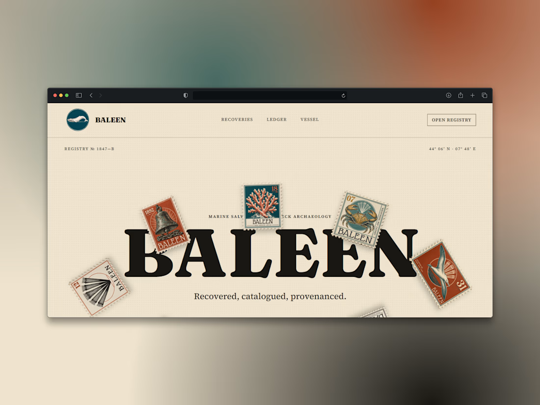
What if a salvage company's brand looked like it belonged in a stamp album, not a treasure map?
Introducing BALEEN — marine salvage & shipwreck archaeology, built on vintage natural-history stamp DNA. Every object recovered, catalogued, provenanced.
Website here