The network for creativity
Join 1.25M professional creatives like you
Connect with clients, get discovered, and run your business 100% commission-free
Creatives on Contra have earned over $150M and we are just getting started
Back to feedPost
Worked on something this week that reminded me:
The fewer decisions a user has to make,
The faster they move toward yes
Simplicity is a conversion strategy


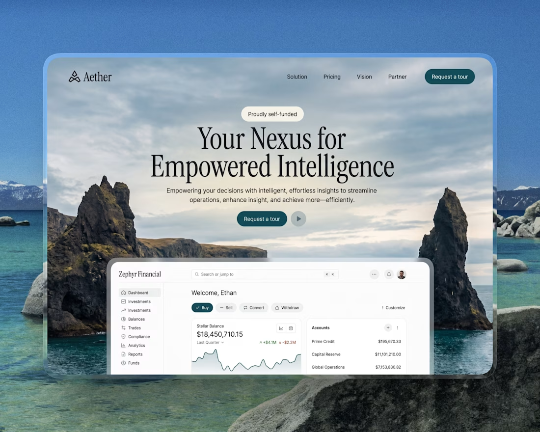

looks stunning 👌

Thanks @Istiak Ahmed Khan
welcome, keep up the good work,

Really like how clean and engaging this feels. If someone wanted to reach this level, what would you say makes the biggest difference in your process?
Honestly, the biggest difference is ruthless iteration, cutting anything that doesn’t add value and focusing on clarity over cleverness.
The network for creativity
Join 1.25M professional creatives like you
Connect with clients, get discovered, and run your business 100% commission-free
Creatives on Contra have earned over $150M and we are just getting started

Challenges
View all


Related posts

I usually don't stop at 3 breakpoints when building a website.
Most people think about: Mobile, Tablet, Laptop
I like adding one more: Desktop
Because what looks great at 1440px can feel completely different at 1920px...
- The layout gets too wide.
- Spacing starts feeling off.
- Content loses its balance.
So I like testing the system across: Mobile → Tablet → Laptop → Desktop
Not because every website needs exactly 4 breakpoints. But because responsive design isn't about making a few screen sizes work.
It's about making the whole system work.
Follow Rushabh for more website fundamentals, experiments, and things I learn while building for the web.
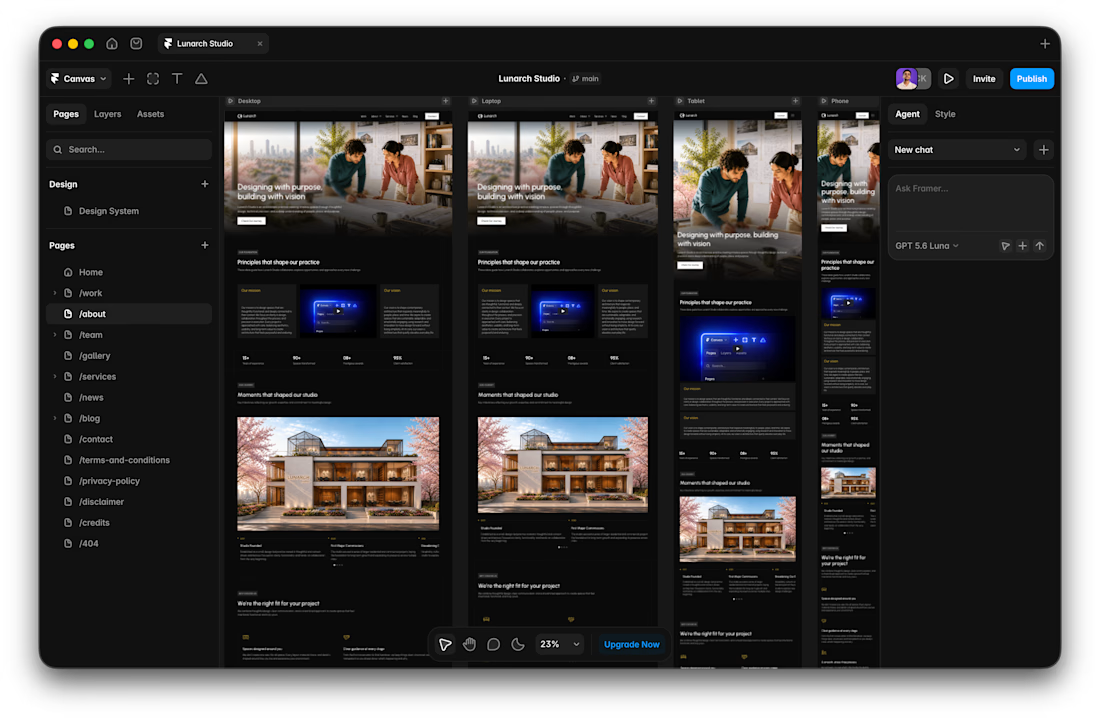

Wide screens expose spacing issues that laptop previews can hide.

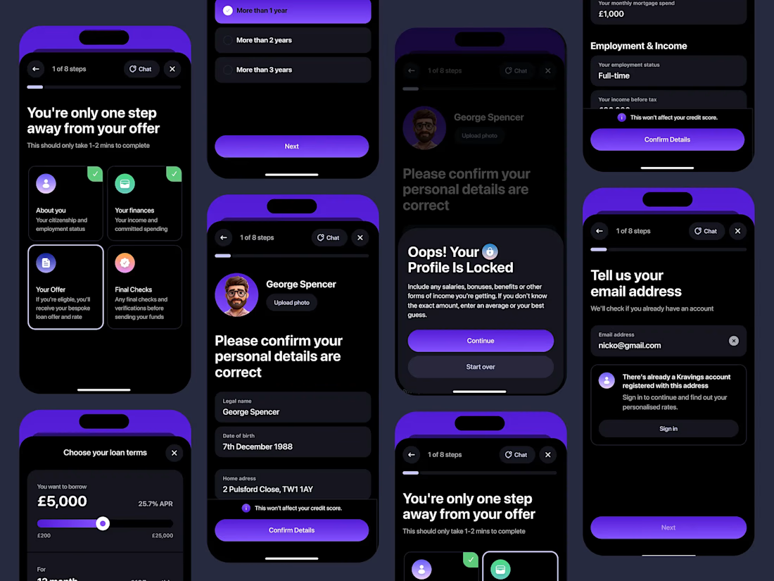

Custom liquid interaction built in Framer.
Turning a static hero into a responsive visual surface through cursor-driven distortion.


How do you adapt the cursor-driven effect for touch screens?