The network for creativity
Join 1.25M professional creatives like you
Connect with clients, get discovered, and run your business 100% commission-free
Creatives on Contra have earned over $150M and we are just getting started
Back to feedPost

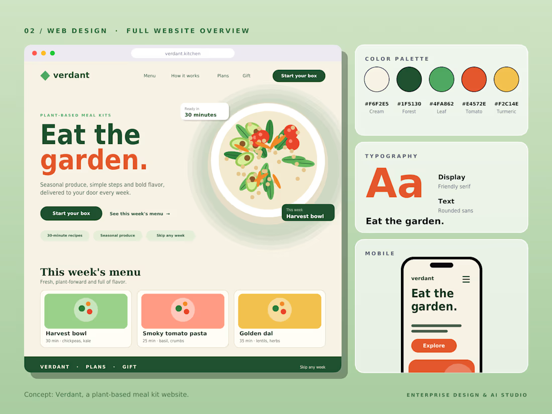
Verdant — Full UI/UX Design System & Mobile View 🥗🎨
Complete design system and mobile responsive breakdown for Verdant, a plant-based meal kit subscription platform. This full case study showcases the color palette hierarchy, typographic system, desktop landing architecture, and seamless mobile responsiveness.
Design System Details:
🎨 Color Palette: Warm Cream (#F6F2E8), Forest Green (#1F5138), Leaf Green (#4FA062), Tomato (#E4573E), and Turmeric (#F2C14E).
🔤 Typography System: Display serif for friendly warmth and rounded sans for readable body text.
📱 Mobile Ergonomics: Adaptive layout optimized for touch interaction and quick meal customization on mobile viewports
🥗 Weekly Menu Cards: Structured UI elements highlighting "Harvest Bowl", "Smoky Tomato Pasta", and "Golden Dal".
A complete end-to-end UX showcase for modern D2C food and wellness platforms.
Full ecosystem design from design tokens to mobile responsiveness. 🌱✨ What do you think of this visual system? Drop your thoughts below! 👇
#UIUX #DesignSystem #WebDesign #Figma #MobileUX #ColorPalette #D2C #Branding #UXCaseStudy


The network for creativity
Join 1.25M professional creatives like you
Connect with clients, get discovered, and run your business 100% commission-free
Creatives on Contra have earned over $150M and we are just getting started







Related posts

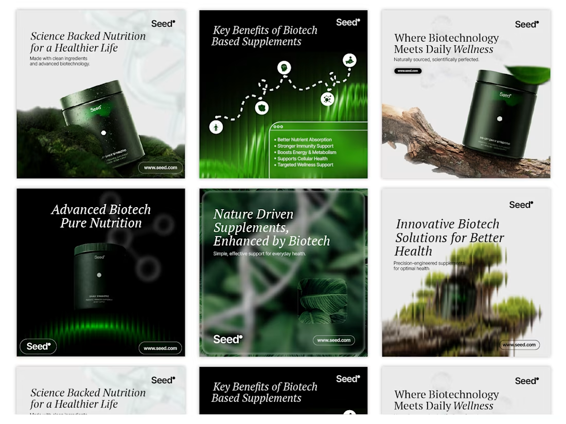
Social Media Concept Design for Seed


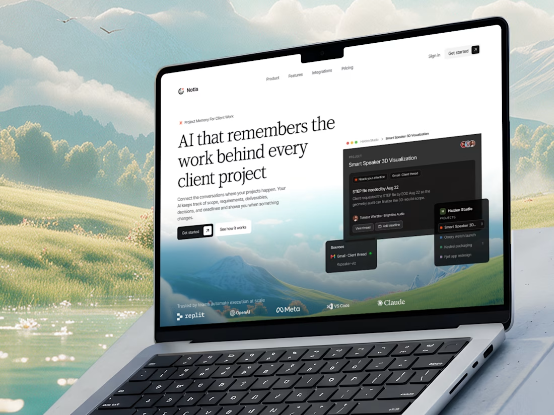
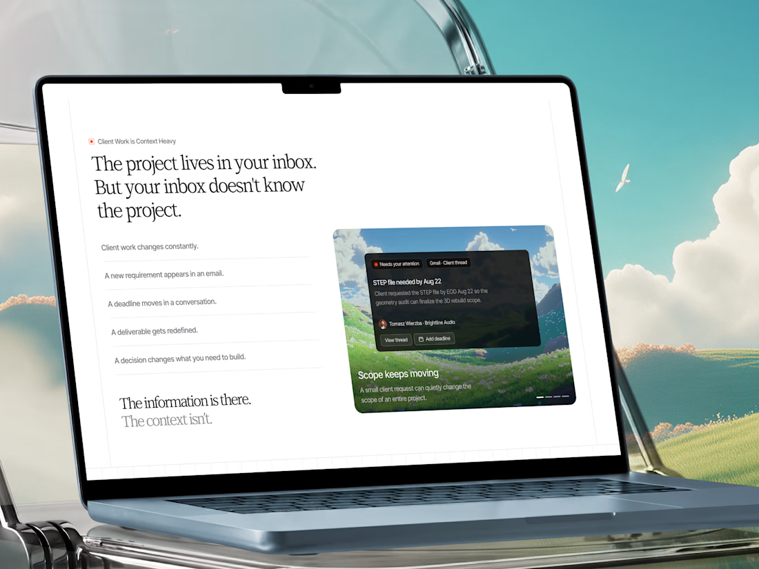
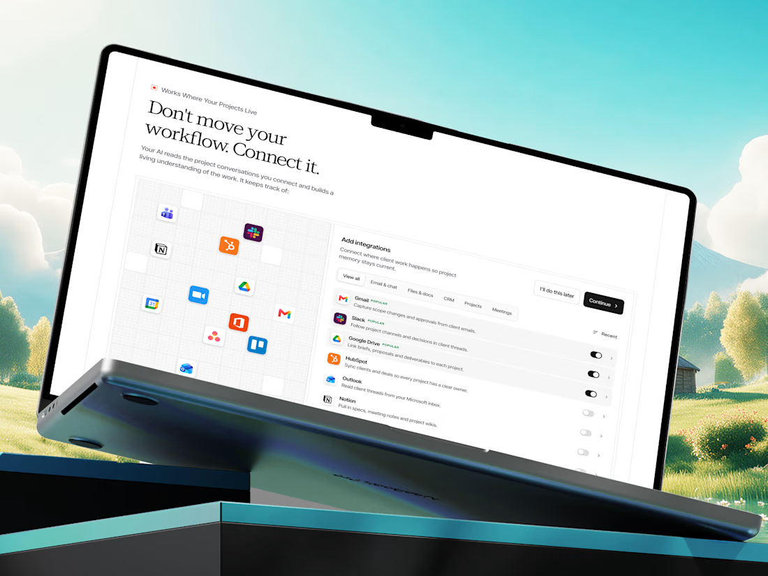
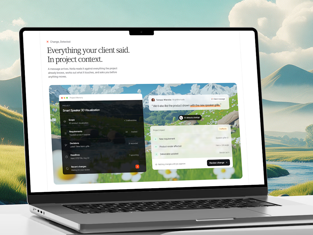
A few shots from our recent web design project for an AI Project Memory Platform.
Check it out
This project is a website and product experience for an AI-powered project memory platform built for freelancers, agencies, consultants, and client-service teams.

That's interesting project great job Fawaz🎉

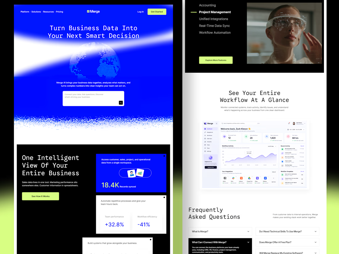
Merge — AI-Powered Business Intelligence SaaS Landing Page Design
Businesses often struggle with disconnected tools, scattered data, and complicated workflows. When important information lives across multiple platforms, teams waste time switching between tools instead of focusing on growth.
For Merge, I designed a modern SaaS landing page concept that presents business intelligence, unified integrations, and workflow automation through a clear and engaging user experience.
The goal: Create a landing page that communicates product value quickly, builds trust, and helps potential customers understand how the platform fits into their workflow.
Design focus
Clear value proposition and messaging
Strong visual hierarchy and conversion-focused CTAs
Dashboard UI to demonstrate product capabilities
Feature sections that simplify complex functionality
Consistent design language across the entire page
A SaaS website should do more than look attractive. It should help the right customers understand the product, recognize its value, and feel confident taking action.


Outstanding work