The network for creativity
Join 1.25M professional creatives like you
Connect with clients, get discovered, and run your business 100% commission-free
Creatives on Contra have earned over $150M and we are just getting started
Back to feedPost
Most sustainable food brands look identical.
Beige packaging. Minimal fonts. Preachy copy that makes you feel guilty for not caring enough.
And honestly? That's a brand strategy failure, not a design problem.
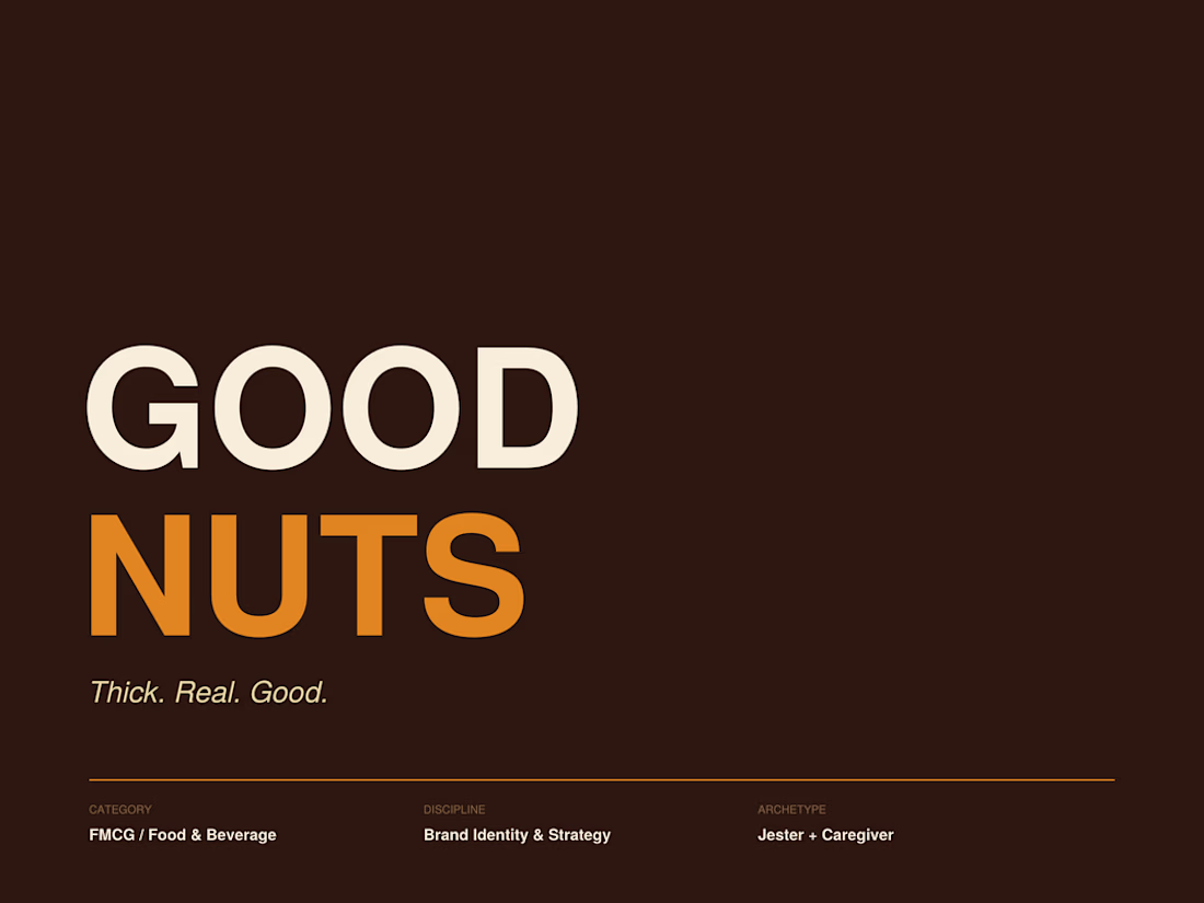
So I took on a brief for Good Nuts, a nut butter brand that wanted to do things differently. Not just look different. Actually think differently about what a sustainable FMCG brand could feel like.
The question I started with:
What if sustainability felt fun instead of restrictive?
That one question changed everything: the positioning, the personality, the visual direction, the copy tone. All of it.
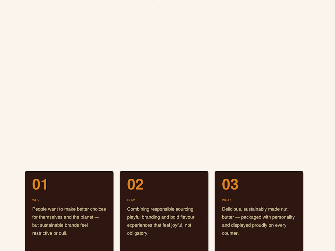
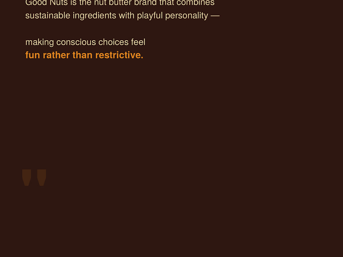
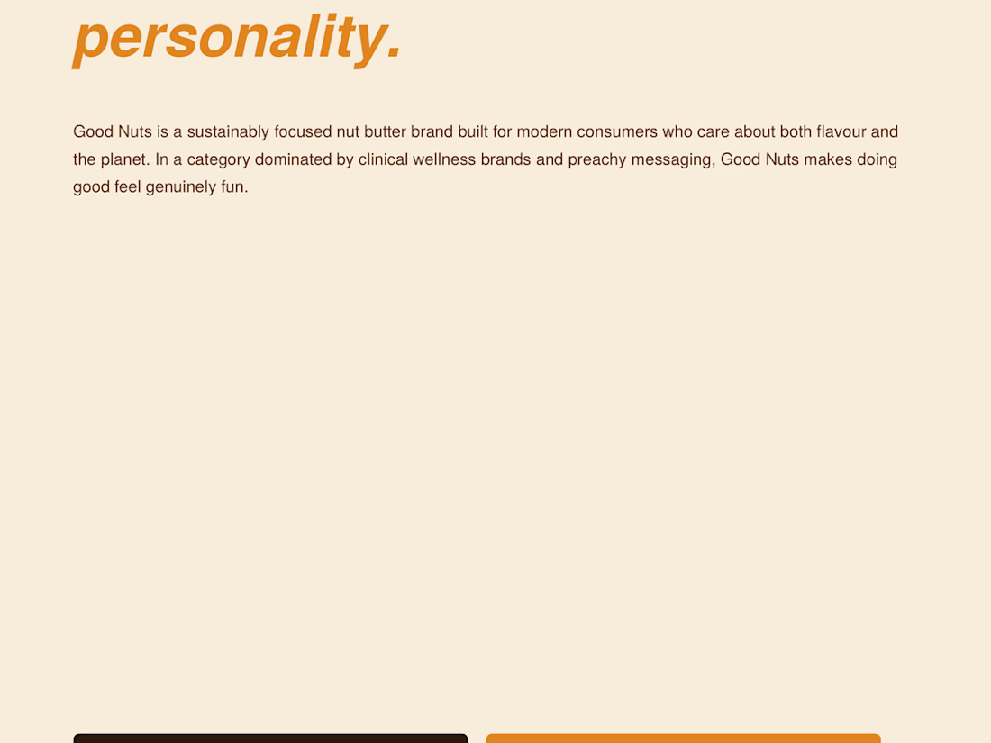
What you're seeing in these 4 slides is just the opening: the brand idea, the story, the positioning statement, and the golden circle that anchored every decision after it.
The full case study covers:
↳ Brand archetypes (and why Jester + Caregiver is a rare but powerful combo)
↳ Competitor mapping across Fix & Fogg, Pip & Nut, and Mayver's
↳ Tone of voice with real copy examples
↳ Visual identity — colours, typography, packaging direction
↳ Full brand positioning map
Dropping the complete case study soon.
But before that, I'm curious:
When you look at a sustainable brand, what makes you actually trust it? The design, the copy, or something else?
Drop your thoughts below. Would love to hear how other designers and strategists think about this.
The network for creativity
Join 1.25M professional creatives like you
Connect with clients, get discovered, and run your business 100% commission-free
Creatives on Contra have earned over $150M and we are just getting started
Related posts
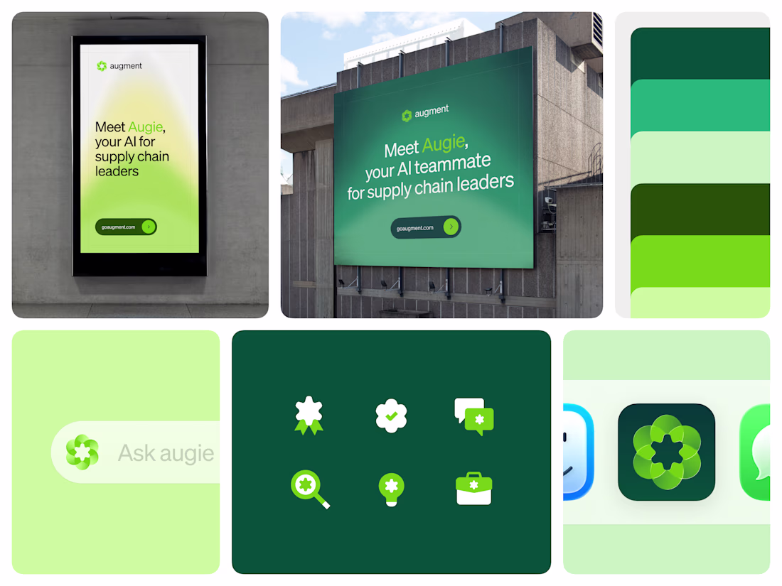
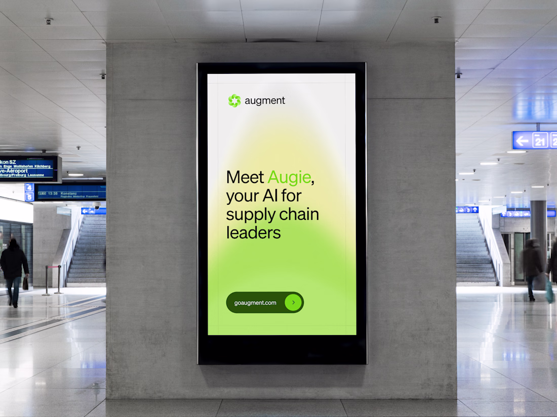
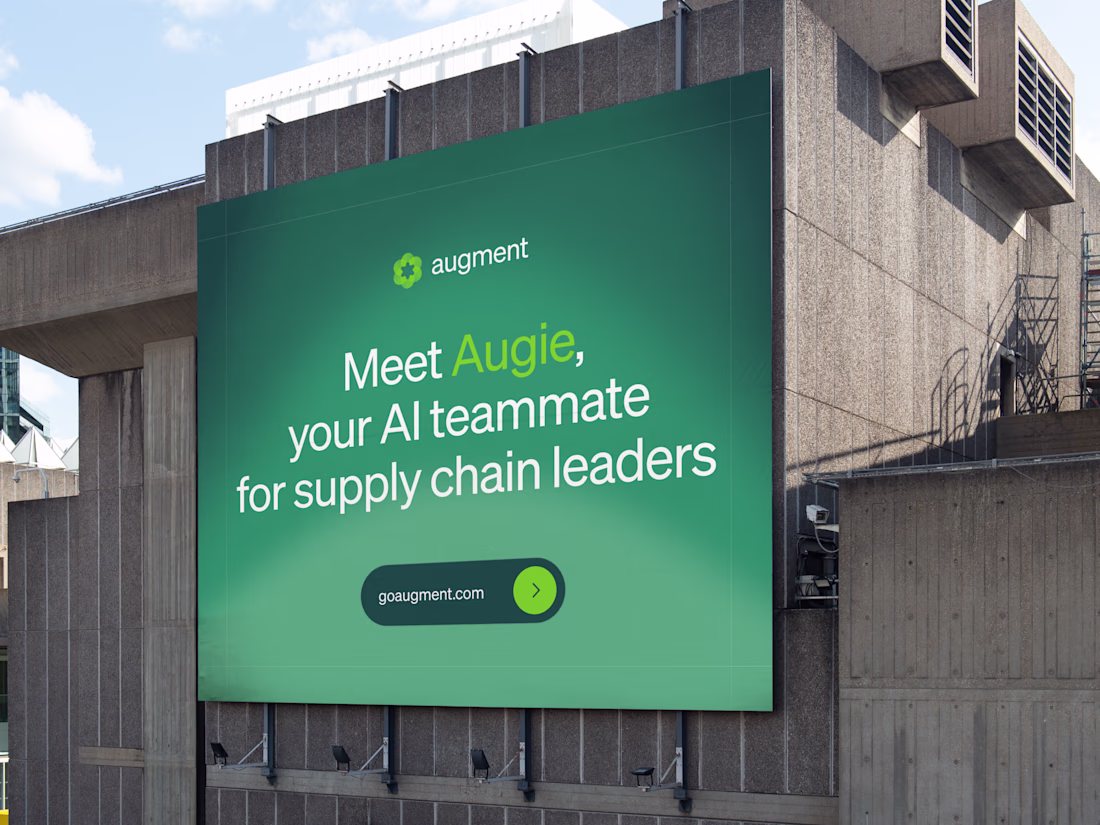
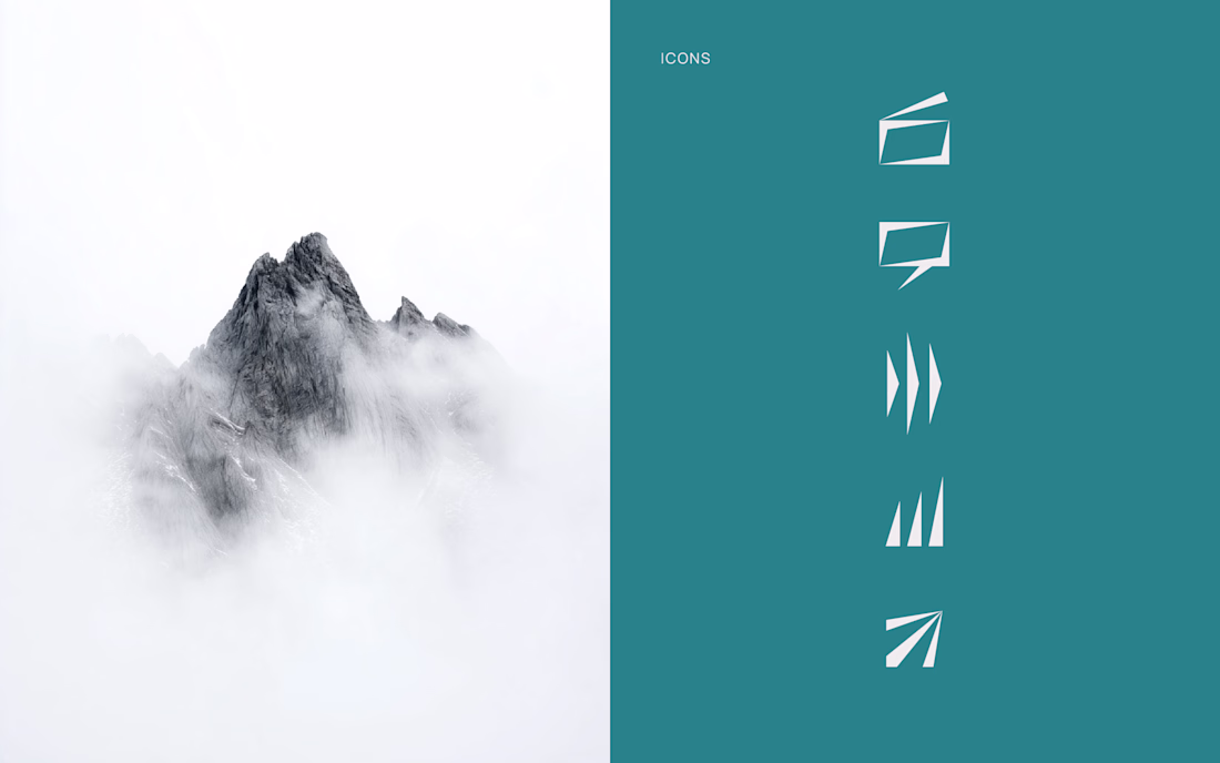
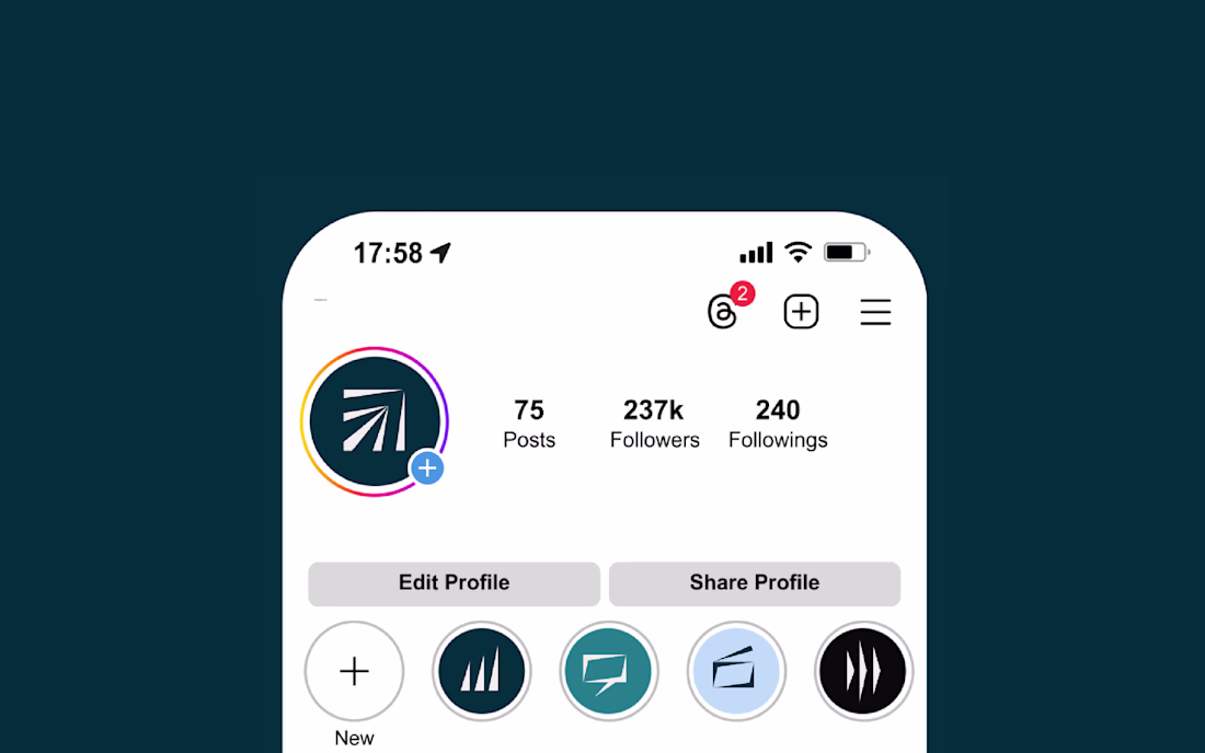
A good brand mark has to work everywhere the product shows up.
The mark was designed to adapt across every medium it appears in. Digital surfaces, product interfaces, and large format interactive billboards at logistics industry events all require different things from a logo. The mark holds up across all of them without modification.
Because the mark is translucent, it reads differently depending on where it sits, lighter and more open on white, denser on dark, bold at large format, and the adaptation works without changing anything about the shape itself.
This is beautiful
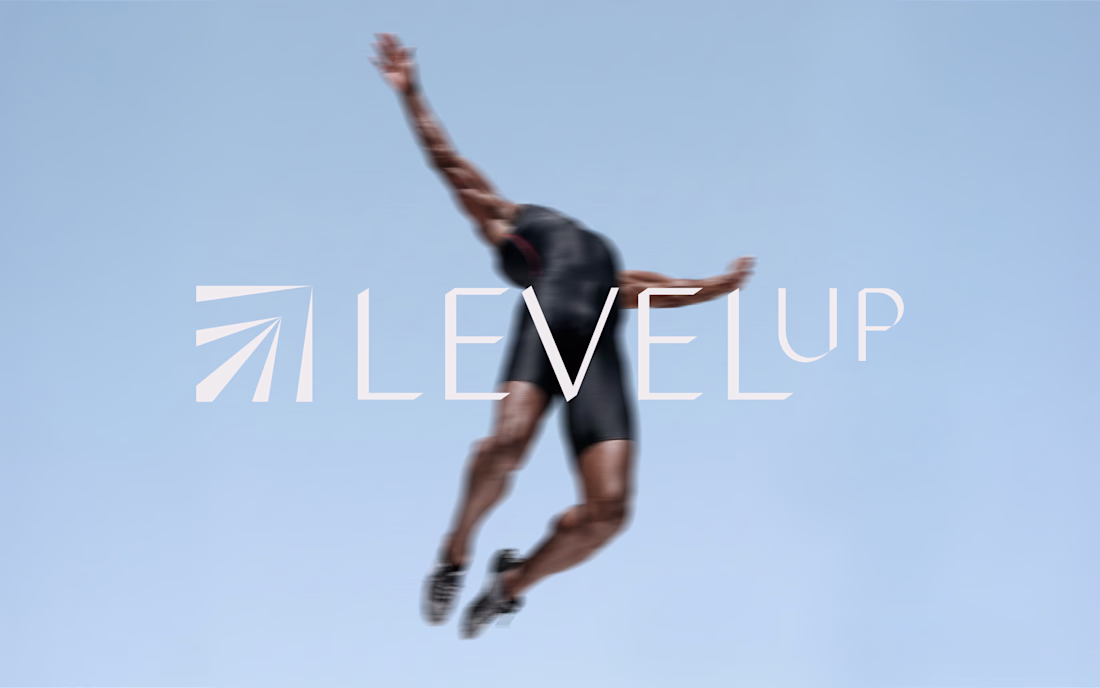
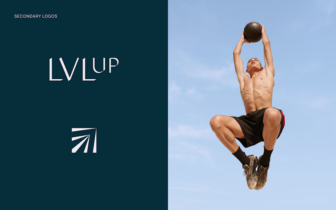
New project: brand identity for LEVELUP FRANCE
I worked on the full visual identity, from strategy to logo, color palette and brand guidelines, translating a promise of method and rigor into something visual and premium. It was a stretch, and I loved every part of it.
Amazing work
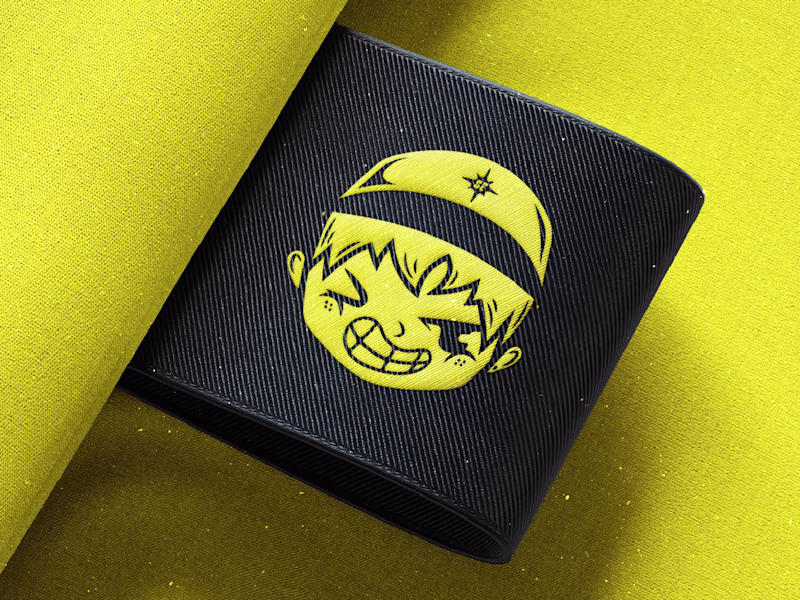
A cool surf brand needs a cool logo suite. So which one do you prefer?
Check how it turned out here.
2 voted
29%
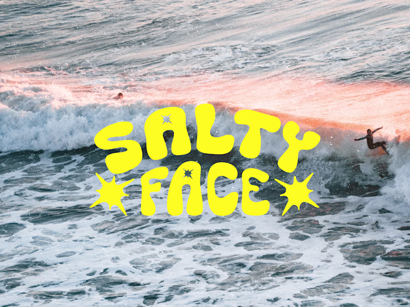
5 voted
71%
7 votes
Closed
Nice work as usual! I'm voting for the Mascot option it gives the brand so much raw identity. It's the exact kind of bold visual you can build a massive, high-energy landing page around. Great job
Trending
Claude
Claude has entered the design space. How are you using Claude Design?
Contra University
Learn from expert creatives how to earn more using next-gen AI tools.
fifaworldcup2026
The World Cup is here and the whole world's watching. How are you designing for the world stage?
creativeaiflow
Creative AI workflows are evolving. What tools do you use, and what are their strengths and weaknesses?
freelancerlife
Freelancer life is wins, pivots, and everything in between. What’s yours right now?