The network for creativity
Join 1.25M professional creatives like you
Connect with clients, get discovered, and run your business 100% commission-free
Creatives on Contra have earned over $150M and we are just getting started
Back to feedPost
Taste Test

Color changes perception more than form.
Which direction would you choose
4 voted
57%

3 voted
43%

7 votes
Closed

Going with black on this one. The gold liquid details pop so much harder against the dark background. The orange version is fire too but black just hits different.
Going with Black on this. The dark background makes the liquid gold texture stand out so much more. On orange it feels a bit busy but on black it has that premium editorial quality.

your idea is awesome
The network for creativity
Join 1.25M professional creatives like you
Connect with clients, get discovered, and run your business 100% commission-free
Creatives on Contra have earned over $150M and we are just getting started


Related posts

Same product. Two design directions. One decision.
How much can visual direction change the way we experience a product?
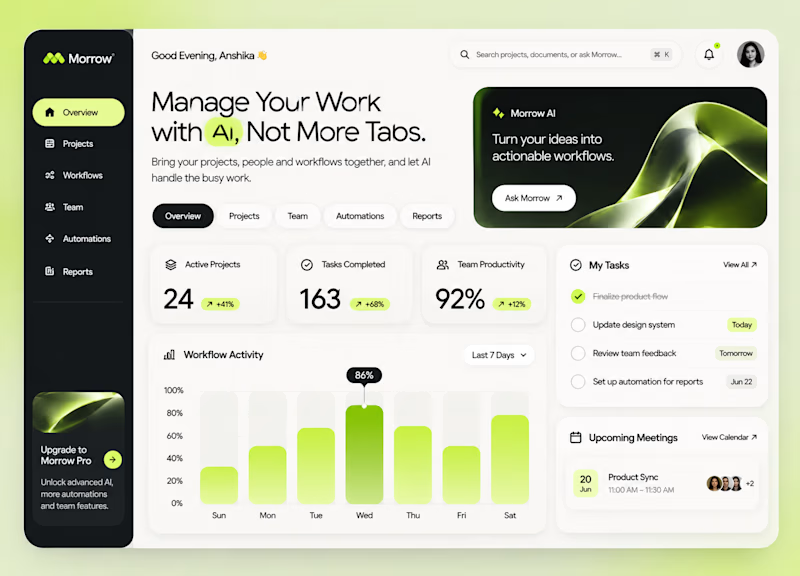
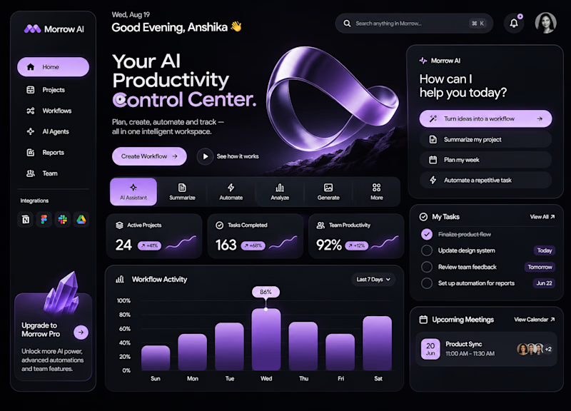
For MORROW, I explored two approaches to the same AI-powered workspace.
01 — The Clarity Workspace
Minimal, light and structured. Built around focus and simplicity.
02 — The AI Control Center
Dark, immersive and expressive. Designed to give AI a stronger visual presence.
Both solve the same problem. Both create a different experience.
But which direction gets the balance between aesthetics and usability right?
Light or Dark? What's your pick, and why?
2 voted
50%
2 voted
50%
4 votes
Closed

I'd ship Clarity as the default and keep the Control Center look as dark mode. Then nobody has to give up either one.

A pool that seems to float above the mountains deserved more than a list of services.
Chris Wellness Spa sits 1,790 m above sea level in Campos do Jordão, Brazil, with a suspended pool that blends into the Mantiqueira range. My brief was a website where guests could discover each treatment and choose their pause before arriving.
So I started with water.
🌊 One concept: the ocean. Flow, tide, depth and calm.
🔹 10 treatments, 10 names: seven from the sea (Thalassa, Maris, Azure…) and three from crystals that hold the color of water (Aquamarine, Citrine, Opaline).
✳️ 10 symbols, drawn in the same family as the spa's mark: petals and circles that repeat like water returning to the shore.
📸 Art direction and image curation: every photo was chosen to feel like the same calm, from the infinity pool to the therapist's touch.
The result is a menu you can feel before you book, built to be found on Google and cited by AI assistants.
Full case study in my profile → Chris Wellness Spa
What's the most unusual brief you've turned into a brand concept?

Naming the treatments after the sea and crystals is a lovely touch. The petal symbols tie it together well.

Lime Cream or Peach Fuzz? 🍋🟩🍑
Two animated isometric sets — same system, different mood. Cast your vote 👇
68 voted
78%
19 voted
22%
87 votes
Closed
Lime Cream. The dark linework pops more on it.