The network for creativity
Join 1.25M professional creatives like you
Connect with clients, get discovered, and run your business 100% commission-free
Creatives on Contra have earned over $150M and we are just getting started
Back to feedPost
Taste Test
Same product. Two design directions. One decision.
How much can visual direction change the way we experience a product?
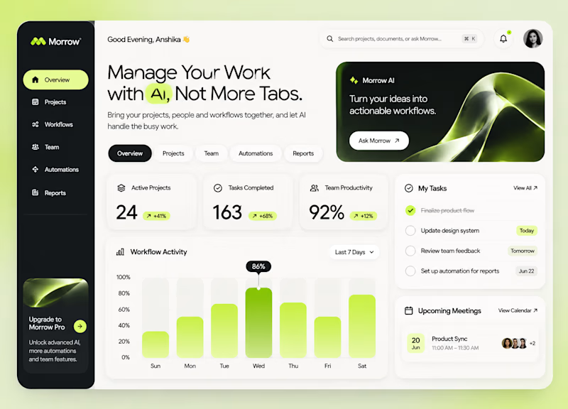
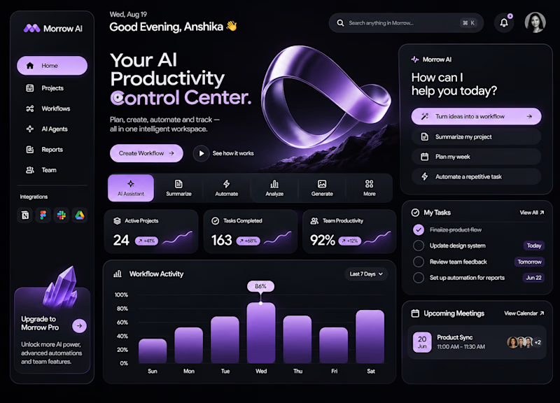
For MORROW, I explored two approaches to the same AI-powered workspace.
01 — The Clarity Workspace
Minimal, light and structured. Built around focus and simplicity.
02 — The AI Control Center
Dark, immersive and expressive. Designed to give AI a stronger visual presence.
Both solve the same problem. Both create a different experience.
But which direction gets the balance between aesthetics and usability right?
Light or Dark? What's your pick, and why?
3 votes
Ends in 21h

For an AI workspace people live in all day, I'd pick Clarity. The dark Control Center looks amazing in a shot, but calm wins for daily use. Maybe borrow the dark style only for the moments when AI is actively working? Curious which one testers trusted more.

That's a fair take. I agree that the experience people return to every day needs to prioritise clarity over visual intensity. I particularly like your suggestion of using the darker direction selectively when AI is actively working. That could create a nice balance between...
The network for creativity
Join 1.25M professional creatives like you
Connect with clients, get discovered, and run your business 100% commission-free
Creatives on Contra have earned over $150M and we are just getting started





Related posts

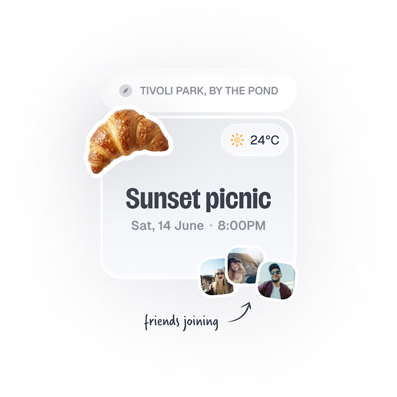
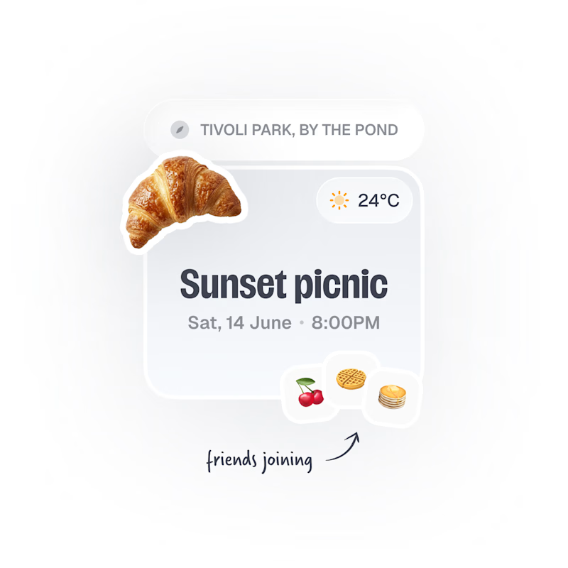
Upcoming card design for a Picnic App 🥞🧺🍎
Do we like the idea of images or predefined avatars more?:)

20 voted
83%
4 voted
17%
24 votes
Closed

Images, with the fruit avatars as the fallback for anyone without a photo. Faces are how you spot your friends at a glance, and the croissant already gives the card plenty of personality.

Same company, two different concepts for an AI storytelling platform. Which one suits better?
31 voted
86%
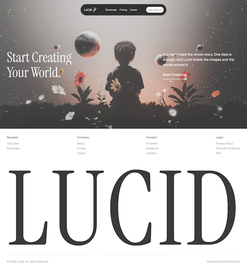
5 voted
14%
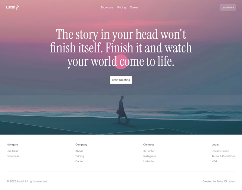
36 votes
Closed

Left!

How do you show someone where to look on a busy dashboard?
For a manufacturing platform, we tried two ways. A zooms straight into the real interface and highlights what matters. B steps away from the screen and tells the same idea with a simple visual story.
Which one would make you understand it faster, A or B?

5 voted
31%
11 voted
69%
16 votes
Closed

Really interesting comparison! For me, A works faster because it shows the real interface and instantly highlights what matters, so I don't have to guess. B is great for storytelling, but when it's a busy dashboard, seeing the actual UI makes it click right away. Both are beautifully executed though, great thinking behind this!