The network for creativity
Join 1.25M professional creatives like you
Connect with clients, get discovered, and run your business 100% commission-free
Creatives on Contra have earned over $150M and we are just getting started
Back to feedPost
A pool that seems to float above the mountains deserved more than a list of services.
Chris Wellness Spa sits 1,790 m above sea level in Campos do Jordão, Brazil, with a suspended pool that blends into the Mantiqueira range. My brief was a website where guests could discover each treatment and choose their pause before arriving.
So I started with water.
🌊 One concept: the ocean. Flow, tide, depth and calm.
🔹 10 treatments, 10 names: seven from the sea (Thalassa, Maris, Azure…) and three from crystals that hold the color of water (Aquamarine, Citrine, Opaline).
✳️ 10 symbols, drawn in the same family as the spa's mark: petals and circles that repeat like water returning to the shore.
📸 Art direction and image curation: every photo was chosen to feel like the same calm, from the infinity pool to the therapist's touch.
The result is a menu you can feel before you book, built to be found on Google and cited by AI assistants.
Full case study in my profile → Chris Wellness Spa
What's the most unusual brief you've turned into a brand concept?

Lovely!

Thank you, Bernice! So glad you like it! 😊

Naming the treatments after the sea and crystals is a lovely touch. The petal symbols tie it together well.
Thank you, Rafee 😃
I’m glad you noticed those details. The sea, crystals, and petal symbol were all part of creating a calm, cohesive identity for wellness.
The network for creativity
Join 1.25M professional creatives like you
Connect with clients, get discovered, and run your business 100% commission-free
Creatives on Contra have earned over $150M and we are just getting started

Related posts


i love this lol, you deserve an upgoat from me hahah


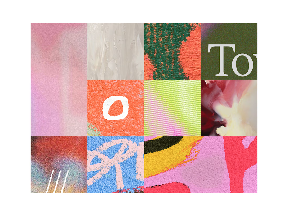

Nothing here is rushed.
Nothing here is dead.
Ink on vellum.
Light on glass.
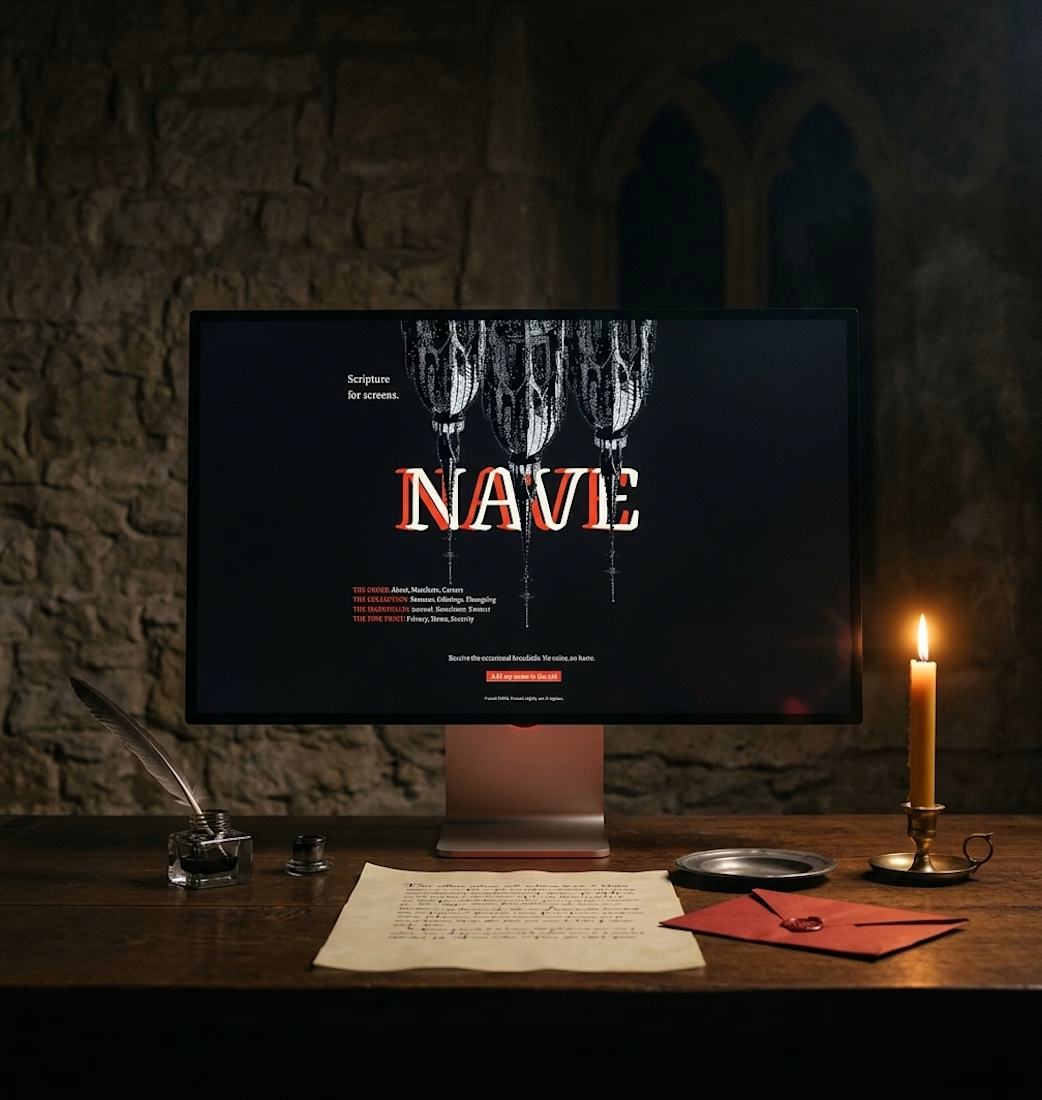
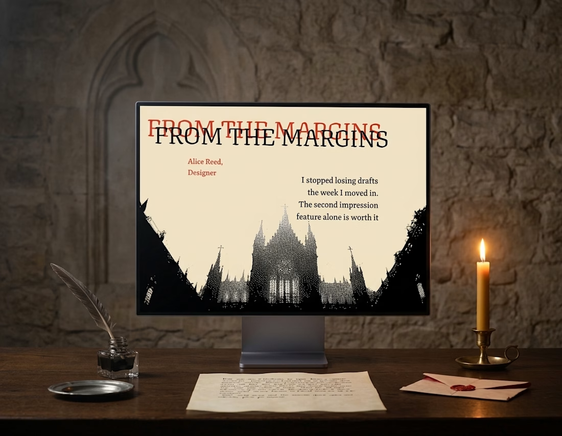
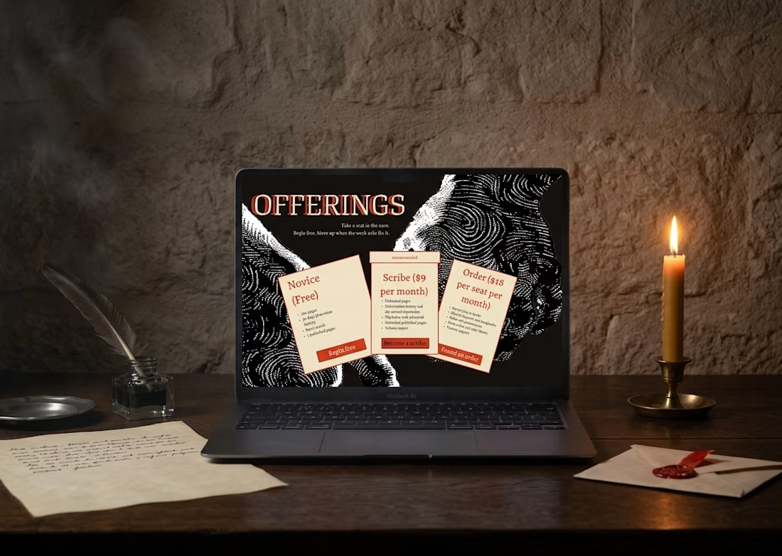
Nave, out soon

Dope