The network for creativity
Join 1.25M professional creatives like you
Connect with clients, get discovered, and run your business 100% commission-free
Creatives on Contra have earned over $150M and we are just getting started
Back to feedPost

Chlamydia Self-Test Campaign
The goal was to promote a sensitive healthcare service in a way that feels approachable and trustworthy while encouraging users to take control of their health privately and confidently.
Visual direction: clarity, privacy, human-oriented
Problem: companies often struggle to balance medical credibility with emotional sensitivity when it comes to sexually transmitted infections. Users searching for testing solutions may experience uncertainty, embarrassment, or anxiety, making it essential to create communication that feels supportive.
Solution: build the design around the concept of privacy and health awareness, rather than using strong clinical or laboratory imagery
Typography & Visual Hierarchy: typography and hierarchy was selected to feel easily scannable allowing users to absorb the most important details
Tools: Adobe Illustrator, Adobe Photoshop
Role: Graphic Designer
Facebook Ads ManagementAdvertisement DesignGraphic DesignSocial Content DesignAdobe IllustratorAdobe Photoshop



The network for creativity
Join 1.25M professional creatives like you
Connect with clients, get discovered, and run your business 100% commission-free
Creatives on Contra have earned over $150M and we are just getting started

Challenges
View all


Related posts

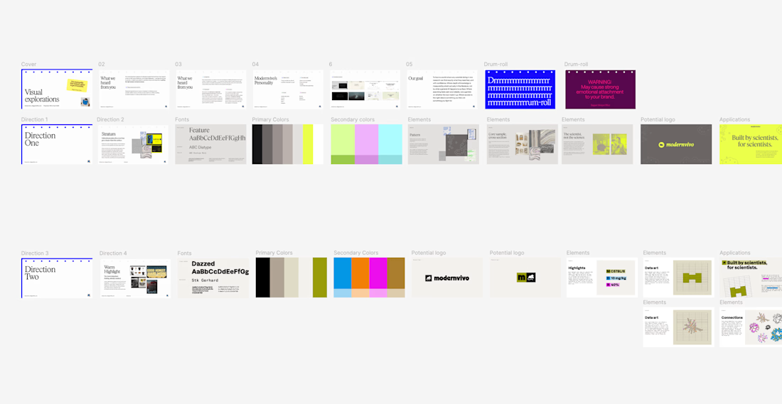
after presenting more brand directions than I can count, one thing I’ve learned: I never jump straight into showing the visuals.
first I want to establish what we're actually trying to solve.
what we heard from the client. what they want to be known for. where they sit in the market. what needs to feel different.
then the big idea, and how it translates into type, colour, imagery and graphic elements.
only then the designs.
context changes how you judge the work.

inspiring


This is one of the most beautiful pieces of art I have ever seen, with a deep message. Great work😍

What happens when propaganda designed to erase the self gets pointed at the self instead?
Soviet propaganda spent 70 years trying to erase the individual soul in favour of the collective machine. I pointed that exact visual language at the thing it was built to suppress.
I kept...




beautiful work!


Like the word mark