The network for creativity
Join 1.25M professional creatives like you
Connect with clients, get discovered, and run your business 100% commission-free
Creatives on Contra have earned over $150M and we are just getting started
Back to feedPost
When thinking about an eyewear brand, the most obvious place to start would be the glasses themselves. For Leon Bergara, we decided to look somewhere else.
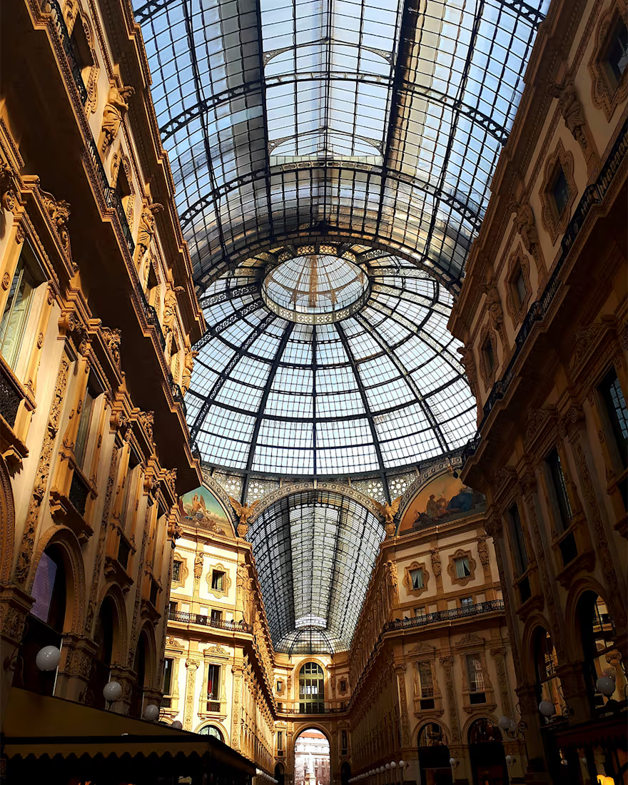
Italy was an important reference in the brief, and during the research process we came across the glass dome of Galleria Vittorio Emanuele II in Milan.
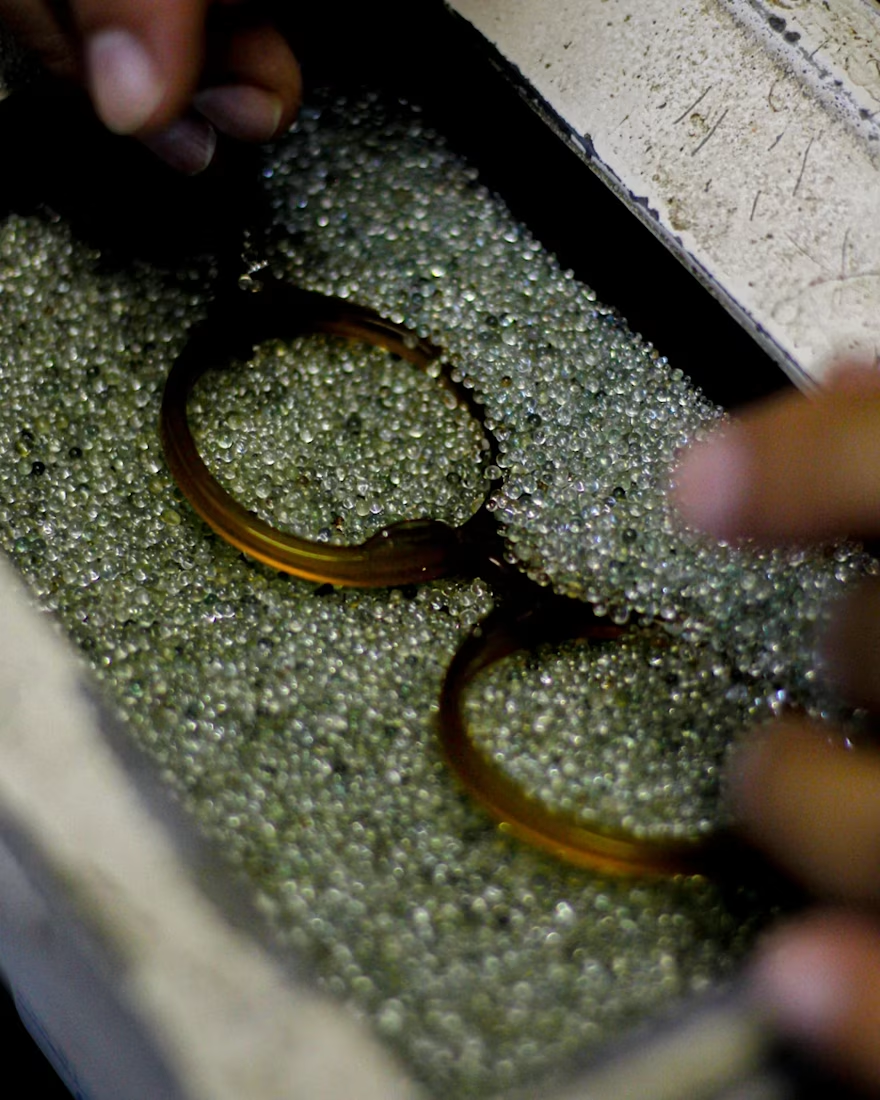
What interested us wasn’t reproducing its shape, but understanding what made it distinctive. Transparency, light, geometry and structure.
Those ideas became the starting point for the symbol.
To me, that’s what a good reference should do. It doesn’t tell you what to create. It points you in a direction and gives you space to find something of your own.
Full case: https://www.behance.net/gallery/205542723/Leon-Bergara

Beautiful work!

thanks

this logo is so beautiful, what a lovely brand identity.
thanks

Thank you so much! I’m really glad the simplicity and the concept behind the brand came through together that way.

That distinction between reproducing a shape and understanding what made it distinctive is such an underrated design principle, most eyewear branding just traces the frames. Did you explore any symbol directions that leaned more literally into the dome before landing on this one?
Thank you so much, Maty! Yes, some of the early explorations leaned more literally into the dome, but I wanted to avoid the symbol feeling like a simple architectural representation. The final direction came from abstracting that reference and turning it into something more ownable for the brand.

Super creative idea, and High-end execution .
Thank you so much, Mahmudul! So glad you enjoyed both the concept and the execution.
Most welcome, mate ! would you like to share all about the project?


Checked it out, incredible work!
Thank you so much, Abdullah! Really appreciate you taking the time to check out the project.


starting from the dome not the frames, that's smart
Thank you so much, Nazar! That was exactly one of the key ideas behind the project: starting from the story and reference behind the brand rather than relying on the more obvious visual codes of the category.

Going to the dome instead of the frames themselves is the right call, it gives the symbol somewhere to live beyond just another lens shape. Transparency, light, geometry and structure translate well to a mark you'd actually want stamped on a case.
Thank you so much, Rafee! That was exactly the intention: to create a symbol that could carry the story and values of the brand without relying on a literal representation of eyewear. I’m really glad that came through.


Great example of using references for direction. The concept feels much stronger because of it.
Thank you so much, Kabir! I agree that having a strong reference helps give purpose to the visual decisions and allows the final result to go beyond aesthetics alone.
The network for creativity
Join 1.25M professional creatives like you
Connect with clients, get discovered, and run your business 100% commission-free
Creatives on Contra have earned over $150M and we are just getting started











Related posts

Figma Football
An unofficial football concept inspired by Figma and its visual language.
The ball was created using a custom 3D generator I built in ChatGPT, with animated interface icons and graphics developed with Claude.
Part design experiment, part exploration of how custom AI-powered tools can become part of the creative process.


The interface icons translate surprisingly well into a football identity.

A natural and premium packaging concept inspired by the purity of wildflower honey and the beauty of nature. The design combines warm honey tones, textured paper, bold typography, and a clean label layout to create an authentic, handcrafted feel.


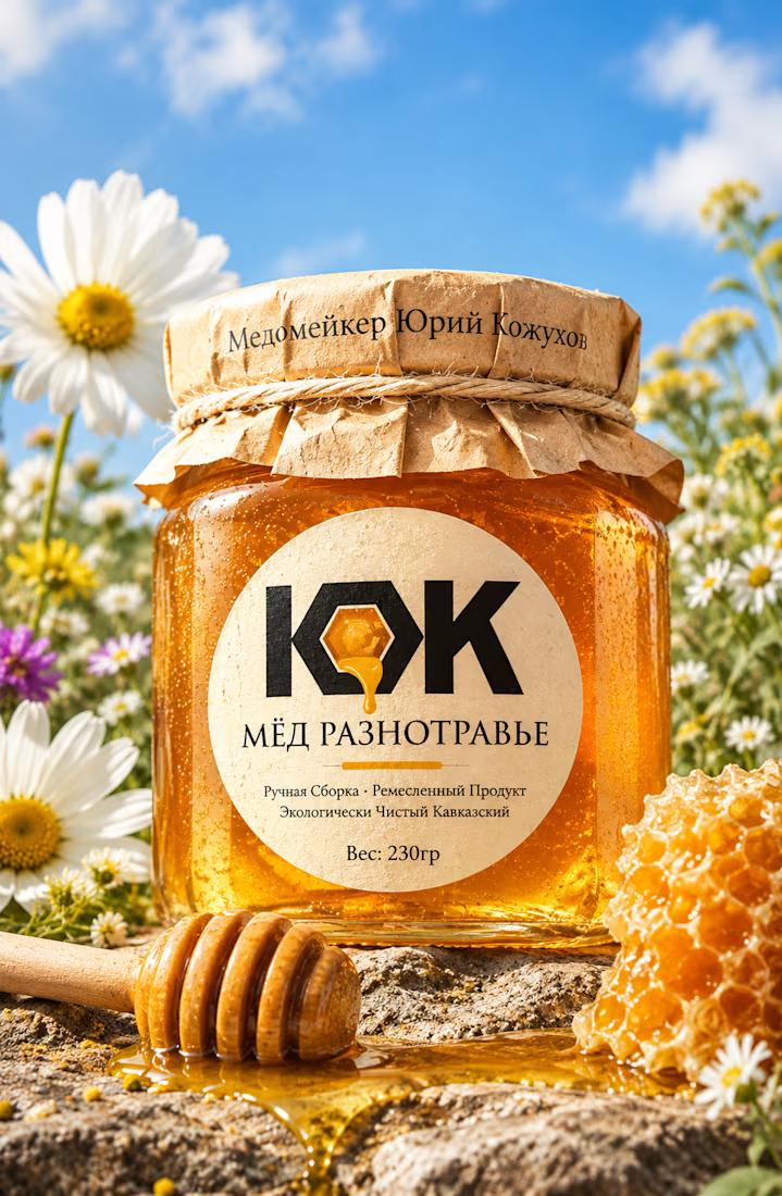

Love this! 🍯 That kraft paper texture + bold KOK mark with the honey drop is such a smart touch. Really nails that authentic, handcrafted Caucasian honey feel. The wildflower field backdrop makes it pop even more - premium but still natural.

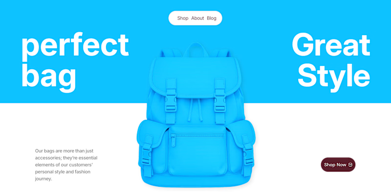
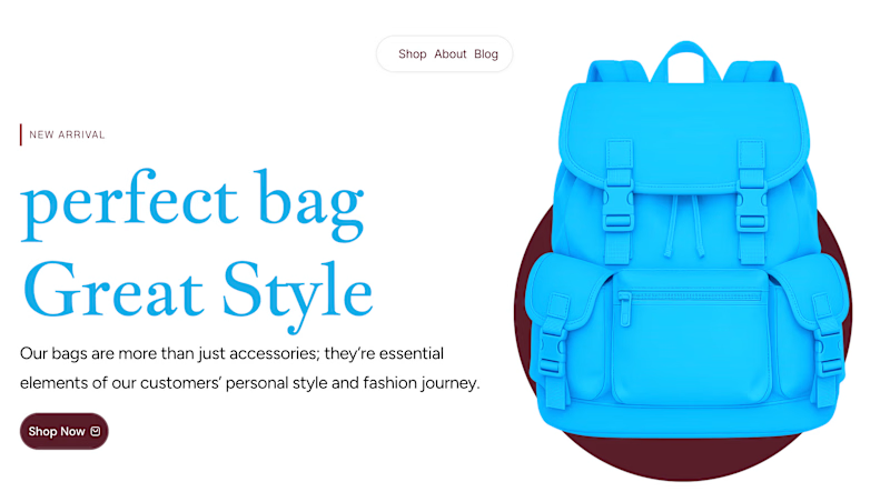
✨ Two Hero Concepts. One Bag Brand. Which One Wins? 👜
Exploring two different visual directions for Vellato, a fictional bag brand designed around everyday style, bold aesthetics, and modern fashion.
🔵 Option A: Bold Vibrant
🤍 Option B: Clean Editorial
If you were designing the digital experience for Vellato, which direction would you choose?
Option A or Option B?
Drop your vote in the comments! I'd love to hear which one catches your eye and why.

3 voted
60%
2 voted
40%
5 votes
Closed

Option A: Bold is great choice but you need make the blue tape darker to increase contrast ❤️❤️
Great job Orlerx🔥🔥