The network for creativity
Join 1.25M professional creatives like you
Connect with clients, get discovered, and run your business 100% commission-free
Creatives on Contra have earned over $150M and we are just getting started
Back to feedPost
Recently completed the UX/UI design for Bold Generic Solutions (boldgeneric.com) - a strategic AI automation platform for enterprise businesses.
The design focused on clarity, structured content hierarchy, and business-oriented flows that help visitors quickly understand services and decisions, reducing cognitive load and increasing conversion potential.
By translating complex enterprise-level AI offerings into clean, user-centred interfaces, the goal was to make strategic technology approachable and actionable for decision-makers.
Outcome: clearer service presentation, improved visual hierarchy, and structured pathways that align with business goals.




Thank you 😃

nice work
The network for creativity
Join 1.25M professional creatives like you
Connect with clients, get discovered, and run your business 100% commission-free
Creatives on Contra have earned over $150M and we are just getting started




Related posts


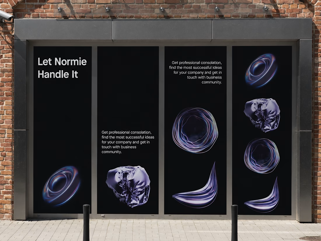
Fantastic execution man, what is the billboard for?

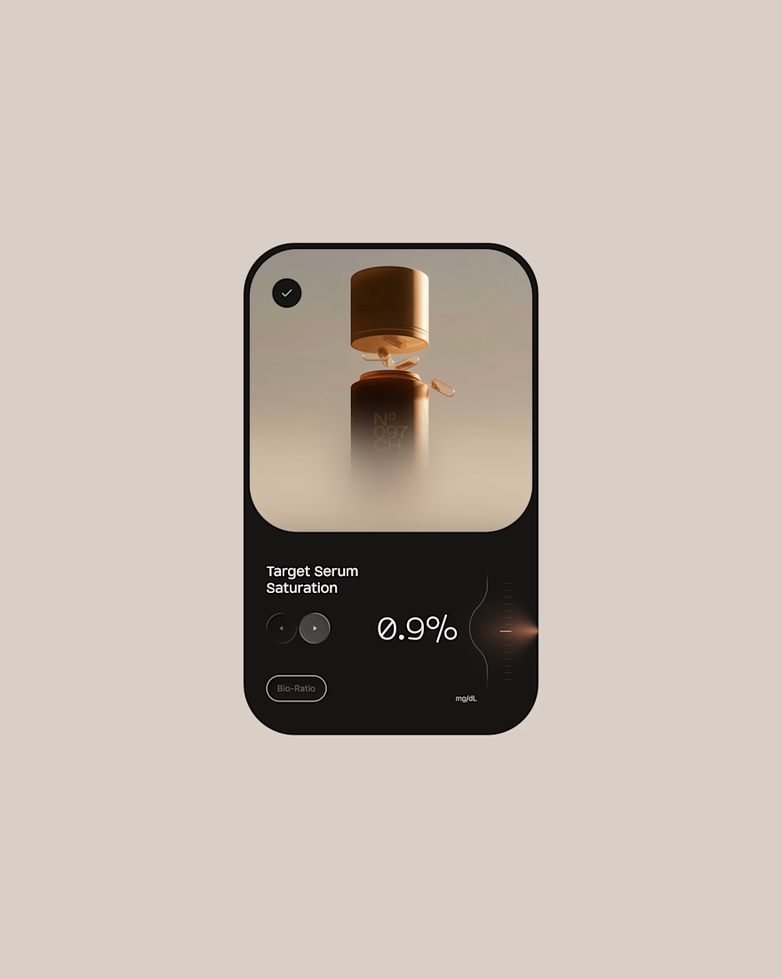
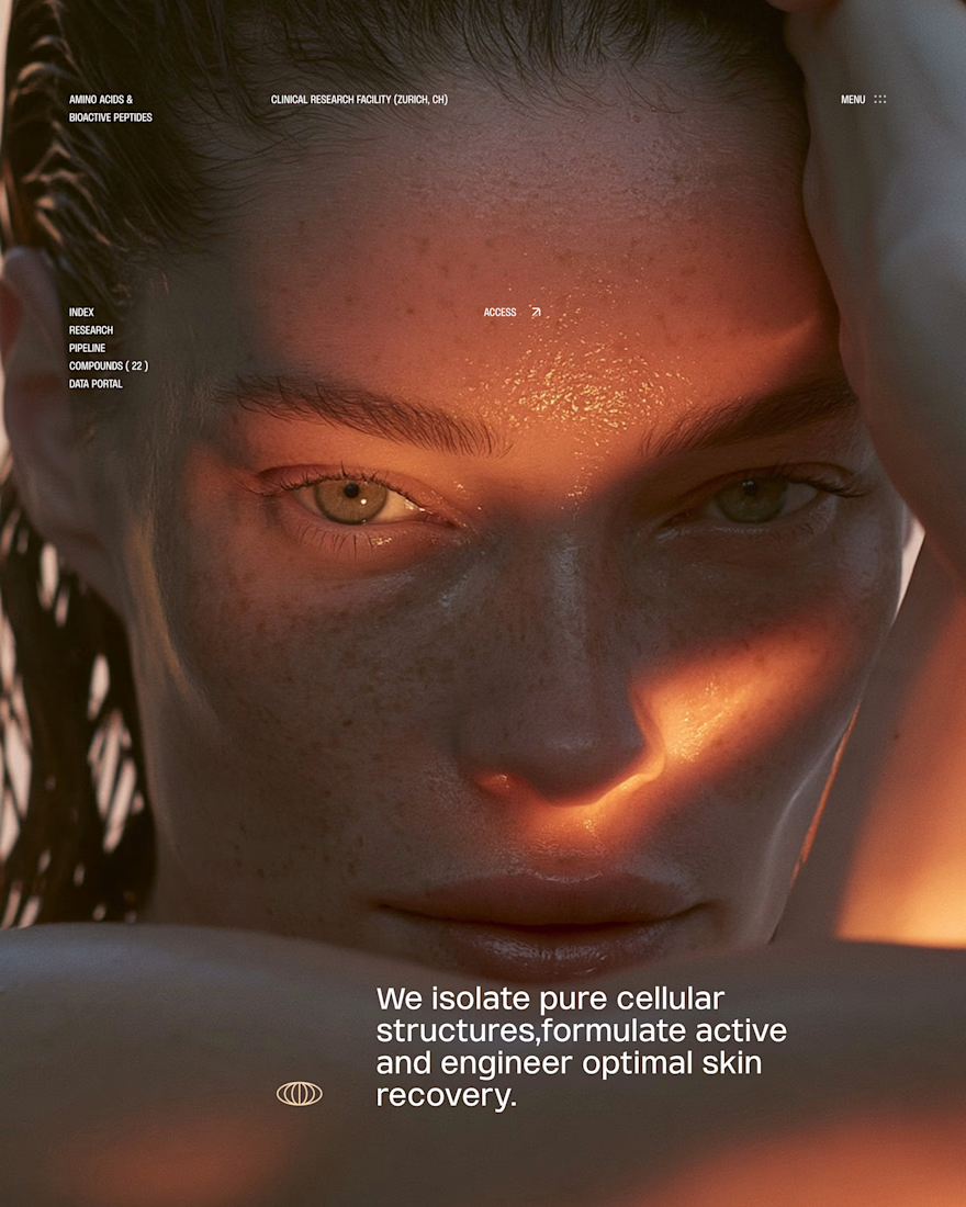
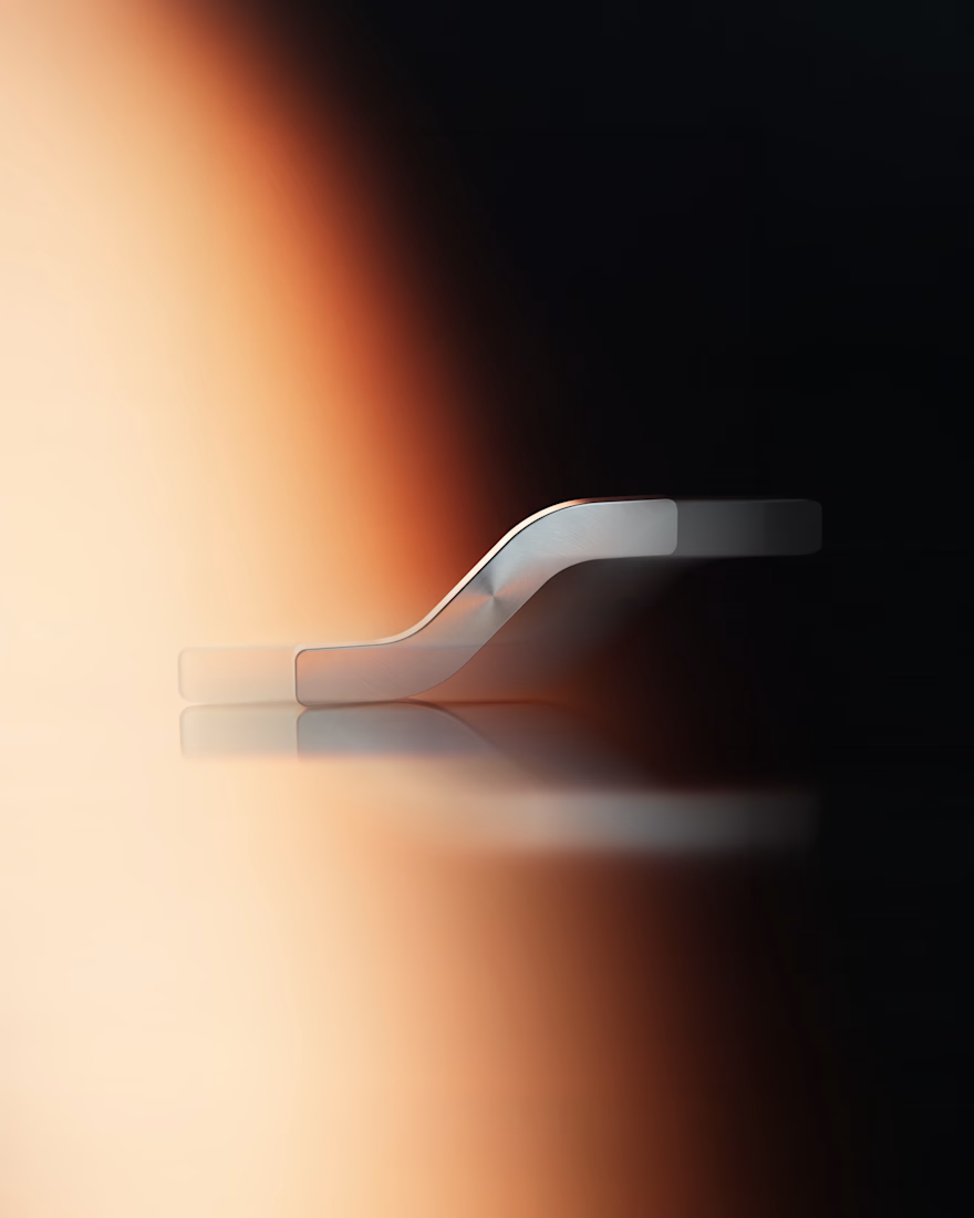
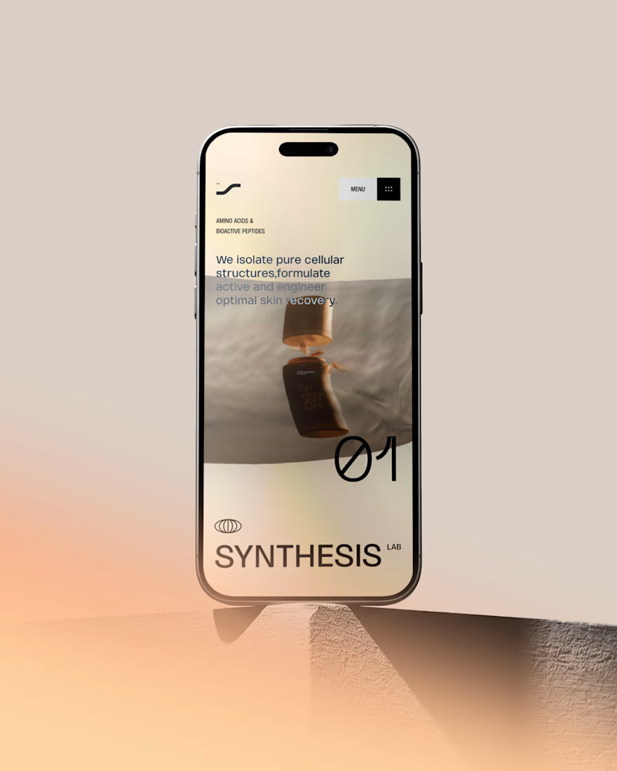
Hot take: Interaction isn't just decoration. It is the brand
I built this visual concept for a Peptides brand using WebGL and fabric physics. The fluid motion isn’t a gimmick it’s the core identity.


GOATED

What should a creative agency website actually feel like?
For Orvika, we didn't want another agency site built around the same safe layouts and predictable sections.
We pushed the visual direction further with oversized typography, editorial layouts, bold imagery, and stronger contrast, while keeping the experience structured enough to communicate the agency's work and capabilities clearly.
The goal wasn't just to make it look different.
It was to make the agency feel different.
Designed in Figma and built in Framer.
We're sharing more of the websites and digital experiences we've been working on here over the next few weeks.


Very neat man