The network for creativity
Join 1.25M professional creatives like you
Connect with clients, get discovered, and run your business 100% commission-free
Creatives on Contra have earned over $150M and we are just getting started
Back to feedPost

Loopo, part 2.
Same financial dashboard now with every interaction in motion add funds, period switch, cash flow toggles and panel controls.
Which interaction stands out to you?
The network for creativity
Join 1.25M professional creatives like you
Connect with clients, get discovered, and run your business 100% commission-free
Creatives on Contra have earned over $150M and we are just getting started
Related posts

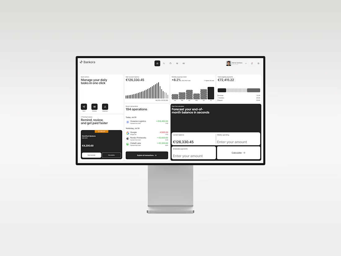
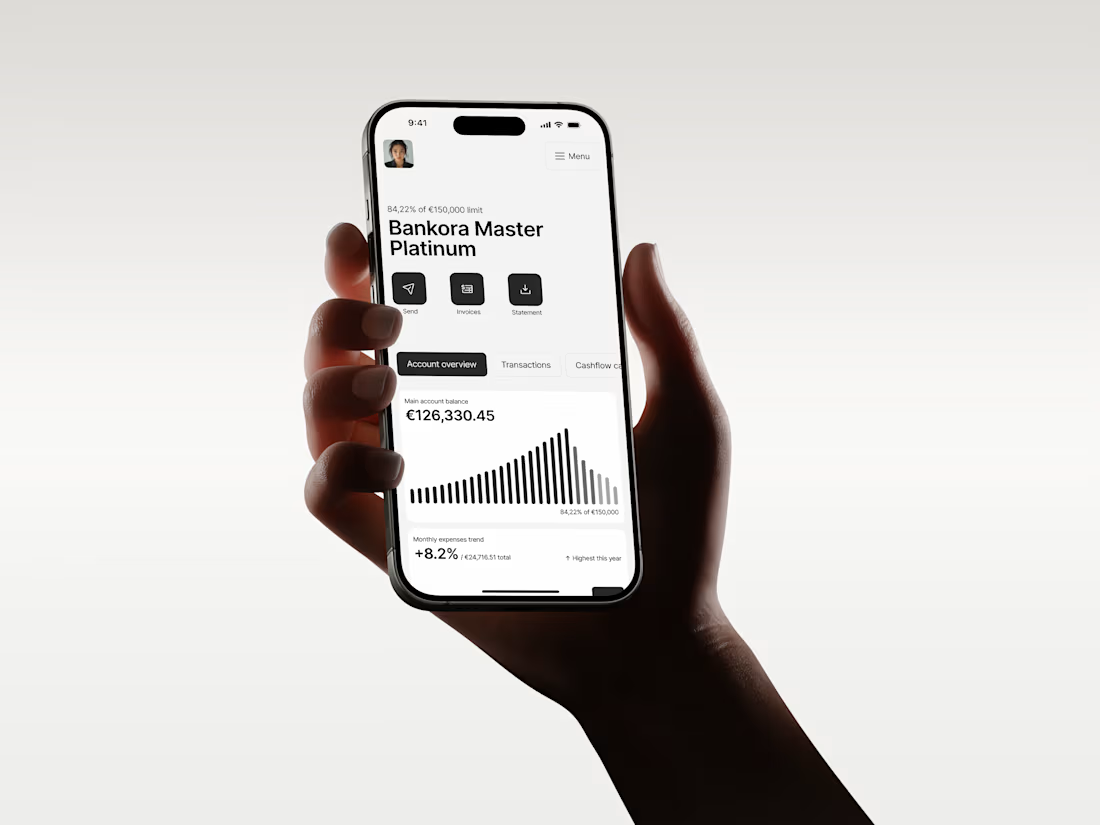
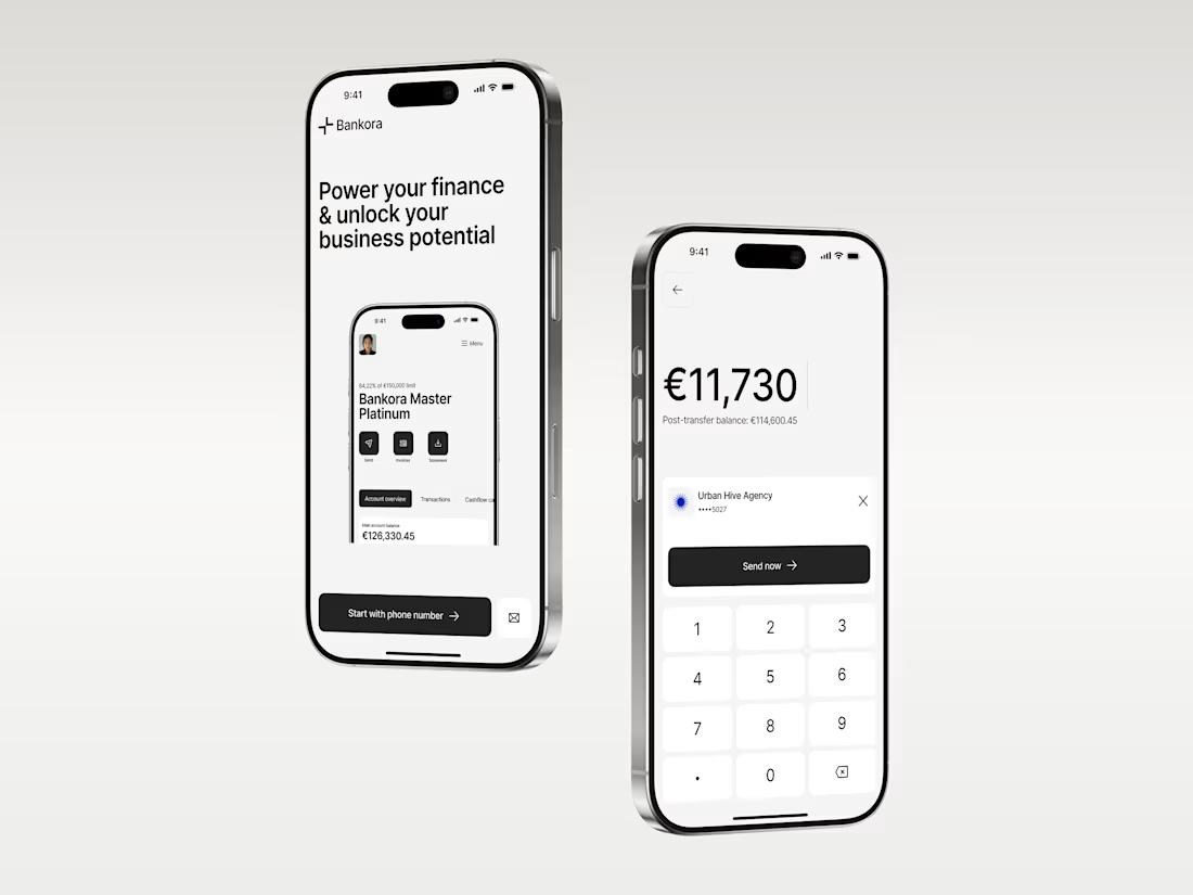
Business banking is already complex. The product shouldn’t make it feel even harder.
That was the thinking behind Bankora.
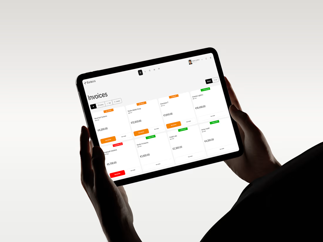
Payments, invoices, cash flow, financial overview. These are things business teams deal with constantly, yet many banking products still bury simple actions under dense data, long paths, and complicated navigation.
So I started with the workflows, not the screens.
I looked at the tasks people need to complete most often, where unnecessary steps appear, and what information actually needs attention first.
From there, I built the experience around clearer priorities: key actions available quickly, predictable navigation, structured financial data, and modular UI that makes things like pending and overdue invoices easier to understand at a glance.
I also designed an interactive cash flow calculator to help users see where the business may be heading, not just what has already happened.
The goal wasn’t to make financial operations simpler than they really are.
It was to make interacting with them feel simpler.
Less searching. Less cognitive load. More confidence in what to do next.
And it was especially nice to see Bankora later featured by Contra.

clean!

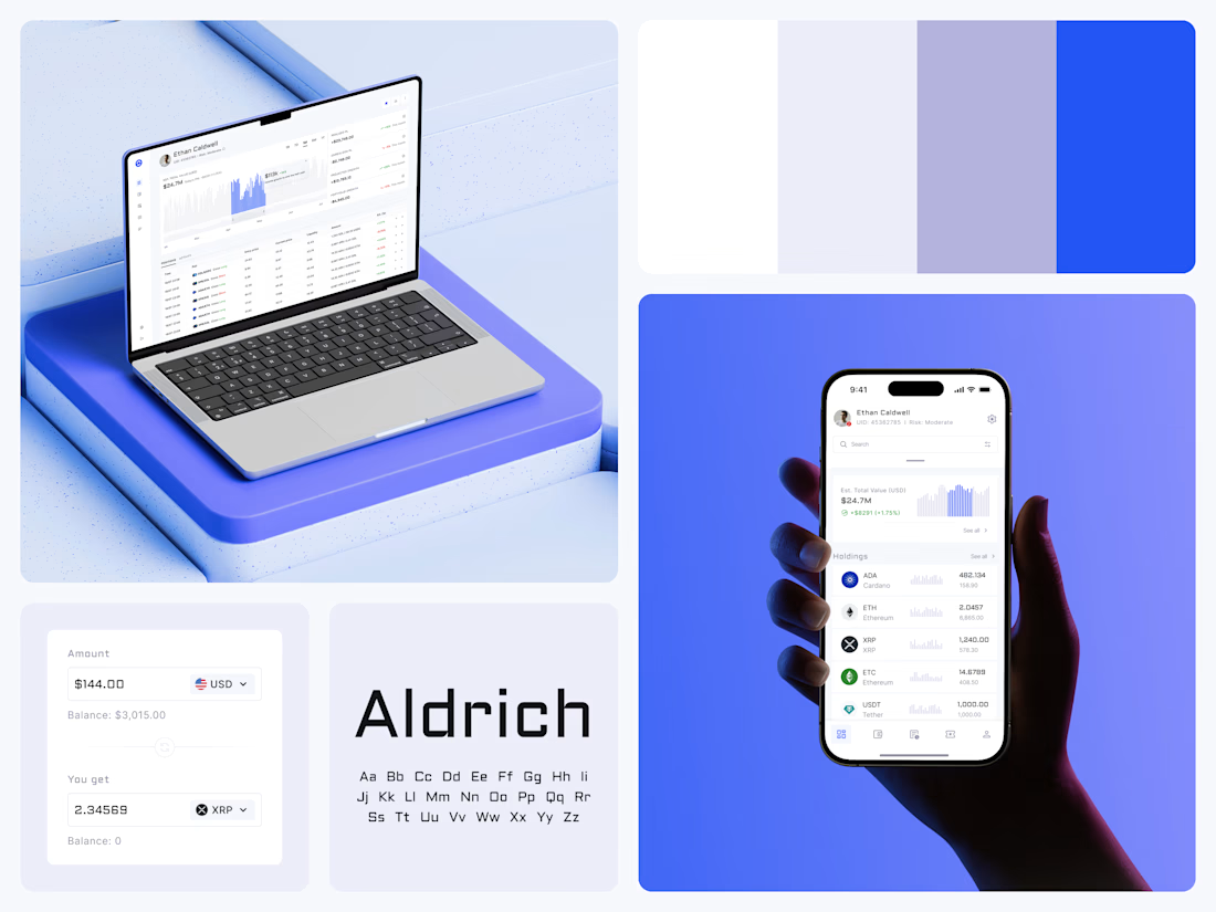
Crypto Portfolio Dashboard
Blue means one thing here: the range you are looking at.
The value chart is a row of thin gray bars, and only the selected date range fills in blue. You read the period that matters and keep the months around it as context.
The phone carries the same chart above the holdings list. Each coin gets its own small bar chart between the name and the amount, so you can scan the whole portfolio for movement without opening a single coin.
Trading screens get busy fast. This one stays light and calm, so the numbers lead: total value, realized and unrealized P&L and open positions, all on one screen.
Designed by the Hue & Machine team.
#Crypto #Fintech #DashboardDesign #TradingPlatform #DataVisualization #UIDesign #ProductDesign #WebApp #MobileDesign #FigmaDesign



Nice Ui Dmytro

The experience is in the details. ✨
A few interaction design explorations from my recent projects.
I’m available for new product design projects this November. If you’re building a new product or looking to improve an existing one, let’s talk.

