The network for creativity
Join 1.25M professional creatives like you
Connect with clients, get discovered, and run your business 100% commission-free
Creatives on Contra have earned over $150M and we are just getting started
Back to feedPost

Descrição do projeto — VEIL
VEIL is a visual campaign for a mysterious and sophisticated feminine fragrance, built around the notes of vanilla and pink pepper.
The concept explores mystery, movement and sensuality through sheer fabric, which surrounds the subject and becomes an extension of the fragrance itself.
The campaign combines fashion imagery, product storytelling and short-form VFX content, creating a cohesive visual language across different formats.
My role: Creative Direction, Art Direction & Visual Development.
Tools: Seedream 5 Pro, Nano Banana Pro 2, Kling AI, CapCut.


The network for creativity
Join 1.25M professional creatives like you
Connect with clients, get discovered, and run your business 100% commission-free
Creatives on Contra have earned over $150M and we are just getting started






Related posts


Some of my recent works. As you can see I have pretty wide range of styles and topics 😅


the range is real

A fragrance that doesn't exist. A launch campaign that does.
FIFTH STATE. Not liquid. Not metal.
One visual engine, written in code, made the film, the billboard, the story ad and the poster. No camera. No 3D software. No stock.
Concept work. Full project on my profile.

Code-built fragrance, no camera — the film feels unreal.

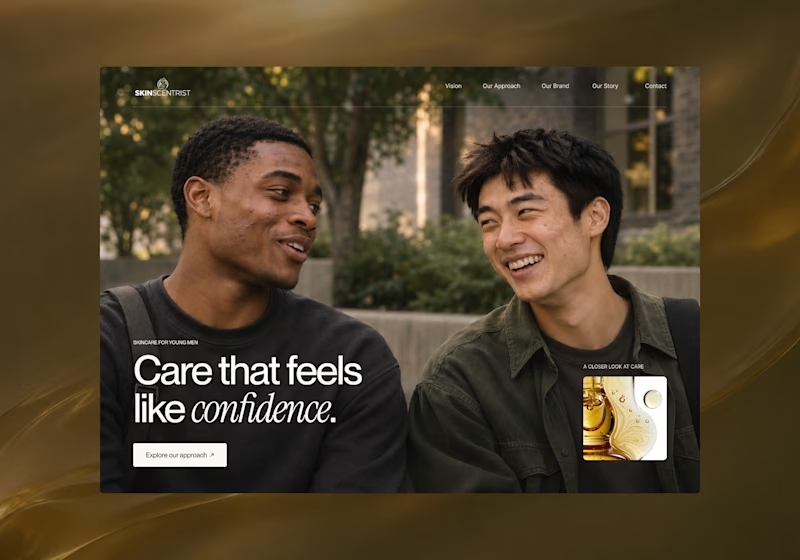
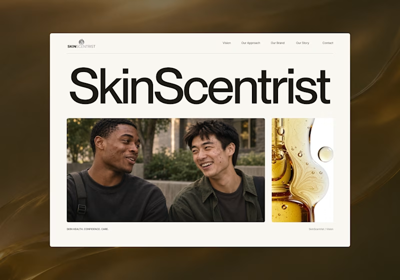
I’m exploring two homepage hero directions for SkinScentrist, a skincare brand focused on helping young men feel more confident in their skin.
Both concepts use the same imagery but take very different approaches to storytelling and visual hierarchy.
Direction 1 feels more emotional, immersive, and lifestyle-driven. The full-screen photography and bold messaging create a stronger connection to confidence and self-care.
Direction 2 feels more minimal, editorial, and brand-focused. The oversized typography, clean layout, and product imagery give it a more refined, contemporary skincare feel.
Direction 1: immersive, personal, emotional
Direction 2: minimal, editorial, premium
Which direction feels stronger for a modern skincare brand?

14 voted
93%
1 voted
7%
15 votes
Closed
Direction one — the full-screen photo feels warmer.