The network for creativity
Join 1.25M professional creatives like you
Connect with clients, get discovered, and run your business 100% commission-free
Creatives on Contra have earned over $150M and we are just getting started
Back to feedPost

Project Overview: Saffron & Stone
Saffron & Stone is a curated brand identity project for a premium dining destination that blends the earthy, grounded textures of the natural world with the vibrant, aromatic luxury of fine spice. The project explores the intersection of rugged minimalism and refined culinary artistry.
🎨 Design Deliverables
Logo Design: A sophisticated visual mark that balances "Stone" (stability, permanence, and texture) with "Saffron" (fluidity, rarity, and warmth). The logo utilizes clean typography paired with an organic icon to reflect the restaurant's dual nature.
Brand Poster: A high-impact visual piece designed to evoke the sensory experience of the restaurant. It uses evocative photography and minimalist layouts to communicate the atmosphere and "soul" of the dining space.
Curated Menu: A functional yet aesthetic editorial layout. The menu design prioritizes readability and tactile appeal, using a palette of deep slates and warm ochres to guide the guest through a premium gastronomic journey.
✨ Core Philosophy
"Where the raw elements of the earth meet the refined golden touch of the kitchen."
The Vision
To be a sanctuary of sensory storytelling, where every guest experiences the timeless harmony between the rugged landscape and the delicate complexities of global flavors. We aim to redefine "earthy luxury" by making the primitive feel prestigious.
The Mission
To serve as a bridge between nature and the plate. Saffron & Stone is committed to using ethically sourced, high-quality ingredients and presenting them in a space that honors architectural honesty and culinary precision. We don't just serve meals; we provide a grounded, unforgettable connection to the elements.
🛠️ Brand Aesthetic
Color Palette: Burnt Orange (Saffron), Charcoal & Sandstone (Stone), and Creamy Bone.
Typography: A pairing of a bold, structural Serif with a light, airy Sans-Serif for modern contrast.
Vibe: Sophisticated, raw, warm, and intentional.


The network for creativity
Join 1.25M professional creatives like you
Connect with clients, get discovered, and run your business 100% commission-free
Creatives on Contra have earned over $150M and we are just getting started





Related posts

My latest branding project for the Atlanta Museum of Paleontology.
Check out the full project at maximjungle.com

A T-rex drawn in one thin outline is such a good mark 🦖 I'd happily visit that museum.


How far can you take a logo beyond the first draft?
I started with Recraft's Logo Maker and a fictional idea: Bibu's Paws, a cosy little dog rescue and adoption shelter.
I wanted the identity to feel warm, homely and full of character, so I explored a few logo directions before settling on the little dog tucked inside a house.
From there, I took the idea further, building out the visual identity with an earthy colour palette, typography, illustrations and a few real-world applications: the shelter space, dog merchandise and an adoption welcome kit.
I enjoyed seeing how a small starting point could grow into a brand with its own personality and world.
Now I'm curious: if you were building a brand around this logo, what would you create next?






It turned out so cozy, you did great

This one made me stop scrolling....
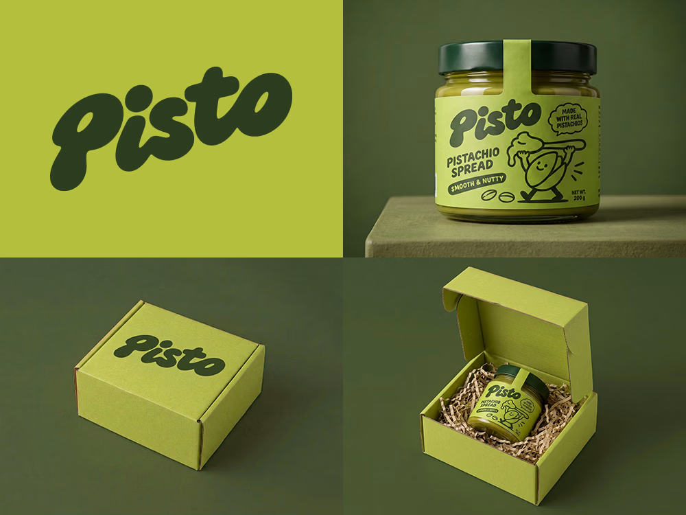
Love the playful wordmark and that olive-pistachio palette.
Sharing so others can enjoy it on their feed a little longer. 🙌

Can AI create a professional-looking logo?
I tried to create a logo concept for a pistachio spread brand using Recraft Logo Maker.
After answering a few questions about the brand and going through several variations, I finally landed on a logo that felt right and captured the fun,...

Wow