The network for creativity
Join 1.25M professional creatives like you
Connect with clients, get discovered, and run your business 100% commission-free
Creatives on Contra have earned over $150M and we are just getting started
Back to feedPost
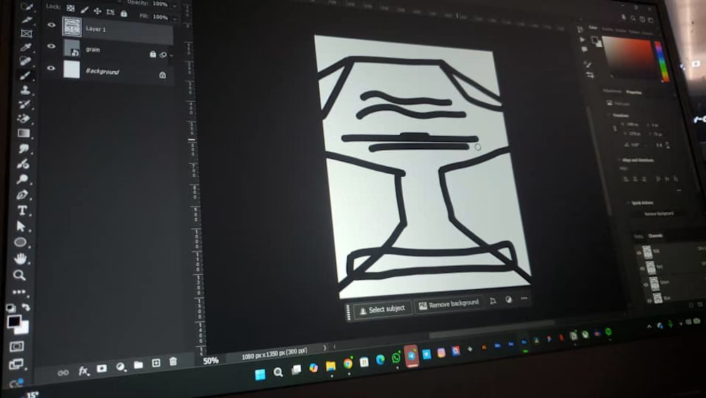
Who still sketches before they design? I do😂
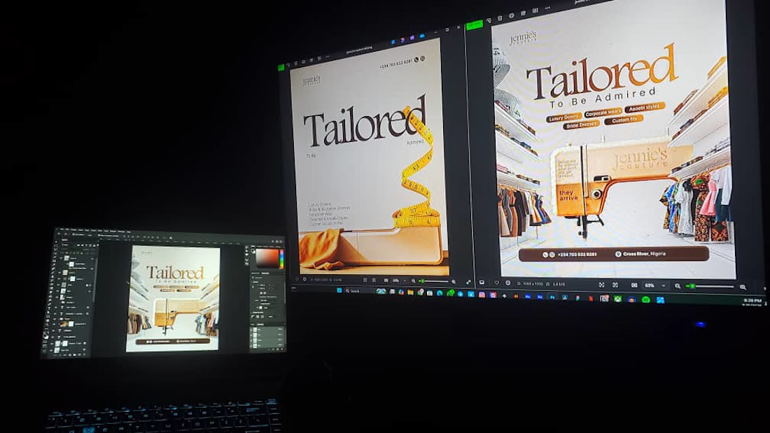
Check out our latest projects for a tailoring brand. Premium and intentional for an intentional brand. Need one?

Nice work!

thankss
The network for creativity
Join 1.25M professional creatives like you
Connect with clients, get discovered, and run your business 100% commission-free
Creatives on Contra have earned over $150M and we are just getting started







Related posts

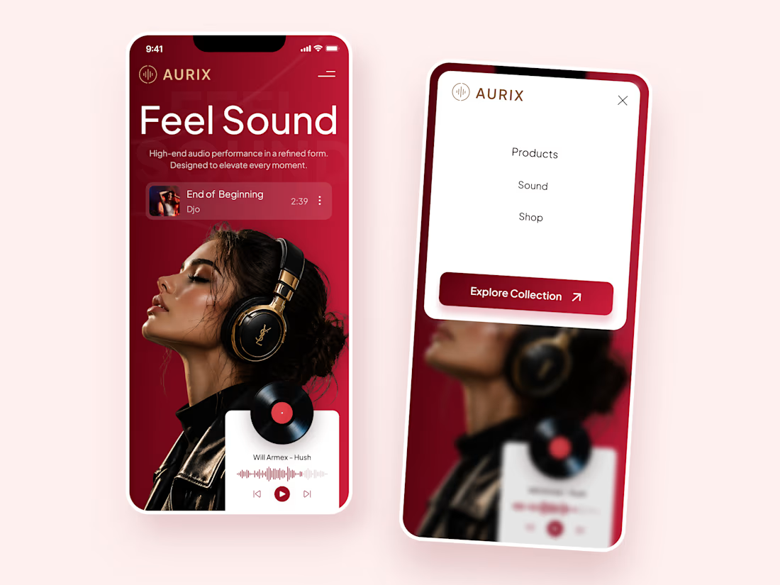
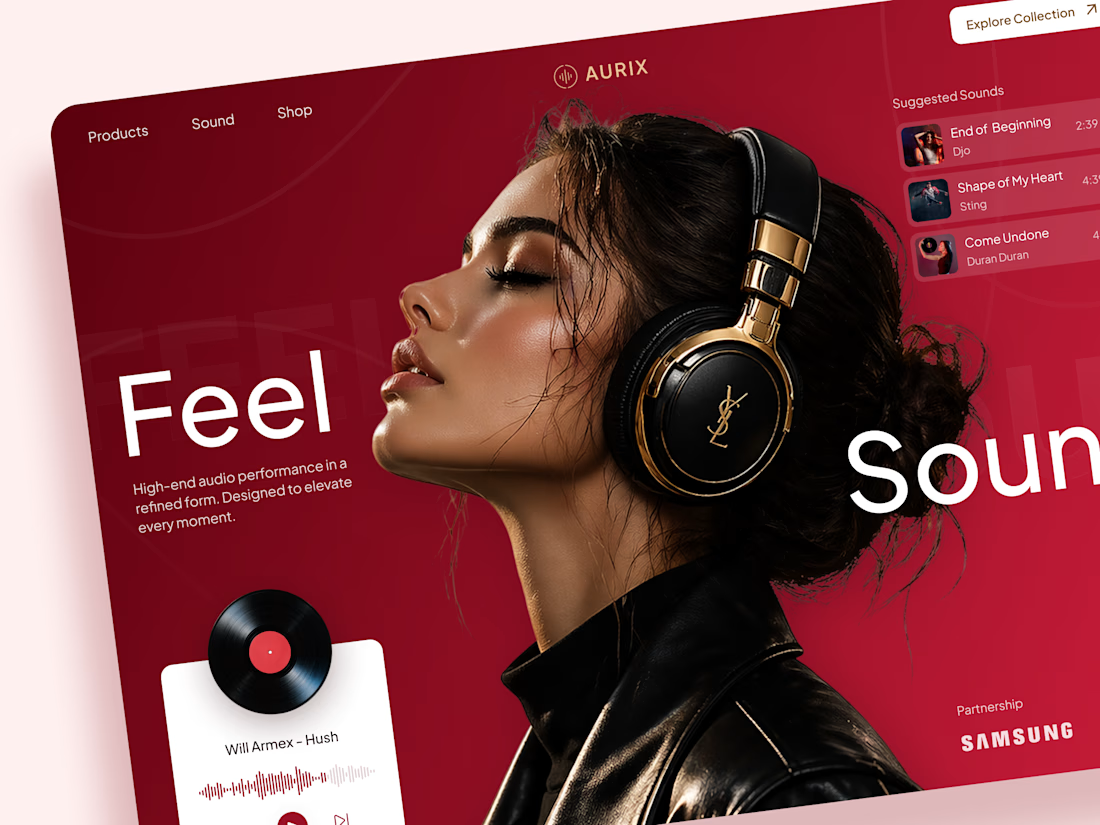
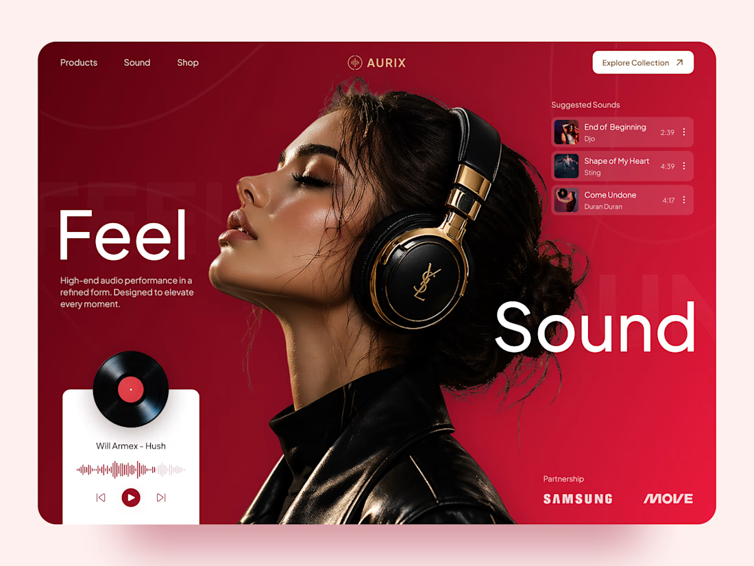
AURIX — Premium Headphones Landing Page 🎧❤️
A bold landing page concept for a premium audio brand, combining luxury headphones, music, and a strong lifestyle aesthetic
The design brings together deep red tones, elegant black and gold details, oversized typography, and immersive lifestyle imagery to create a modern, fashion-inspired experience
Special attention was given to:
• Bold lifestyle-focused hero composition
• Rich red and gold color palette
• Clean, oversized typography
• Music player and suggested tracks
• Premium product presentation
• Responsive mobile experience
• Minimal navigation and clear CTA
The result is a stylish, immersive landing page that connects premium audio with fashion, music, and everyday lifestyle ✨



Love the style!

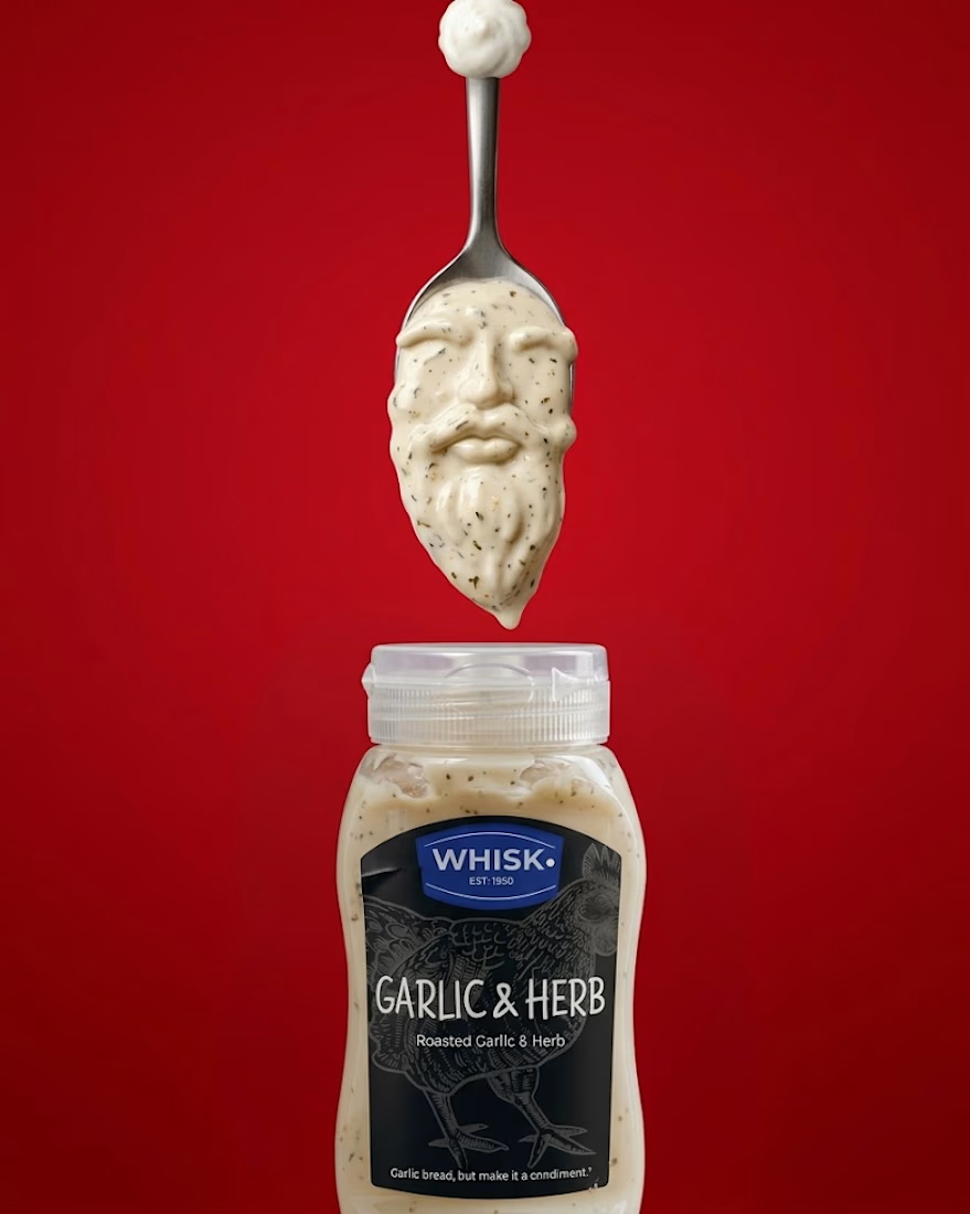
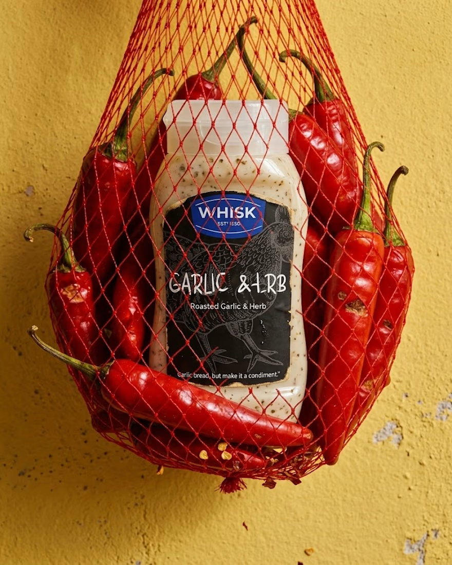
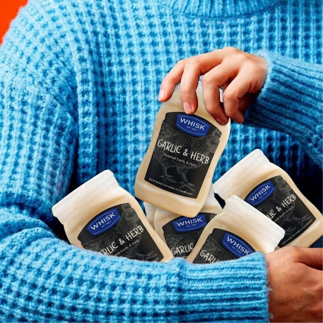
Real eggs. No apologies 🥚
Spent the past week designing WHISK, an artisan mayonnaise brand built on one idea: even the most overlooked item in the fridge deserves a brand that takes it seriously.
No squeeze bottle, no label built to disappear into the shelf. Just a glass jar, a short ingredient list, and four flavors told apart by one accent color each. Classic, garlic and herb, smoked chili, vegan. 🫙
Sometimes the boldest thing a condiment can do is be particular about itself.



The animation looks top tier! Nice work

What type of combination is that?
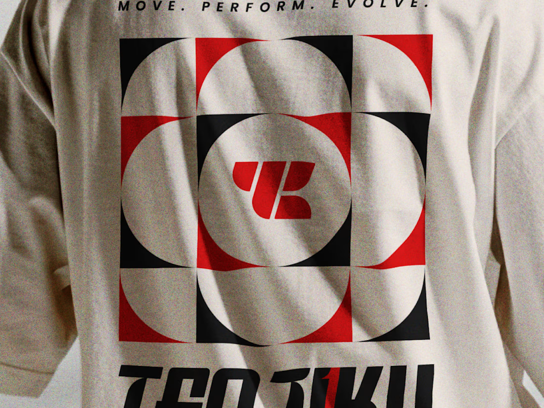
Indian spirituality × Japanese minimalism × personality-driven clothing.
That’s Tenjiku.
But getting this combination right wasn’t as simple as putting three ideas together. We started with research digging into what Tenjiku means, where the name comes from, its cultural roots, and how those ideas could shape a visual identity without feeling forced or predictable.
From that research came the logo, typography, symbols, and the overall visual language.
Every element has a reason behind it.
The logo is only the final result. The interesting part is how we got there.
We’ve documented the whole thinking & design process on Behance.
Go check out the story behind Tenjiku

The research showing through the design is what makes this work. Love the Indian x Japanese balance - not easy to pull off but you nailed it.