The network for creativity
Join 1.25M professional creatives like you
Connect with clients, get discovered, and run your business 100% commission-free
Creatives on Contra have earned over $150M and we are just getting started
Back to feedPost
Hello friends 👋
I wanted to share a project I wrapped up recently that I’m genuinely proud of, would love to hear your thoughts!
Client Work // Carinspect
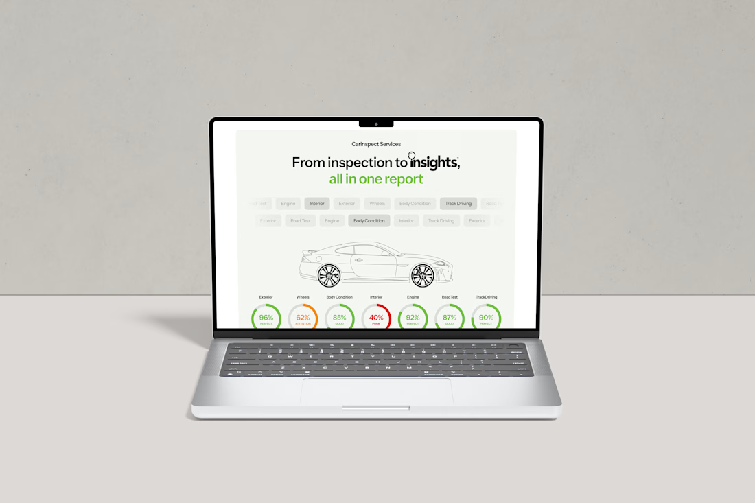
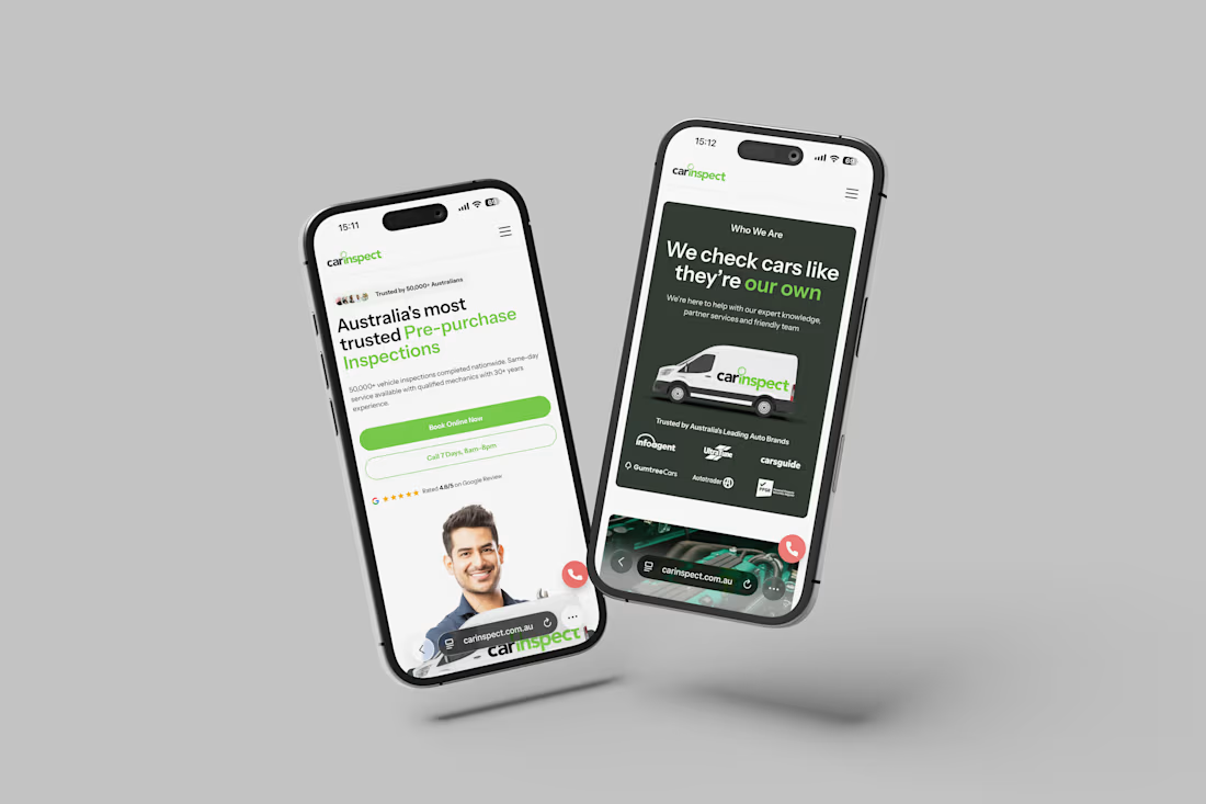
Carinspect is a national leader in vehicle inspections across Australia. The goal was to modernise the site, build confidence, and make booking feel effortless - especially on mobile, where most users convert.
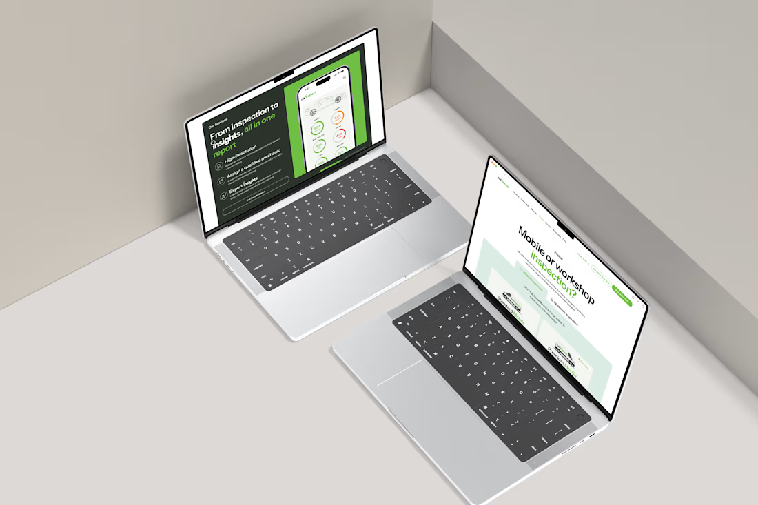
The project covered research, design, and development. The design was created in Figma, balancing credibility with a clean automotive aesthetic and strong trust signals throughout.
Webflow was our platform of choice with performance, responsiveness, and SEO in mind. A structured CMS gives the team full control over location pages and inspection reports.
Big thanks to Zasch at Carinspect for a great collaboration.
Got a website project coming up in 2026? Let’s chat!



Great and very clean design. Well done! 🔥


Thanks Amanuel, Carinspect was a real success!

Looks so good Matthew!!!
Thank you Ellie, more to come!


Nice work! Clean UI and very responsive for desktop and mobile.
Sharing the website here incase anybody wants to see the live webpage: https://www.carinspect.com.au/

carinspect.com.au
Pre-purchase Car Inspections | Vehicle Inspections | Carinspect
Australia’s most trusted pre-purchase car inspections. Expert onsite and mobile inspections so you do not buy a lemon. Book online today.
Thanks Yanis!
Yeah great point I appreciate you sharing the link. I also have a full project on my profile for anyone who would like more detail 🙂


National leaders should do custom photography...


@Matthew Shillings this is some really neat work, love it!
Thanks you @Angad Singh! Much more to come 😃

Well done! Great job
Thanks!

Amazing work @Matthew Shillings
🙌 🙌 🙌 Thanks!

Strong color choices and a clean layout make the product stand out.
I agree, having such a bright brand colour can sometimes be difficult to incorporate but here it works so well!

Love it! Super clean and sleek!

This is actually Clean, sophisticated, and highly functional design 🙌
Thanks so much! This was the intention and goal all along, thanks for your thoughts!

This is nice


Love it!
quick q: is this with iPhone animation mockups or do you also animate it?
Thanks! These we all mockups I edited myself 😃
The network for creativity
Join 1.25M professional creatives like you
Connect with clients, get discovered, and run your business 100% commission-free
Creatives on Contra have earned over $150M and we are just getting started
Challenges
View all


Related posts


A look at the identity I’ve been working on for Sync, a car rental platform in Greece.
You pick the car you want and a local provider brings it to you. Pretty good starting point.
The goal was to give them a brand that could sit comfortably next to the big rental companies and still feel like people you’d actually want to rent from.
I kept their pink and built the layouts around a shape inspired by a car’s side mirror with real cars and Greek scenery inside it.
Big Greek headlines, plenty of space and a system their team can keep easily.

Impressive work, colors are great in use.
A look at the identity we designed for Vetti, a dog health monitoring brand.
There’s a lot of data behind a product like this but the person using it just wants to know their dog is okay.
That’s the balance in the design with a connected dot system that feels precise and warm colors and photography that keep it close to what people care about.
Also, an excellent excuse to spend far too long choosing dog photos.


Engaging website for a New York–based architecture and construction studio, balancing bold typography, immersive imagery and a minimal editorial layout.


