The network for creativity
Join 1.25M professional creatives like you
Connect with clients, get discovered, and run your business 100% commission-free
Creatives on Contra have earned over $150M and we are just getting started
Back to feedPost
Taste Test

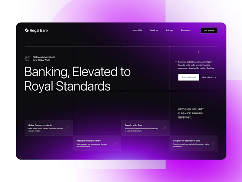
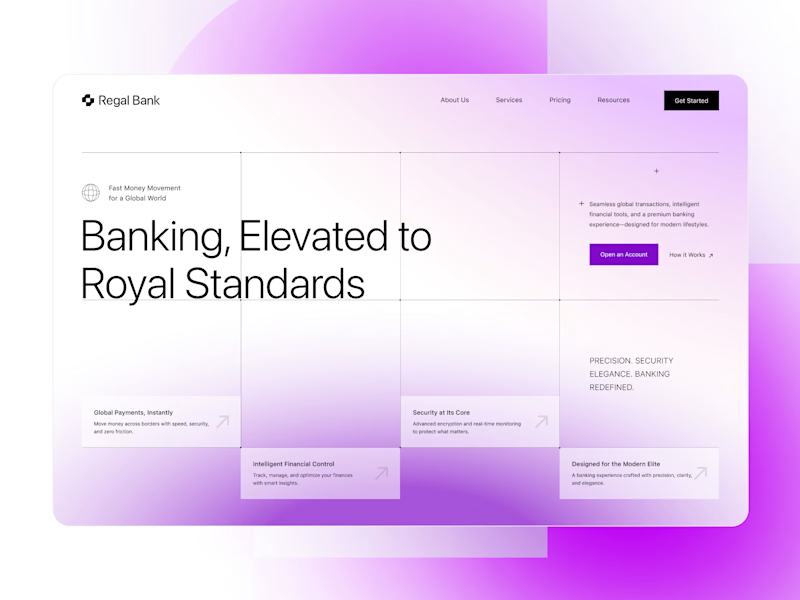
Which direction feels more premium and trustworthy for a modern digital bank - DARK or LIGHT?
48 votes
Ends in 16h

I prefer the dark one. But both of them are amazing

Dark adds more sense of security
I also posted an A/B poll, would love to see which one you'd pick 😊

Awesome look !

Light one!

Definitely dark. The purple glow works so well with the darker background. 🔥

Both are amazing.

Awesome look !


Dark looks really good, however the purple color is not giving a safe or secure feeling for a banking website I suggest to use blue color instead
You did the right decision then Also really nice designs Kiran. Enhance mockups look awesome

Dark all the way


it's not about light/dark, but clear visual, hierarchy, easy UI for user...without flashing their eye

both looks awesome, dark theme always looks best, but here you did very good with light theme too, will go light theme for efforts

Dark is amazing

Great typography, color and composition!

Dark!

Dark for me. Royal Standards needs to feel exclusive, and the light version reads closer to a generic banking app than a premium one.

Dark looks great

Going with dark mode
The network for creativity
Join 1.25M professional creatives like you
Connect with clients, get discovered, and run your business 100% commission-free
Creatives on Contra have earned over $150M and we are just getting started
Trending
retrofuturism
Share your favorite designs from the past exploring the distant future. Or your own take on the aesthetic 🚀
halftone
Dots. Texture. Grain. Let's see your designs using the halftone technique.

Midjourney
Creatives are showing off what they're making with Midjourney.
colorgrade
Video editors sound off: How do you enhance the mood of your video in color grading?
Related posts

Created two Jitter presentations for my work showcase. Which one do you prefer?

29 voted
45%
36 voted
55%
65 votes
Closed

1 is also god, but 2 has that scroll stopping aesthetic!!

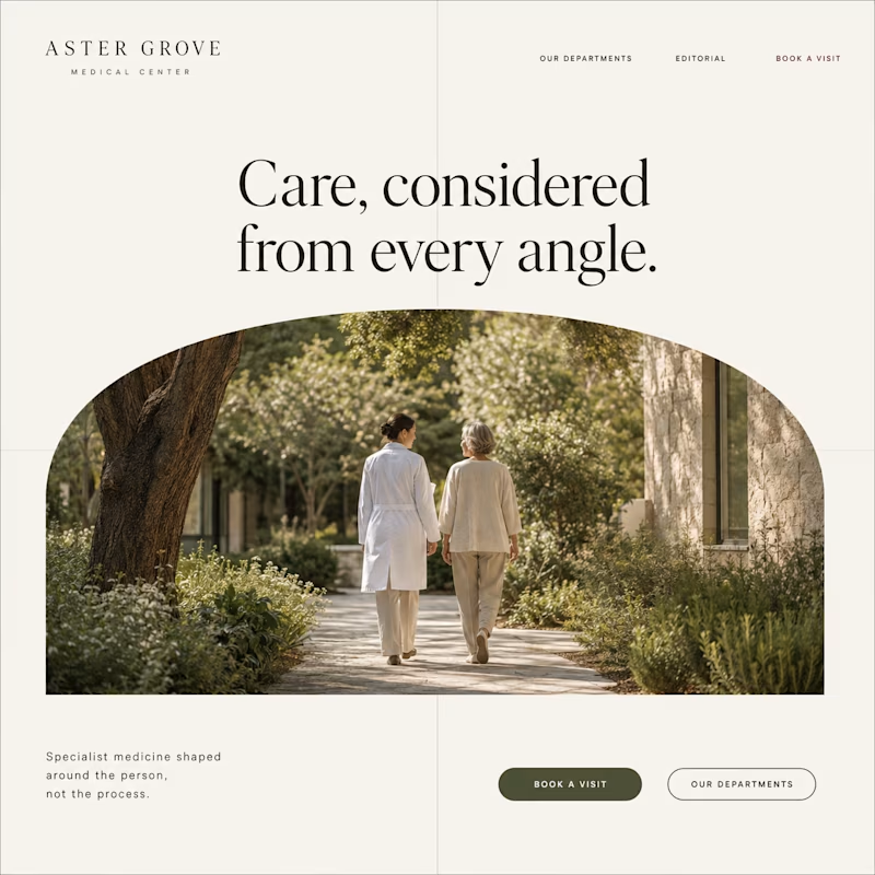
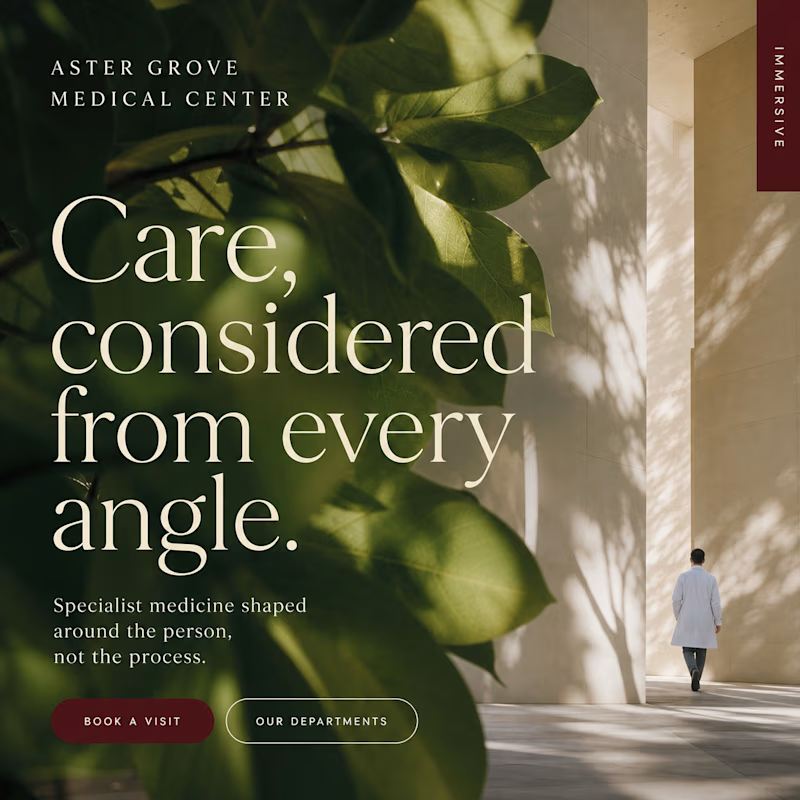
I’ve been looking at these two hospital homepage directions for too long, so I’ll let you decide.
Same brand. Same message. Two different approaches.
Which hero feels stronger?

25 voted
57%
19 voted
43%
44 votes
Closed

i love option two, though i think it could be even more impactful if a pair was pictured walking together where you have a singular figure right now. something about the natural greens make the text pop!

Help me pick the cover 👀 1 or 2?
Finally getting around to sharing my case study after a little too long. I’ve narrowed the cover down to these two, but I’m stuck.
Which one would make you click? 👇

2 voted
9%
21 voted
91%
23 votes
Closed

1 for sure