The network for creativity
Join 1.25M professional creatives like you
Connect with clients, get discovered, and run your business 100% commission-free
Creatives on Contra have earned over $150M and we are just getting started
Back to feedPost
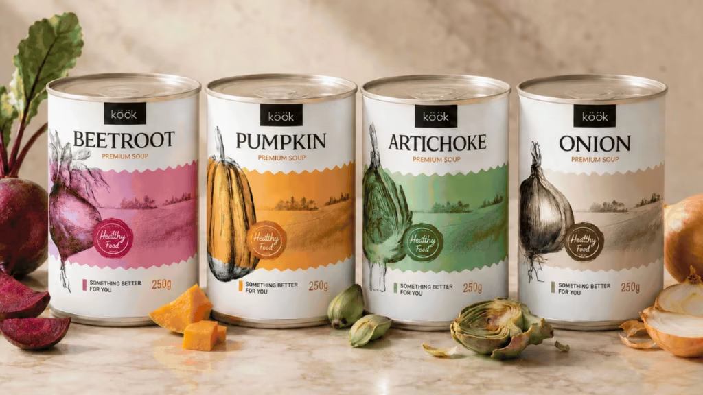
Sharing KÖÖK, a vegetable soup brand I worked on for a client in Portland.
The idea was to bring the warmth of homemade soup into a canned range. I put the vegetables at the center of the packaging, using botanical illustrations and a different color for each recipe. Something traditional, but still modern.
I’m curious! Do you still associate canned soup with being unhealthy, or has that perception changed for you?


Thank you! Really glad you like it

Nice work!
Thank you so much!
The network for creativity
Join 1.25M professional creatives like you
Connect with clients, get discovered, and run your business 100% commission-free
Creatives on Contra have earned over $150M and we are just getting started





Related posts

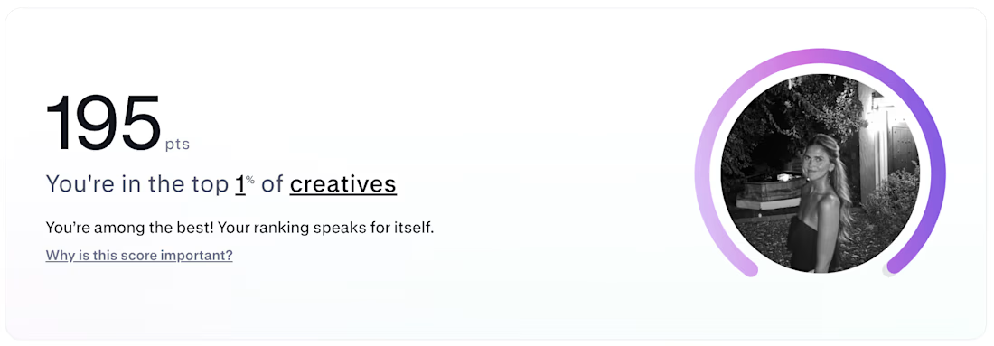
Top 1% of creatives on Contra with a 195 score 🎉 What I'm most excited about is who's showing up because of it: new clients, designers, new conversations, projects I wouldn't have found on my own. Grateful, and ready for more.


Huge congrats! 🎉 Top 1% is an incredible milestone.

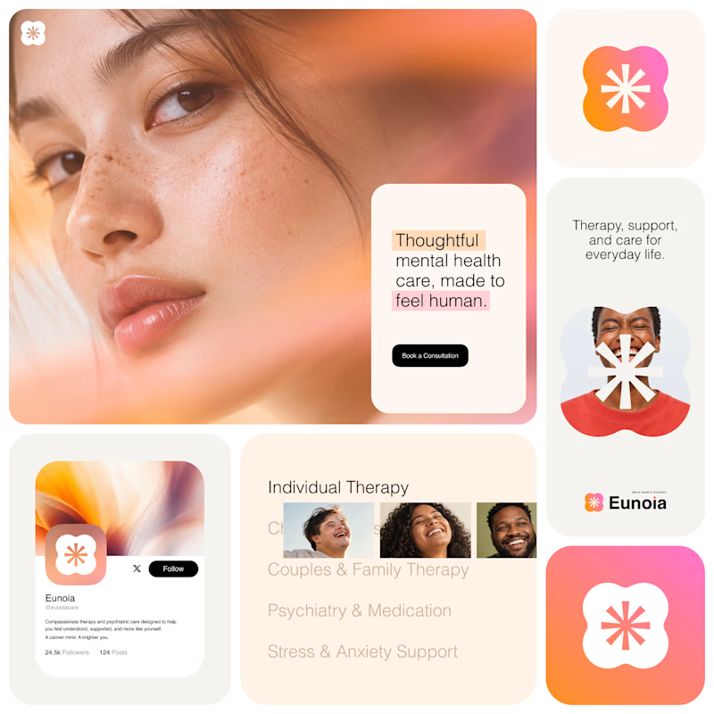
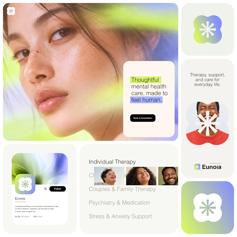
Exploring two visual directions for Eunoia, a mental health & psychiatry brand.
Direction 01 - Warm peach, orange and soft pink tones for a calm, human and comforting feel.
Direction 02 - Lime and periwinkle tones for a fresher, more optimistic and contemporary expression.
Same brand system. Different emotional energy.
32 voted
52%
29 voted
48%
61 votes
Closed

That's impactful, love to see fresh styles


pure eye candy 😍