The network for creativity
Join 1.25M professional creatives like you
Connect with clients, get discovered, and run your business 100% commission-free
Creatives on Contra have earned over $150M and we are just getting started
Back to feedPost

Remote Work Hub Zimbabwe | Brand Identity
I'm excited to share the brand identity I designed for Remote Work Hub Zimbabwe, a project dedicated to connecting Zimbabweans with remote jobs, freelance opportunities, career resources, and digital skills.
The objective was to create a clean, modern, and versatile identity that reflects:
🌍 Global connectivity
💻 Remote work and technology
🤝 Opportunity and growth
🔵 Trust and professionalism
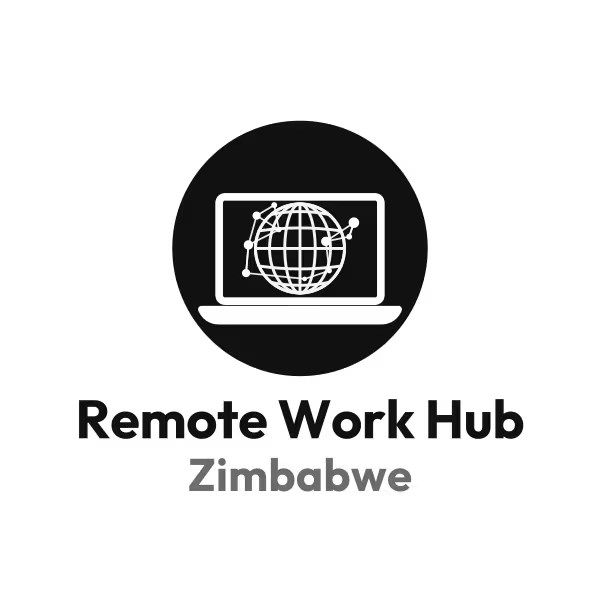
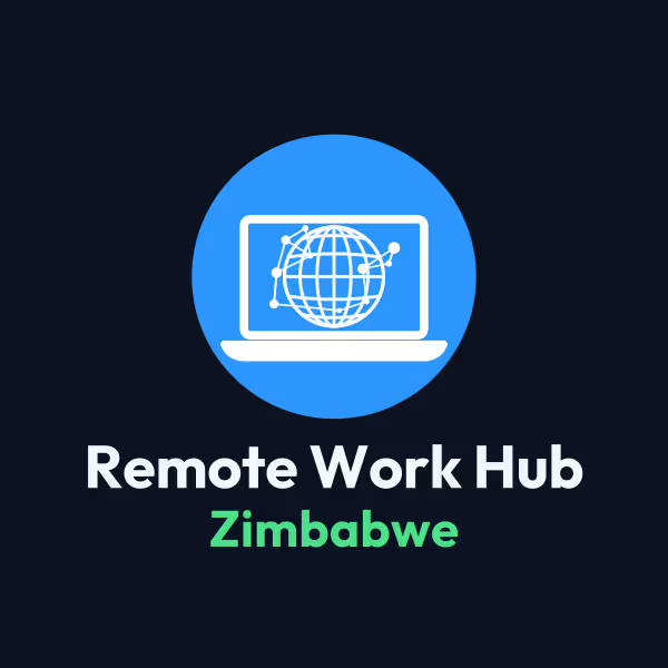
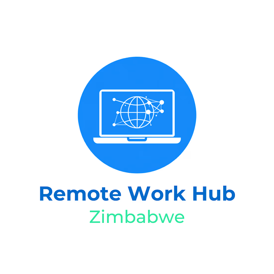
The logo combines a laptop, a connected globe, and network elements to symbolize the digital world and the opportunities made possible through remote work.
To ensure the brand is adaptable across different platforms and use cases, I also designed:
Primary full-color logo
Dark mode version
Monochrome version
Designed entirely in Figma, this identity is built to scale across social media, websites, presentations, and future marketing materials.
This is the first step in building the visual identity for a platform that aims to empower Zimbabweans to access opportunities in the global digital economy.
I'd love to hear your feedback!

The network for creativity
Join 1.25M professional creatives like you
Connect with clients, get discovered, and run your business 100% commission-free
Creatives on Contra have earned over $150M and we are just getting started




Related posts

What should a creative agency website actually feel like?
For Orvika, we didn't want another agency site built around the same safe layouts and predictable sections.
We pushed the visual direction further with oversized typography, editorial layouts, bold imagery, and stronger contrast, while keeping the experience structured enough to communicate the agency's work and capabilities clearly.
The goal wasn't just to make it look different.
It was to make the agency feel different.
Designed in Figma and built in Framer.
We're sharing more of the websites and digital experiences we've been working on here over the next few weeks.



Very neat man

Logo Suite designed for Annie Bakery — a local bread bakery.
©2026
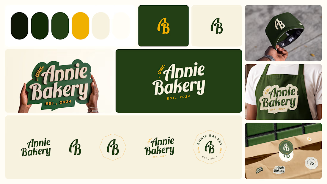

The suite holds together because the script wordmark, the AB monogram, and the round badge all carry the same wheat detail, so it reads as Annie Bakery whether on a storefront or shrunk onto a cap. The dark green with mustard is also a warm artisan pairing that dodges the usual beige bakery cliche.

Some more Midjourney backgrounds.