The network for creativity
Join 1.25M professional creatives like you
Connect with clients, get discovered, and run your business 100% commission-free
Creatives on Contra have earned over $150M and we are just getting started
Back to feedPost

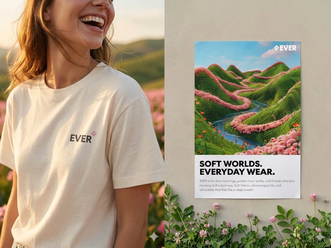
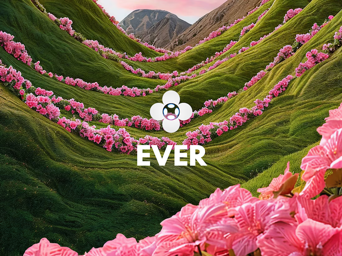
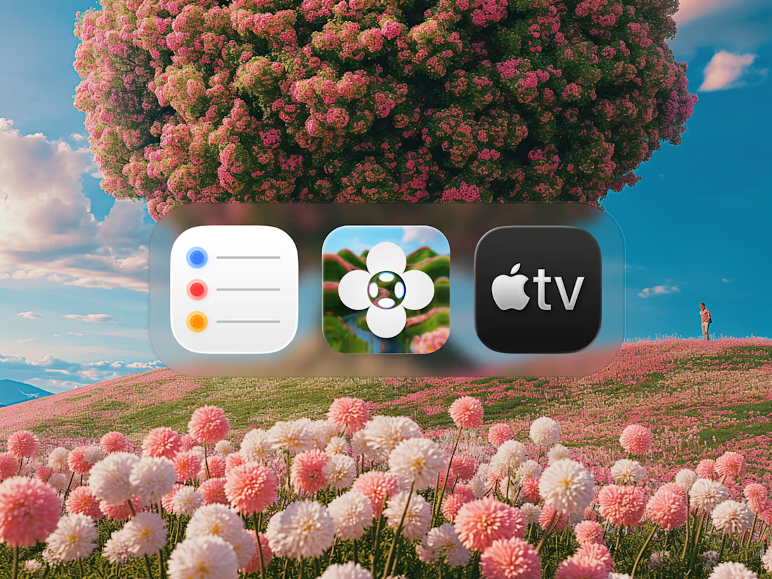
Just published our latest work for Quorum!👋
A fresh visual direction, built around the same UI language as the product.
What do you think? 👀
Check it out!


Looks cool!🤩

Amazing work mate
🤩

looks great
thank you!


I like how the website feels connected to the product instead of like a separate brand.
thank you mate 🙌


There's a self selection benefit here too. showing the real interface upfront means the people who convert already know roughly what they are walking into. less mismatch between what sold them & what they open on day one which usually shows up later as lower churn
thank you for the comment, yes the intention of showing the real interface to make the visitor understand what will they get if they use the platform
Makes sense. that kind of transparency tends to pay off longer term even if it feels riskier upfront.

Love how the UI language seamlessly ties in with the product—did you face any challenges in maintaining consistency across the design?

perfect visual
The network for creativity
Join 1.25M professional creatives like you
Connect with clients, get discovered, and run your business 100% commission-free
Creatives on Contra have earned over $150M and we are just getting started
Trending

Claude
Claude has entered the design space. How are you using it?

Contra University
Learn from expert creatives how to earn more using next-gen AI tools.
Brand Design
The best brand designers are on Contra. Scroll to see what's trending in brand design. What are you building?
creativeaiflow
Creative AI workflows are evolving. What tools do you use, and what are their strengths and weaknesses?
freelancerlife
Freelancer life is wins, pivots, and everything in between. What’s yours right now?



Related posts

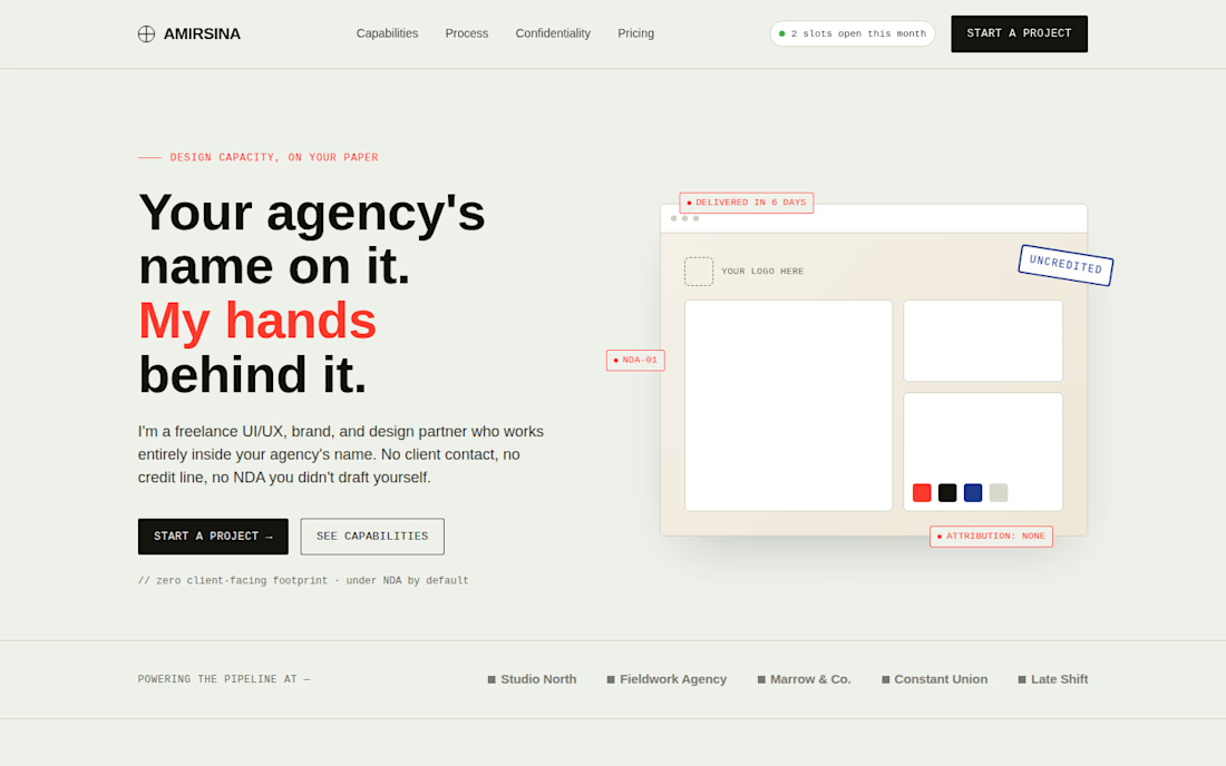
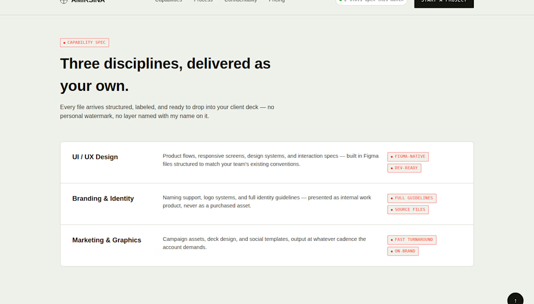
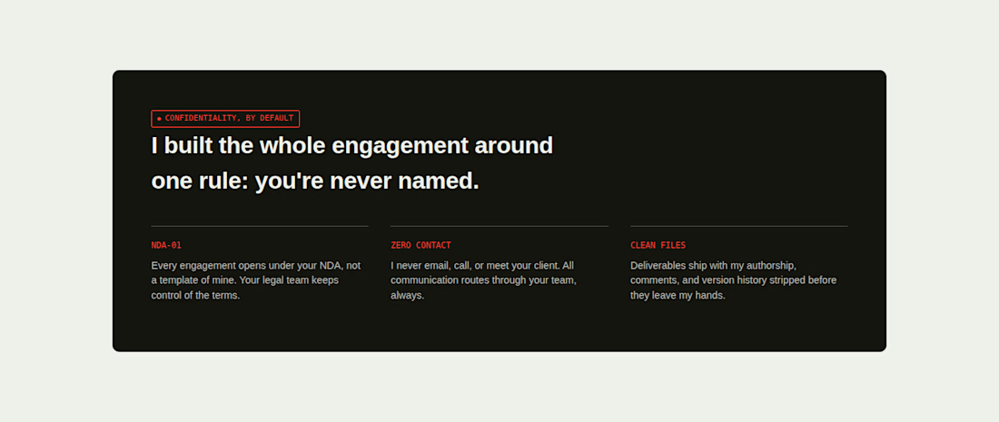
I designed this concept for freelancers who do design work behind an agency's name, the kind of job where your best work never gets your name on it. So instead of a typical portfolio-style landing page, I built the whole thing around that idea: the visual language borrows straight from design redlines — annotation tags, spec callouts, a stamped "uncredited" mark — the same marks designers use to talk to each other, turned into the page's personality.
It's fully interactive: scroll animations, a working contact form, an FAQ accordion, a testimonial carousel, and a hero mockup that tilts as you move your cursor. Built responsive, accessible, and ready to launch.
The goal was simple, make trust and discretion feel like the product, not just a line in the copy.
Tools I utilized Framer, Figma, HTML/CSS/JS



Nice concepts


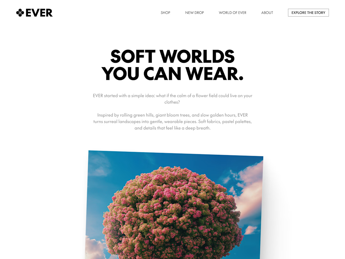

Nice work!

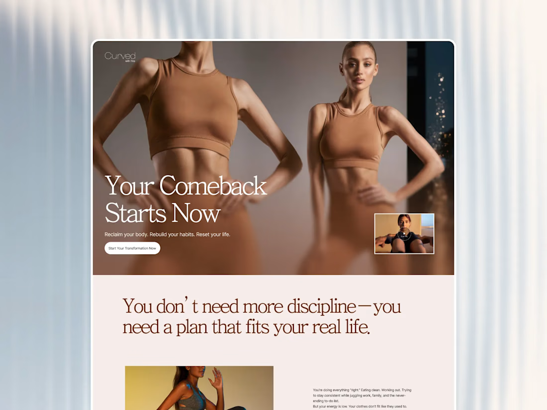
Working on a cocept for health-fitness brand for a client 🔥


Excellent