The network for creativity
Join 1.25M professional creatives like you
Connect with clients, get discovered, and run your business 100% commission-free
Creatives on Contra have earned over $150M and we are just getting started
Back to feedPost

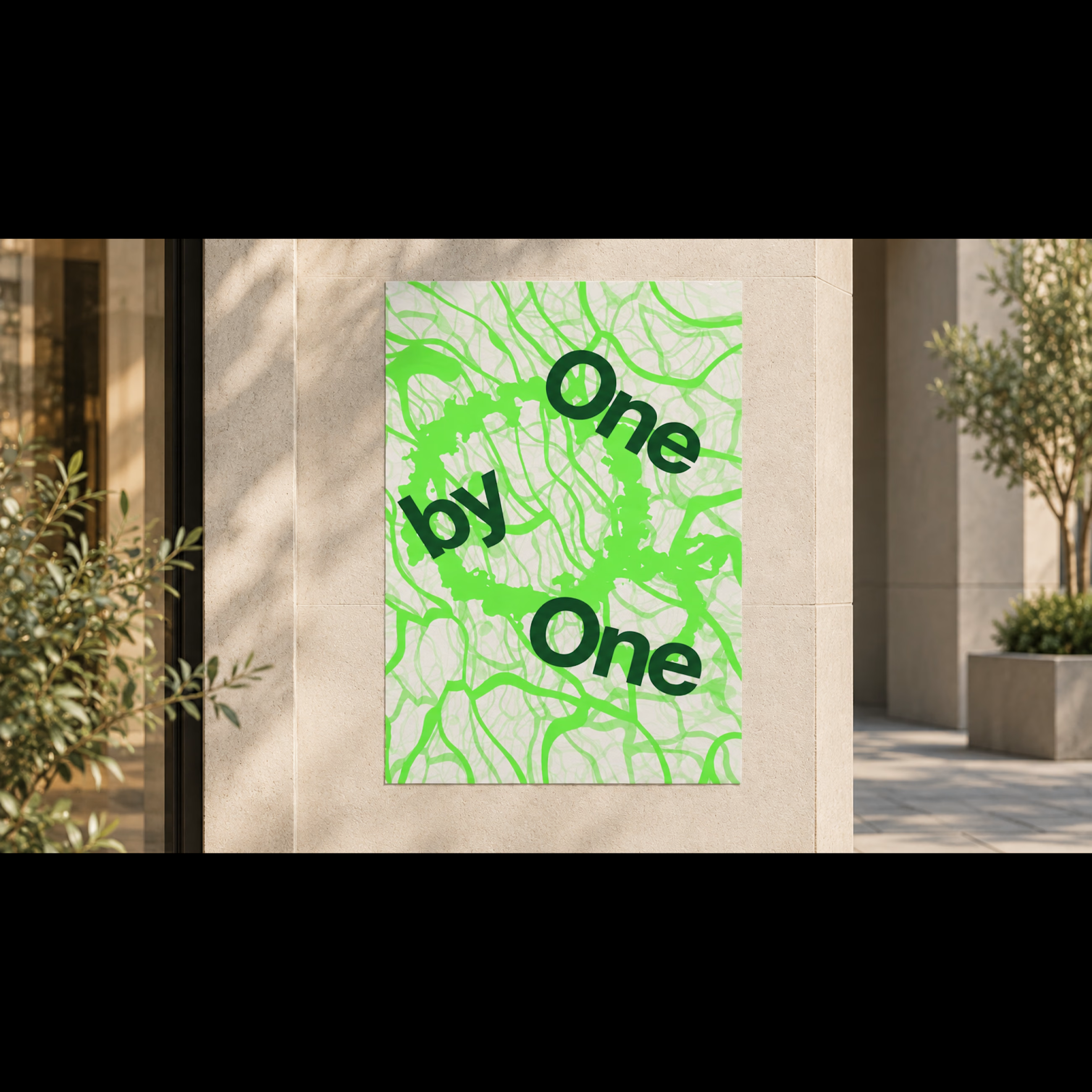
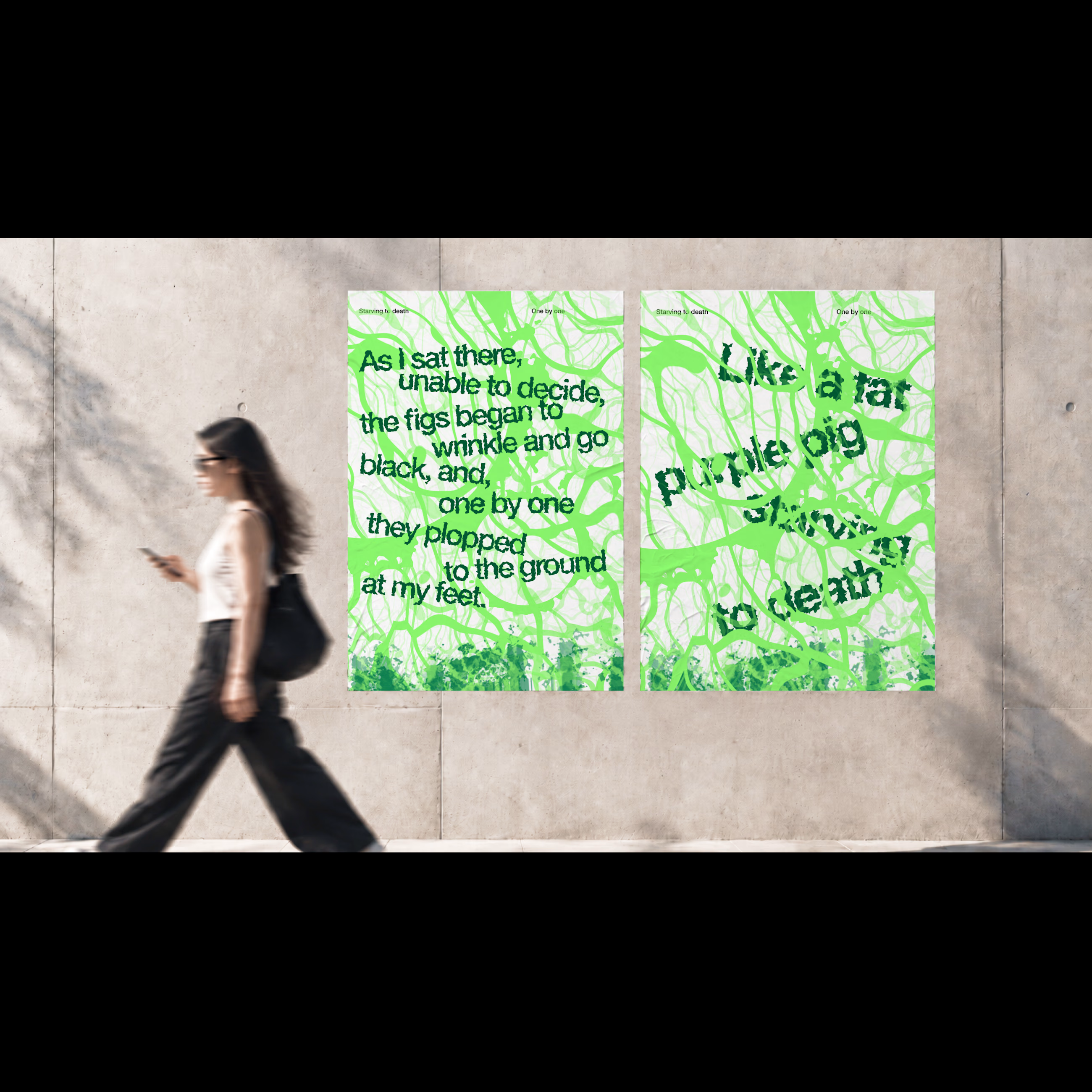
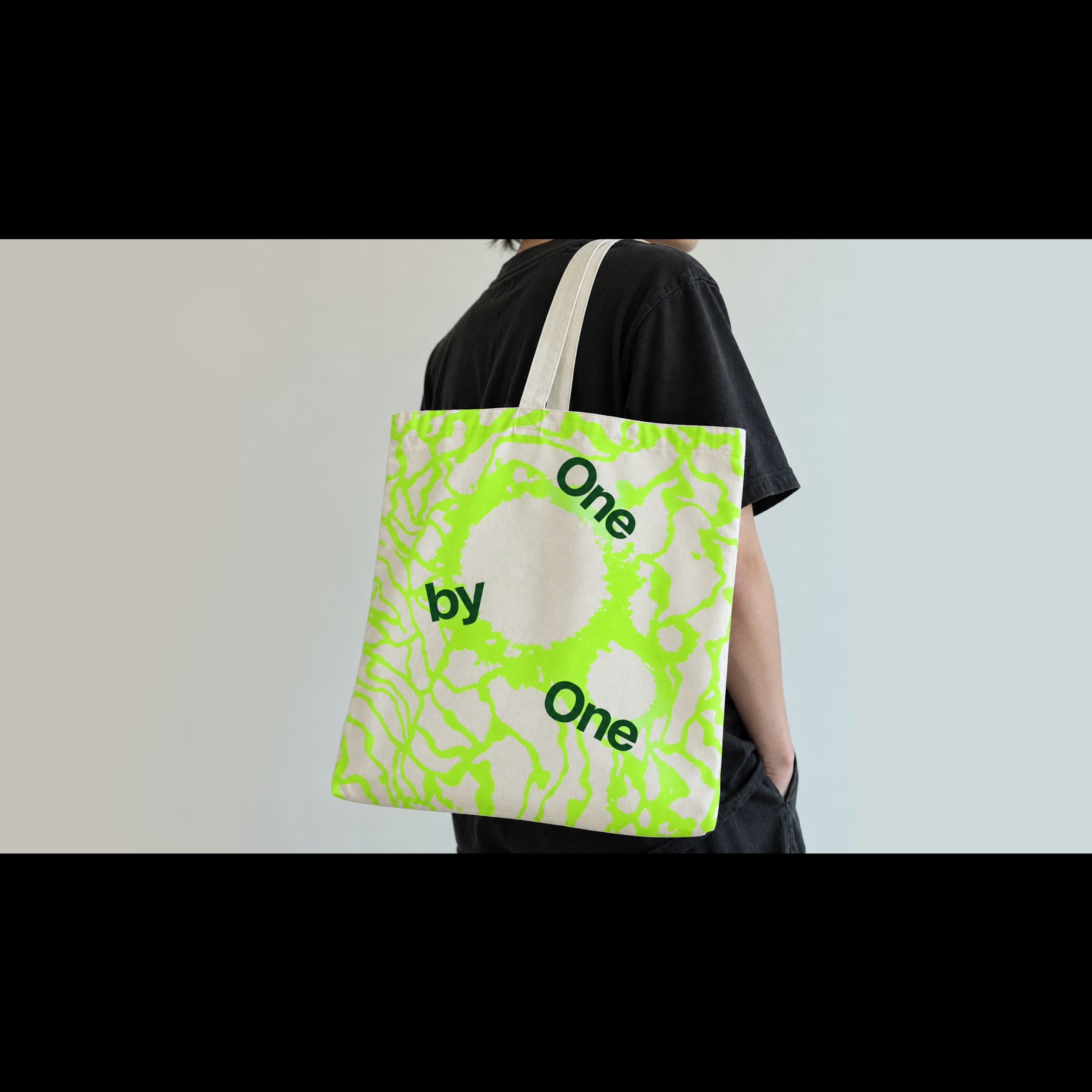
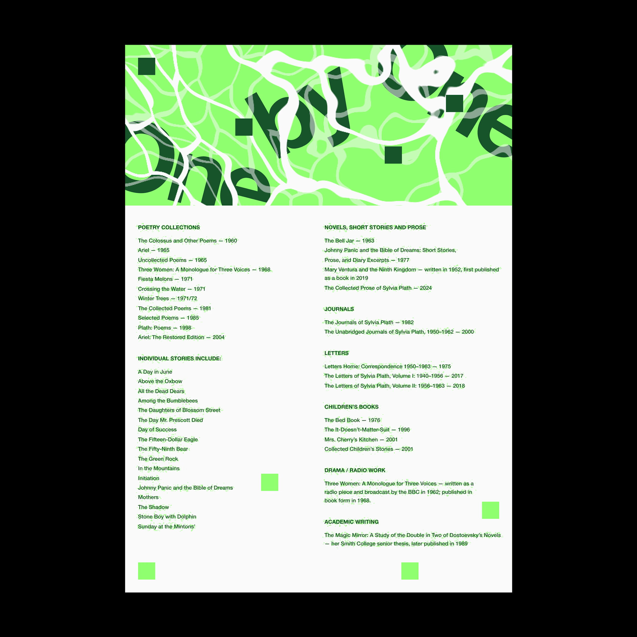
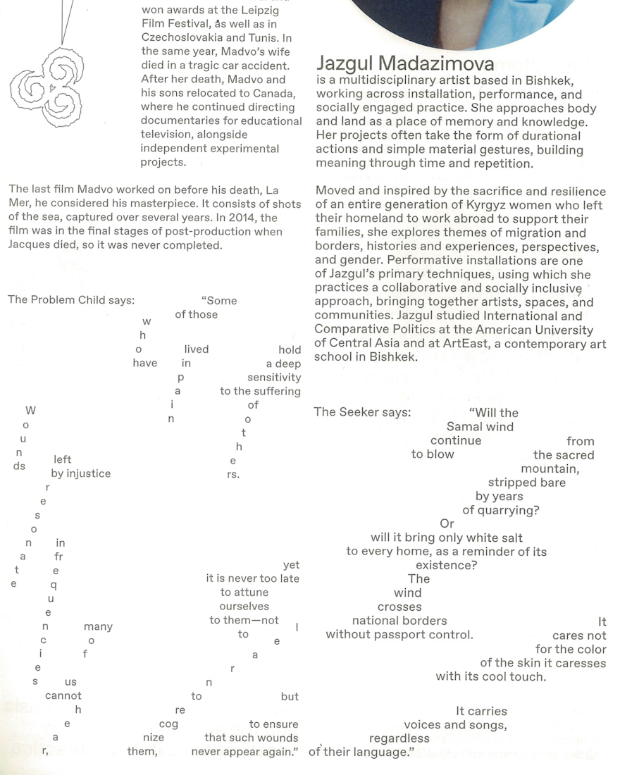
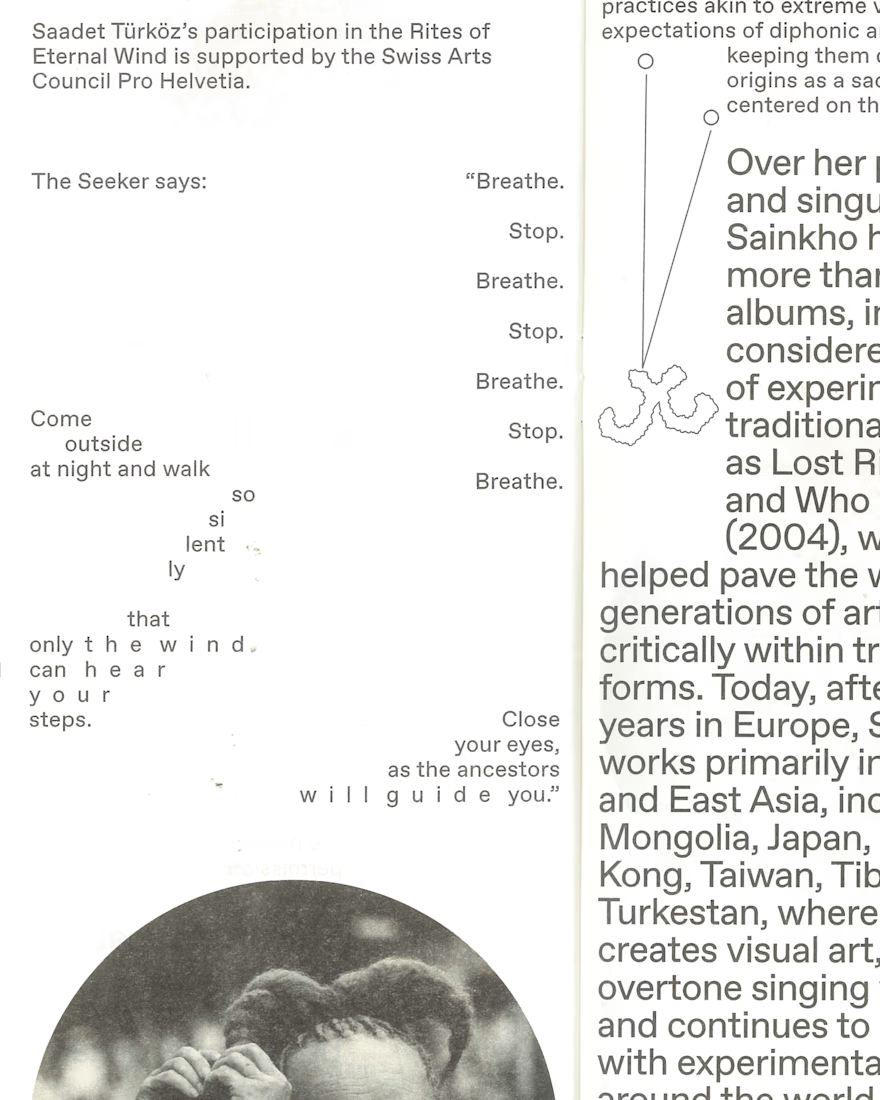
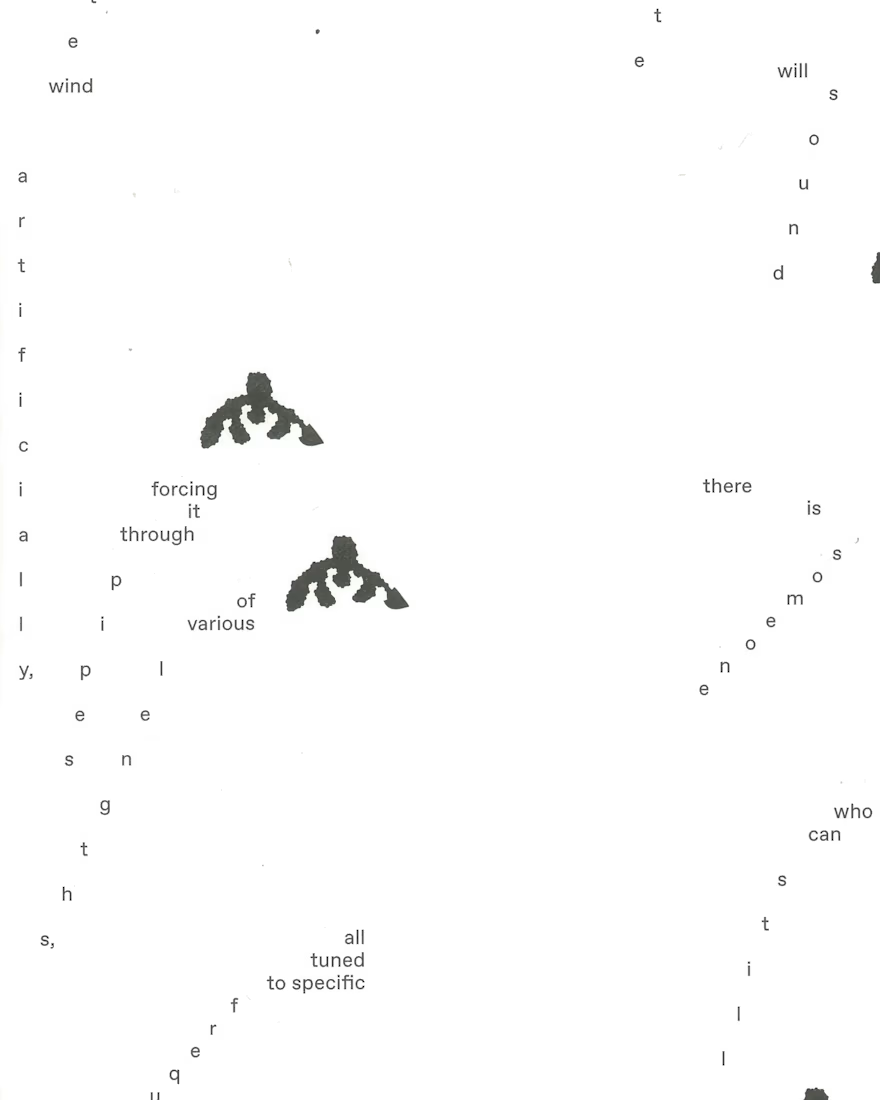
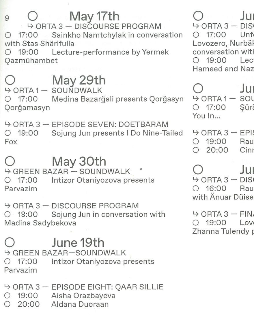
Typography for the Rites of Eternal Wind Sound Triennale

The network for creativity
Join 1.25M professional creatives like you
Connect with clients, get discovered, and run your business 100% commission-free
Creatives on Contra have earned over $150M and we are just getting started
Related posts

what you think of the experimental poster i just made.
A conceptual halloween party "Dress for the dark".
which one should we go for light or dark.
7 voted
50%
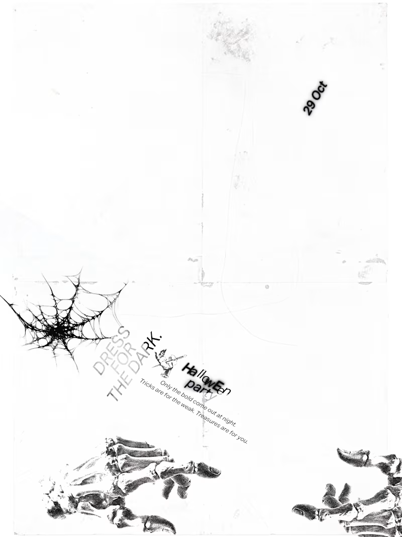
7 voted
50%
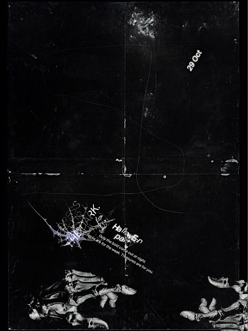
14 votes
Closed

Dark for me. The photocopy grain, cobweb and plant shapes feel like a scratched film print on black, perfect for a party in the dark. Would you bump the small type so it reads from across the room?


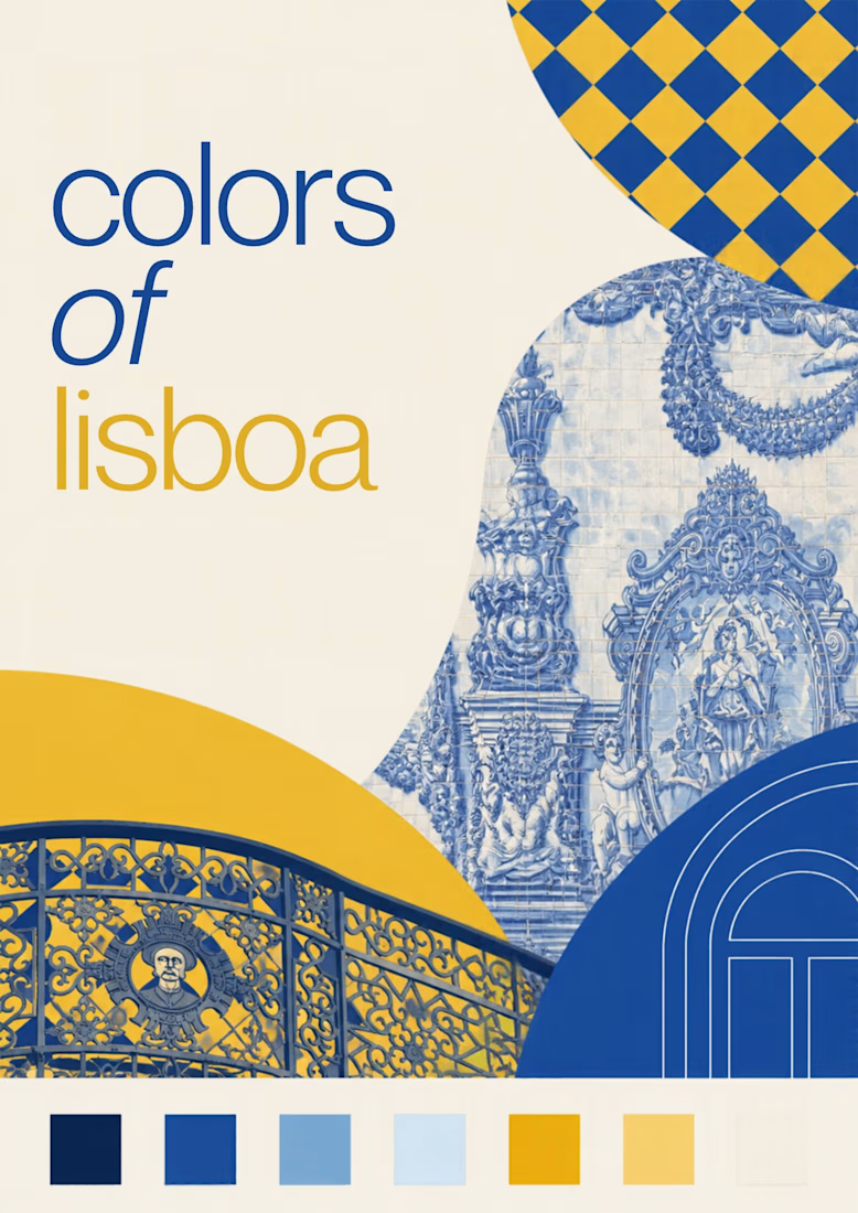
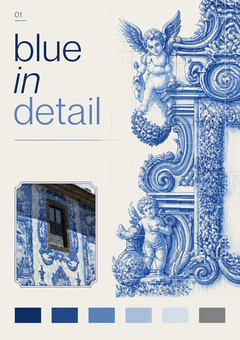
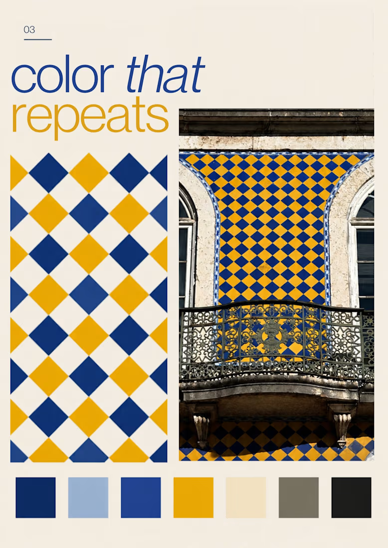
Turning the colors I notice around Lisbon into a series of posters, each inspired by a different photograph.
01 [Blue in Detail] started with the blue Portuguese tiles, exploring their intricate patterns, ceramic tones, and small details.
02 [Color on Repeat] explored the rhythm of blue and yellow tiles, using repetition as the starting point for the design.
I sampled colors from my photographs and used Canva Craft to explore layouts, typography, and graphic elements. Then I refined the designs by hand, adjusting the colors, spacing, and text.


Was playing around with Rogie King's Noise & Texture plugin in Figma and thought it’d be fun to throw in a few excerpts from Sylvia Plath’s The Bell Jar.
One thing led to another, and I ended up with these experiments in typography and texture.
It got me thinking about how texture and typography can do more than just look interesting. They can help communicate the mood and meaning behind the words.
What do you think? Does the chaos add to the story, or get in the way of it?