The network for creativity
Join 1.25M professional creatives like you
Connect with clients, get discovered, and run your business 100% commission-free
Creatives on Contra have earned over $150M and we are just getting started
Back to feedPost



The network for creativity
Join 1.25M professional creatives like you
Connect with clients, get discovered, and run your business 100% commission-free
Creatives on Contra have earned over $150M and we are just getting started





Related posts




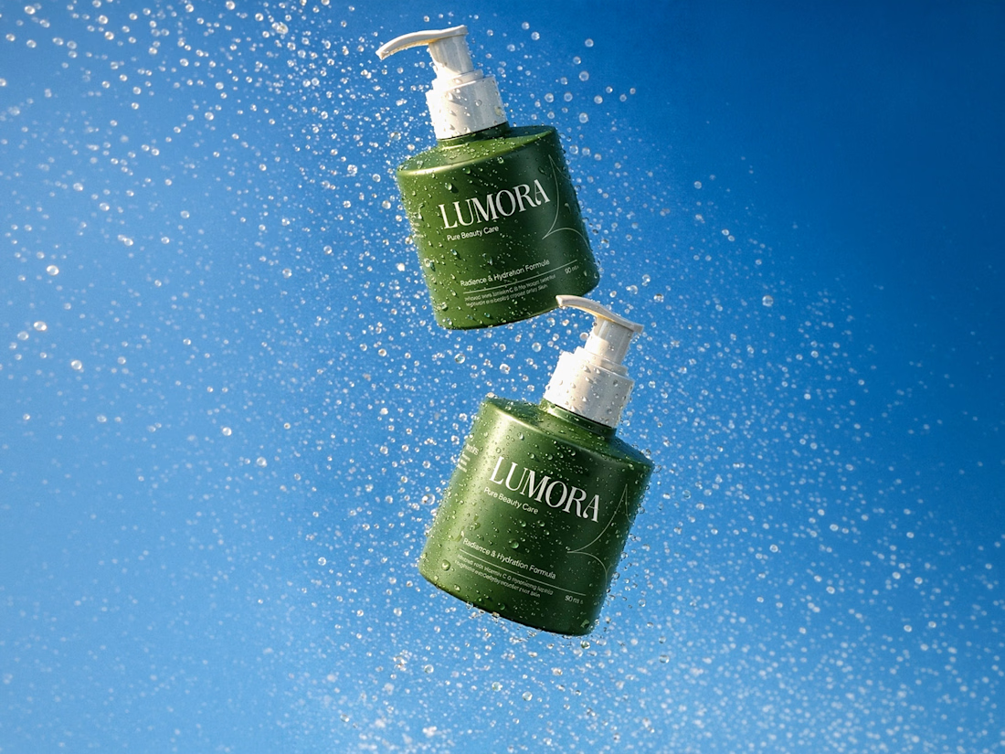

Great work!

Bring back mascot logo's 🙌
Ram logo 'Stagepaid'.

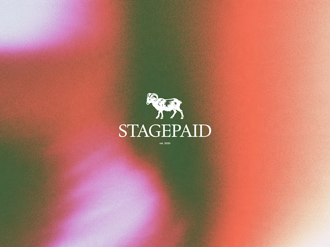


cool work! love mascot logos :D

WOLLSEY - Jewelry for the Bold Ones
Wollsey is a jewelry brand built on one idea: bold jewelry should never blend in.
The identity centers on two interconnected principles; presence and permanence. The symbol takes the form of a solid, self-contained mark: a circular silhouette holding a crown-like negative space at its center, representing a piece of jewelry as an object of its own weight and status, not an accessory borrowed from someone else's trend cycle.
This concept carries through the entire visual system. The custom wordmark is built in a bold, condensed sans — compressed, confident letterforms that read as a stamp rather than a script, echoing the same solidity as the symbol itself.
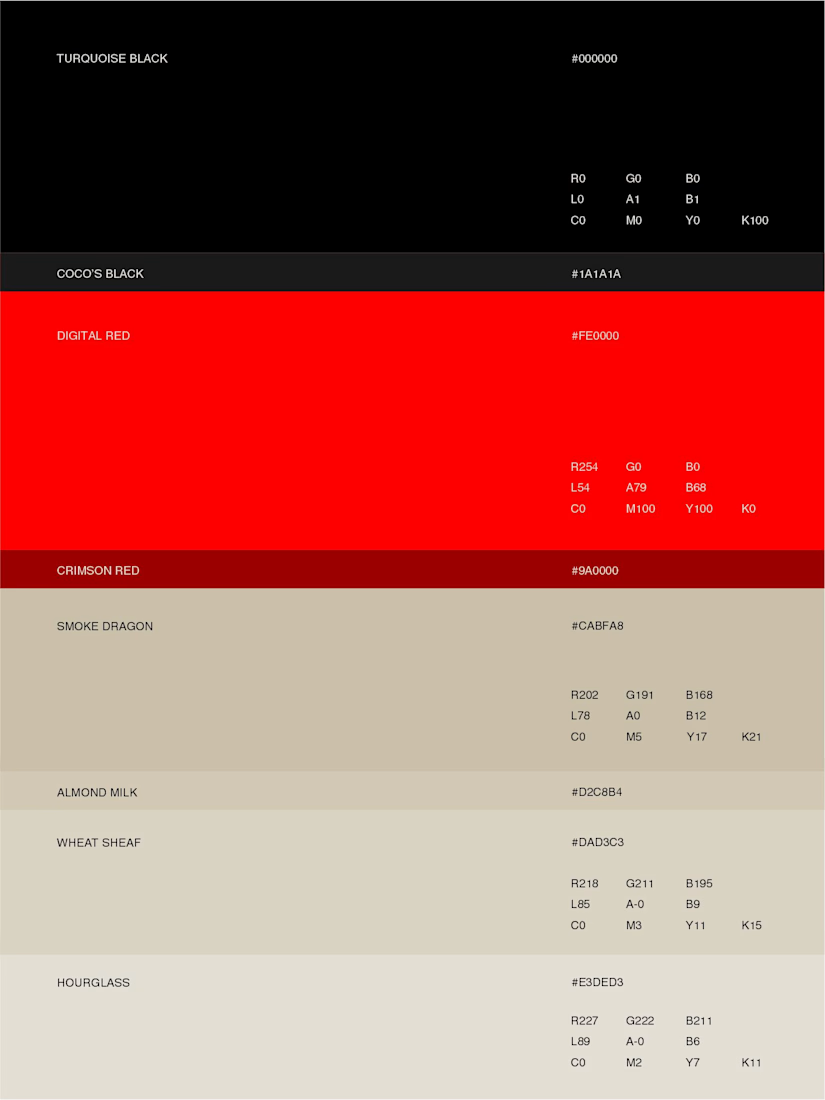
The color palette pairs deep matte black with a controlled, high-impact red, balanced by warm cream and stone tones across packaging and supporting materials — a system built for contrast and attention rather than quiet luxury.
Full casestudy is coming soon
jewelrylogojewelrybrandidentityLogo DesignBrand DesignGraphic DesignAdobe IllustratorAdobe PhotoshopCorelDraw

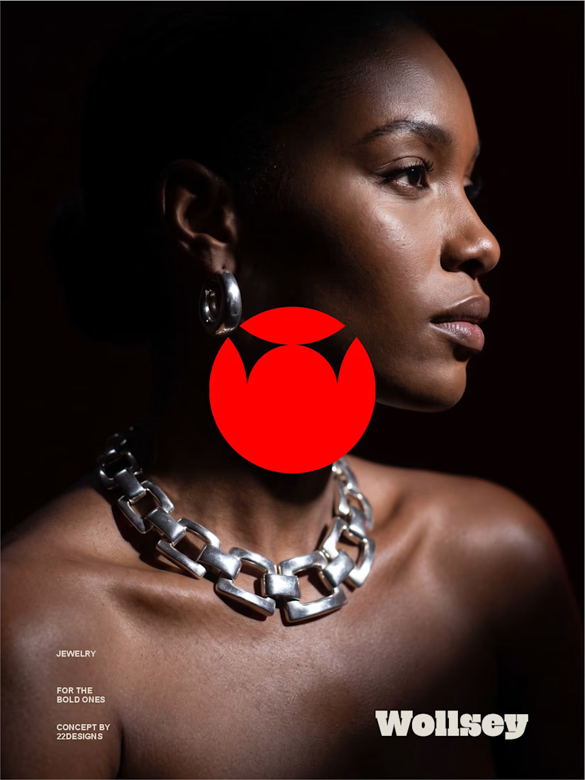
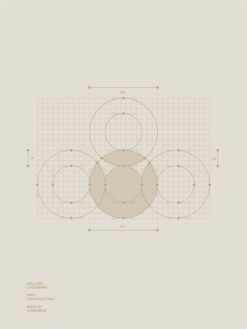
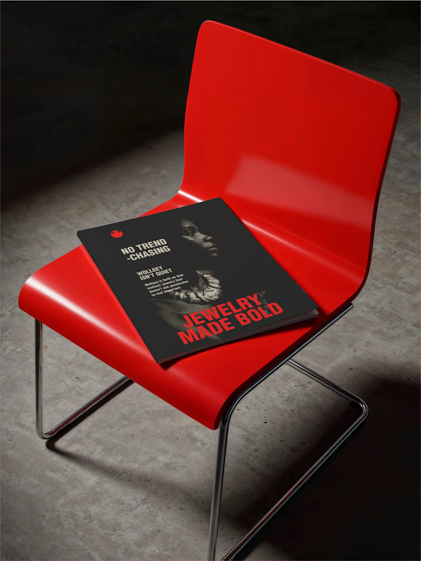

Bold jewelry should never blend in is the perfect one-line brief, and that solid red mark on the chained editorial shot backs it up completely. Jewelry Made Bold on the lookbook ties it all together. Presence and permanence really come through in the whole system.