The network for creativity
Join 1.25M professional creatives like you
Connect with clients, get discovered, and run your business 100% commission-free
Creatives on Contra have earned over $150M and we are just getting started
Back to feedPost

EVERFORM — A Brand Identity Built Around Strength, Wellness & Transformation
Strength is built. Wellness is sustained. Progress never stops.
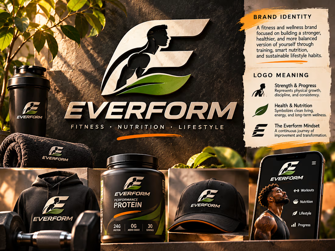
EVERFORM is a self-initiated brand identity concept developed for a contemporary fitness and wellness brand focused on physical strength, balanced nutrition, and sustainable lifestyle improvement.
The project explores how a meaningful visual identity can bring multiple dimensions of wellness together under one recognizable symbol.
Rather than creating a logo that communicates fitness through conventional gym imagery alone, the creative direction combines three connected ideas: physical development, natural wellness, and continuous personal transformation.
The result is a bold, sculptural identity designed to feel powerful, contemporary, and purposeful across fitness apparel, nutritional products, digital experiences, and lifestyle accessories.
Brand Concept & Strategic Direction
EVERFORM represents the idea that personal improvement is an ongoing process rather than a fixed destination.
The name brings together the concepts of ever-evolving and form, reflecting the continuous development of physical strength, healthy routines, and personal well-being.
The brand is positioned around three defining principles:
Strength & Progress: Developing physical capability through consistent training, discipline, and intentional effort.
Health & Nutrition: Supporting performance and long-term wellness through balanced nutrition and sustainable habits.
Continuous Transformation: Embracing gradual improvement and recognizing that meaningful progress develops through consistency.
These principles informed the central logo concept and the broader visual identity.
Logo Design & Symbolism
The logo is the primary visual element of the identity.
Its foundation is a custom sculptural E monogram, created to establish an immediate connection to the EVERFORM name while providing a recognizable symbol that can function independently of the wordmark.
Within the letterform, a stylized athletic human profile communicates strength, movement, and physical development.
The figure represents the brand's commitment to training, discipline, and the pursuit of personal progress.
A flowing green leaf shape is integrated into the lower section of the symbol, introducing the complementary idea of health, nutrition, and natural balance.
The relationship between the athletic figure and organic leaf establishes a visual connection between physical performance and sustainable wellness.
Together, these elements transform the monogram from a decorative initial into a symbol that communicates the brand's underlying philosophy.
The sculptural construction also introduces a sense of momentum, reinforcing the concept of continuous growth and transformation.
Typography & Brand Personality
The EVERFORM wordmark uses bold, angular, contemporary lettering designed to complement the strength of the monogram.
Its forward-leaning proportions and confident letterforms introduce movement, performance, and energy.
The typography is intentionally substantial, creating a visual presence appropriate for athletic apparel, nutritional packaging, and fitness-related branding.
A secondary descriptor—Fitness • Nutrition • Lifestyle—establishes the brand's broader positioning while maintaining a clean and organized hierarchy.
The combination of the expressive monogram and assertive wordmark creates a cohesive identity that feels both athletic and premium.
Color Palette & Visual Language
The visual identity is built around a controlled palette of charcoal black, warm metallic cream, natural green, and energetic orange accents.
Charcoal black establishes strength, confidence, and sophistication.
Metallic cream introduces a premium, sculptural quality that gives the symbol depth and distinction.
Natural green represents health, nutrition, balance, and sustainable living.
Orange accents introduce energy, ambition, and forward momentum.
These colors create a recognizable visual system that can adapt to different brand environments without losing its identity.
The presentation combines rich stone textures, warm natural lighting, and premium product photography-inspired compositions to communicate the brand's lifestyle positioning.
Brand Applications & Identity System
The identity is demonstrated across a selection of realistic brand touchpoints, including athletic apparel, headwear, fitness accessories, nutritional packaging, and a mobile wellness interface.
Each application demonstrates how the symbol remains recognizable across different sizes, surfaces, and materials.
The monogram functions as a standalone brand mark on smaller products, while the complete logo system establishes stronger brand recognition across larger applications.
The nutritional packaging highlights the brand's connection to health and performance, while the apparel and accessories communicate its athletic lifestyle positioning.
The digital interface extends the identity into a contemporary wellness environment, showing how the visual language could support training, nutrition, and progress-related experiences.
Together, these applications establish a cohesive brand world rather than a collection of unrelated mockups.
Creative Execution & Design Outcome
The central objective was to create a logo that communicates meaning before the viewer reads the brand name.
By combining a recognizable letterform with visual references to strength and natural wellness, the identity establishes a clear relationship between the brand's philosophy and its visual expression.
The oversized logo presentation reinforces the importance of the symbol, allowing its structure and meaning to become the focal point of the composition.
Supporting applications demonstrate how the identity can translate across physical and digital environments while maintaining visual consistency.
The completed EVERFORM concept showcases an approach to logo and brand identity design that prioritizes symbolism, recognizable form, strategic thinking, and cohesive visual storytelling.
It demonstrates how a carefully developed visual identity can communicate a brand's values while creating a distinctive and versatile foundation for future brand experiences.
Self-initiated portfolio concept developed to demonstrate logo design, brand identity development, visual symbolism, and creative art direction.


The network for creativity
Join 1.25M professional creatives like you
Connect with clients, get discovered, and run your business 100% commission-free
Creatives on Contra have earned over $150M and we are just getting started
Related posts

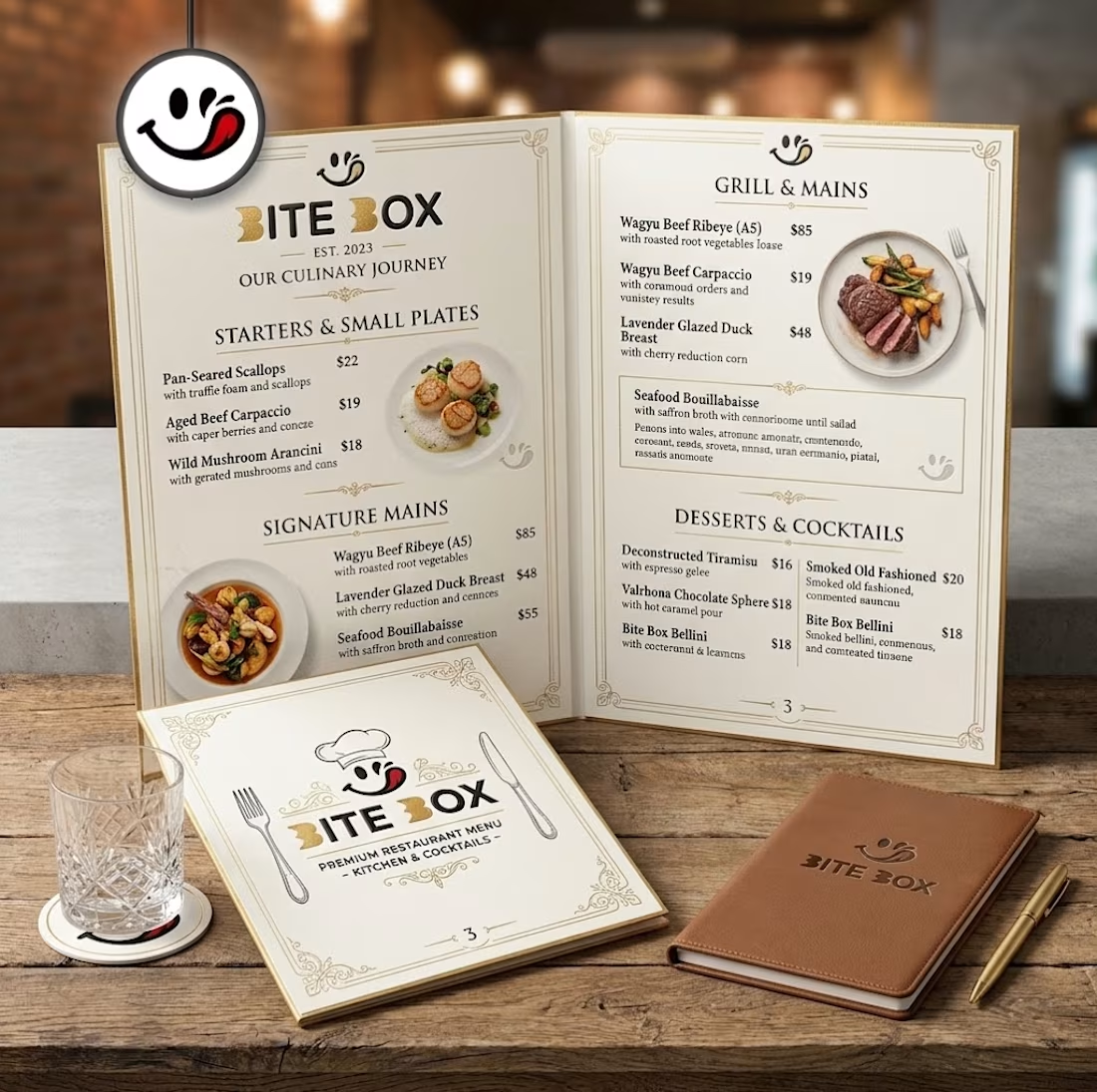
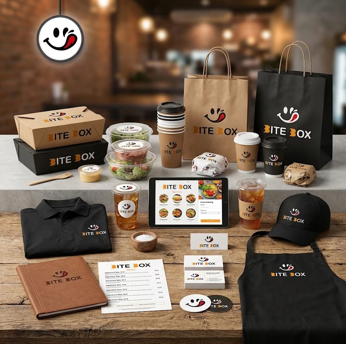
🍔 BITE BOX — Where Every Bite Brings a Smile! 🧡
A fun, fresh, and memorable logo concept designed for a modern fast-food brand. The smile icon represents happiness, while the bold typography creates a friendly and recognizable identity. 🍟✨
#LogoDesign #FoodBranding #GraphicDesign #BrandIdentity #LogoDesigner


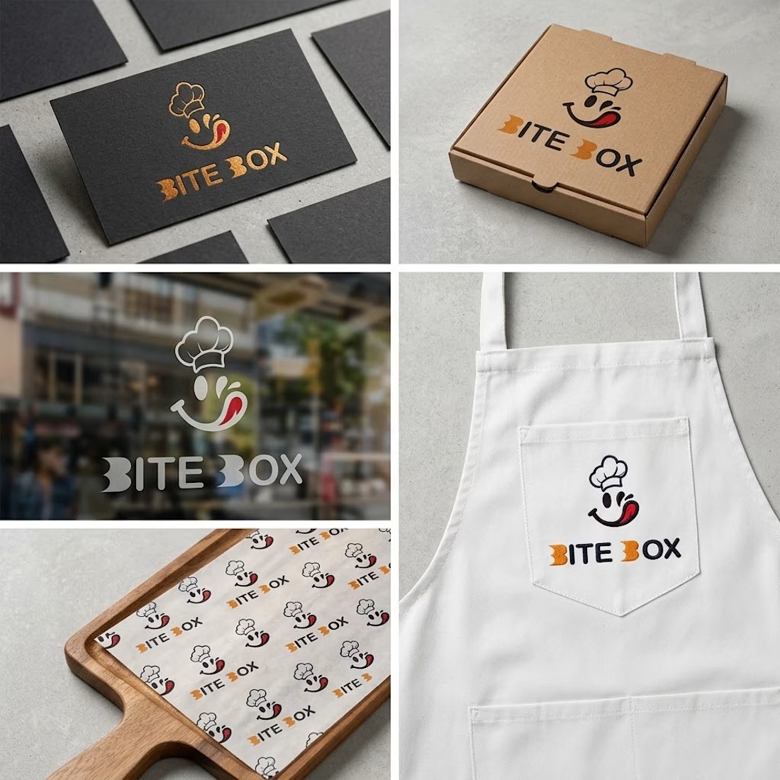
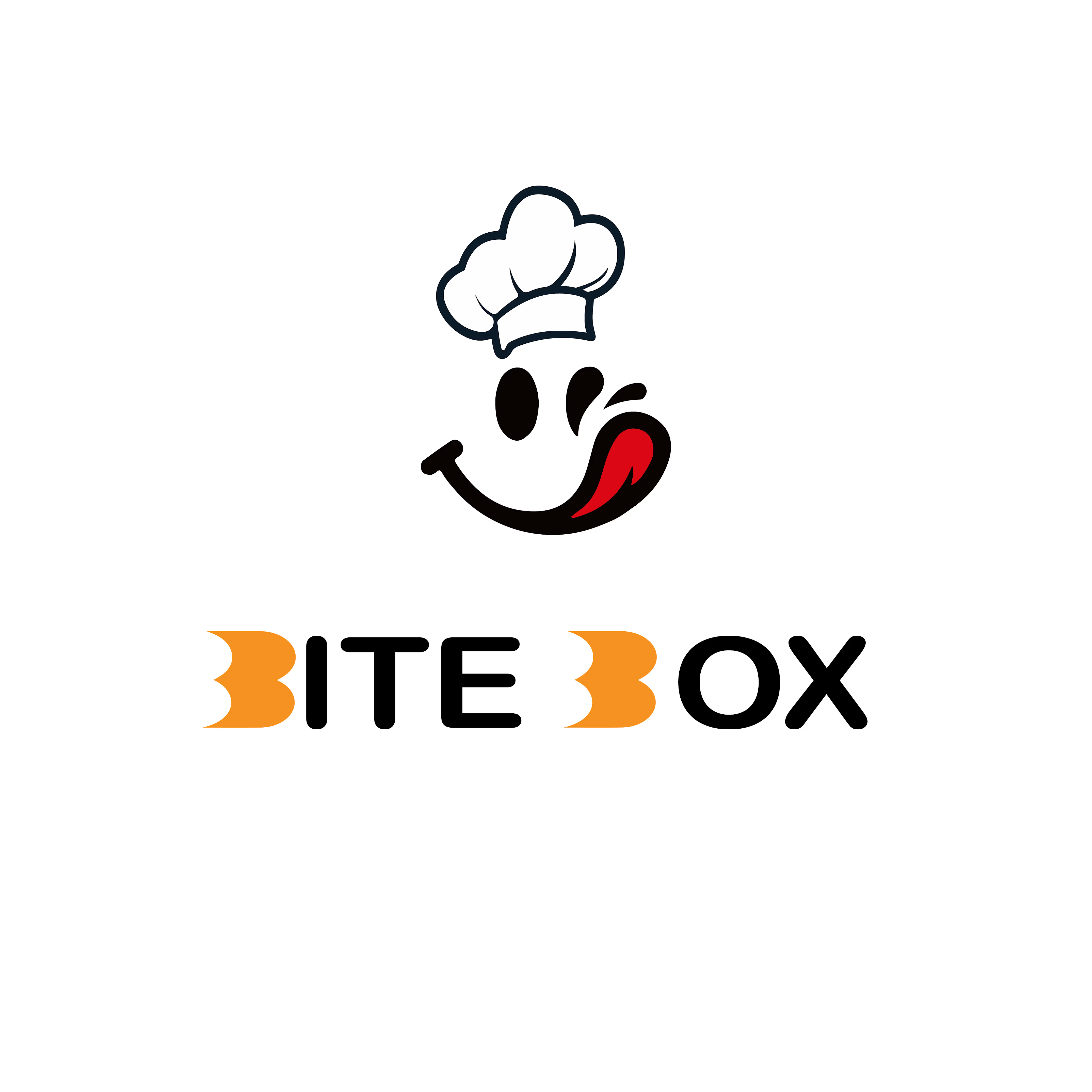


the little chef smile on the box is doing a lot of the work here

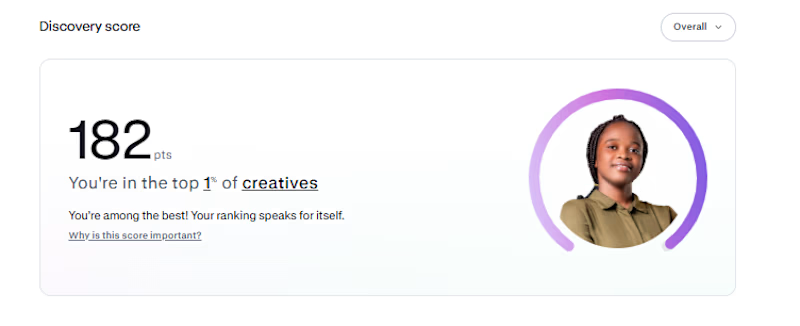
My Contra discovery score is now 182, putting me in the top 1% of creatives.
Funnily enough, I haven't gotten a job on Contra yet. 😂 I'm just here, posting my work, building my portfolio, and hoping the right clients find me
One thing I've learned is that you have to keep showing up, even when the results aren't coming yet.
Hopefully, something good comes out of it...

Congrats buddy

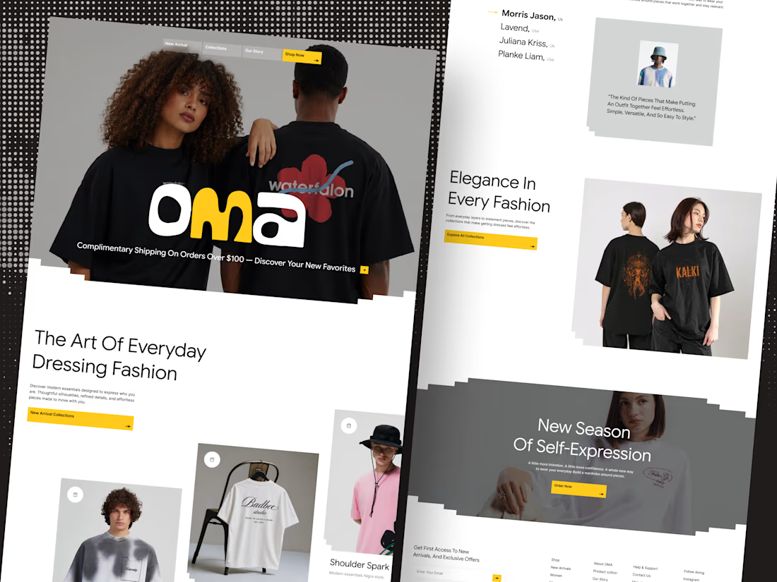
🛍️ Shopify based fashion E-commerce website Landing page
Your fashion brand deserves a storefront that sells style.
Introducing OMA — a modern fashion e-commerce website designed to make every collection stand out.From bold editorial visuals to a clean shopping experience, every detail is crafted to help fashion brands create a stronger first impression and turn browsing into buying.
✨ Premium fashion-focused design
🛒 Conversion-focused shopping experience
🎨 Modern, editorial art direction
📱 Designed for a seamless online shopping journey
Building a fashion brand? Let’s design a storefront your customers will love.
Available for Shopify store design projects and custom e-commerce website design.
💬 DM me to discuss your next project.



Nice work