The network for creativity
Join 1.25M professional creatives like you
Connect with clients, get discovered, and run your business 100% commission-free
Creatives on Contra have earned over $150M and we are just getting started
Back to feedPost


The network for creativity
Join 1.25M professional creatives like you
Connect with clients, get discovered, and run your business 100% commission-free
Creatives on Contra have earned over $150M and we are just getting started


Related posts


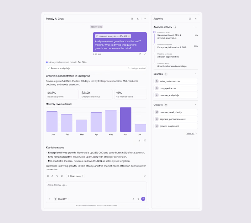
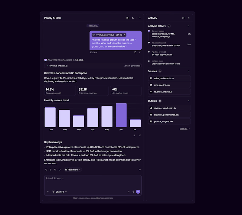

I'd pick Light for an analysis tool, the charts and sources read better on a pale surface and the violet bars still pop. Dark works as the night option. Is the sources panel on the right open by default?

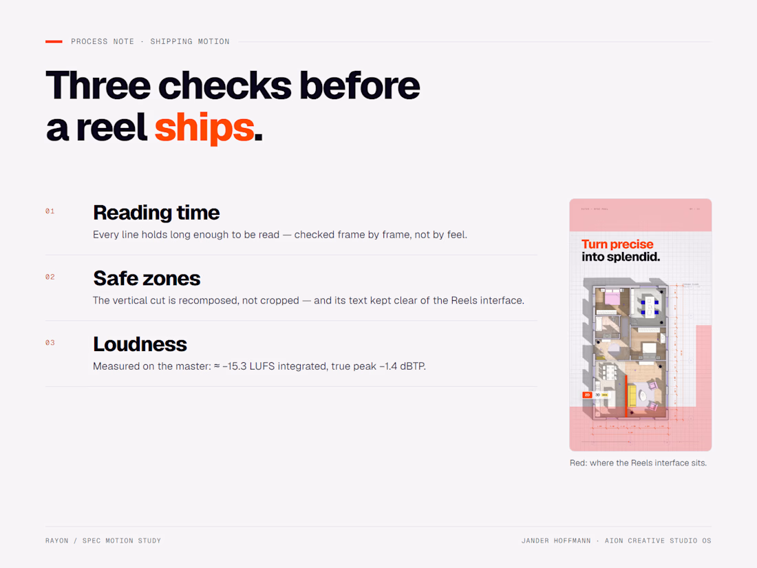
Three checks before a reel ships.
Reading time: every line holds long enough to be read, checked frame by frame.
Safe zones: every vertical text clear of the Reels interface.
Loudness: measured on the master: ≈ −15.3 LUFS, true peak −1.4 dBTP.
Clients never see these checks. They feel them.
I’m taking on brand films, launch reels and social motion kits >> send me a message.

Halden - Landing Page Concepts
Halden sells to grid operators, and there were two good ways to pitch it: tell them what's coming, or show them everything happening now. Rather than pick one on instinct, I designed the landing page as an A/B test so real traffic decides.
The two pages share one 12-column grid, the same section order, type system and components. Each variant changes only its message, its hero visual and its light color, so any difference in demo requests comes from the pitch and not the layout.
The work was building a system flexible enough to carry two different stories without either one feeling like the backup version.
Forecasting (act before demand spikes) vs metering (see and bill every kilowatt)
Primary metric: Demo requests from the hero CTA
6 votes
Ends in 9h
I'd pick Forecasting. "From meter reading to early action" tells a grid operator what they get in one line. Did you write both hero lines before designing the visuals?