The network for creativity
Join 1.25M professional creatives like you
Connect with clients, get discovered, and run your business 100% commission-free
Creatives on Contra have earned over $150M and we are just getting started
Back to feedPost
Transforming green energy into a premium and structured visual identity. Proud to share our work for SOLA. Tap the link to explore the full case study!
Share your feedback below! 👋
📩 Project inquiries? Contra Odama Studio
That neon lime on the SOLA logo makes a strong first impression for a clean energy brand. Pairing it with the muted B&W photography in the color study keeps the palette from feeling too synthetic.
Thanks! We explored a few directions before landing on this. What would you have tested differently in the palette?
I’d probably test one softer organic variation alongside the current neon palette — maybe a warmer off-white base, deeper charcoal, and a muted sage/forest green accent. The neon lime gives SOLA a strong modern energy feel, but a softer green direction could make the brand feel...
The network for creativity
Join 1.25M professional creatives like you
Connect with clients, get discovered, and run your business 100% commission-free
Creatives on Contra have earned over $150M and we are just getting started

Related posts
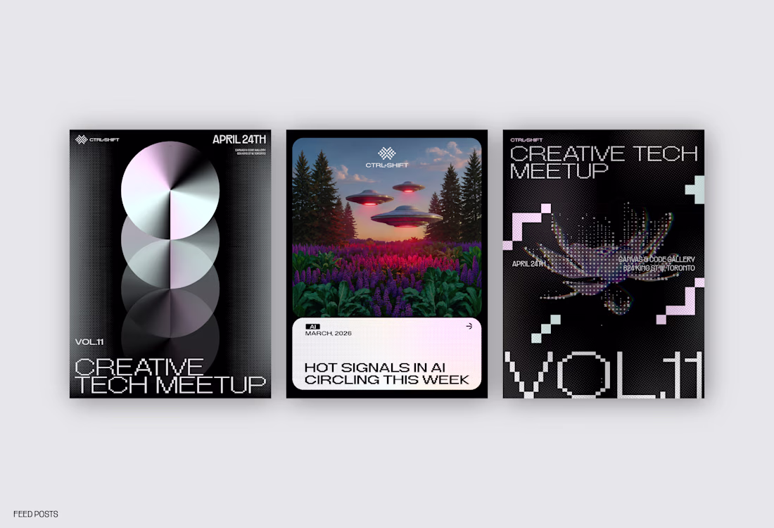
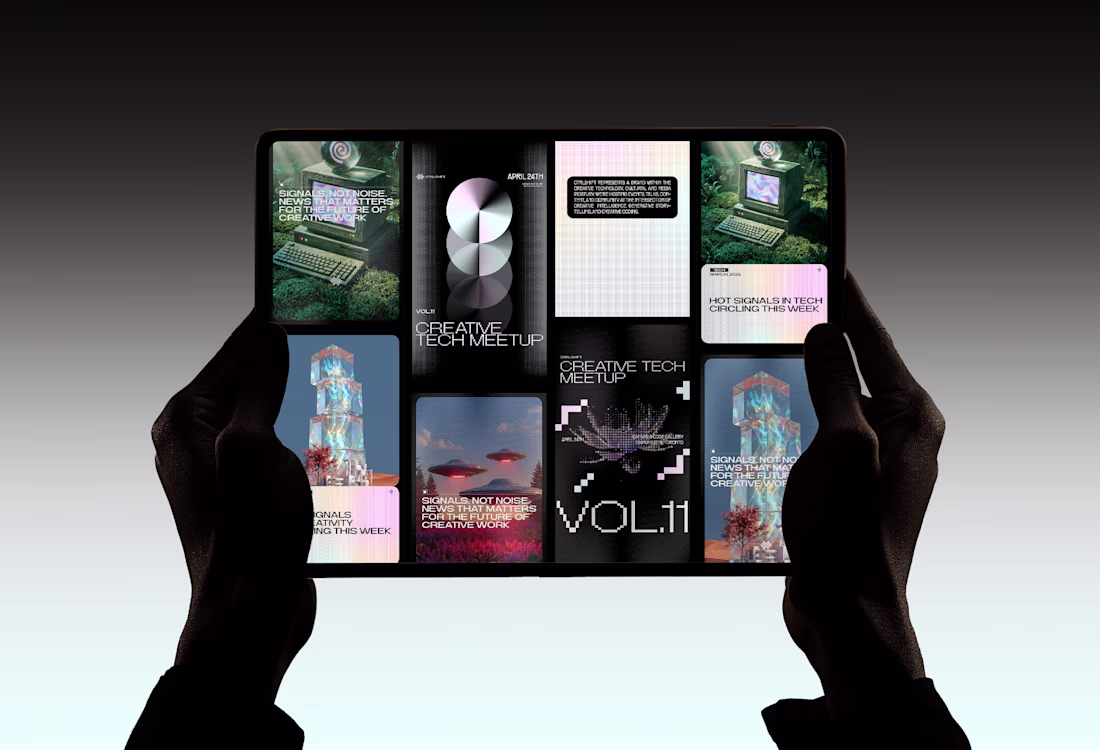
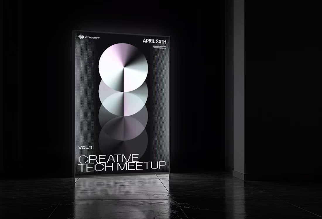
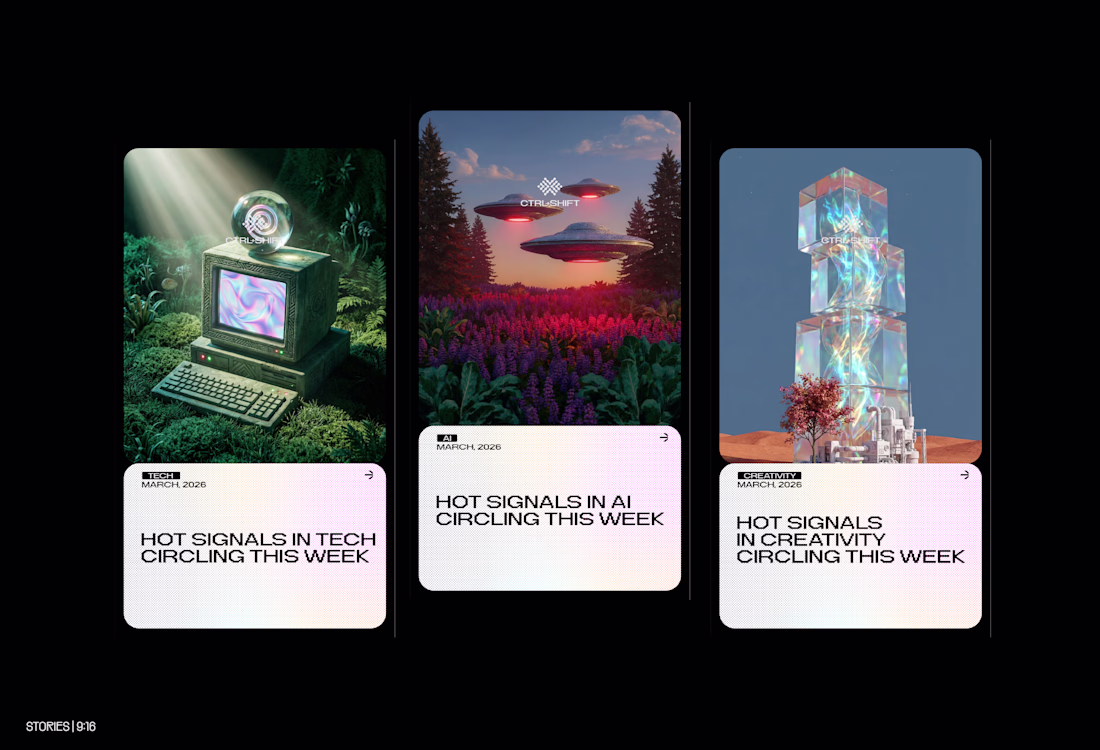
Social Media & Event Designs for CTRL+SHIFT
Feel free to share your feedback.
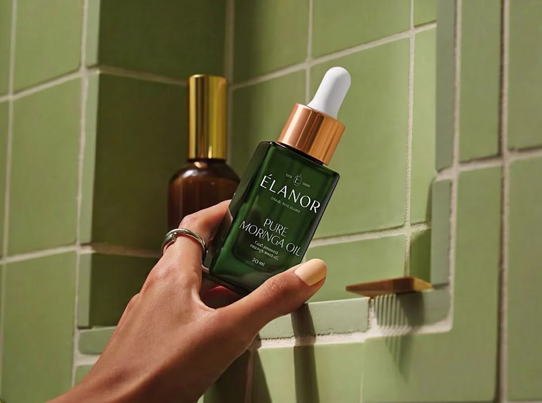
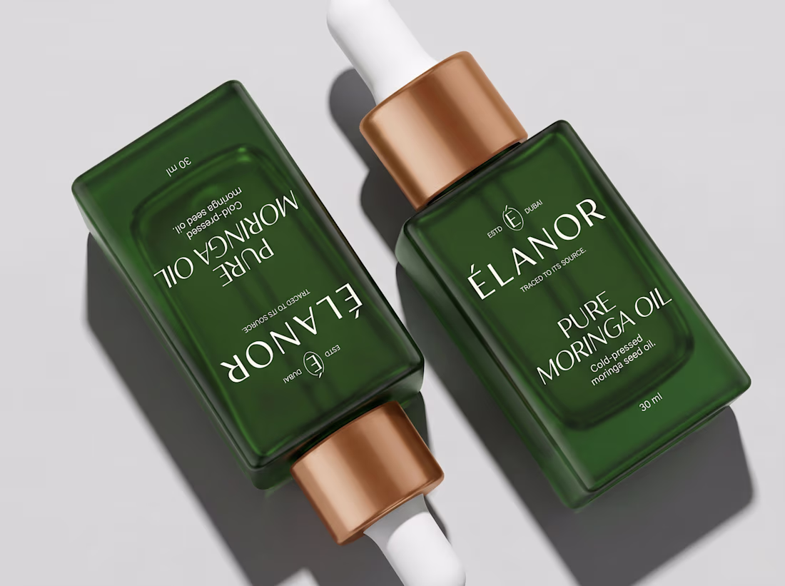
Wrapping up a skincare project I've been working on for the past few weeks.
From brand strategy and identity to packaging design for 4 amazing products, it's always rewarding to see everything come together in the final mockups.
Sharing a few sneak peeks before the brand officially launches ✨
Curious, what's your favorite phase of the branding process?

ChargeIndia involved extensive logo exploration and multiple iterations to shape its brand identity. The core essence of this EV charging aggregator is to bring diverse charging networks together under one unified platform while reflecting Indian aesthetics.
There were too many concepts to fit within the artboard, so I'm sharing them here for better visibility.
superb every concept is outstanding🔥 😍
Challenges
View allTrending
Claude
Claude has entered the design space. How are you using Claude Design?
Contra University
Learn from expert creatives how to earn more using next-gen AI tools.
MagicPath
The canvas is infinite, and exploration is becoming the workflow. How are you using MagicPath?
creativeaiflow
Creative AI workflows are evolving. What tools do you use, and what are their strengths and weaknesses?
freelancerlife
Freelancer life is wins, pivots, and everything in between. What’s yours right now?