The network for creativity
Join 1.25M professional creatives like you
Connect with clients, get discovered, and run your business 100% commission-free
Creatives on Contra have earned over $150M and we are just getting started
Back to feedPost

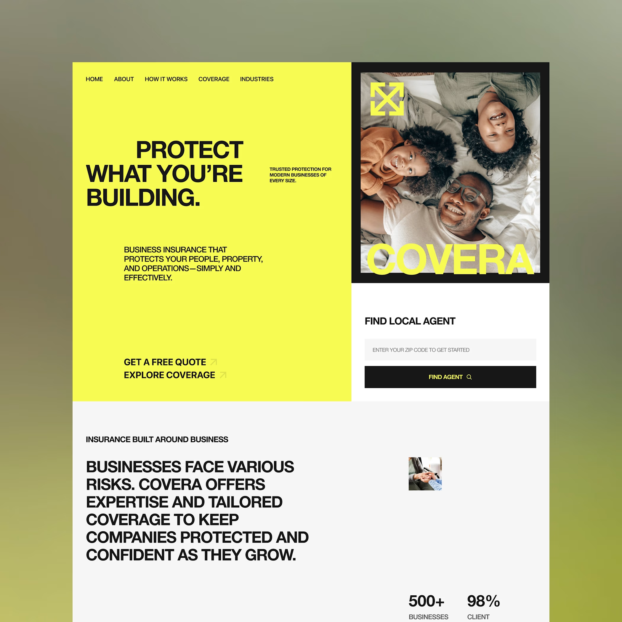
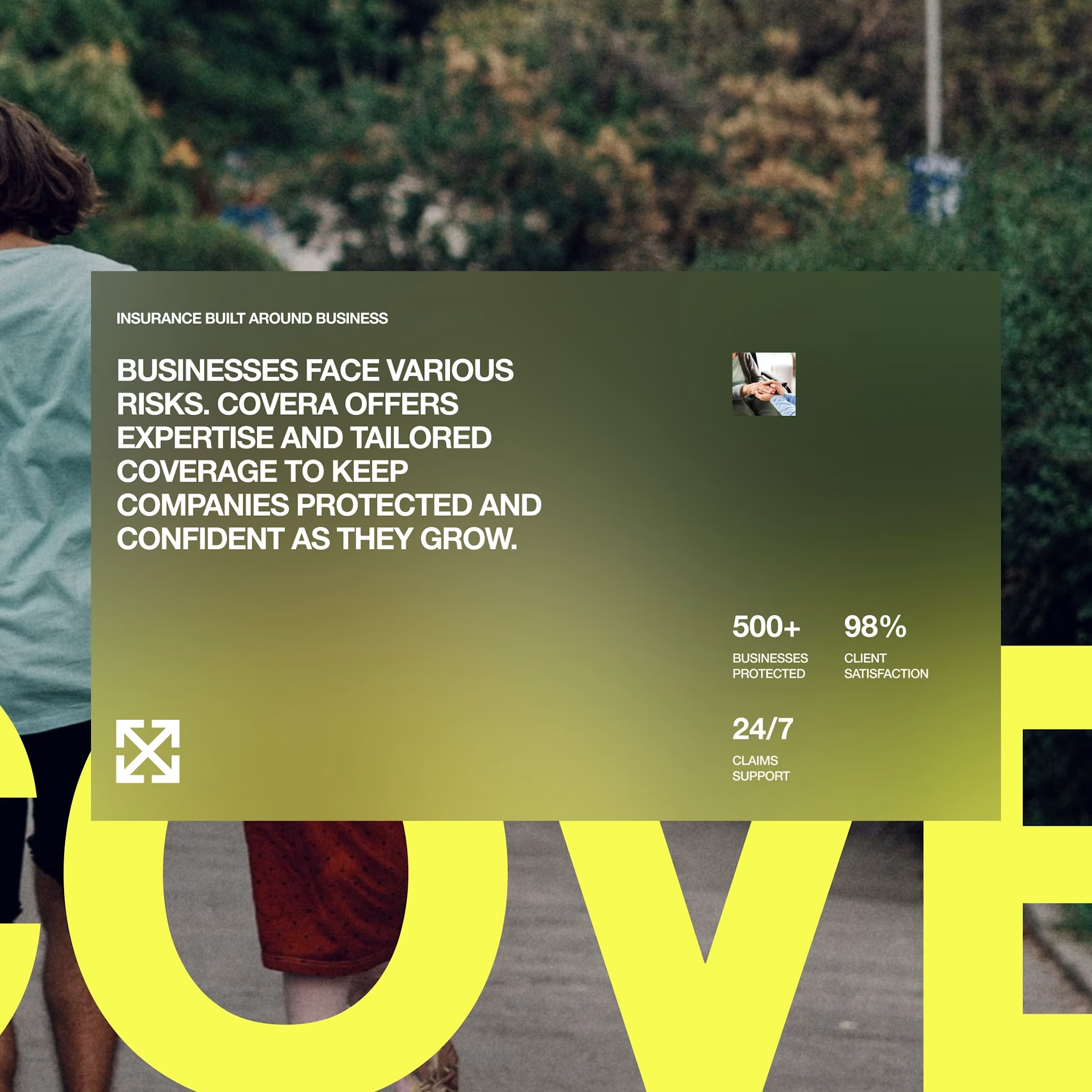
COVERA — Business Insurance Landing Page. Bold, structured, and straight to the point.
I explored a more editorial side of business insurance with oversized type, modular layouts, and high contrast visuals to make a traditionally serious space feel a little more distinctive.

Awesome
The network for creativity
Join 1.25M professional creatives like you
Connect with clients, get discovered, and run your business 100% commission-free
Creatives on Contra have earned over $150M and we are just getting started
Challenges
View all


Related posts



Creative design 🤩

Olma Hotel client Project Website preview
Instead of simply making a hotel website look beautiful, I focused on creating a design that helps visitors quickly understand:
Where they are staying → What they get → Why they should trust the hotel → How they can book.
I designed this hotel Website for Olma Hotel with one goal in mind: make the brand feel premium while making the booking journey simple and clear.
The design combines large architectural imagery, strong typography, spacious layouts, and carefully placed CTAs to create a visual experience that communicates comfort, trust, and luxury.
What I focused on:
— Premium first impression
— Clear hotel positioning
— Strong visual storytelling
— Easy-to-understand room & amenity sections
— Strategic booking CTAs
— Responsive-friendly layout structure
— Consistent luxury-focused visual language
A luxury hotel website should sell the experience before the guest even books.

This looks very attractive, but I feel like it will get more better if the blank spaces are not there, there are too many blanks spaces

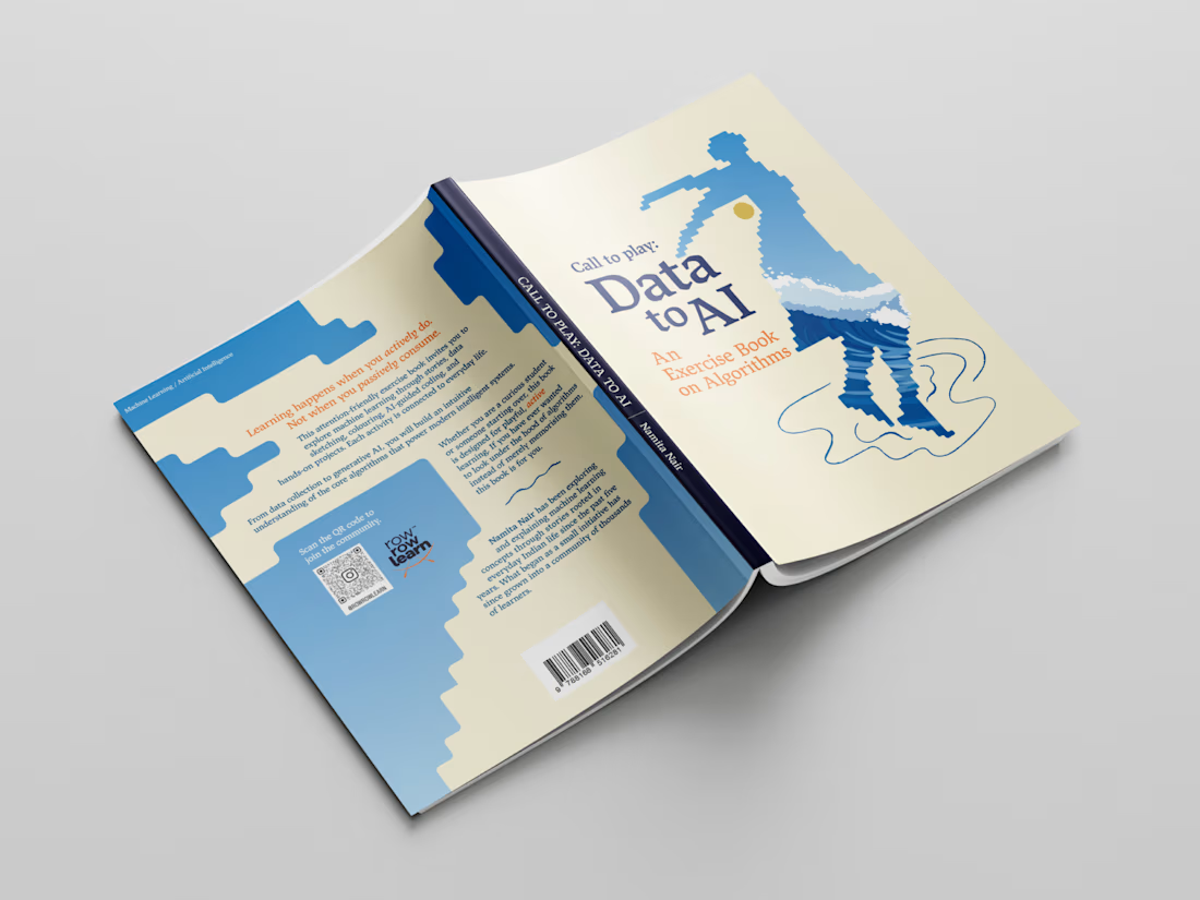
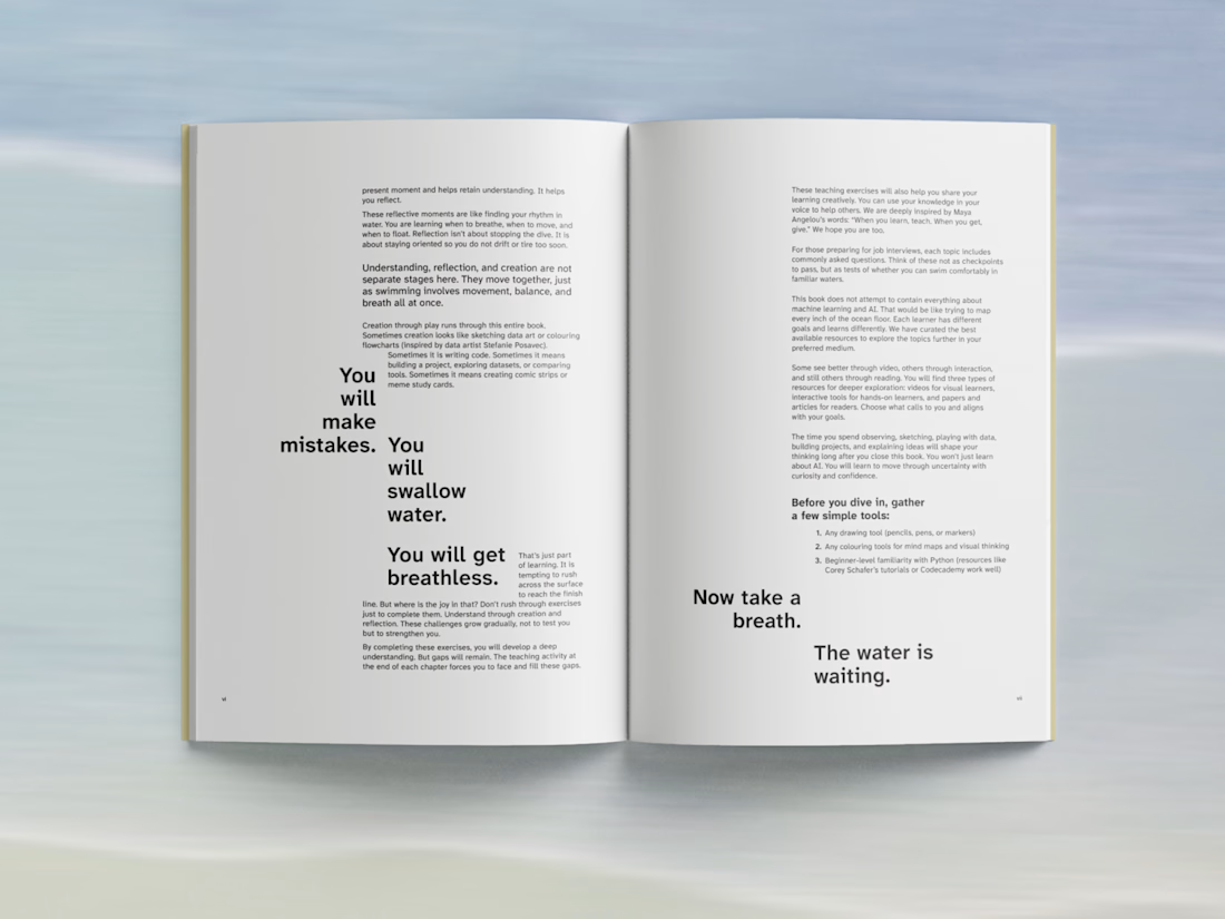
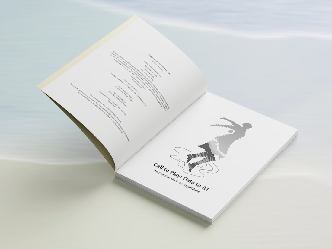
Editorial book design for @rowrowlearn, which has over 70k organic followers ✨
When the author reached out to me for the book's layout design - she said that she doesn't what another off-the-shelf educational book. Good design and aesthetics mattered to her as much as the content of the book.
It was a very interesting project to work on - the editorial design was about creating a consistent visual language across longer-form text & explanations to data, illustrations, diagrams, while still giving each section and type of content its own rhythm.
Here are a few pages from the final publication.
Case Study.
#Book Design #LayoutDesign #Minimal Design


Holding one visual language across prose, data and illustration usually breaks at the diagrams - they want their own scale and the text grid rarely stretches that far. Did you build the layout around the diagrams and let the running text fall in, or the other way round?