The network for creativity
Join 1.25M professional creatives like you
Connect with clients, get discovered, and run your business 100% commission-free
Creatives on Contra have earned over $150M and we are just getting started
Back to feedPost
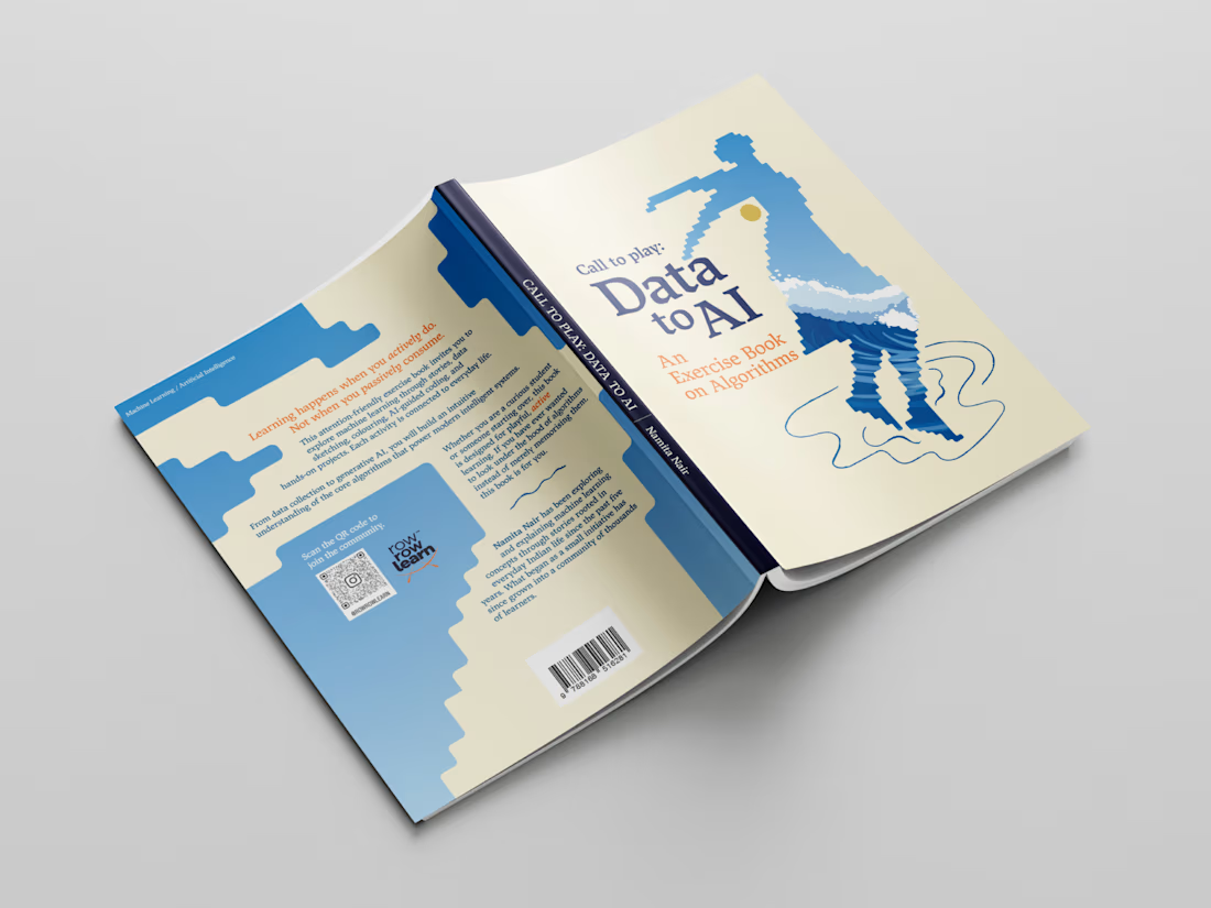
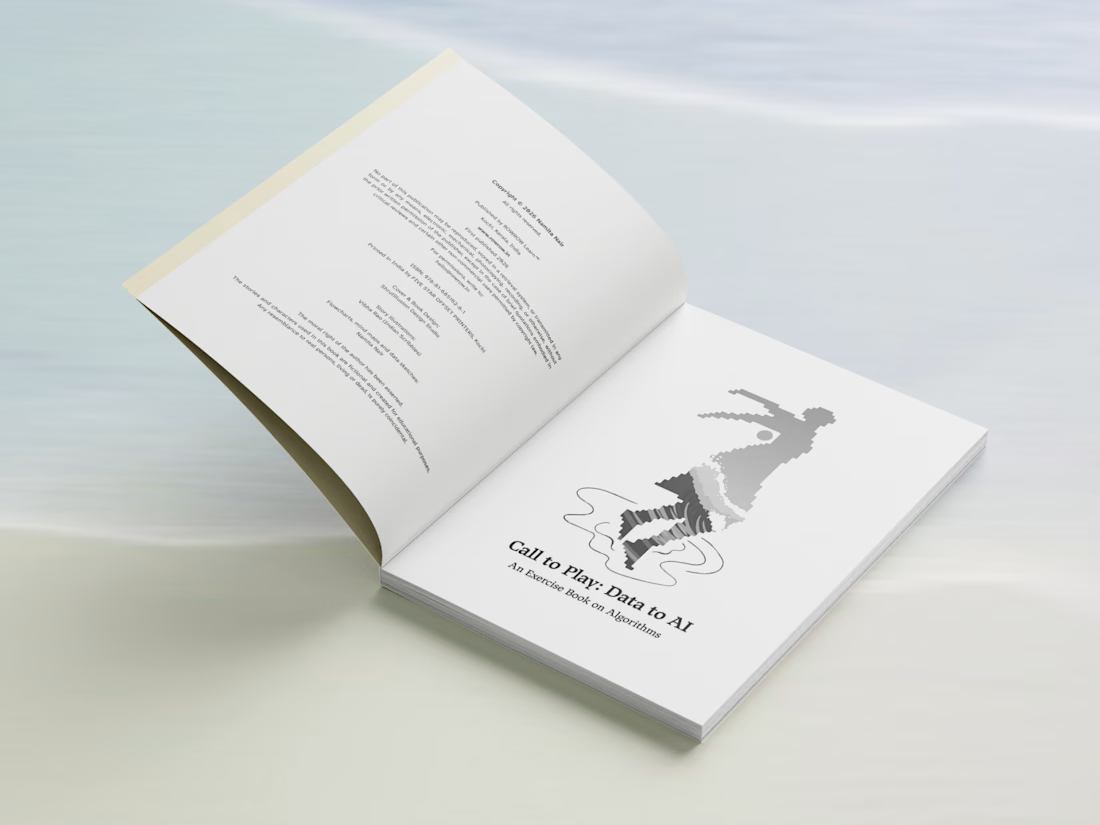
Editorial book design for @rowrowlearn, which has over 70k organic followers ✨
When the author reached out to me for the book's layout design - she said that she doesn't what another off-the-shelf educational book. Good design and aesthetics mattered to her as much as the content of the book.
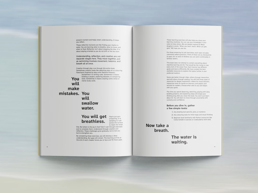
It was a very interesting project to work on - the editorial design was about creating a consistent visual language across longer-form text & explanations to data, illustrations, diagrams, while still giving each section and type of content its own rhythm.
Here are a few pages from the final publication.
Case Study.
#Book Design #LayoutDesign #Minimal Design


Holding one visual language across prose, data and illustration usually breaks at the diagrams - they want their own scale and the text grid rarely stretches that far. Did you build the layout around the diagrams and let the running text fall in, or the other way round?

Yes, all the diagrams, flowcharts and illustrations were finalised first. We even decided to have a dedicated space for writing notes between chapters, early on. So the text was actually the last thing to fall into place.
It became easier looking at it as a design system that can...
The network for creativity
Join 1.25M professional creatives like you
Connect with clients, get discovered, and run your business 100% commission-free
Creatives on Contra have earned over $150M and we are just getting started







Related posts

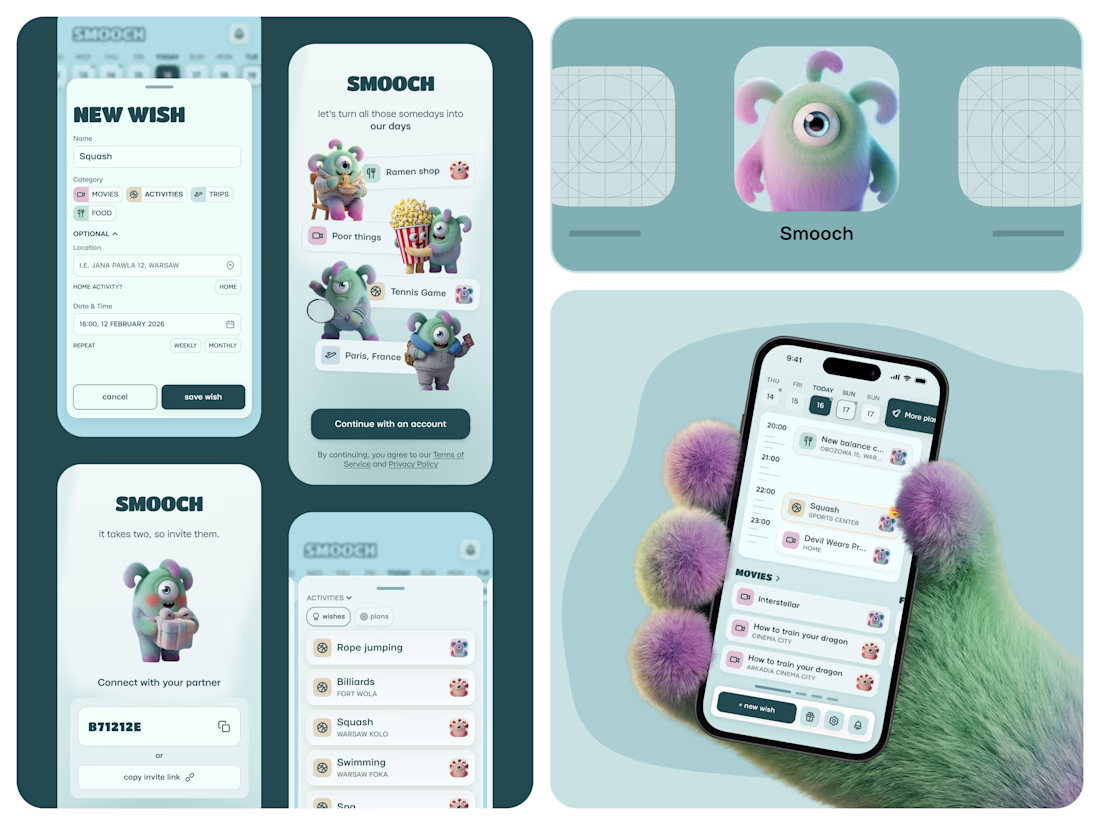
Smooch is live on the App Store 🥹
It started in January. My partner and I were planning trips for March and May, and suddenly realised we’d forgotten a movie we wanted to watch and a new Korean place we wanted to try. Big plans: fine. Small ones: gone.
So I built us a shared space for all those “we should try this someday” ideas. You save them together, drag one onto a day, and it becomes an actual plan.
I made it on my own: product, design, the build with Lovable, the website and the blog - Framer. 60 builds, a few App Store rejections, and one timezone bug that sent us to squash at 2am instead of 2pm xD
And there are no photos inside, just Smooches characters. Because who calls their person by their actual name anyway? (or it's just me there, huh)
The whole story is in the case study 🦄

That furry hand holding the phone is a scroll-stopper. These characters would be so fun animated, even just a little wiggle when a wish turns into a plan. Huge congrats on the launch.

Just published a new case study on Contra for Tiun.io 🚀
A 3-minute product launch video combining UI animation, motion graphics, and dynamic transitions to showcase their backend infrastructure platform.
Check it out and let me know what you think💭


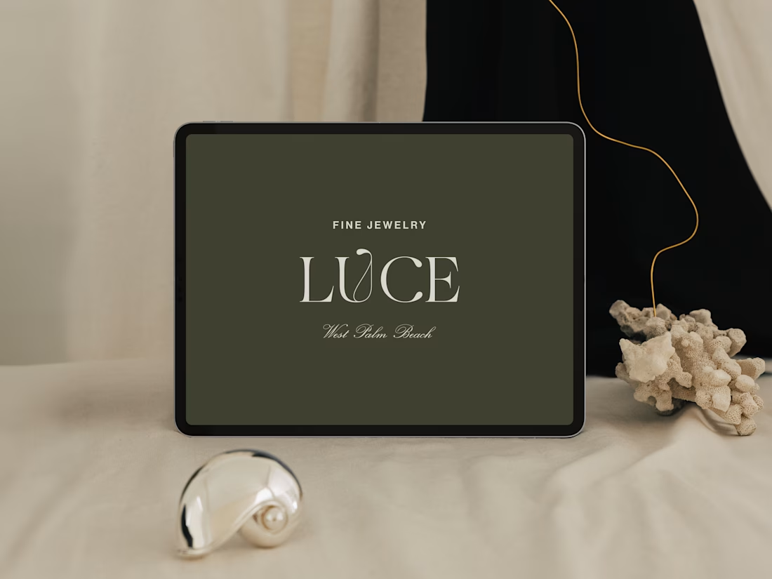
Introducing LUCE, a fresh chapter in four generations of fine jewelry.
Earthy greens, expressive typography, and thoughtful packaging bring warmth and personality to a brand rooted in heritage.
I worked with LUCE across brand strategy, visual identity, packaging experience, and full Shopify website design and development, bringing every detail into one cohesive world.


NEAT