The network for creativity
Join 1.25M professional creatives like you
Connect with clients, get discovered, and run your business 100% commission-free
Creatives on Contra have earned over $150M and we are just getting started
Back to feedPost
Taste Test

Just launched my new portfolio. Light or dark, which one's better? 👇
5 voted
56%
4 voted
44%
9 votes
Closed

Dark look nice

Both look slick so why not give visitors a toggle and support both system themes? Dark mode really makes the typography pop while light mode gives the case studies an editorial feel.

This is beautiful 😍
The network for creativity
Join 1.25M professional creatives like you
Connect with clients, get discovered, and run your business 100% commission-free
Creatives on Contra have earned over $150M and we are just getting started








Related posts

The previous poll on this preloader had exactly 50-50 results between Horizontal gallery and Circle intro. Now I'm continuing with 2 other options. Which one is better? Check the live preview here
19 voted
53%
17 voted
47%
36 votes
Closed

Team mosaic!!

Which ZVEZRA logo direction do you prefer? 👀
I’ve been exploring two variations of the wordmark. Both follow the same visual direction, but each has its own character.
Vote below!
I’d love to hear your thoughts! 👇

39 voted
53%
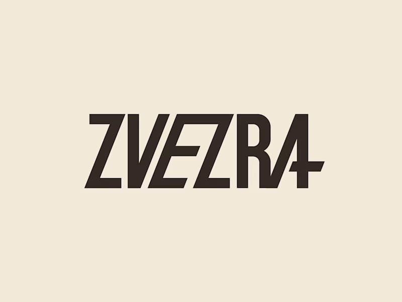
34 voted
47%
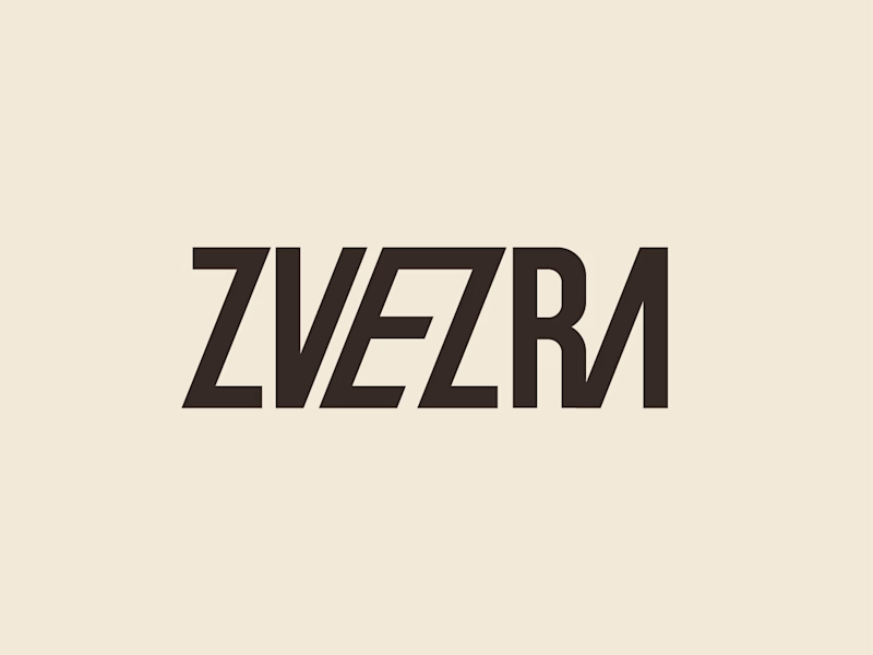
73 votes
Closed

Option 1 for me, it has a bit more personality. Both are strong though, tough call


A few pieces of the website we recently created for Kodilion. Com check the complete website at https://kodilion.hr/


