The network for creativity
Join 1.25M professional creatives like you
Connect with clients, get discovered, and run your business 100% commission-free
Creatives on Contra have earned over $150M and we are just getting started
Back to feedPost
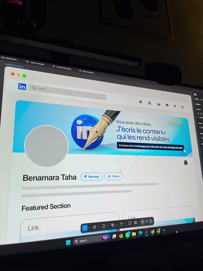
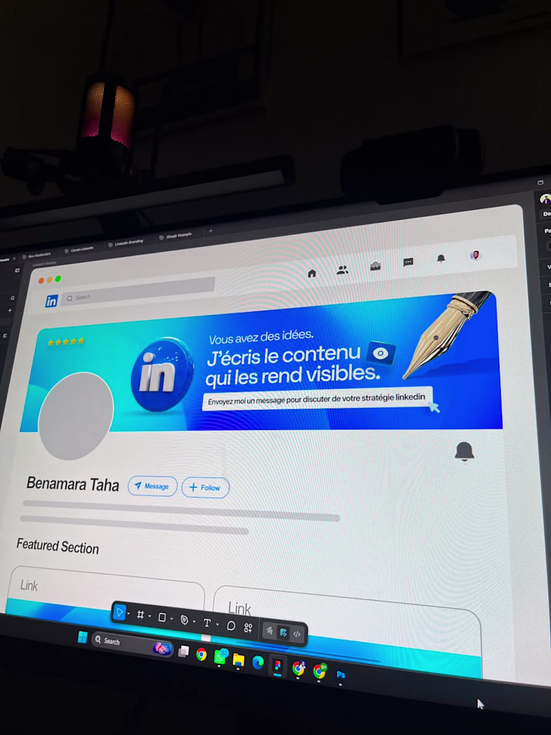
Taste Test
I know you don't speak French but check these two visual directions and let me know which you think works better for a LinkedIn Banner.
If you are a freelancer, you can reach out to me to handle your banner as well. It helps position you better and make you stand out.
Banner A or Banner B
5 votes
Ends in 21h
Banner A for me.
The larger LinkedIn icon creates a stronger focal point and immediately communicates the platform context. It also feels more balanced because the visual weight is distributed across the banner instead of being concentrated around the copy.
Banner B is cleaner,...
Banner A
Banner B for me. The composition feels more balanced at a glance, which matters a lot for a LinkedIn banner since people see it for maybe 2 seconds.
Going for Banner B
As to me, BANNER A
Thank you for your feedback
Will go for A
Thank you Sharon
The network for creativity
Join 1.25M professional creatives like you
Connect with clients, get discovered, and run your business 100% commission-free
Creatives on Contra have earned over $150M and we are just getting started
Related posts
Good job
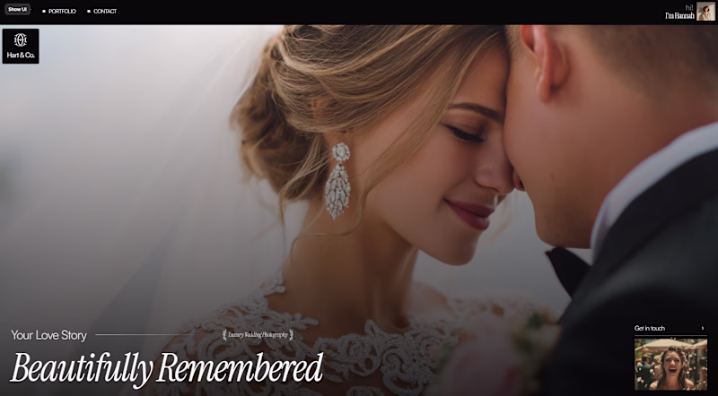
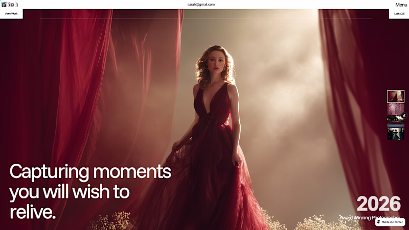
Working on creating 2 Framer templates for photographers, because I could not decide which direction is better.
7 voted
39%
11 voted
61%
18 votes
Closed
Editorial the font adds a classic feeling
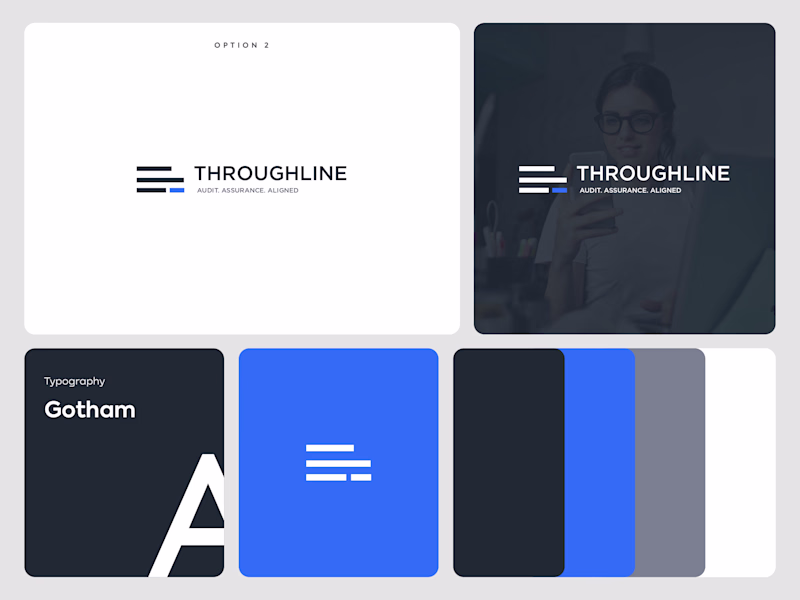
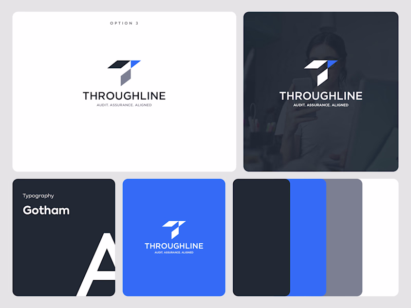
🎨 Exploring two logo directions for Throughline.
🔹 Option A: Clean, minimal, and structured.
🔷 Option B: Bold, distinctive, and more dynamic.
Both are built around trust, alignment, and professionalism, but each tells the story differently.
Which one gets your vote?
🅰️ Option A
🅱️ Option B
6 voted
21%
23 voted
79%
29 votes
Closed
B aligns more with it
Challenges
View allTrending
Claude
Claude has entered the design space. How are you using Claude Design?
Contra University
Learn from expert creatives how to earn more using next-gen AI tools.
MagicPath
The canvas is infinite, and exploration is becoming the workflow. How are you using MagicPath?
creativeaiflow
Creative AI workflows are evolving. What tools do you use, and what are their strengths and weaknesses?
freelancerlife
Freelancer life is wins, pivots, and everything in between. What’s yours right now?