The network for creativity
Join 1.25M professional creatives like you
Connect with clients, get discovered, and run your business 100% commission-free
Creatives on Contra have earned over $150M and we are just getting started
Back to feedPost
Taste Test


Why does some text feel effortless, and some feel like a wall?
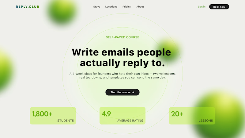
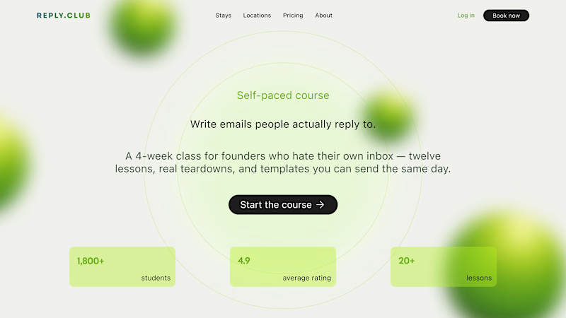
Same words, same order, same brand. All that changes is the size relationship between the lines, and the space between them. That alone decides whether the eye knows where to start.
01 - A real scale. The headline jumps, the body steps back, and the spacing tightens around what belongs together. Now the eye lands, skims, and reads in the right order.
Hierarchy isn't bigger fonts everywhere, it's a bigger gap between the levels, and a smaller one inside them.
02 - One size, one gap. Eyebrow, headline, and body sit at nearly the same size, spaced evenly apart. Tidy, but flat, nothing steps forward, so nothing says "read me first."
Be honest - do you use a type scale, or just size things until they look right?
25 votes
Ends in 1d


i use type scale because i already know what works

The first. Better hierarchy, the factor numbers add value and the CTA continues to play a leading role.

01 is perfect

01 is the best


01 is easier to read

Why the choice of colour and distractions behind the texts ?
The network for creativity
Join 1.25M professional creatives like you
Connect with clients, get discovered, and run your business 100% commission-free
Creatives on Contra have earned over $150M and we are just getting started
Trending
retrofuturism
Share your favorite designs from the past exploring the distant future. Or your own take on the aesthetic 🚀
halftone
Dots. Texture. Grain. Let's see your designs using the halftone technique.

Midjourney
Creatives are showing off what they're making with Midjourney.
colorgrade
Video editors sound off: How do you enhance the mood of your video in color grading?


Related posts

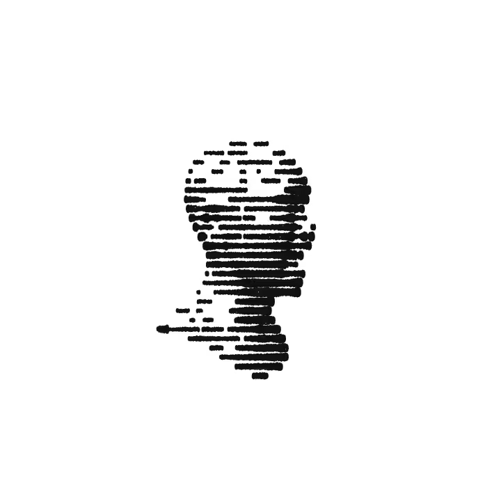
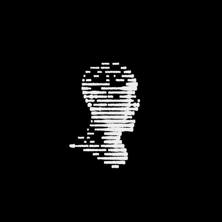
inkbleed effect design - dark or light mode?

75 voted
54%
63 voted
46%
138 votes
Closed

Great work! I'm curious to know what tools you used to create this?


we are working on two framer templates in parallel
hero interaction magic ✨


Great work on animations


Some thumbnails I made recently for a podcast client. Which title would make you click first?

12 voted
43%
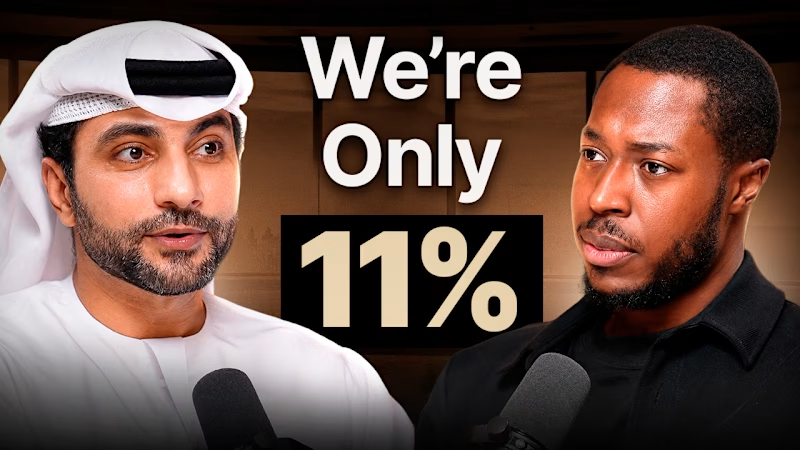
16 voted
57%
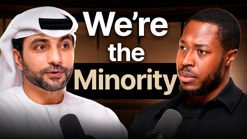
28 votes
Closed

Option two feels stronger because it’s more direct about what the content is and who it’s for. With option one, I can tell it’s probably some kind of podcast, but the text doesn’t clearly explain the topic.
Option two gives me an immediate understanding of what I’m looking at....