The network for creativity
Join 1.25M professional creatives like you
Connect with clients, get discovered, and run your business 100% commission-free
Creatives on Contra have earned over $150M and we are just getting started
Back to feedPost
Taste Test
Some thumbnails I made recently for a podcast client. Which title would make you click first?

12 voted
43%
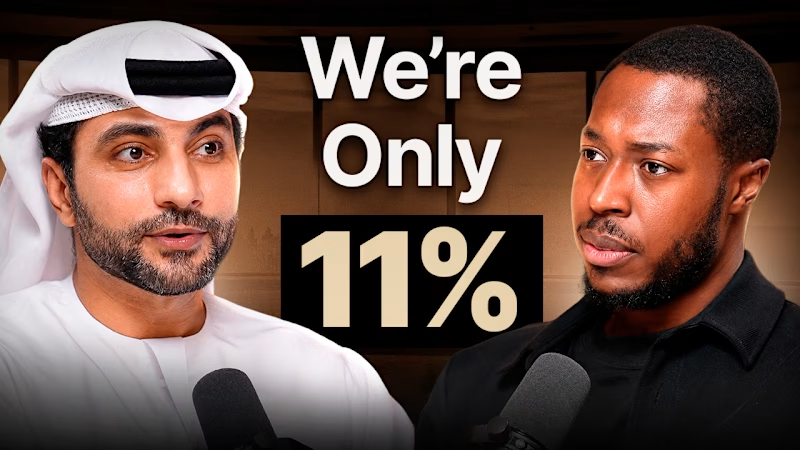
16 voted
57%
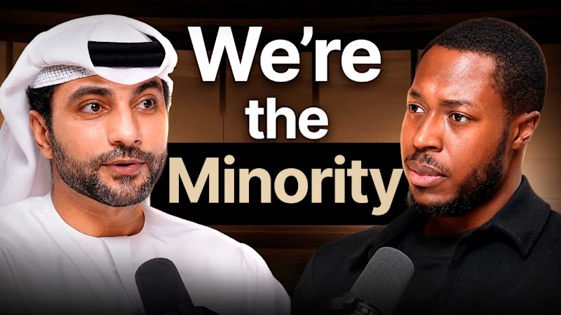
28 votes
Closed

Option two feels stronger because it’s more direct about what the content is and who it’s for. With option one, I can tell it’s probably some kind of podcast, but the text doesn’t clearly explain the topic.
Option two gives me an immediate understanding of what I’m looking at....


thank you so much Jonathan that was an outstanding comment. I really appreciate the suggestion and I'll definetly apply it

options 2 for me

"We're Only 11%" immediately makes me want to know the rest of the stat, that specificity does a lot of the clicking work for you. Was that number pulled straight from the episode or something you found while digging around for the thumbnail?

thank you so much!!!!!

thank you!!
The network for creativity
Join 1.25M professional creatives like you
Connect with clients, get discovered, and run your business 100% commission-free
Creatives on Contra have earned over $150M and we are just getting started











Related posts

WIP - Brand Identity
Which one?
9 voted
47%
10 voted
53%
19 votes
Closed

B is more suitable for these textures ❤️❤️
Great job Gaber🎉🎉🔥🔥

Same design. Which palette? 👀
You picked your favorite preview last time. This time, I’m putting the colors to the vote.
One body-care packaging concept, with the same typography and composition:
A · Rose Cream, Strawberry Sorbet + Plum Jelly
B · Lime Mousse, Coconut Cream + Plum Jelly
Which would you choose and what does it make you feel about the brand?
Both palettes use colors and matching ingredient textures from DCS 654, my library of 654 dessert-inspired colors.
Take a closer look: dcs.mariya.design

7 voted
44%
9 voted
56%
16 votes
Closed
B is absolutely stunning 🎉🎉🎉🎉
Great job Mariya❤️

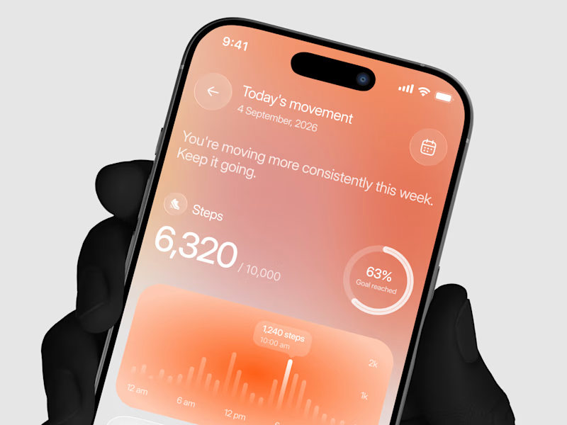
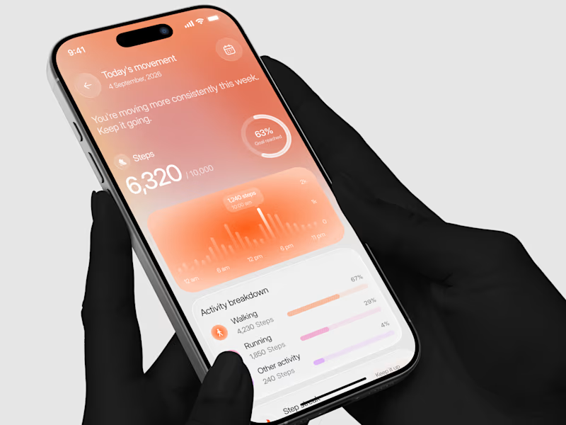
Designed a step tracking screen where you can see your daily progress and weekly trend in one glance.
Same screen, two shots. Which one would stop your scroll? 👀

11 voted
73%
4 voted
27%
15 votes
Closed
