The network for creativity
Join 1.25M professional creatives like you
Connect with clients, get discovered, and run your business 100% commission-free
Creatives on Contra have earned over $150M and we are just getting started
Back to feedPost
Taste Test

I used Lovable to build two different hero section concepts for an outdoor adventure brand ("Wild Nature"), and I want to see which one resonates more with you.
Which layout looks best for an adventure brand?

0 voted
0%
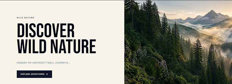
2 voted
100%
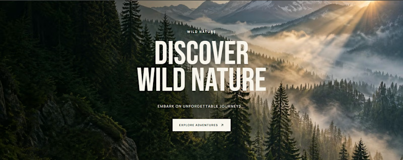
2 votes
Closed

Full Background.

Full Background
The network for creativity
Join 1.25M professional creatives like you
Connect with clients, get discovered, and run your business 100% commission-free
Creatives on Contra have earned over $150M and we are just getting started











Related posts

Designed a step tracking screen where you can see your daily progress and weekly trend in one glance.
Same screen, two shots. Which one would stop your scroll? 👀


11 voted
73%
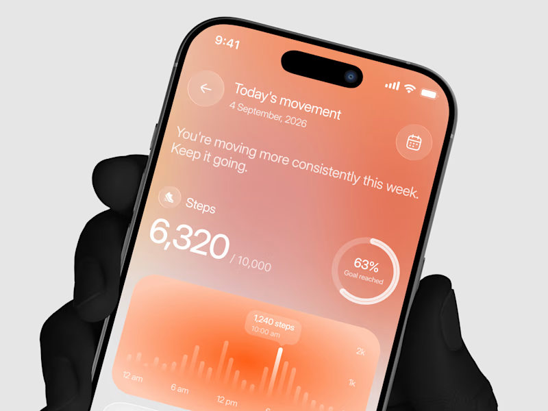
4 voted
27%
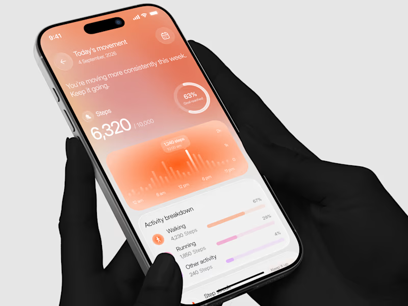
15 votes
Closed


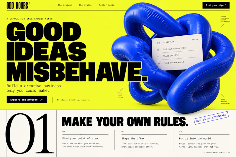
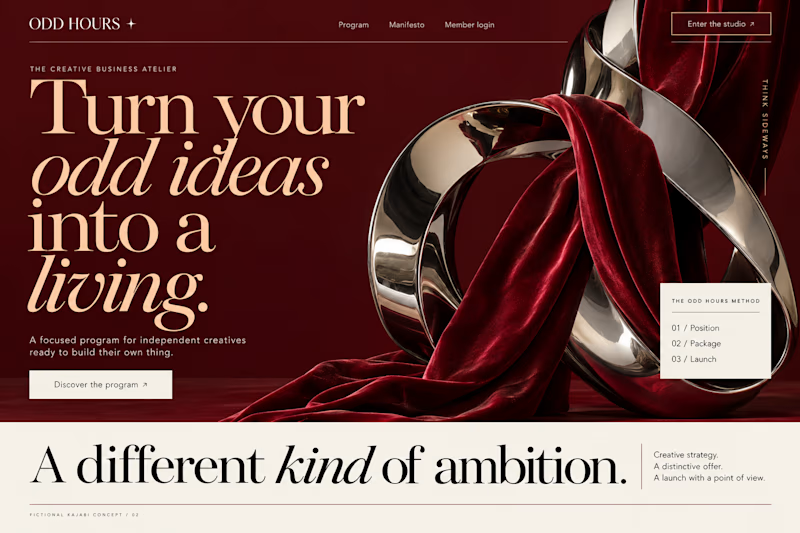
Which Kajabi direction would stop your scroll?
Meet ODD HOURS, a creative-business academy concept.
A / Acid Play: electric yellow, oversized type and a sculptural blue knot.
B / Velvet Rebellion: oxblood, chrome and velvet with fashion-editorial typography.
Two original AI-generated concepts. Same offer. Completely different energy.
Which one pulls you in, and why?

15 voted
65%
8 voted
35%
23 votes
Closed

It's only Acid Play it's unbelievable 🔥🔥🔥🔥
Great job Kraig🎉🎉

Two page transitions, one site. Which one feels better to you?

5 voted
83%
1 voted
17%
6 votes
Closed
Kinetic Reveal feels more natural ❤️❤️
great job Dayyan🎉🎉