The network for creativity
Join 1.25M professional creatives like you
Connect with clients, get discovered, and run your business 100% commission-free
Creatives on Contra have earned over $150M and we are just getting started
Back to feedPost

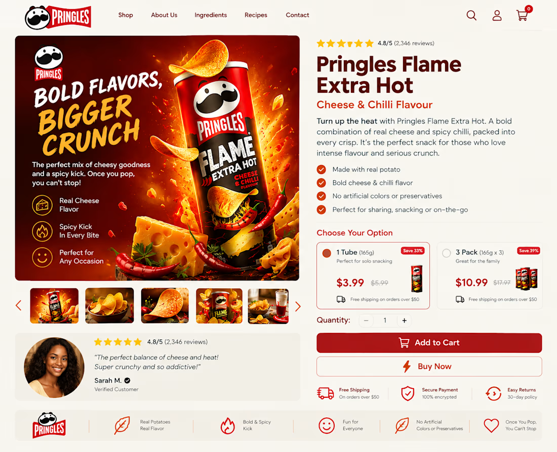
Great products deserve better landing pages.
Confusing layouts, weak messaging, and poor CTAs can cost you sales.
I create clean, conversion, focused ecommerce pages that fix those problems. DM me.


The network for creativity
Join 1.25M professional creatives like you
Connect with clients, get discovered, and run your business 100% commission-free
Creatives on Contra have earned over $150M and we are just getting started





Related posts

Winder is a bold brand identity built around a geometric W-inspired symbol, combining sharp angles and forward movement to represent progress, speed, and direction.
The identity uses a striking red and deep burgundy palette, supported by clean typography and a consistent visual system across brand guidelines, digital applications, and product mockups.
Progress in Motion.




Great logo it feels it really has an identity 🎉🎉

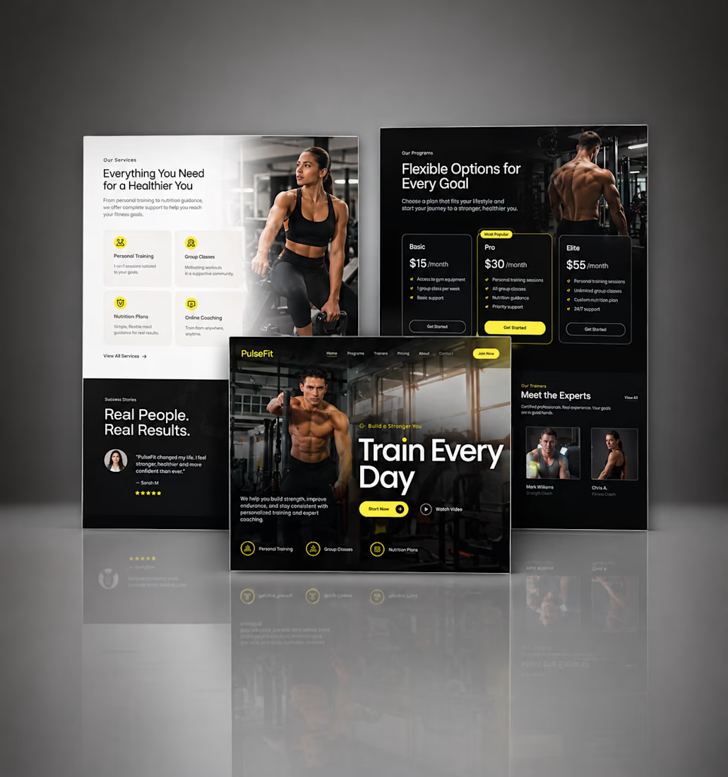
Kajabi Gym & Fitness Landing Page Design
The client needed a focused landing page for their gym and fitness offering that could present the program clearly and encourage visitors to take the next step.
I designed the landing page in Kajabi with a strong visual hierarchy, clear sections for the fitness program, benefits, social proof, and calls to action. The layout was also structured to work smoothly across desktop and mobile.
The result was a clean, focused fitness landing page that makes the offer easier to understand and gives visitors a clear path toward getting started.
#KajabiFitness #KajabiFitnessCoach #KajabiFitnessWebsite #KajabiFitnessLandingPage #FitnessCoachWebsite #FitnessCoachingWebsite #OnlineFitnessCoach #PersonalTrainerWebsite #FitnessLandingPage #GymLandingPage #FitnessProgram #OnlineFitnessProgram #PersonalTraining #WeightLossCoach #FitnessFunnel #FitnessSalesPage #GymWebsite #FitnessWebsiteDesign #FitnessWebDesign



Great work, Hesty. I like how you focused on clear hierarchy, social proof, and strong CTAs instead of just making the page look good. That combination of UX + conversion thinking is what makes a landing page effective.

You leaned toward Atmospheric in my last taste test, so I took it beyond the hero.
Here’s the full homepage for the same fictional lighting studio, with two different scroll experiences: Fluid and Cinematic.
Which one makes you want to keep exploring?
Continuing from this post: https://contra.com/community/KacW2yxF-homepage-design-comparison-product-photography-vs
22 voted
46%
26 voted
54%
48 votes
Closed
I can't recognizable the difference but both of them are great 🎉🎉