The network for creativity
Join 1.25M professional creatives like you
Connect with clients, get discovered, and run your business 100% commission-free
Creatives on Contra have earned over $150M and we are just getting started
Back to feedPost

What if a hot sauce bottle looked exactly like the ingredient that made it iconic? 🌶️
The hot sauce shelf is filled with generic bottles that all look the same. For ChilliKa, the challenge wasn't to redesign a label—it was to rethink the product itself.
The inspiration came from a familiar tradition across India: bunches of fresh red chillies tied together with jute and hung to dry. That simple cultural ritual became the foundation of the brand.
Instead of placing a chilli on the packaging, the packaging became the chilli. The bottle was sculpted to mimic its natural form, while the hanging display transformed retail shelves into a modern interpretation of traditional chilli bunches.
A simple idea, inspired by tradition, turned an everyday condiment into a memorable brand experience.
View the complete case study:
https://akshaygupta.co.in/project/chillika
#BrandIdentity #PackagingDesign #BrandStrategy #FoodPackaging #Branding #CreativeDirection #RetailDesign #Packaging #GraphicDesign #ChilliKa

The network for creativity
Join 1.25M professional creatives like you
Connect with clients, get discovered, and run your business 100% commission-free
Creatives on Contra have earned over $150M and we are just getting started


Related posts


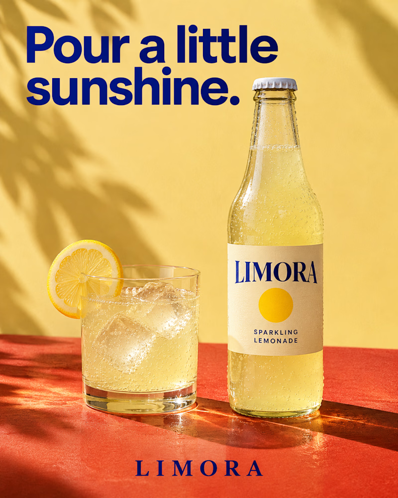
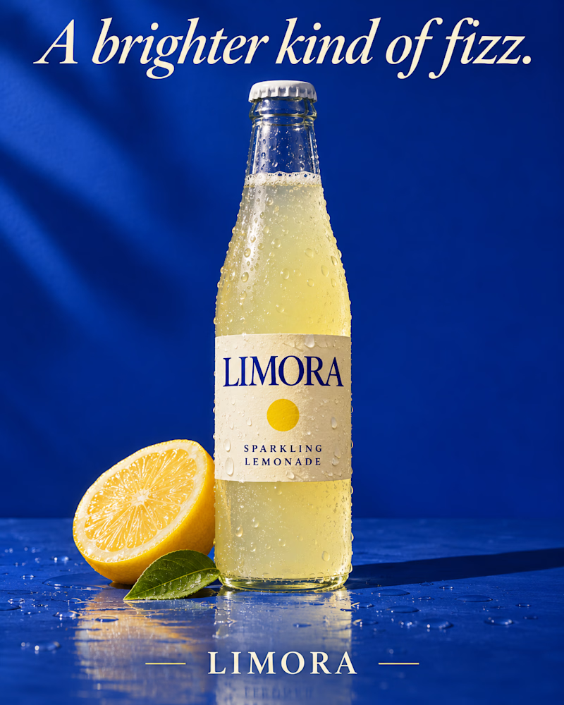
Which one would you put in the fridge door?
The first is a clear glass bottle with a cream label and a yellow sun mark on a terracotta ledge, a tumbler of lemonade beside it with ice and a lemon wheel on the rim, palm shadow across a butter yellow wall, heavy navy sans headline.
The second is the same bottle beaded with cold on wet cobalt, half a lemon and one green leaf at its base, droplets scattered across the surface, a soft streak of light on the wall, the headline in cream italic serif.
One sells the afternoon. The other sells the chill.
👇 #packagingdesign #brandconcept #beveragedesign
13 voted
68%
6 voted
32%
19 votes
Closed

The one on the left feels so fresh and summery. Actually made me thirsty haha 😁

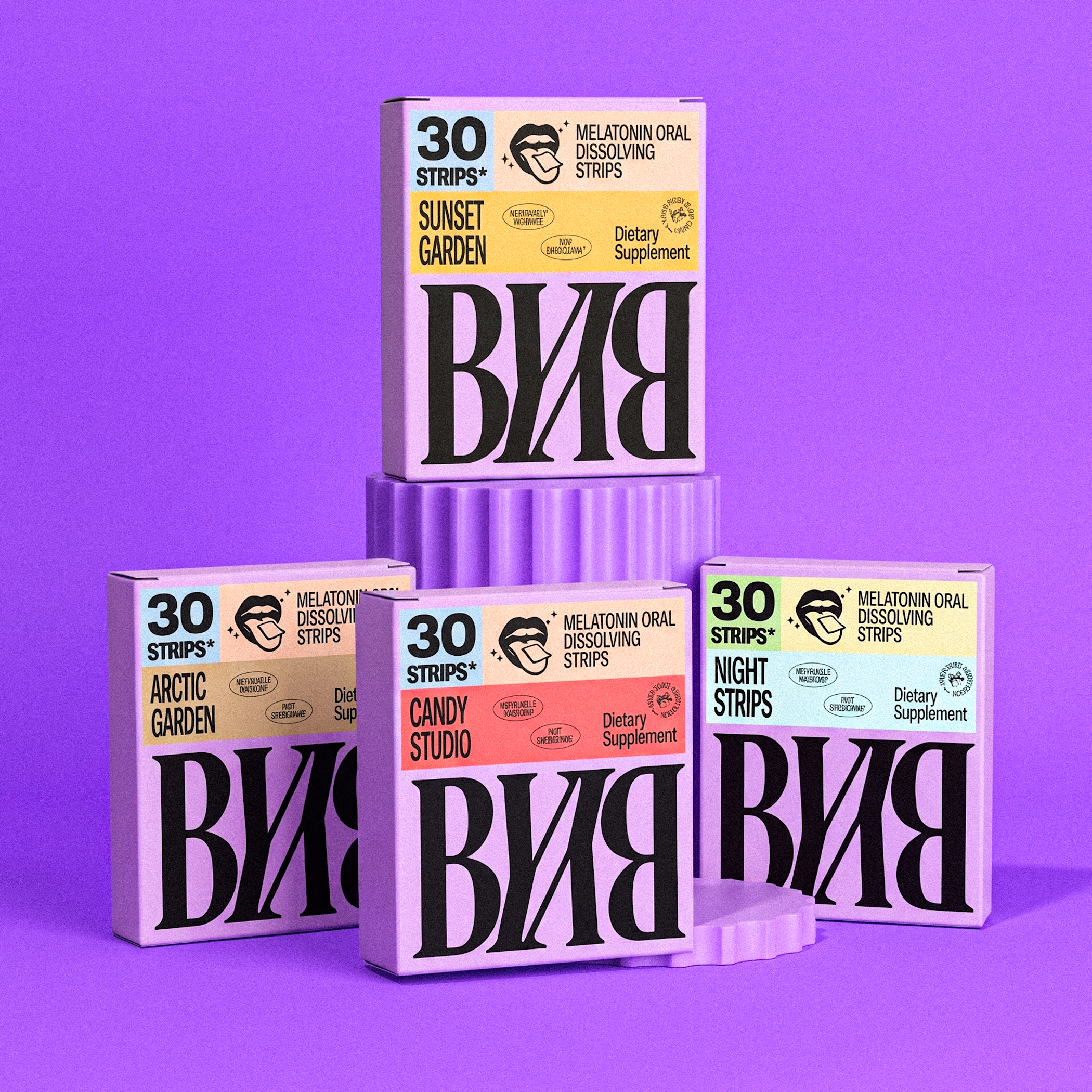
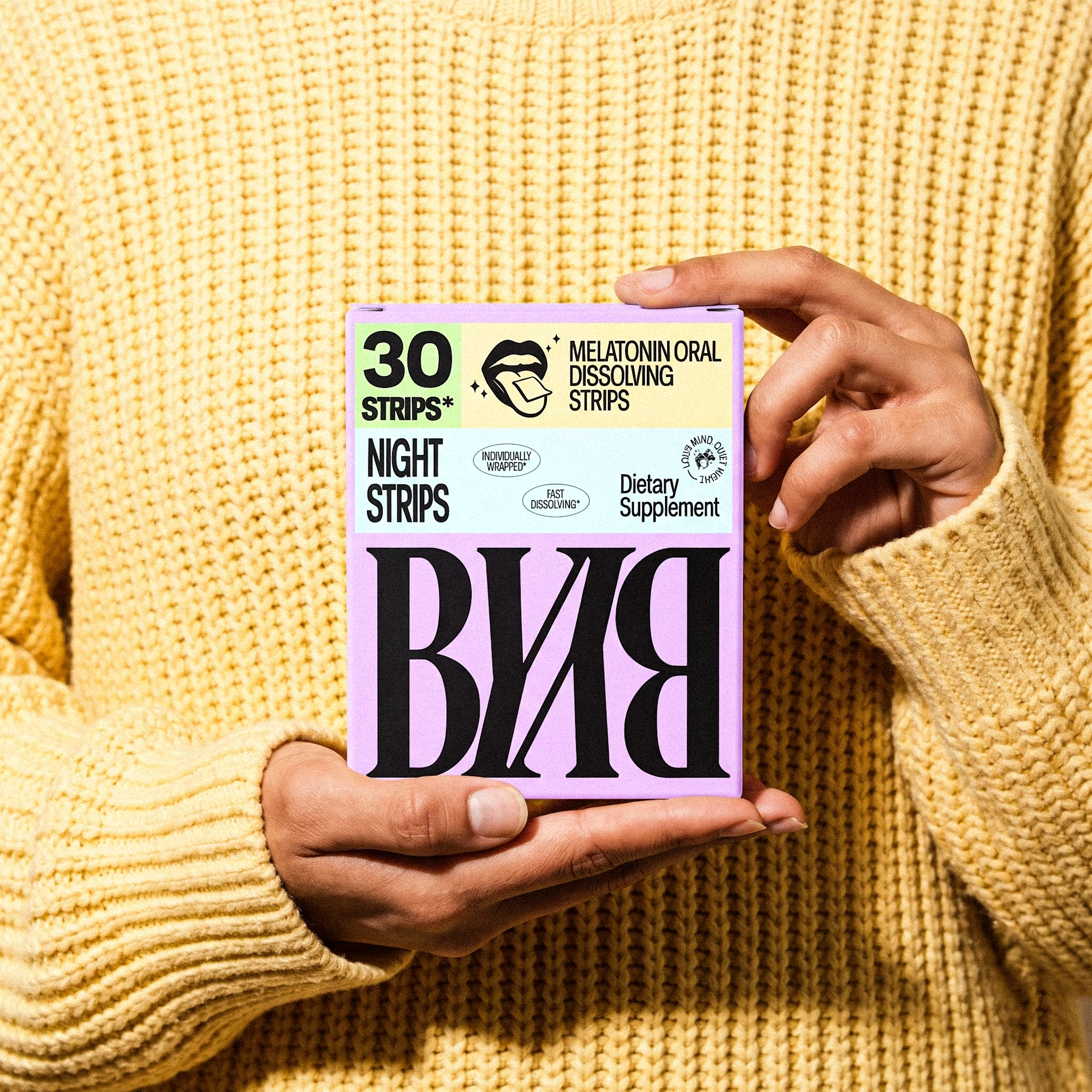
BYBY — Sleep Wellness Packaging Concept
A bold and playful packaging direction for BYBY, a modern sleep wellness brand.
Exploring four distinct flavour identities through vibrant colour palettes, expressive typography, and a consistent visual system.
Designed to stand out on the shelf.
#BYBY #PackagingDesign #BrandIdentity #SupplementPackaging #PackagingDesignConcept
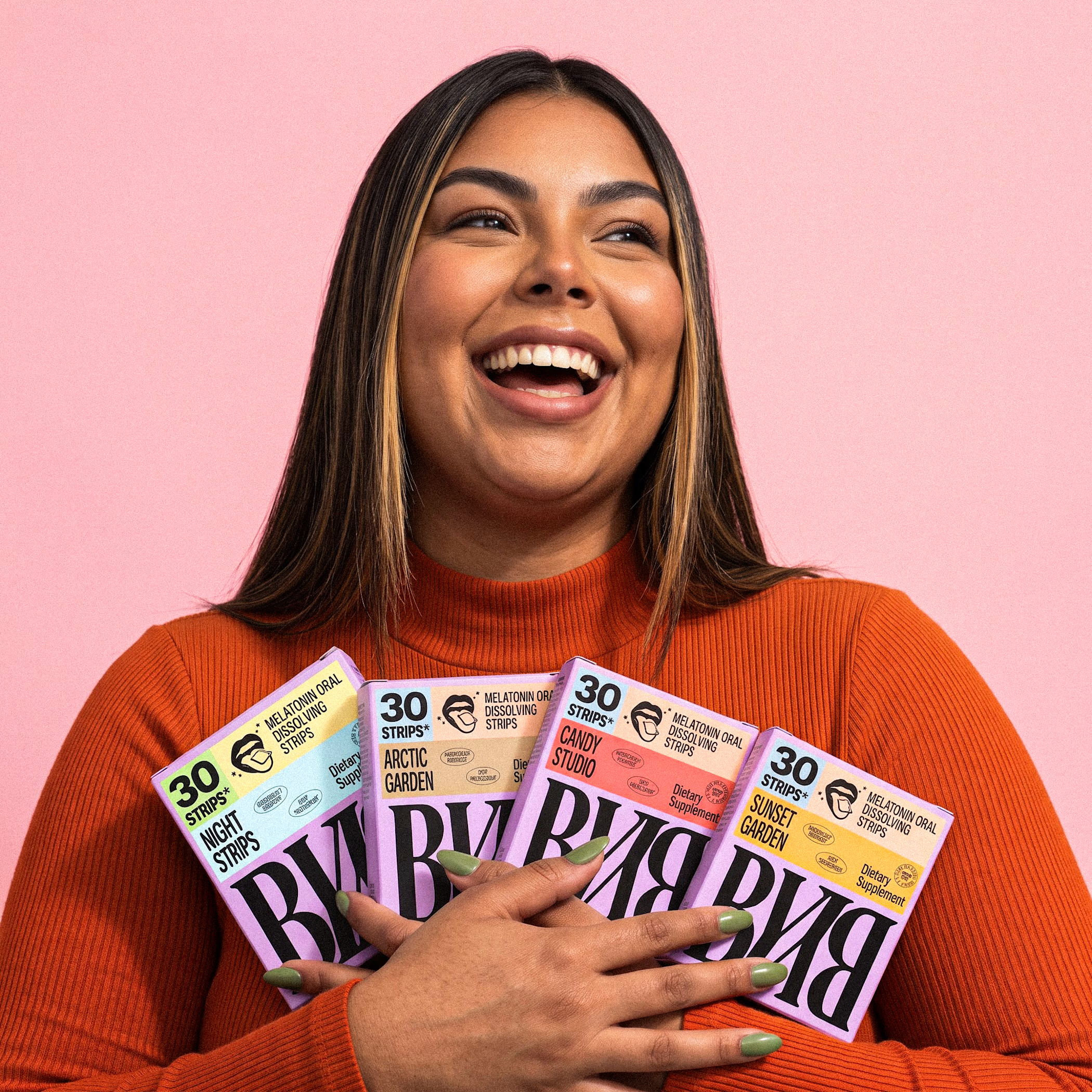
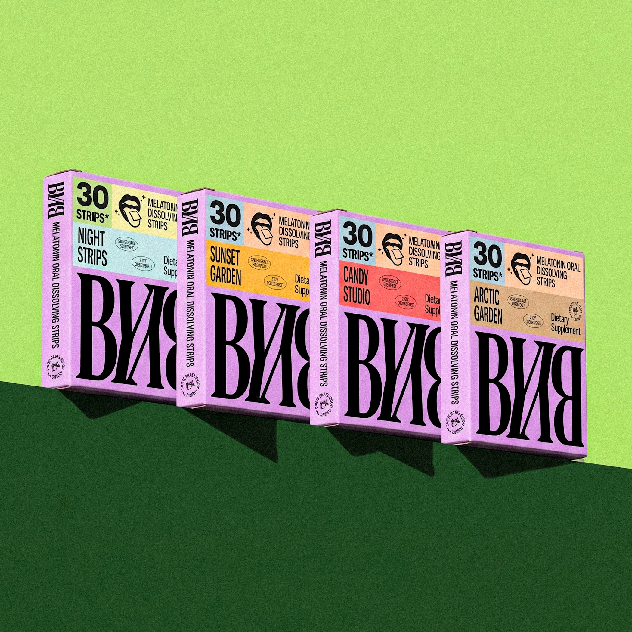

The four flavor colors work really well as a set. Strong shelf presence.

Golden Grain - Premium Beverage Branding 🍺
Complete product lineup design for Golden Grain:
Original, Strong, Premium Lager & Light Zero
Designed 7 SKUs with one consistent brand system:
3 Cans + 4 Bottles, same G monogram, same premium gold + green identity.
Concept: Premium, cold, fresh & energetic.
Ice, water drops and golden splash to show chill & refreshment.
Tools: AI + Photoshop
Full Branding | Packaging | Product Visual
