The network for creativity
Join 1.25M professional creatives like you
Connect with clients, get discovered, and run your business 100% commission-free
Creatives on Contra have earned over $150M and we are just getting started
Back to feedPost
Taste Test


Which one would you put in the fridge door?
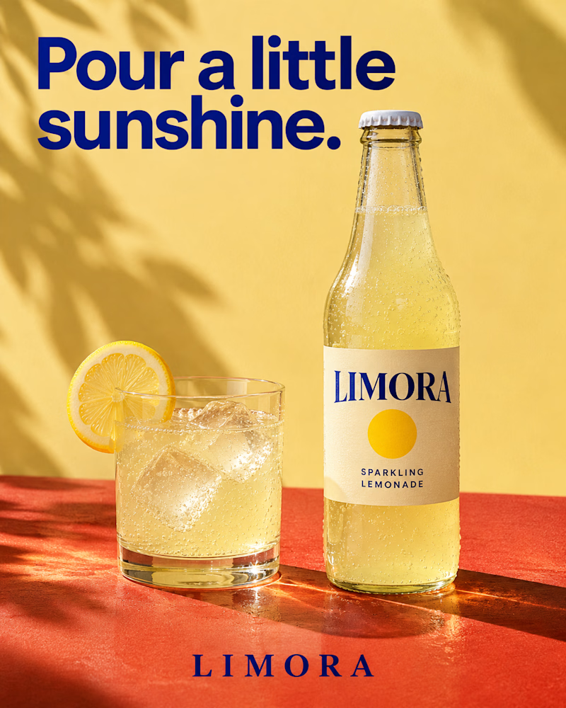
The first is a clear glass bottle with a cream label and a yellow sun mark on a terracotta ledge, a tumbler of lemonade beside it with ice and a lemon wheel on the rim, palm shadow across a butter yellow wall, heavy navy sans headline.
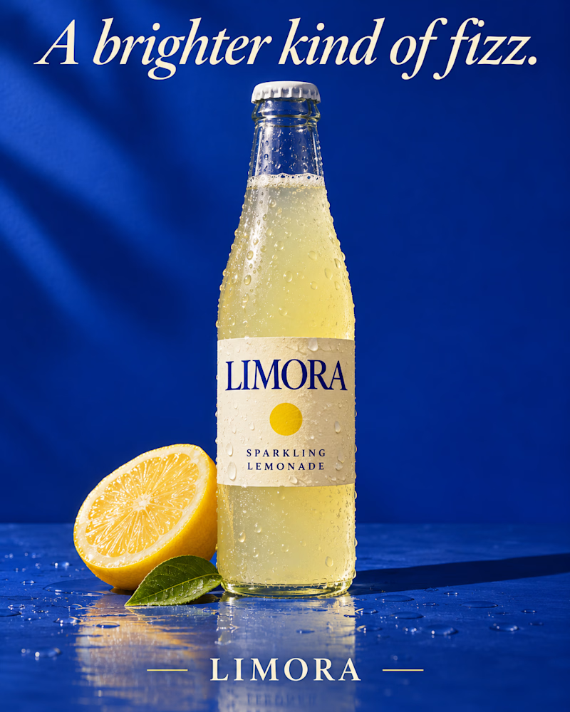
The second is the same bottle beaded with cold on wet cobalt, half a lemon and one green leaf at its base, droplets scattered across the surface, a soft streak of light on the wall, the headline in cream italic serif.
One sells the afternoon. The other sells the chill.
👇 #packagingdesign #brandconcept #beveragedesign
18 votes
Ends in 1d

The one on the left feels so fresh and summery. Actually made me thirsty haha 😁

Same bottle but i like the first.

Love the sunshine vibe

Sunshine for me, the palm shadow feels like a real afternoon ☀️ The cobalt one is a close second.

Fizz 🔥
The network for creativity
Join 1.25M professional creatives like you
Connect with clients, get discovered, and run your business 100% commission-free
Creatives on Contra have earned over $150M and we are just getting started

Related posts

Which J0l bottle design stands out more to you?
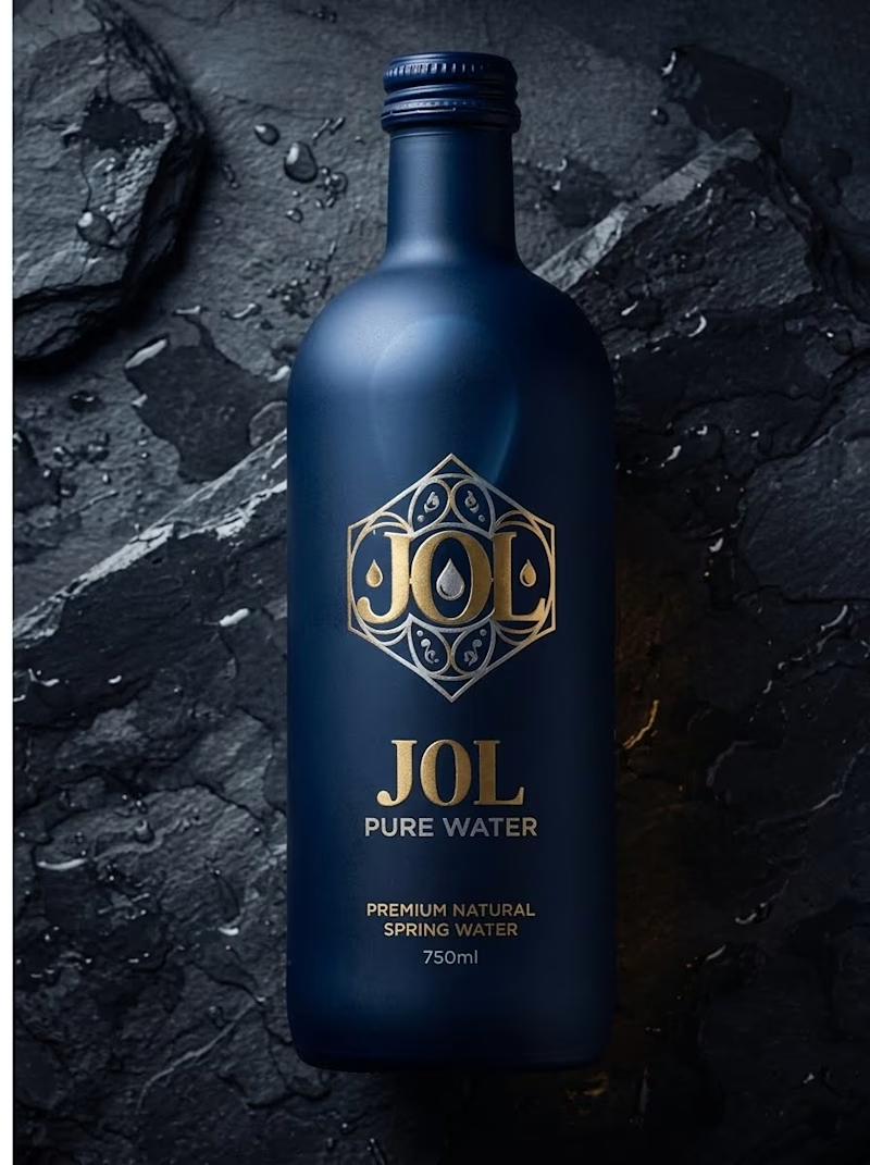
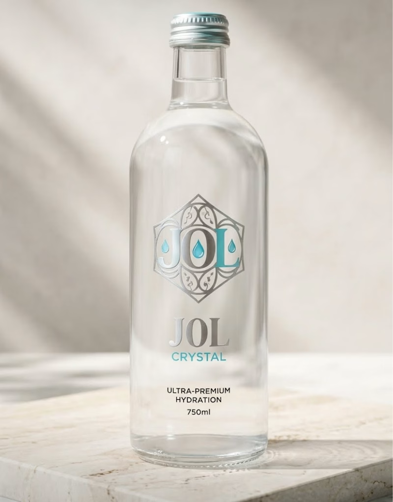
I am testing two packaging directions for J0l, a luxury water concept I designed.
On one side, I created a bold, matte midnight blue bottle with gold accents. On the other, I designed a clean, crystal clear glass bottle with silver and teal details.
Which look grabs your attention first? Let me know in the poll below!
0 voted
0%
1 voted
100%
1 vote
Closed

Love how clean and well-balanced this is.

Very close to finish a website project! Help me out!
Blue or orange scheme?
38 voted
47%
43 voted
53%
81 votes
Closed

The orange scheme was stunning 😍

Fine tuning and testing on real client's project. That tool works perfectly, love it, especially when I use it for myself!
#startup #design #designsystem #tool #founder
1 voted
33%
2 voted
67%
3 votes
Closed


real client work is the only honest test for tools like this tbh