The network for creativity
Join 1.25M professional creatives like you
Connect with clients, get discovered, and run your business 100% commission-free
Creatives on Contra have earned over $150M and we are just getting started
Back to feedPost
Taste Test

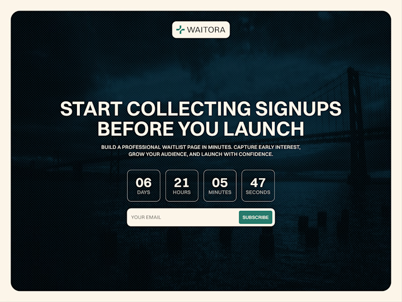
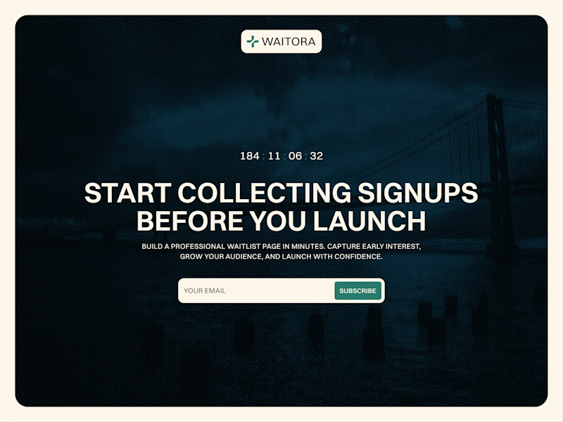
Which countdown looks better?
More complex on the left or simple one on the right?

18 votes
Ends in 1h

Great!

Going more complex. The layered type + product grid reads stronger for a template showcase. Simple wins for clarity, complex wins for "this is what Framer can do".
I like your approach, Noel! The complex one was built with Workshop, but it bugs when I reload the website, so I switched to the simpler one.

I like the simple one more.
Got it, Gideon!

Voted simple. The bold overlay type reads better at a glance than the boxed digits, and it keeps the hierarchy focused on the headline instead of competing with it.
Okay, Rafee🙌

I like the more complex better
Okay! Cool!

The number should be clear, they dont even want to know what the event was.
Got it!
The network for creativity
Join 1.25M professional creatives like you
Connect with clients, get discovered, and run your business 100% commission-free
Creatives on Contra have earned over $150M and we are just getting started
Related posts

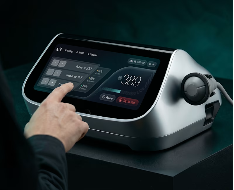
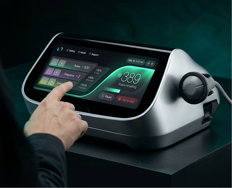
I sent the client a couple of options for the main control panel screen design and thought I'd ask for your opinion.
6 voted
43%
8 voted
57%
14 votes
Closed
I love the colored

Planning to publish my first ever Framer template and can't help obsessing over the details. Which mockup should I choose?
2 voted
13%
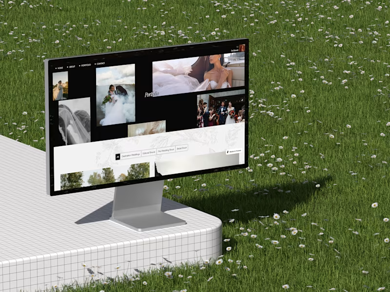
14 voted
87%
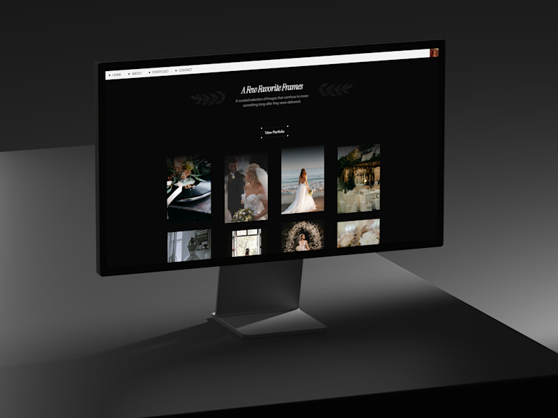
16 votes
Closed

Impressive design !


New resource: Auria AI Rebuild Prompt ✦
I turned the complete Auria homepage into one detailed prompt for Codex and Claude Code.
Auria is a luminous Framer template created for modern service businesses, wellness brands, and productized offers.
Usually $19. Free for anyone who supports Auria on its Framer Marketplace page.
Get the prompt:
https://startfrom.co/templates/auria
Created with Framer, Midjourney, Claude Code, and Codex.
Rebuilding a whole landing page with just one prompt is such a cool experiment, Alex! Did Claude Code manage to handle the Framer-specific layout structure well on the first try?












Trending

Claude
Claude has entered the design space. How are you using Claude Design?

Contra University
Learn from expert creatives how to earn more using next-gen AI tools.
creativeaiflow
Creative AI workflows are evolving. What tools do you use, and what are their strengths and weaknesses?
freelancerlife
Freelancer life is wins, pivots, and everything in between. What’s yours right now?