The network for creativity
Join 1.25M professional creatives like you
Connect with clients, get discovered, and run your business 100% commission-free
Creatives on Contra have earned over $150M and we are just getting started
Back to feedPost
Taste Test

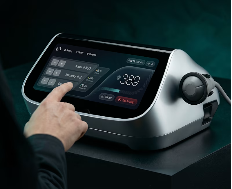
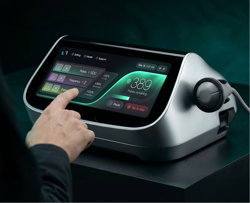
I sent the client a couple of options for the main control panel screen design and thought I'd ask for your opinion.
6 voted
43%
8 voted
57%
14 votes
Closed


For a machine like this minimal Dark is my go to.


I love the colored

Really depends on a few things here. First, how critical is "pulses remaining"? It only shows on the colored version, so before comparing looks I'd decide whether that label belongs on the screen at all.
Second, context of use: how long does someone sit in front of this...

honestly, something in between those 2

The network for creativity
Join 1.25M professional creatives like you
Connect with clients, get discovered, and run your business 100% commission-free
Creatives on Contra have earned over $150M and we are just getting started





Related posts

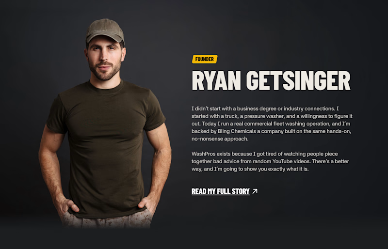
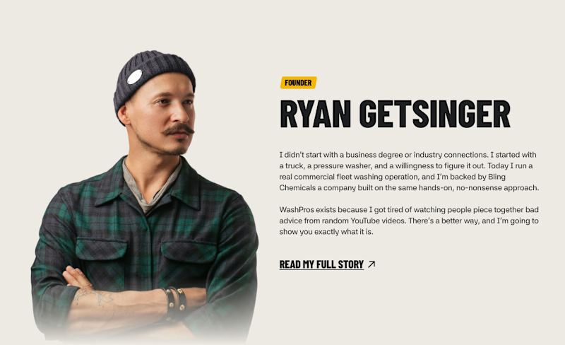
A/B testing a founder section. Which one lands better? 🤔

6 voted
43%
8 voted
57%
14 votes
Closed

I went back to some AI-generated packaging images I created one year ago and tried to recreate them using newer AI models.
The difference is honestly wild. The materials, lighting, shadows, reflections, proportions… everything feels significantly more realistic now.
It made me wonder what we'll be recreating with these tools another year from now.
2025 or 2026: which one looks more convincing?

3 voted
11%
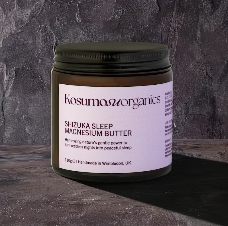
25 voted
89%
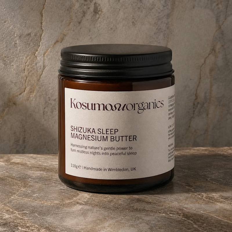
28 votes
Closed

"October 2026" looks better. It has better lighting, shadow, material design and it looks more realistic.

Which thumbnail do you prefer for a portfolio piece on a website?
High or low contrast background?🤔
5 voted
63%
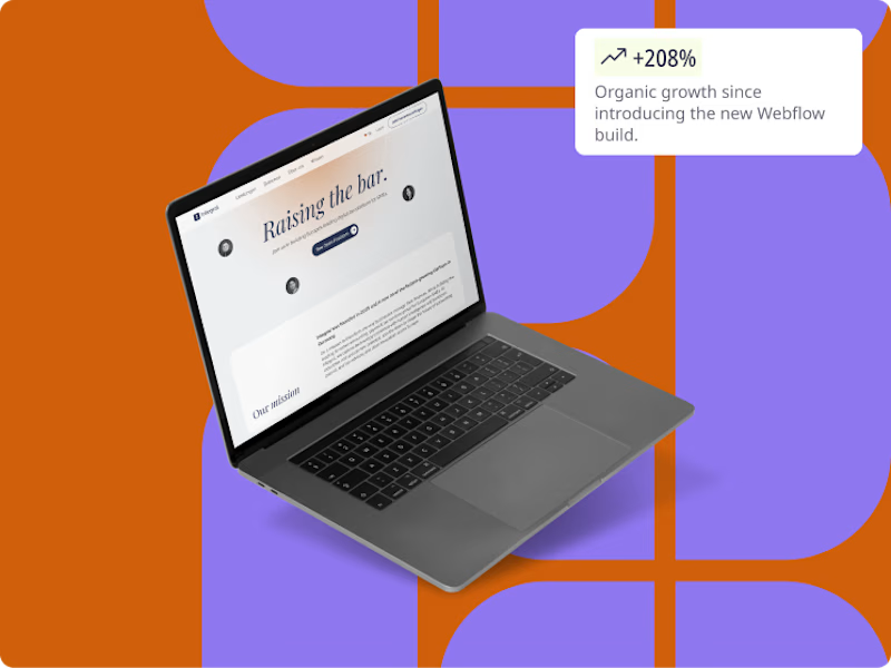
3 voted
37%
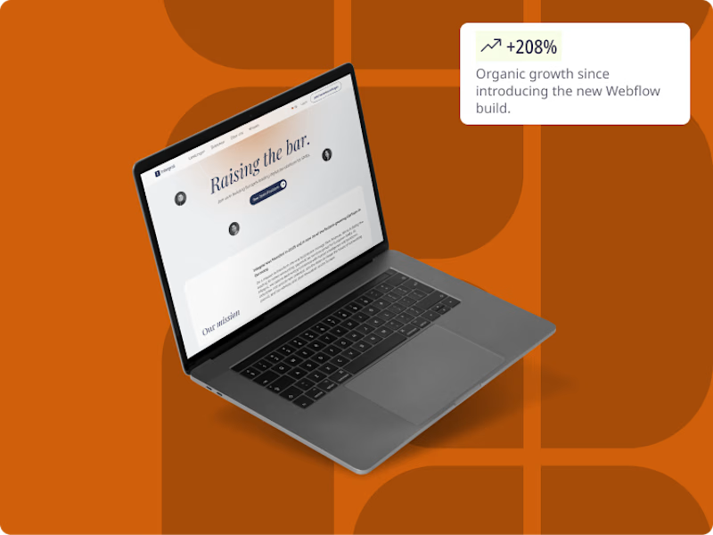
8 votes
Closed

I would experiment more on how to make the project the hero of the illustration by keeping the background less dominant and letting the work speak for itself.