The network for creativity
Join 1.25M professional creatives like you
Connect with clients, get discovered, and run your business 100% commission-free
Creatives on Contra have earned over $150M and we are just getting started
Back to feedPost
Taste Test
Hey community remember when i posted about the building an AI Chrome extension to help job seekers beat automated filters.
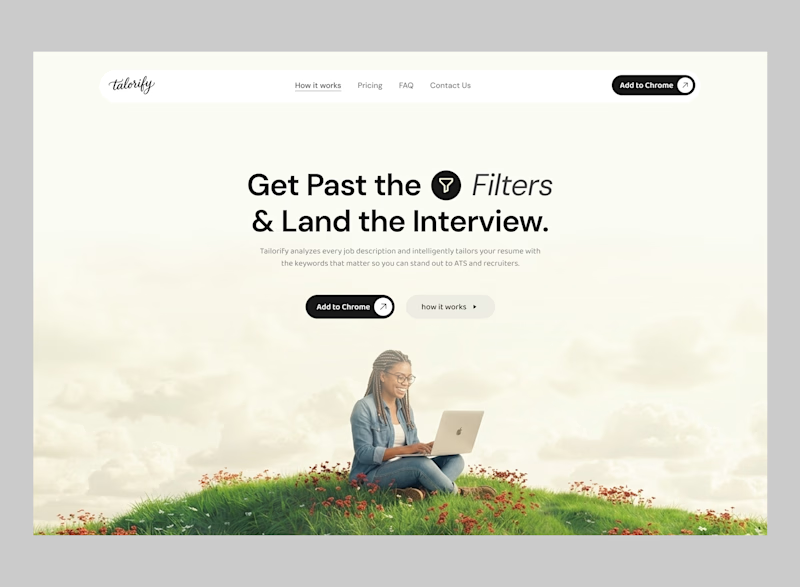
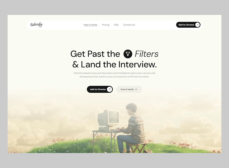
now we are working on the Landing page and here is the hero section but hard to choose
Which hero section instantly makes you trust the product more
HERO (A)
or HERO (B)?

17 votes
Ends in 15h

i wanna know what you guys think


LOCKED

I see what youre trying to do with Hero B and I like the experiment, but I would still go with A. It feels more balanced and the visual fits the message better.
you caught me right, thanks we pushing Hero A


Hero A
We just locked that in
Thank you

Hero A. Modern laptop matches today’s job seeker. B looks artistic but A feels practical and believable.
Thank you for that great insight
The network for creativity
Join 1.25M professional creatives like you
Connect with clients, get discovered, and run your business 100% commission-free
Creatives on Contra have earned over $150M and we are just getting started







Related posts

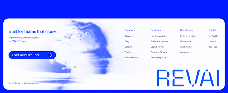
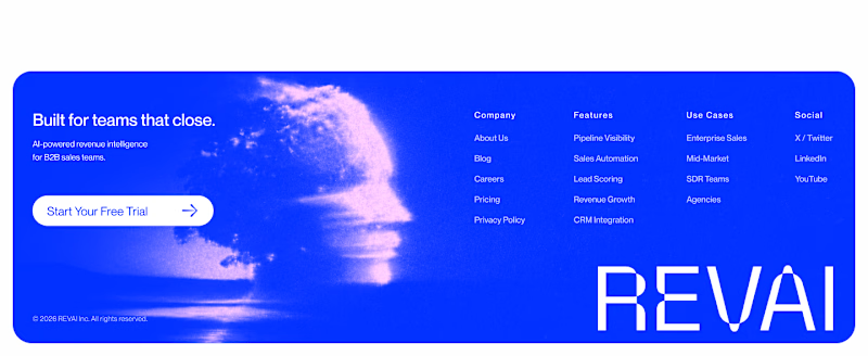
Footer exploration for an AI-powered platform built for B2B sales teams.
Which one would you pick — 1 or 2?
27 voted
40%
41 voted
60%
68 votes
Closed

The blue footer feels more confident for a B2B sales product—the contrast gives the navigation and CTA a clearer presence. I’d pick Blue Footer.

Which hero section image position looks good?
help me choose, you can also share any idea you have for different layout
2 voted
29%
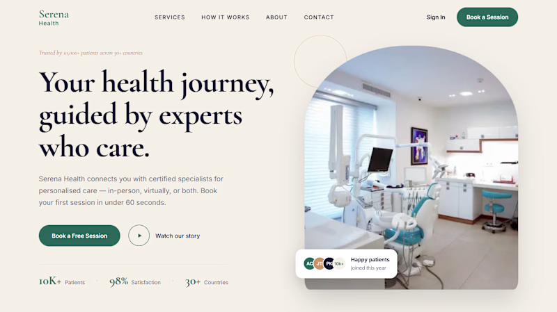
5 voted
71%
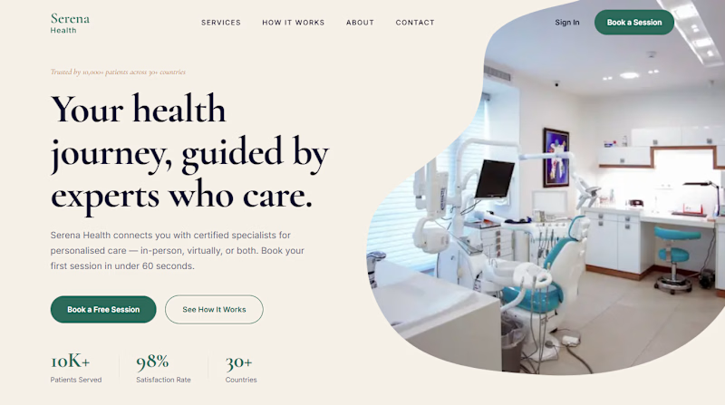
7 votes
Closed

Both look great but I love the organic feel of "B" and how it reaches the top corner of the screen :D


A look at my design work for Tithe, an app built around being more deliberate with your attention.
That idea carries into the design too. Soft blue and warm neutrals give the screens a quiet feel, while direct copy makes the next step clear.
There’s a lot happening across the product, from choosing what deserves your focus to earning your way back into blocked apps. The challenge is making each of those moments feel simple – @BrightStudios®

Amazing work Daniel🙌