The network for creativity
Join 1.25M professional creatives like you
Connect with clients, get discovered, and run your business 100% commission-free
Creatives on Contra have earned over $150M and we are just getting started
Back to feedPost


Good Job

Nice transformation 👌
Curious — what was the biggest challenge translating the Figma design into Elementor?
Appreciate it! The biggest challenge was definitely translating the animations and micro-interactions. Figma allows a lot of visual freedom, while Elementor requires more structured logic. A bit of CSS and JS helped bridge the gap.

The network for creativity
Join 1.25M professional creatives like you
Connect with clients, get discovered, and run your business 100% commission-free
Creatives on Contra have earned over $150M and we are just getting started



Related posts

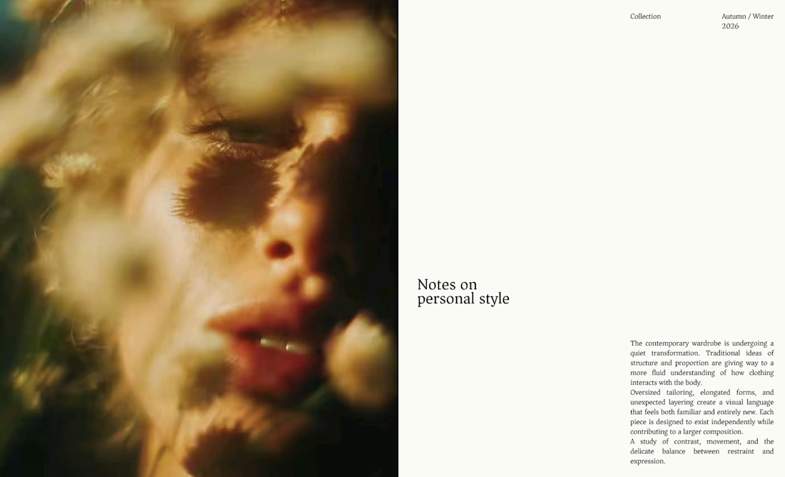
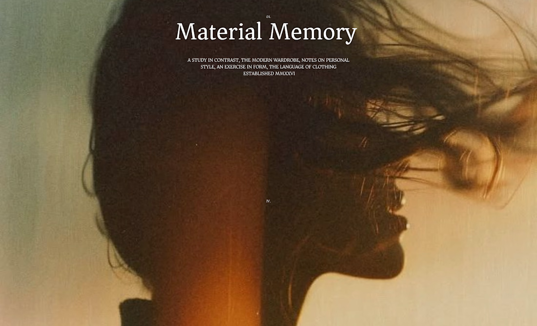
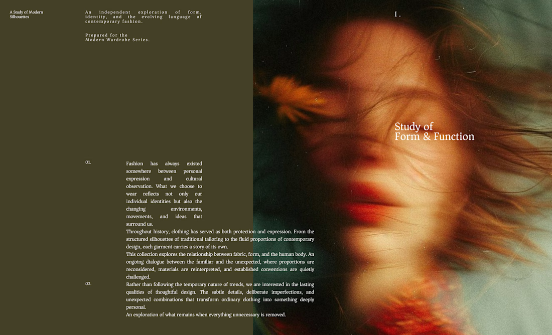
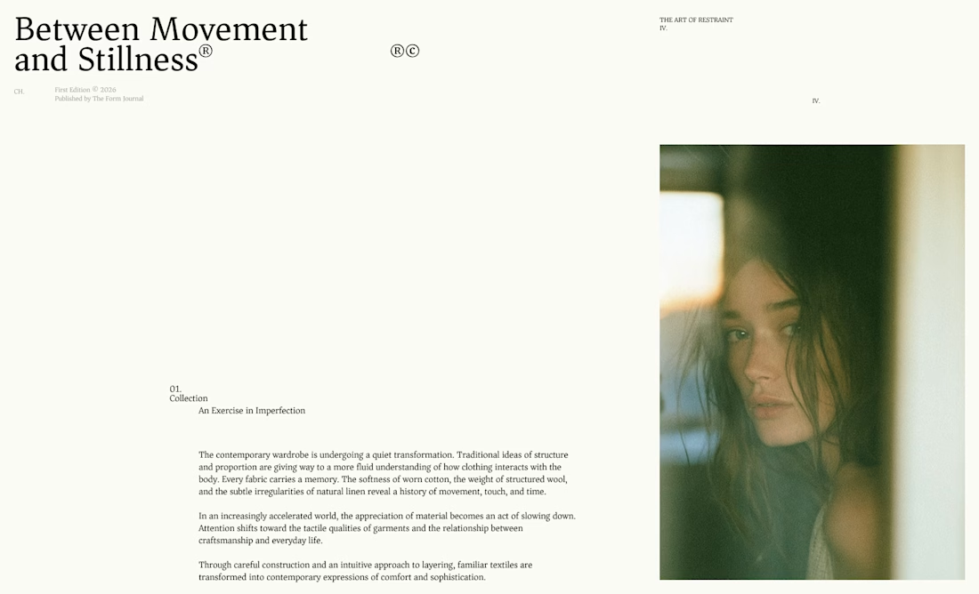
I designed these editorial-inspired layouts as part of an exploration for a fictional photography and fashion magazine
↳ Master typography & layout - The foundation of timeless web design. Join 350+ designers inside my 13-hour online course https://typomonday.com/course

Really nice exploration 👍

Design Agency Website
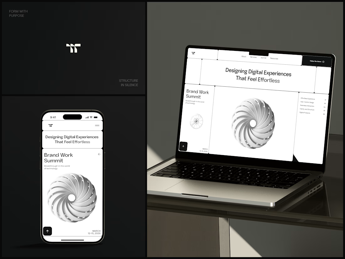
Only one cell on this homepage is black.
The rest of the page is a grid of rounded white cells: the headline, an event card, a white 3D spiral and a list of services. The black one, top right, holds the "Follow the future" button and stands out against all that white.
On the phone, the cells stack into a single column. The navigation folds into a menu icon, and the event card and spiral merge into one cell.
The headline reads "Designing Digital Experiences That Feel Effortless", so the grid has to look organized before anyone reads a word.
Designed by the Hue & Machine team.
#DesignAgency #WebDesign #AgencyWebsite #LandingPage #BentoGrid #MinimalDesign #UIDesign #ResponsiveDesign #MobileDesign #FigmaDesign



Looks cool

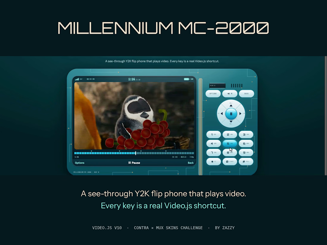
Millennium MC-2000 is a see-through Y2K flip phone that plays video. The keypad isn't decoration: every key is a real Video.js shortcut. 1–9 jump to 10–90%, OK plays, the D-pad seeks and sets volume, ✱ is captions, # is fullscreen.
The status bar is live player data: signal bars show the buffer, the battery shows volume, the clock shows time, and a ✉ arrives with each new chapter. Under 480px the lid closes and flips open on demand.
Every key is 44px and keyboard-reachable, and with reduced motion or transparency the shell turns solid and still.
It works with any video: millennium-mc2000.netlify.app/?media=plain
More explorations: two more skins I designed, switchable live on the same film, at zazzy-skins.netlify.app (House, built from videojs.org's own brand, and Darkroom, a film-developing player).
Film: "Caminandes 3: Llamigos" by Blender Foundation, CC BY 3.0.



Lovely work Zazzy