The network for creativity
Join 1.25M professional creatives like you
Connect with clients, get discovered, and run your business 100% commission-free
Creatives on Contra have earned over $150M and we are just getting started
Back to feedPost

One thing I find interesting about branding a company like COREGRID is how much of its value comes from something most people never see.
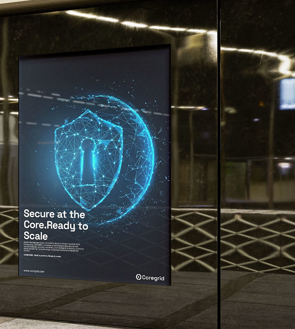
When a business launches an application, manages customer data, or expands its digital services, there’s an entire infrastructure working behind the scenes to keep things running. Performance, security, and reliability matter because even a small disruption can affect how a business operates.
That’s the idea behind COREGRID, a cloud infrastructure brand built around providing dependable, secure, and scalable computing environments for modern businesses.
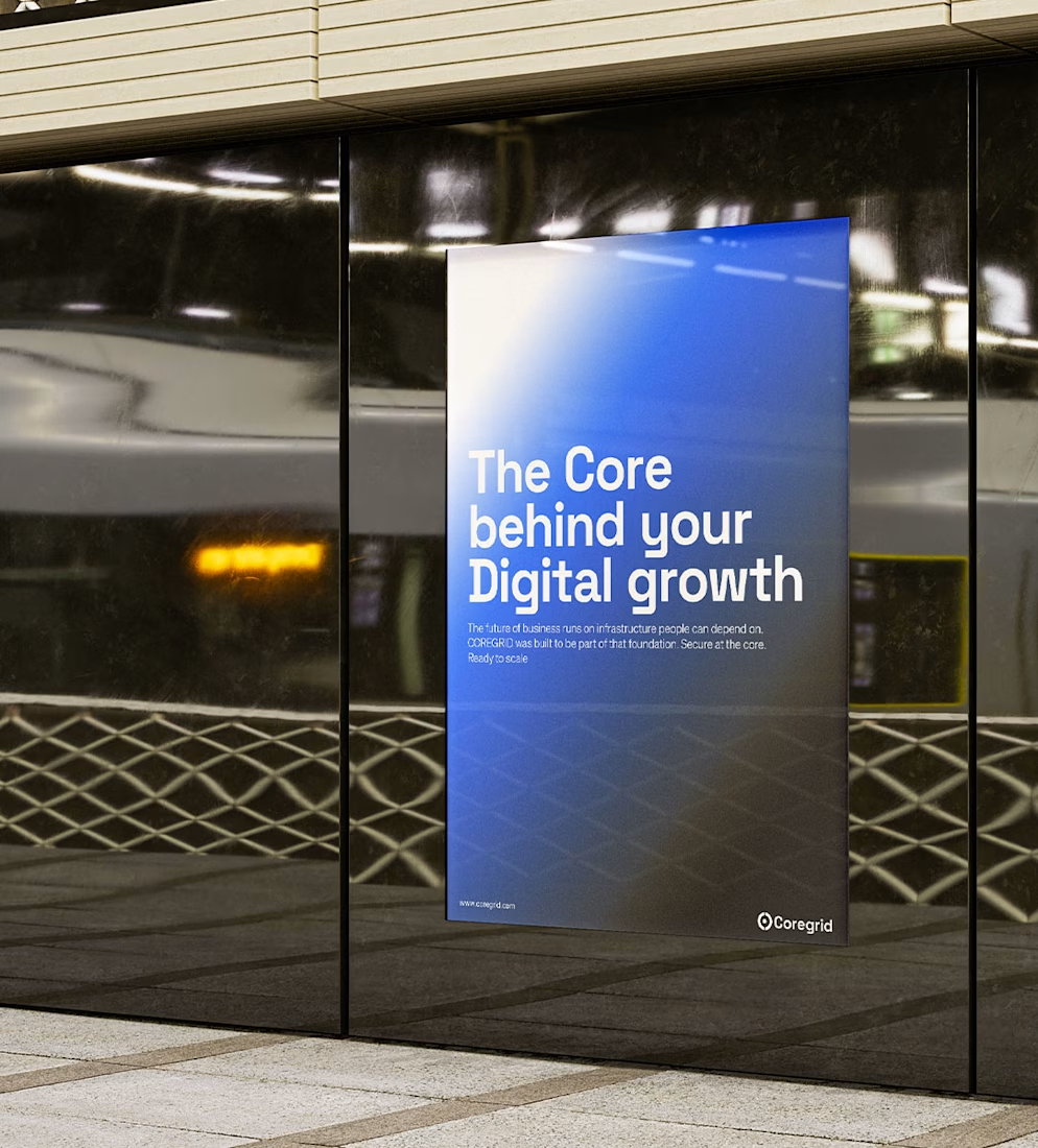
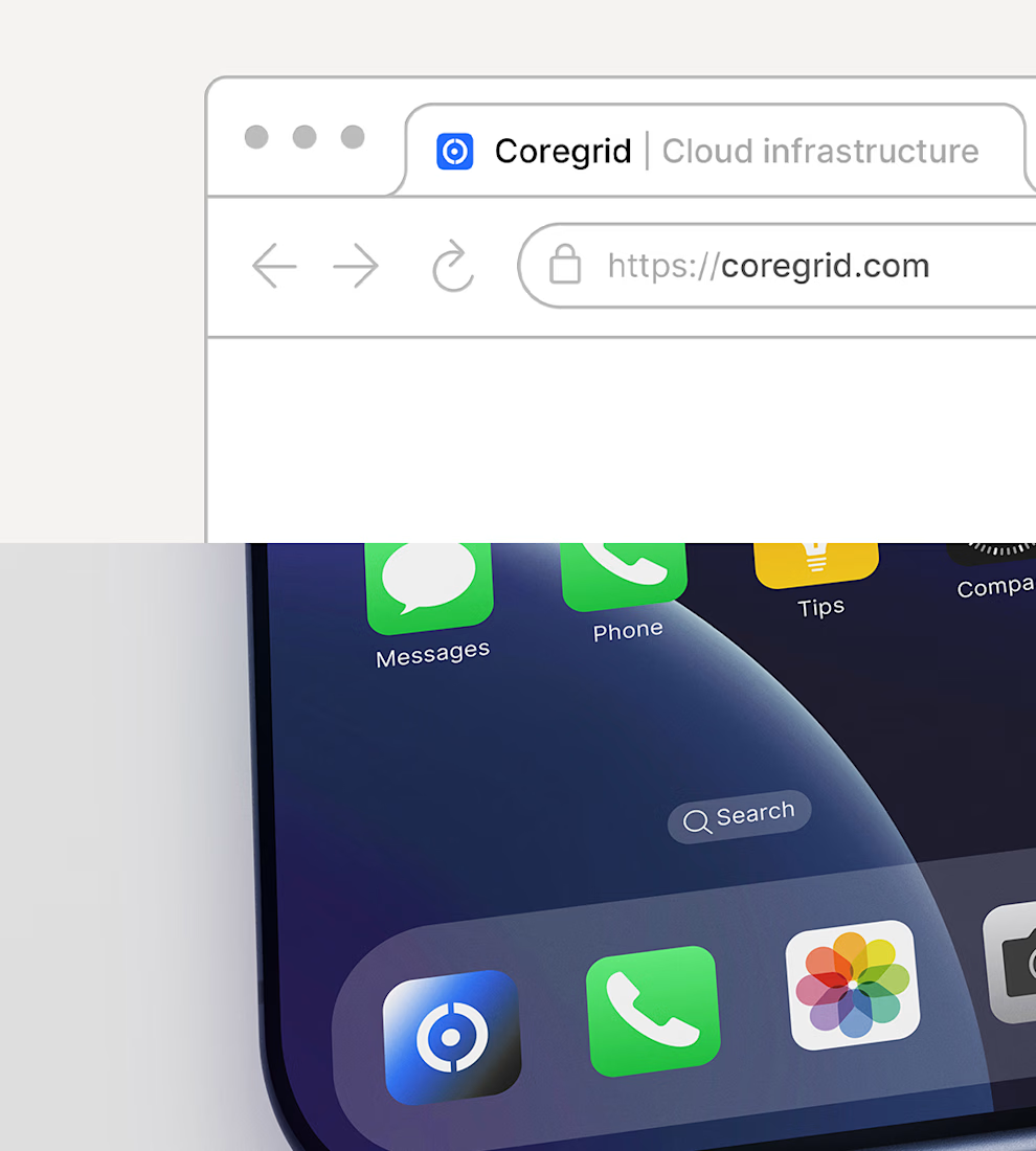
From a brand design perspective, I wanted to explore how to communicate something as technical as cloud infrastructure without making the identity feel cold or overly complicated. The challenge is finding that balance between a structured, intelligent visual direction and a brand that still feels clear, modern, and easy to recognise.
I’m learning that designing for a technical industry requires more than choosing a good typeface or creating an interesting symbol. You have to understand what the business does, what its audience needs to trust, and how those ideas can translate into visual decisions.
For COREGRID, the direction is centred on structure, precision, and dependability, qualities that reflect the role the brand is designed to play in the digital world.
Here are some of the visuals for a branding project that I am currently exploring🙂↔️
#BrandIdentity #BrandDesign #BrandStrategy #VisualIdentity #CloudInfrastructure #GraphicDesign
The network for creativity
Join 1.25M professional creatives like you
Connect with clients, get discovered, and run your business 100% commission-free
Creatives on Contra have earned over $150M and we are just getting started



Related posts

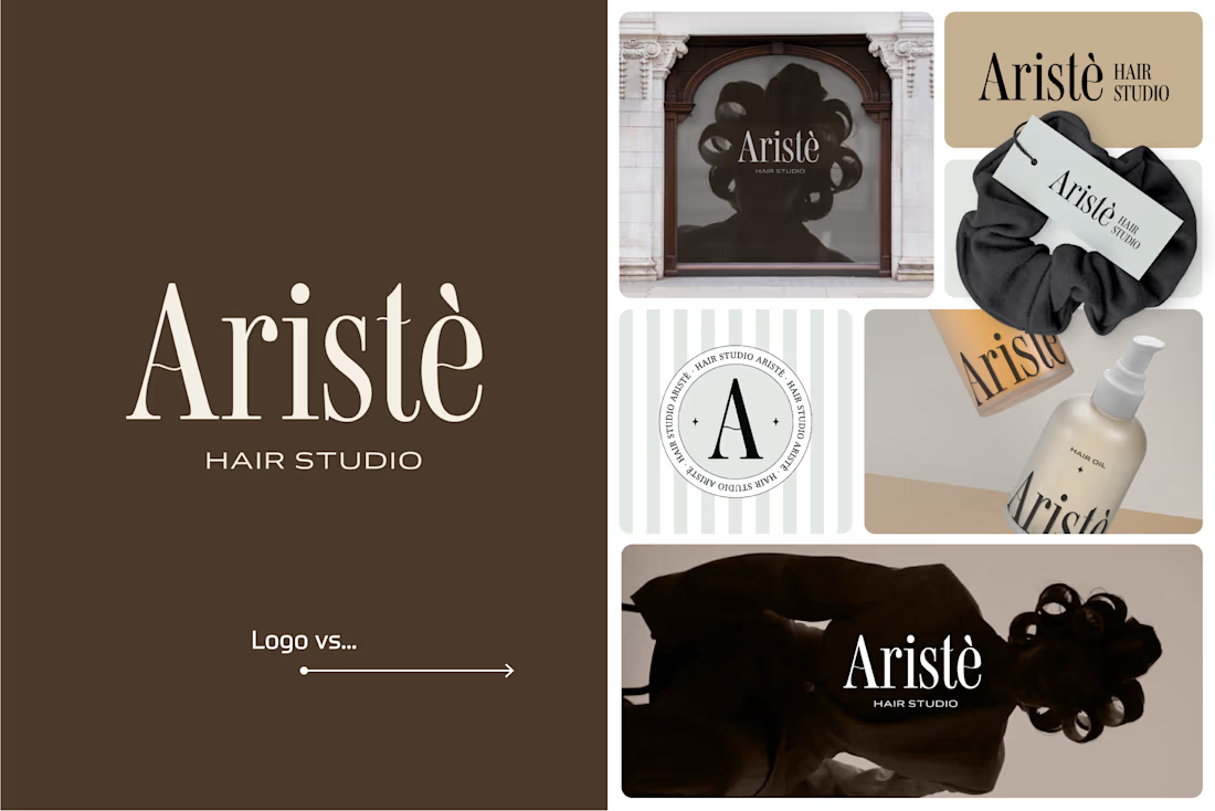
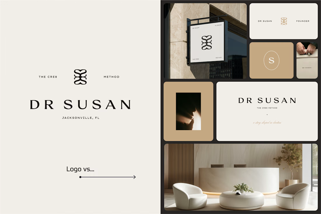
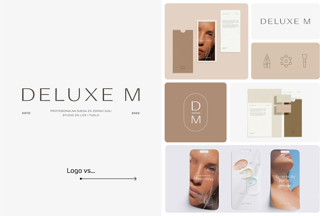
A logo is one thing. Giving it a whole personality is another. 👀
I picked a few of my branding projects to show what happens beyond the logo.
First, the logo on its own. Then, the full visual identity: colours, typography, graphic elements, patterns, packaging, and all the little details that make each brand feel like itself.
Because I don't want a logo to just look good sitting on a presentation slide. I want to see what it can become when it gets out into the real world.
Every project has a different story, personality, and visual direction. And that's probably my favourite part of brand design: figuring out how to turn one initial idea into a whole visual language.
Swipe through and meet the logos, then their bigger personalities. ;)
A logo is the starting point. The fun really begins after that.
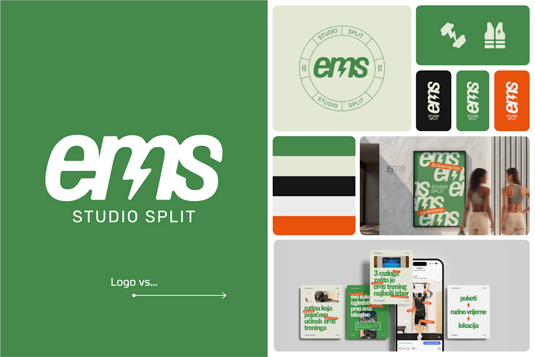

Clever use of the lightning bolt in the EMS logo!


Branding & Visual Identity for AirCon West based in London.
Designers! Present your work with motion! It breathes life into your work and conveys your ideas in a dynamic way.
Use free online motion tools to do it.
My favorites:
https://animos.app/
https://arqe.ai/
https://orelin.app/editor
https://openvid.dev/en
(Or animate it yourself, like I did here using EffectCraft!)


Nice work!!

A beautiful Shopify store is great. But does it make people want to shop?
Take a look at my latest e-commerce design project for Amora Renae, a luxury hair extension brand.
I wanted the experience to feel as premium as the products themselves.
From the bold pink hero section and elegant product collections to the detailed product pages and responsive layouts, every design decision was made to bring the brand's identity to life while keeping the shopping journey intuitive.
But here's where I need your honest opinion:
If you were the customer visiting this store for the first time, what would catch your attention first?
The homepage and overall visual identity 🎨
The product presentation and collections 🛍️
The product page experience
The mobile shopping experience 📱
And for the designers here, what would you improve?
I genuinely want to hear different perspectives. Let's talk design, user experience, and what makes an online store memorable.
#Shopify #EcommerceDesign #WebDesign #UIDesign #UXDesign


Love the creativity behind this. The visual identity feels consistent and well thought out.