The network for creativity
Join 1.25M professional creatives like you
Connect with clients, get discovered, and run your business 100% commission-free
Creatives on Contra have earned over $150M and we are just getting started
Back to feedPost
Launching a new app? The onboarding flow is your handshake. It needs to be clear, trustworthy, and fast.
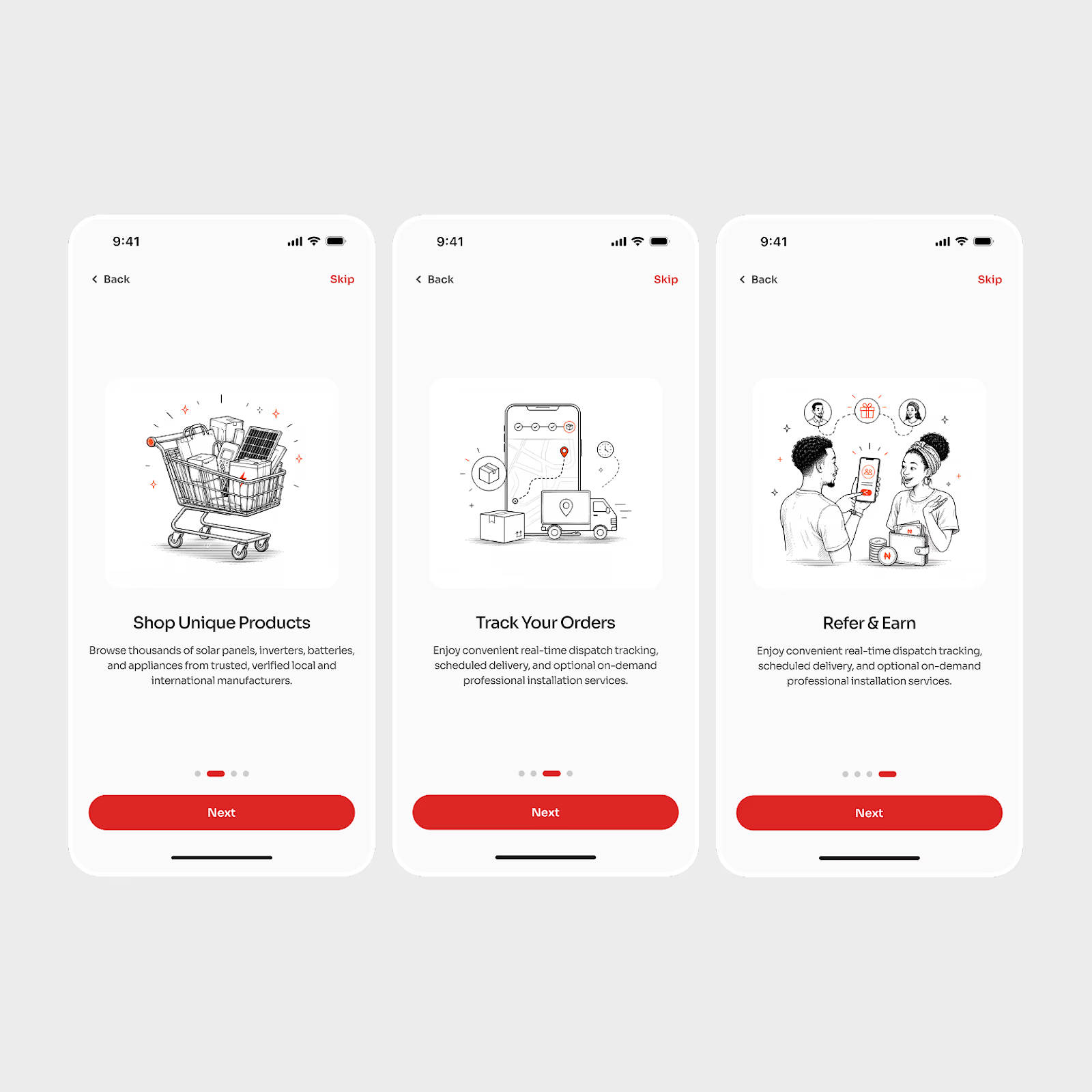
Here’s my designed three-step onboarding sequence for an e-commerce platform specialising in solar and renewable energy products. This design balances informing the user with getting them into the shopping experience quickly.
I prioritised:
A clean visual style for quick understanding.
Specific product highlights.
A frictionless progression via 'Next' and 'Skip' buttons.
A great onboarding experience makes a good first impression



Amazing work

Thank you
The network for creativity
Join 1.25M professional creatives like you
Connect with clients, get discovered, and run your business 100% commission-free
Creatives on Contra have earned over $150M and we are just getting started
Challenges
View all


Related posts


“Or similar” leaves a lot to the imagination.
A few billboard designs I made for Sync as part of the rebrand. The campaign centres on a simple promise: the car you see is the car you drive.
I kept that message big and direct, with the cars up close and enough pink to make you look twice.
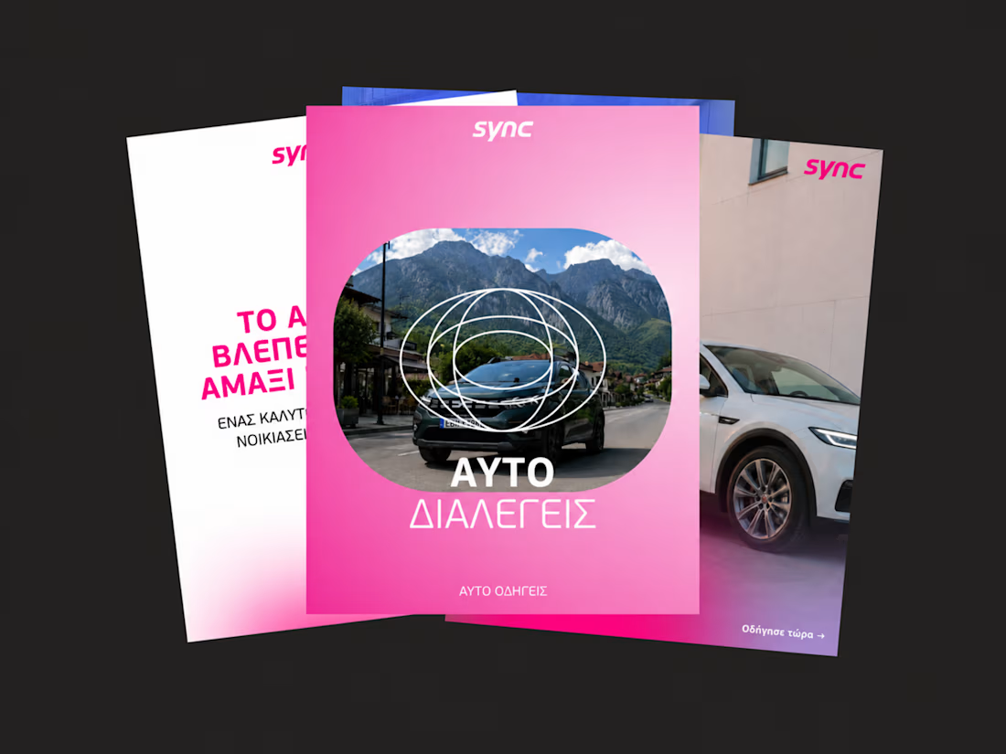
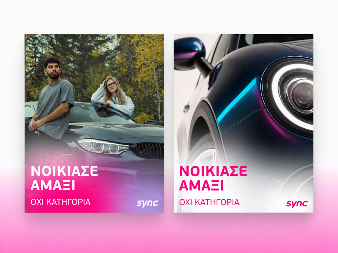
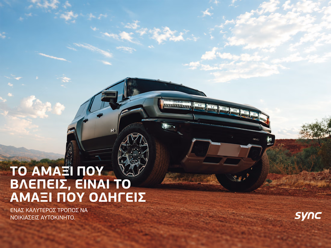
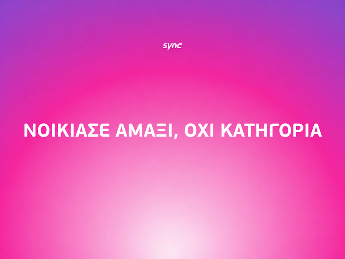

The way the oversized promise carries through the pink palette is really effective—the close-up crops make the car feel immediate without losing the campaign idea.


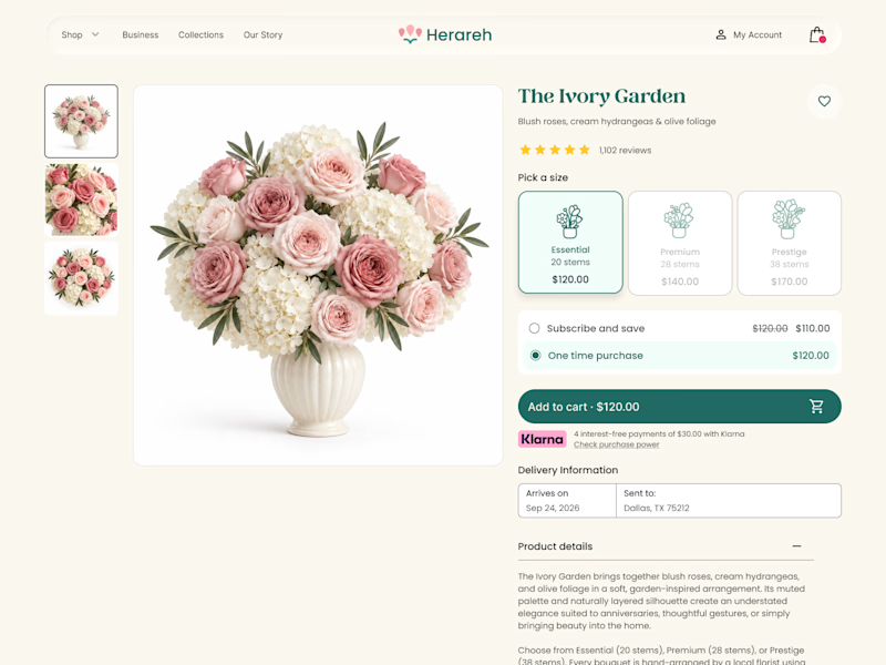
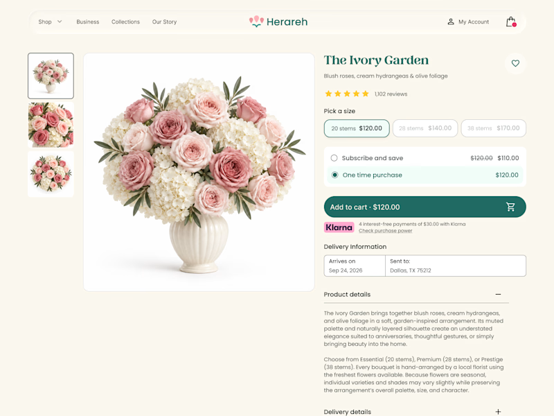

Icon cards for me, bouquets are such a visual purchase that a scannable icon beats reading "small/medium/large" every time. Did the compact chips version convert worse in testing, or are you still gathering data on that?
SENE car rental Website Projects
A car rental website shouldn't make people think too much. It should help them find the right car, understand the price, trust the service, and book with confidence.
I designed SENE around exactly that principle.
Need a website that turns visitors into customers?
I help businesses create modern, conversion-focused websites that look premium and make the user journey easier.
Available for website design & redesign projects.

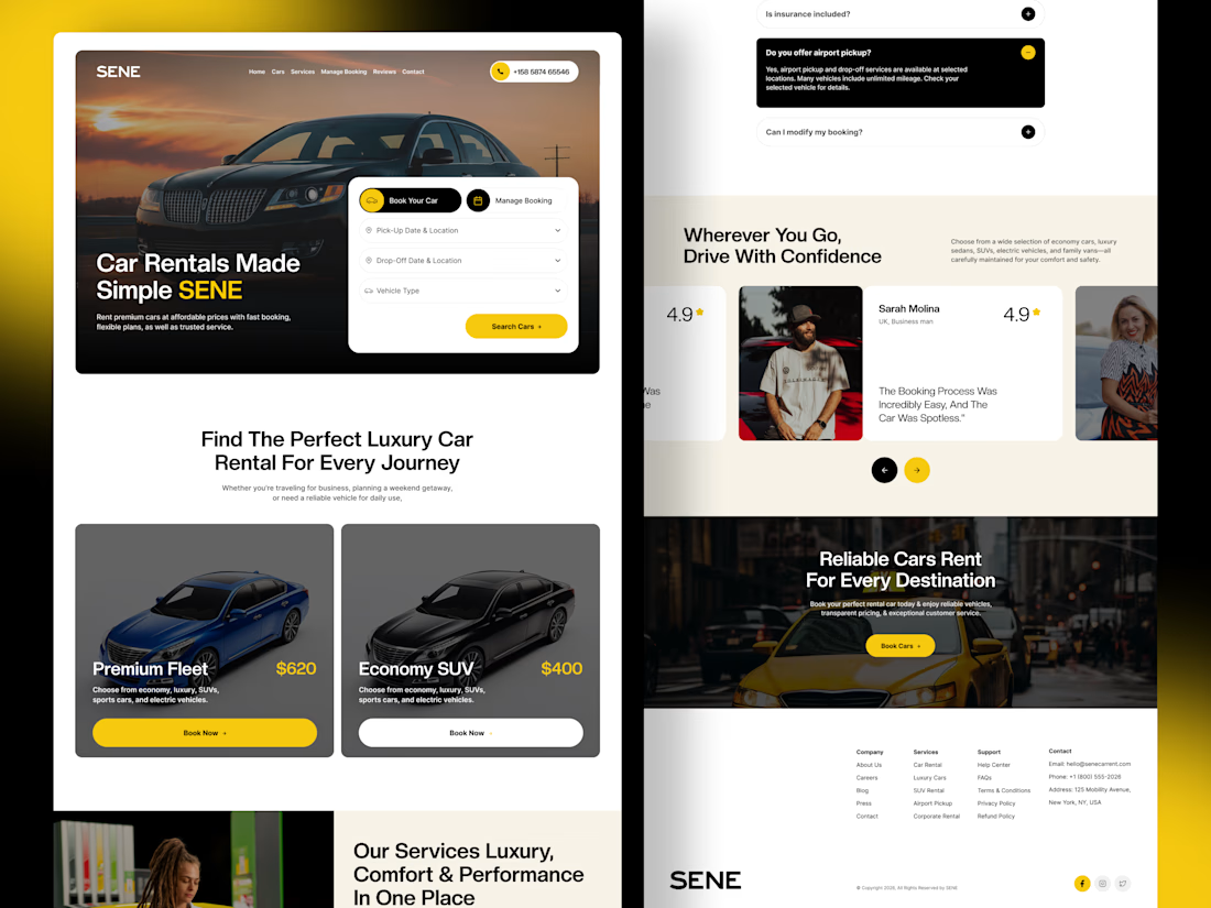

The composition is extremely clean and well organized. It’s impressive how you managed to fit so much information into the layout while keeping everything visually comfortable.