The network for creativity
Join 1.25M professional creatives like you
Connect with clients, get discovered, and run your business 100% commission-free
Creatives on Contra have earned over $150M and we are just getting started
Back to feedPost
Taste Test

Help me choose the best presentation! 🎨
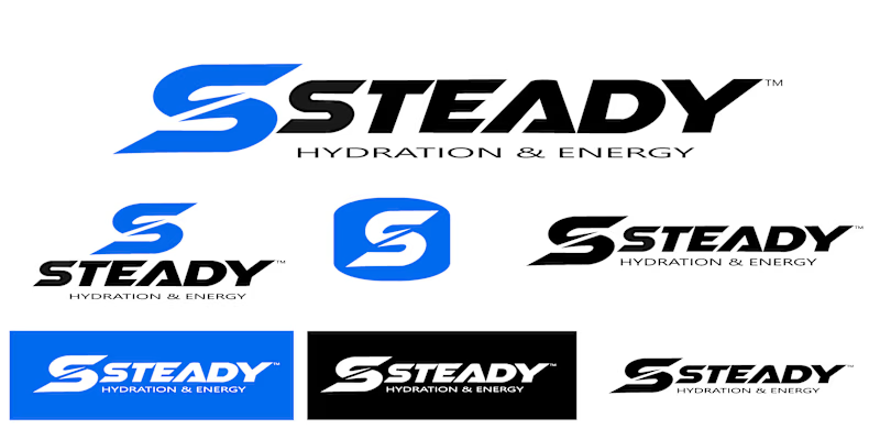
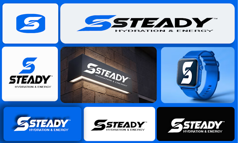
I’m designing a brand identity for STEADY (Hydration & Energy).
Which presentation style catches your eye more?
Option A: Clean Logo & Vector Sheet
Option B: Real-world Mockup Grid
Which logo icon variation feels most energetic and commercial for a hydration brand?
Drop your vote (A or B) and any quick feedback in the comments! 👇
0 voted
0%
1 voted
100%
1 vote
Closed
The network for creativity
Join 1.25M professional creatives like you
Connect with clients, get discovered, and run your business 100% commission-free
Creatives on Contra have earned over $150M and we are just getting started











Related posts

Same content, different experience. A few thoughtful design choices can completely change how a presentation feels, flows, and communicates. Which version would you choose?

11 voted
31%
24 voted
69%
35 votes
Closed

Verde Vista 1 is more modern and futuristic specially with blue colors and robotic hand❤️
Great job Rasid🎉🎉🔥🔥

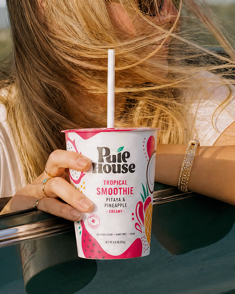
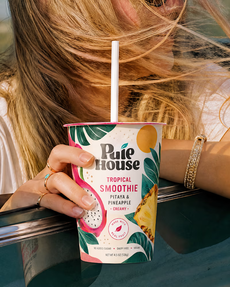
Exploring Two Branding Concepts
I explored two distinct visual directions for Pulp House, focusing on how color, composition, and design elements can shape a brand's identity.
This comparison reflects my approach to creating thoughtful, cohesive visuals that help businesses present their brands with confidence.
1 voted
5%
20 voted
95%
21 votes
Closed

Fun concepts, Mati!

Two Ads, Two Designs but Different Vibes:
Using the hours and the rest day, I came with these ads using the
software of SVGator combined with the transitions from Adobe After Effects.
Vote and let me know your opinions on which one and why?


12 voted
57%
9 voted
43%
21 votes
Closed
